Over my last 8 posts I have looked at colour theory in considerable depth, focussing of course on its application in garden design. One of the most powerful ways we can utilize this knowledge is by experimenting with colour schemes in our gardens.
Many gardeners balk at the idea of purposefully employing a garden colour scheme, assuming it’s just one more rule to follow, or at the very least, too restrictive.
Utilizing a colour scheme doesn’t have to be restrictive though, if we think rather in terms of a hue scheme. Looking to the Munsell Book of Colour, we find that for each hue, there are many permutations of value and saturation all arranged on an individual page. So if we want to work with a scheme which includes red, we have a whole hue page to choose from – just for red! The other hues in our scheme afford us the same broad selection of colours. A little less restrictive than you thought, right?
Colour Schemes
A colour scheme is a planned or logical combination of hues on a colour wheel. As we discussed in earlier posts, there is more than one colour wheel, but you’ll probably find the artist’s colour wheel to be the most user-friendly. You can then refer to Munsell hue pages (or reasonable facsimile) for guidance with the various colours that fall within that hue. I do sometimes utilize Munsell’s hue circle to work out colour schemes, but they aren’t always as straightforward. For ease of use then, I am mixing models here.
So how does one go about choosing a colour scheme for the garden? If your house or other backdrop is a particularly strong chromatic colour, then it’s most effective if you include that colour in your scheme. If on the other hand, your house is more neutral, then start with a colour you really like and build from there.
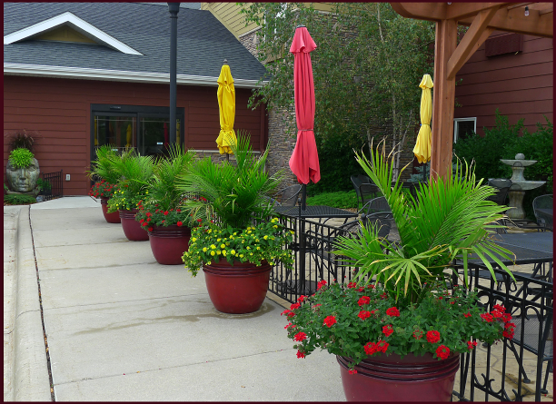
The colours used in this restaurant patio planting echo the muted red and yellow hues of the siding on the building. Photo: Sue Gaviller
Keep in mind that most plants – both in your garden and in the surrounding landscape – have green foliage, hence green will always be present. Since this hue is so much a part of the outside world, the eye tends to ignore it, and will instead focus on other colours. Green is therefore experienced mostly as a backdrop for your garden composition. But it can certainly be one of the hues in your colour scheme too.
You can vary the colour schemes from one part of the garden to another (particularly if you have a large canvas), and the scheme can also change or evolve as the season progresses. For example a garden that has a yellow-green and red-violet combination in the spring might add other colours later in the season, but those hues must always be part of the scheme.
Realistically speaking, some scenarios don’t lend themselves to formal colour schemes (if only for the reason that the proprietor of a well established garden may not want to part with anything – just to incorporate a colour scheme). One can still play with colour schemes though; containers are a great way to experiment without committing to a particular composition.
So let’s have a look at what we can construct using the artist’s colour wheel and some Munsell hue pages.
Monochromatic colour schemes use various values and degrees of saturation of a single hue. Working with a single hue creates naturally harmonious colour compositions.
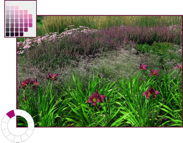
Monochromatic colour scheme using the hue of red-violet (5RP). Photo and graphics: Sue Gaviller
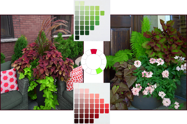
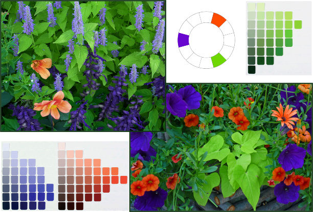
Complementary colour schemes contain two hues that are opposite each other on the colour wheel.

This is a high contrast colour combo, which means it can be loud and demand attention. So you’ll want to tame it by including numerous value/saturation variations of the pure hues – and of course lots of green.
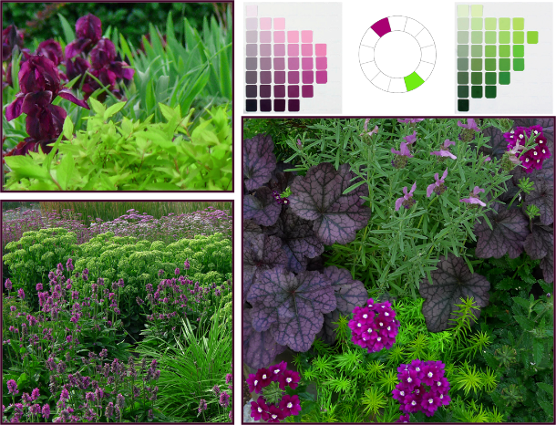
Complementary Colour Scheme: Red-violet (5RP) and yellow-green (5GY). Photos: Top left – Pat Gaviller. Bottom and right – Sue Gaviller
Analogous colour schemes use two or three hues that are next to each other on the colour wheel.

Although this is a low contrast combination, analogous hues still benefit from utilizing variations in saturation and value of the chosen hues, thus introducing more variety. Remember if you choose warm hues, there will need to be significant green (foliage) in your composition to provide the necessary cool/warm balance.
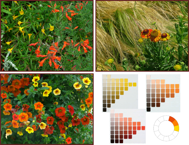
Analogous Colour Scheme: red-orange (10R), orange (5YR) and yellow-orange (2.5Y). Photos and graphics: Sue Gaviller
Counterpoint schemes consist of a hue and one of the hues on either side of its complement.

This too is a dynamic colour combo, but somewhat less so than complementary compositions – many people prefer this colour duo as it generates less visual conflict. Again the use of variations in value and saturation of the two hues will create both unity and variety.
Counterpoint Colour Scheme: red (5R) and yellow-green (5GY). Photos and graphics: Sue Gaviller
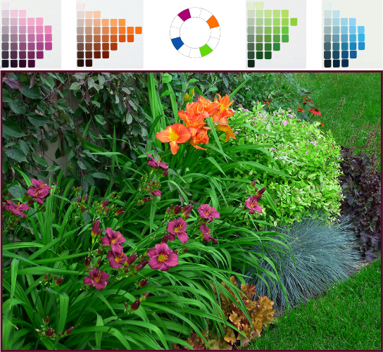
Split-complementary schemes are three-hue combos that use one hue and the two hues on either side of its complement.

The split-complementary colour combo has all the dynamism of complementary and counterpoint, with the balancing addition of two hues that are closer together. A garden may transition from the aforementioned counterpoint theme to split-complementary as the growing season progresses and more plants (thus more colours) take the stage.
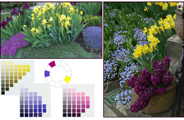
Split Complementary colour scheme: yellow (5Y), blue-violet (7.5PB) and red-violet (5RP). Photos: Top left – Cathy Gaviller. Right – Jane Reksten. Graphics: Sue Gaviller
Analogous-complementary schemes use two adjacent hues and the complement of one of those hues.

Similar in effect to split-complementary, analogous-complementary schemes are especially soothing if the analogous constituents are cool hues.
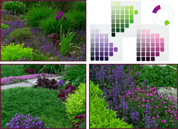
Analogous-complementary Colour Scheme: violet (5P), red-violet (5RP) and yellow-green (5GY). Photos: Top left – Pat Gaviller. Bottom left/right – Sue Gaviller. Graphics: Sue Gaviller
Double-complementary schemes use two adjacent colors and the complements of both of those hues.

This four-hue scheme brings both drama (from opposites) and subtlety (from analogues) to a garden composition, and can be a natural seasonal transition from analogous-complementary as more plants come into bloom.
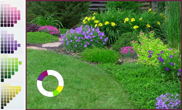
Double-complementary Colour Scheme: violet (5P), red-violet (5RP), yellow (5Y) and yellow-green (5GY). Photo and graphics: Sue Gaviller
Diads are colour schemes that consist of two hues located two spaces apart on the colour wheel.

Though this colour duo provides more contrast than an analogous scheme, it is still a low-contrast theme and less dramatic than higher contrast combinations. More contrast can be introduced if one of the hues is warm and one is cool, for example red and purple.

Diadic Colour Scheme: red (5R) and violet (5P). Photos: top – Pat Gaviller. Bottom – Sue Gaviller. Graphics: Sue Gaviller
Triads use three hues that are equally spaced around the colour wheel.

Triadic schemes offer interesting colour combinations and are inherently balanced because the hues are all equidistant from each other.
Triadic Colour Scheme: blue-violet (7.5PB), orange-red (10R), and yellow-green (5GY). Photos and graphics: Sue Gaviller
Tetrads are colour schemes using four hues that are consistently spaced on the colour wheel.
- Square tetrad – 4 hues touched by the four corners of a square placed in the centre of the colour wheel.
- Rectangular tetrad – 4 hues touched by the four corners of a rectangle placed in the centre of the colour wheel

Four-hue schemes provide considerable colour choice thus can be quite vibrant, especially when hues are at full saturation. They can be toned down somewhat with the addition of less saturated versions of the pure hues.
Tetradic Colour Scheme: red-violet (5RP), orange (5R), yellow-green (5GY) and blue (5B). Photos and graphics: Sue Gaviller
You can see that with all the variations in value and saturation for each hue, many different but related colours are available to you – even when using only a couple of hues. Unfortunately, most of us don’t have access to the Munsell Book of Color, but there are numerous apps and online tools that will provide more than enough visual info for application in the garden.
I highly recommend the Virtual Munsell Color Wheel. It’s very easy to use – just bear in mind that it includes all the intermediate hues that lie between the basic hues (totaling 40 hues), which you may find overwhelming. The digital ‘hue pages’ aren’t identical to those in the Munsell Book of Colour either (copyright and such). You’ll also note that, compared to the traditional RYB colour wheel, Munsell’s blue (5B) appears more green and his purple-blue (5PB) more blue – this is because he divided the circular colour spectrum differently. I wouldn’t get too carried away with detail or accuracy though. Just choose your colour scheme using the artist’s colour wheel and find the hues that most closely approximate them on the Virtual Wheel.
Finding foliage or flowers in exactly the right colour may be next to impossible anyway. But don’t get discouraged. Remember green foliage abounds in the garden, and with all that ‘green between’, you’ll find that almost-the-right-colour will be close enough.
‘Til next time, Sue

I love how clearly you explain and illustrate color theory in the garden. Great blog.
Hi Jacki – thanks for your comment. Glad you found my posts on Colour Theory helpful – now if only spring were here………….
Thanks for reading,
Sue
[…] yellow front door, I decided on the tetradic colour scheme of blue, purple, yellow and orange (see more at this extremely informative garden blog by Sue, a garden designer in Calgary). I think it will be […]
[…] I planted these in a rush in October, just wanting to get the plants I brought from my old house into the ground before winter. I’d like to do some re-arranging, sticking to purple and red flowers, with some yellow-green spirea such as ‘Gold Mound’ to jazz things up (a split-complementary colour scheme: see this useful blog for more on colour schemes). […]
Hi there, me again! Your blog posts are SO informative and inspiring; you have seen, above, that they are helping me plan my new garden in Edmonton! Before my consult with you in Calgary I never spent much time thinking about colour schemes but they truly made SUCH A DIFFERENCE. You’re right – a well-planned colour scheme turns a nice garden into a head-turner. I hope to apply your lessons effectively at my new place!!
Thanks for the generosity of your expertise,
Janice from Fresh Digs
Hi Janice.
Thanks for your lovely comments – I’m sure you will do wonderful things with your new place in Edmonton. It looks like you have almost a blank slate to start from – how exciting! But also bittersweet I imagine – you had put many years and much love into your Calgary garden. And it was coming together nicely.
The chance to start anew though, especially with a thoughtfully considered colour scheme, will be so much fun – I’ll be reading and watching.
Take care and stay in touch,
Sue
Hi, first, we are so lucky that a great blog like this exists. This is definitely one of the bests, if not the best, gardening blog that I visited. The content is supported by examples and lots of photos! Big thanks for sharing your knowledge to us.
On the other hand, I felt confused with the color combinations. After reading so many combinations, it seems that any color is a good combination now. Can you give a good example of a bad combination? Thanks again!
Hi there,
Thank you for your compliments on my blog content – always nice to hear.
As for your confusion about colour combos, I guess the first thing I would ask is if you have read the preceding 8 posts exploring colour theory. If not, I would recommend you give them a read – I can see how colour schemes as I’ve presented them in this current post, might seem confusing without any theoretical framework.
While some of these colour combinations may be new to many readers, they are in fact universal colour schemes that have been used by artists and designers for a very long time. If you examine them individually, you’ll see that they aren’t just random colour choices – each colour scheme uses hues that have some logical relationship to each other on the colour wheel, e.g. opposite each other, beside each other, evenly spaced around the wheel etc. The maximum number of hues used is 4 – note that these 4 hues are actually 2 pairs of opposites – so it is still an ordered combination of hues.
Perhaps the confusion comes from all the different colours that are included as part of each hue – these colours are all variations of lighter, darker, more muted or more saturated – for each hue in the scheme. So a complementary scheme of say, orange and blue, might include bright orange, soft peach, dark rusty brown, pale warm tan (all variations on the hue of orange), baby blue, navy blue, royal blue, gray-blue ( all variations on the hue of blue). Again, reading (or re-reading) the other posts in the colour series may make this less confusing.
Are there any bad colour combinations? Hmmm, good question. Specifically as it relates to garden design, I would say there is bad use of colour (I cover this in previous posts), but it is more about the chosen hues being applied in an unbalanced way, without taking other variables into account and without understanding their effect. While using colour randomly isn’t necessarily bad (I certainly don’t always use colour schemes), I do believe that using a prescribed colour scheme like the ones I cover in this post – if applied with some discernment and with design principles in mind – does help to create visual order, harmony and unity.
Hope this helps.
Sue
This is great! I never really thought about the different colors that go into my garden and how they work together,
Hi Tina,
Thanks for your comment – good use of colour can indeed add a whole new dimension to your garden composition.
Sue
Beautiful and interesting article. After reading this article, people will have good knowledge about color combinations and they will benefit while doing landscaping. Keep on posting such articles!
Very interesting post – I did a search for ‘colorful garden’ and found this blog. It’s really different . Great job . 🙂
Great post. Really interesting and informative. You explain the theory so well. I feel less overwhelmed with my blank canvas garden now! Thank you 🙂
Hi Chi,
Thanks for your comment. A blank canvas can be overwhelming indeed – you might find my design process/principles posts helpful as well. Good luck and thanks for reading!
Sue
Great article and superb photos! Although I’ve always been colour driven in my garden, I can now see why I’m so ambivalent about a particular combo right now involving Chinese delphinium blue and dark daylily rust red beside my rosy lilac coneflowers. Where in the Calgary area can I find Munsell hue pages in print? I am looking forward to reading Parts 1 to 8 of your colour series. Thank you!
Hi Vanessa,
Thanks for your comment, and I hope you find some colour inspiration as you read the rest of the series. Munsell Colour books can be purchased online from Munsell.com, but they’re pretty pricey. You might find a used one for less at a used book store or possibly on Amazon. On the blog I’ve included a few links to other resources you might find helpful as well.
Best of luck and thanks for reading!
Sue
Hi Sue! Your post is very inspiring. I come across different blogs, I see different pictures, but I have never seen a post which says how to mix colours in the garden. I always plan my garden forwards, I mean what to grow and where to place it, but I have never payed attention to colours. This year I’d like it to be a bit different so I’m searching through sites to find the best options. For sure, I’l go for pink colours, so on my list there are light pink bergenias: https://gardenseedsmarket.com/bergenia-seedlings/ and I’d also like to have marigolds in purple/dark red colour. I hope this year my garden will be stunning!
Yes colour coordinating is “higher level gardening” to be sure – good for you that you are taking that step up!
Be careful with pink and red though – the best colour harmony will result from choosing pinks and reds that have the same base hue. Bergenia tends to be a cooler pink, so base hue is likely red-violet, whereas “red” marigolds are more mahogany than dark red, so the hue is orange, not red – just sayin’….
Have fun experimenting with colour this coming season and thanks for reading!
Sue
Hi great reeading your post
Thank you so much for these posts!! So easy to follow.
Hi Jennifer – glad you enjoyed. Colour theory can be a bit dry, not to mention confusing for some people – so I’m happy to hear you found the posts easy to follow! Thanks for reading.
Sue
Hi Sue. Thanx sooooo much for sharing your design skills. I just finished the classroom protion of the Illinois Master Gardeners program. Good program with very little design content (my interest). I started searching the web and found some okay info until I ran across your blogs. I read, reread, read again and create summary sheets!! You are the best!
I started my gardens 40 plus years ago and now that I’m retired I’m redoing a lot of areas. The entrance to my yard has a wooden walkway through a small courtyard that is now full sun (neighbor removed a huge silver maple). It has a lattice fence along the property line. The fence is approxomately 10X20 and 5 ft high. The area next to the walkway is mostly hosta and ferns. My thought was a triad of pastle fence climbers. Mr Nash climbing rose in the corner (soft yellow grows 14ft high 6ft wide). Heavenly blue morning glories (soft pastel blue) at each far end and celmatis Nellie Moser (pastel pink with light red stipe) in the middle of each fence run.
I’ve comntemplated this for awhile but recently finding myself awakening in the middle of the night in a cold sweat thinking are you nuts!! Way too much color for such a small area!! I like my greens with a little splash of color here and there. the palnts have been ordered and the MG seeds started (but my yard is 3/4 acre so I can deploy them elsewhere.
Can I ask your thoughts?
Thanx
best . . . paul
Hi Paul,
So sorry I took so long to reply! I started thinking about your question and trying to envision the space so I could respond – but then I got busy and it just fell off my radar.
Thanks for your kind comments re my blog – I haven’t posted anything new for so long, I sometimes forget it’s even there. But people still seem to visit regularly and find helpful info, so I’m happy to continue to make it available. One day I will start writing and posting again….
As to your question, it’s difficult to answer appropriately with only a written description of the space, but a couple of thoughts come to mind. My first comment would be that a lot of pastels in full sun might be pretty glaring – or conversely, it could look really washed out. Having said that, if there is lots of green (as I emphasize over and over again in my colour posts) it could look quite lovely. My second comment would be, will they all actually be blooming at the same time, and for how long? Thirdly, my experience with morning glories is that they really are a morning flower – they look gorgeous till about mid day and then they close up, hence cease to provide much colour. Maybe you have a different experience with them?
My final thought is, now that you’re retired, you have more time (theoretically), it’s your own garden (as opposed to a clients), so why not give it a try? The design and colour advice I give doesn’t necessarily have to constrain a gardener’s design choices – but if something isn’t working, you’ll have pretty good idea why. Of course, the whole trial and error thing does get tiresome, which is where design knowledge can be so helpful – but when it comes to colour, one can’t always predict the outcome. So if you’re willing to undo, and redo if you don’t like it, I say go for it!
Let me know how it goes!
Thanks for reading,
Sue
Thanx Sue. I think I will give at a shot! I’m really new to color and of all the design principles it “freaks me out”! But it’s fun too. You are the best. paul