Well that was a lot of work.
The whole summer I mean – and the fall. And the spring before the summer – and the winter before that.
When gardening season wrapped up last year, I promised myself I wouldn’t procrastinate on my winter design projects – which I didn’t. I vowed I would pace myself during the off season – which I did. I was determined not to let everything languish until late winter or early spring, requiring a huge push to get all my designs finished and ready for contractor quotes in time for the new season – which I didn’t.
As a result, I didn’t need to turn business away this year – which I often do when my work load gets too heavy. In fact, I was able to take on more clients than ever before. I was so busy that my husband started calling me Stranger, as in “Hi Stranger – come here often?” I was so busy I couldn’t keep up with the demands of my own garden, the irony of course being that when I got into this business, my monetary goal had simply been to make enough that I could spend more money on my own garden – and now I’m too busy to spend any time there.
The weeds began to proliferate – weeds I’d never seen before – and while they were mostly hidden beneath the canopy of shrub foliage (Hubbie referred to this as ‘the understory’), I knew they were there, taunting me and threatening to take over. So even when I did manage to find a few minutes to enjoy my garden, I couldn’t really enjoy it. All I could do was obsess about those foreign invaders and that I needed to get in there and annihilate them before they really did take over the garden. Imagine, a garden designer not wanting to spend time in her own garden!
So for the first time ever, I hired someone to weed my garden. My niece had been working for a landscape maintenance company for the summer and was happy to make some extra cash before heading back to school in the fall. She – like the rest of the women in our family – is a perfectionist and attacked the weeds with a vengeance, leaving no weed or stray blade of grass standing. Ha! Take that you evil green things!
Aahhh – I breathed a sigh of relief. At long last, I was able to sit in my garden (well not right in the garden) and enjoy my morning coffee without fear of transmogrified weeds pouncing on me. But not for long………..there were still last-minute designs to complete before season’s end, fall consults, fall clean-ups, winter container arrangements – like I said, I’ve been busy.
So now you understand why it’s been so long since my last post. In fact it’s only now that I can finally sip a glass of wine by the fire and do a little writing (you knew I’d get there didn’t you). Okay, okay I’m not sipping wine and I’m not sitting by the fire, but I am writing. If you’re still paying attention, I’m going to continue with my discussion of Colour Theory as it pertains to garden design.
In my last post we began exploring ways that our visual system distorts colour, by way of Simultaneous Contrast and Successive Contrast. In this post we’ll examine two other adjustments our eyes make; Colour Assimilation and Colour Separation.
Colour Assimilation
Previously we discovered that when a large area of one colour is adjacent to, or surrounded by, a large area of another colour, the colour differences seem more pronounced – Simultaneous Contrast at work. The reverse occurs when small areas of colour are interspersed with small areas of another colour, the resulting illusion being that the colours appear more alike. This effect is known as Colour Assimilation (also referred to as spreading effect or Von Bezold effect).

When small strips of red are interspersed with small strips of blue (bottom), the colours look more alike than they actually are (top). Colour Assimilation causes the red to appear more blue and the blue to appear more red.
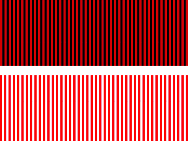
Red stripes, when alternated with black stripes, appear darker (top) whereas when alternated with white stripes, appear lighter (bottom). The eye mixes the value of red with the values of the black and white respectively, thus darkening/lightening it.
We experience this often in the garden – it is most commonly observed in flowers with more than one colour (especially those with detailed colour patterns), or leaves with small variegations. For example, a flower that has petals of one colour, sepals of another, stamens of yet another, intricate veins, and contrasting eye zones – unless viewed up close, our visual system will interpret the colours as more alike and begin to blend them.

The flower of Hemerocallis ‘Strawberry Candy’ presents numerous colours, the detail of which is mostly lost when seen from even a short distance away. The eye has mixed the various colours together and averaged their hue, value and saturation. Photos: Sue Gaviller
Another example – leaves that are striped green and white appear lighter because the eye mixes the medium value of the green with the high value of the white, thus producing the illusion of lighter green leaves.

The striped foliage of Miscanthus sinensis ‘Variegatus’ appears soft pastel green when viewed from a few feet away. When viewed up close, the colour detail becomes apparent. Photos: Sue Gaviller

Photo: Pat Gaviller
Variegated leaves consisting of larger blocks of colour, say a green Hosta with white or cream coloured margins, won’t exhibit this effect because the larger area of colour allows the eye to accurately discern the edges and differentiate the colours.
The image on the left illustrates this – the Hosta at the bottom of the photo shows no colour blending, Euonymus at the top exhibits some, and Lamiastrum in the centre shows considerable assimilation, such that the leaves appear very pale gray-green.
Colour Assimilation will be greater when plants are seen from a distance – as the eye fails to distinguish stripes, margins, veins, stamens, eyes, throats and other leaf or flower features, the colours will blend together, averaging the hue, value and saturation of each colour as the viewing distance lengthens. Recognizing how and when this happens can be helpful in editing our plant choices for maximum colour satisfaction.
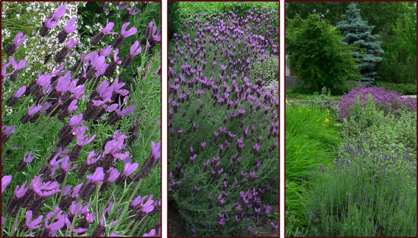
The inflorescence of Spanish Lavender (Lavandula stoechas) consists of light purple bracts atop darker purple flowers. Note how the dark coloured flowers begin to appear lighter and the light coloured bracts begin to appear darker when observed from farther away. Eventually, with further distance, they appear as all one medium value purple. Photos: Sue Gaviller
Colour Separation
I used to have a flirty red dress which I would pair with equally flirty red suede pumps – they weren’t actually the same colour, but because they were separated by a considerable length of leg (I have long legs and the dress was kinda short) it still worked; shoes and dress appeared to match.
We can make use of this phenomenon in the garden scenario too – let’s say we have several kinds of flirty red flowers but they aren’t all exactly the same colour; we need only to separate them with lots of foliage greens and our eyes will be tricked into thinking they are the same(ish) colour. Indeed it’s the oldest trick in the book.
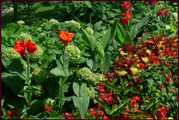
First impression of this composition is that the red Cannas, red Begonias and red Salvia are all the same hue of red, but closer inspection reveals they are not. The large Canna flowers are slightly orange-red, the Begonias at the bottom are coral-red and the Salvia on the right are true red.
Photo: Sue Gaviller
Of course flirty red dresses and flirty red flowers aren’t the only examples this useful little illusion addresses. It will be similarly helpful when working with any colours that are almost-but-not-quite the same.
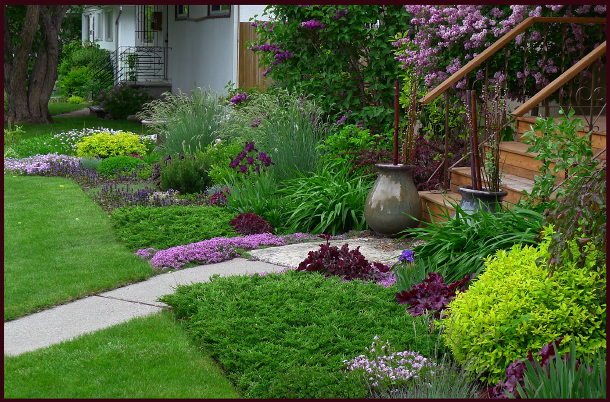
In my late spring garden, several Heuchera cultivars, Iris, Lilac and Barberry all present some variation of red-violet, but due to their separation the eye reads them as the same colour.
Photo: Sue Gaviller
Understanding these four Optical illusions (Simultaneous Contrast, Successive Contrast, Colour Assimilation and Colour Separation) can help us compensate for their effects in the garden – allowing them to work in our favour rather than against us.
Well my friends, this long series of posts on Colour Theory is finally drawing to a close; I have one more topic to cover, that being the use of colour schemes in the garden – join me for my next post as I utilize the colour wheel and Munsell’s hue pages to fashion pleasing colour combos for your garden. See you then!
Now where did I put that red dress…?
Merry Christmas Y’all, Sue

I have been wondering what you have been up to! It is so good to see beautiful pictures and read about gardening on this cold winter night and as always love learning about garden design. Thanks Sue. Have a wonderful Christmas and New Year
Hi Shirley,
Great to hear from you! Glad I could warm things up a little with some pretty pictures and pretty colours. Spring is so very far away now isn’t it?
Merry Christmas to you too,
Sue
Your late spring garden is visually stunning. What you said about professional horticulturists never having time for their own gardens? Truer words were never spoken. I have great plans! Now to find the time to execute them…
Hi Shannon,
Thanks for your lovely comment. I expect in your climate your ‘great plans’ are somewhat more adventuresome than what we might do here in zone 3 – 4. Good luck with it though – sometimes we just have to say to ourselves, “Today, I work in my garden, the other gardens can wait”. Easier said than done I know.
Thanks for reading,
Sue
[…] 9 part deep dive into plant colour theory:Part 1, Part 2, Part 3, Part 4, Part 5, Part 6, Part 7, Part 8 and Part […]