A week or so ago, while out for a walk with my sister in her inner-city neighbourhood, I heard the familiar sound of Robin chirps. It took me a minute to realize that the sound was out of place on this mid-February afternoon. Indeed my sister doubted me initially, but then she heard it too. “Holy $#!+.” she said. According to local bird experts a few robins do spend the winter here, but neither of us had ever seen one this early in the year.
Several blocks later I happened to look up and espied what appeared to be pussy willows. At first I thought it might be water droplets on the branches reflecting the late day sun – but then I reached up and felt the fat fuzzy protuberances. Yep, those are pussy willows. While there are many species of willow that produce the downy catkins, a few as early as February, Salix discolor, the true North American pussy willow doesn’t usually bloom here until mid March – this was February 12th! I didn’t know whether to be elated or alarmed. Either spring is coming really early or the birds and the trees are in for a cold, snowy, nasty surprise in the weeks to come – despite a mild winter from a moderate El Nino effect, this is still zone 3 Calgary and the early bird rarely gets the worm. Only time will tell I guess, but my vote is for an early spring. In the meantime fellow gardeners, we have more to learn about colour.
Over the last few months I’ve been discussing colour theory as it relates to garden design. We’ve looked at two of the three attributes of colour (Hue and Value) and today we’ll examine the third; Saturation, or what Munsell called Chroma.
Saturation is the strength or concentration of a colour and is determined by how much of a particular hue is present in that colour. Think high school science for a moment and consider the amount of solute in a solution – in the scientific sense, saturation occurs when a liquid has reached its capacity to absorb a dissolved substance. Brine for example, is a solution of water and salt – if we start with pure water, then add salt until the water can’t absorb any more, we have a saturated solution. Similarly with colour, if we start with gray then add a particular hue until maximum hue content (i.e the pure hue) is reached, then we have full colour saturation.
High Saturation
A highly saturated colour reflects a great deal of light from one specific part of the spectrum, and very little light from anywhere else on the spectrum; for example, the pure hue of red reflects most light from the end of the visible spectrum where red is located, and yellow reflects most light from near the middle of the spectrum.
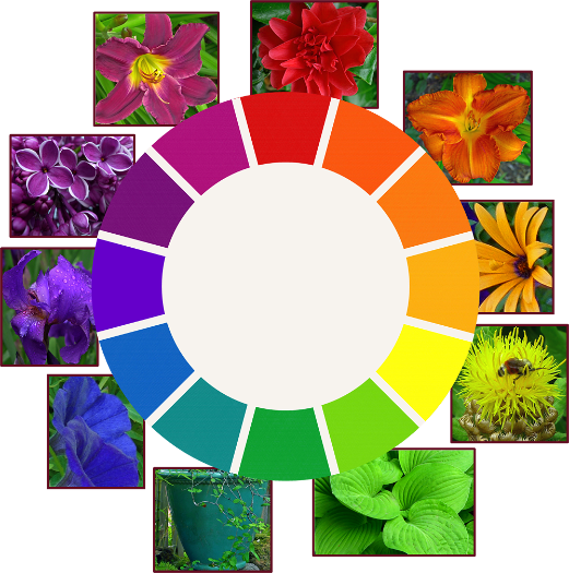
The pure hues (i.e. Munsell’s 10 basic hues around the outer edge of the Munsell Colour Space, or the 12 hues on the Artist’s Colour Wheel) are considered fully saturated. These are the vibrant colours some gardeners adore and others abhor; they are intense and flamboyant, and employed effectively are stunning additions to a garden composition. Used indiscriminately however, they’re sure to create garden chaos.
Full saturation. Photos and Graphics: Sue Gaviller
Saturated hues hold up well under full sun with very little colour washout, and like warm hues and high value colours, appear closer than they really are. They are thus highly conspicuous in the landscape, perfect for creating emphasis or accenting an area you want to draw attention to; an approach or a destination.
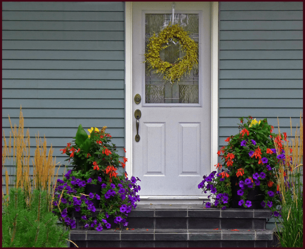
Planting bright saturated colours in entryway container arrangements as this gardener has done, effectively draws the eye to the front entrance, creating a welcoming focal point. Photo: Sue Gaviller
Public gardens and parks often use abundant saturated colours in their annual display gardens – while this style of planting design isn’t one I’m likely to adopt, the plethora of intense colour certainly does what it’s intended to do; attract attention.

Massed annuals in strong spicy hues draw the eye directly to the Tea House, advertising its presence and inviting visitors in. Note how the saturated reds and yellows hold their colour without fading in the bright sunlight. Photo: Sue Gaviller
Fullest saturation is experienced when hues are used individually rather than together – if two highly saturated colours are in close proximity to each other, the effect will be to decrease the intensity of both. This isn’t to say you should never use more than one saturated colour in a composition – you certainly can – but any given colour will be seen at its purist if there aren’t other equally intense, and therefore competing, colours close by (remember the design principle Unity by Dominance). The exception to this is complementary hues, which will both be intensified by their nearness to one another.
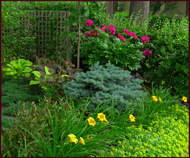
Lime green Hosta, violet-red Paeonia, golden Hemerocallis and yellow Sedum all present very saturated colour – while it’s an attractive composition, the strong colours do compete somewhat meaning none of them can take centre stage. Photo: Pat Gaviller

The same photo, now cropped to isolate the peony from the other intense colours, illustrates how a saturated colour on its own has stronger colour presentation than numerous competing colours together. Photo: Pat Gaviller
The eye perceives large areas of colour as more saturated than smaller areas; hence fine textured plants (small leaves and/or flowers) don’t appear as saturated as those with coarse texture (large leaves and/or flowers). This is particularly apparent when seen from a distance, so fullest possible saturation will only be experienced up close – distance tends to mute or desaturate colour. I learned this quite by accident in my own garden in my pre-designer years. I’d wanted a hefty shot of hot pink in a particular spot in the garden and chose Anthony Waterer spirea for its long-blooming bright fuchsia flowers. I thought I was happy with the choice, since it was just the right colour and bloomed continuously. However, I soon realized that unless I was right up at the edge of the garden, the fine-textured umbels of hot pink blooms looked dull an unimpressive, if seen at all. Needless to say I removed it – at some point I figured out that I needed a bigger, bolder flower to anchor the spot. I have since planted Purple Pavement rose, its large velvety, red-violet blooms showing strong colour even from far away.
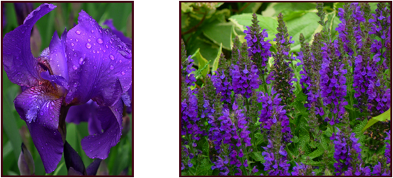
Viewed from very close, coarse-textured Iris and fine-textured Salvia both present saturated Blue-Violet colouring. Photos: Sue Gaviller

Viewed from a few feet away, the big bold Iris blooms maintain almost-full colour content and still appear richly-hued, whereas the finer-textured Salvia flowers appear somewhat desaturated. Photos: Sue Gaviller
Low Saturation
Colours become less and less saturated the closer they are to the central neutral axis of Munsell’s Colour Space. The neutrals have no hue content whatsoever – they are the achromatic colours of white, black and numerous shades of gray in between. Colours that have some hue content but are relatively low in saturation, have a dull or muted appearance compared to their more highly saturated counterparts; hence they attract much less attention. We see this in some foliage, especially evergreen foliage, ornamental grasses, fading flowers and seed heads.

Low or weak saturation. Photos and graphics: Sue Gaviller
These muted colours are a nice foil or contrast to brighter flowers and foliage, affording the appearance of fuller saturation to neighbouring plants, even those that may be less than fully saturated.

Spent flowers of purple smoke bush appear like billowy wisps of copper-rose smoke. The colour is actually a red of only medium saturation, but looks more intensely coloured next to the much less saturated inflorescence of the ornamental grasses. Photo: Sue Gaviller
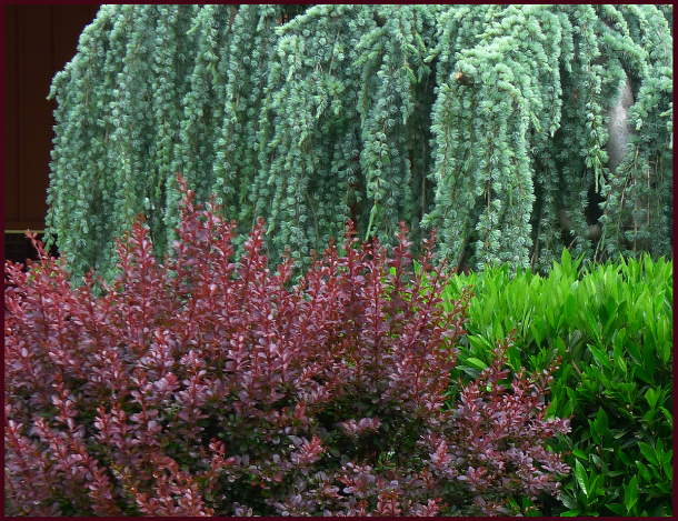
The muted blue-green of weeping blue cedar provides a soft backdrop allowing rich crimson barberry to really stand out. Photo: Sue Gaviller
Colours that have low or weak saturation appear to recede from the viewer thus seem farther away than they actually are. As mentioned earlier in this post, distance desaturates colour, as does bright sun and fine texture – any of these scenarios will lead to further desaturation of already dullish colours.

 Left: Fine-textured Festuca glauca (foreground) appears almost colourless under the glare of mid day sun. Right: the same blue fescue grasses, now in shade, display much higher colour content. Photos: Pat Gaviller
Unlike highly saturated colours, less saturated colours allow for the use of many hues within the same composition – without the garish results.

Muted hues of red, orange, yellow, green, and red-violet are present in this composition but due to their low colour content, don’t overwhelm. Note that the one very saturated colour, the yellow-green cypress in the centre of the photo, is more prominent than any other colour. Photo: Sue Gaviller
Saturation Contrast
Contrasting saturation levels of a single hue creates subtle unity as the eye recognizes the underlying hue and connects the elements.

Terra cotta is a weakly saturated (and higher value) red-orange and provides elegant contrast to the highly saturated red-orange of the begonia. Photo: Sue Gaviller
You may recall from my last post that the pure hues don’t have equal native values – neither do they have equal hue content or saturation. The pure hue of Red for example has the highest degree of saturation, twice that of the lowest, which is Blue-Green. This means there are twice as many steps from neutral to pure red, than there are from neutral to pure Blue-Green.

An image from Munsell’s Atlas of Color showing the scale of Chromas (Saturation) for Red and Blue-Green. Note that from the central neutral (gray) axis, there are 10 steps outward to fully saturated Red, and only 5 steps to fully saturated Blue-Green
When combining these colours, in order to achieve a balanced composition, you’ll need at least twice as much Blue-Green as Red. Alternatively you could use a Red that is less saturated so it approximates the saturation of the Blue-Green.

One way to balance Red and Blue-Green is to use a less saturated Red that is closer to the more weakly saturated Blue-Green. Photo and graphics: Sue Gaviller
Of course gardeners can’t be expected to know or remember the precise chroma or saturation of any given hue – but with a little colour knowledge we can be confident that if a colour seems very strong or intense, it probably is, and we can use it accordingly (i.e. sparingly). Likewise if a colour appears to be more subtle or muted, we can be pretty sure that it is less saturated and we can use a little more of it to balance out the more saturated colours.
Maintaining colour balance in the garden is another reason for using plenty of – you guessed it: green. And I don’t mean yellow-green, blue-green, gray-green or variegated green; I mean the basic hue of green – think lilac foliage or kinnickinnick, daylily, Russian cypress, peony or pine. These foliage greens have medium value and medium saturation – which means they can balance and bring together the stronger and weaker colours. Are you starting to get the picture now?
The basic hue of green has medium value and medium saturation. Clockwise from top: common lilac, kinnickinnick, daylily, Russian cypress, Itoh peony and dwarf mugo pine. Photos: Sue Gaviller
During the long months of winter, weak desaturated colours abound (dead grass, naked bark, dull evergreen foliage, mud, gravel, etc.), especially evident in mild winters when there is no snow to brighten the landscape – we long for the full, rich colours of spring and summer. My friends I think it’s not far off – I’m anticipating a very early spring.
However, despite the robins and willows fuelling my hopes, a good friend and client has cautioned me, “Don’t you dare, dare to hope for such an early spring – February is WAYYYYY too early!” she jokingly admonished.
Hey girl, don’t rain on my parade.
’Til next time, Sue
Another great post, Sue. It is no wonder our brains hurt at the end of the day!
Hi Janna,
As designers we certainly need to take in and retain a lot of information and our brains do get full. Maybe that’s why we blog – to let some of it out.
Thanks for reading,
Sue
Very informative, Sue. I’ve just started following your blog and I’m quite impressed. Your explanation of colour theory is easy to understand, especially with the inclusion of your beautiful photos as examples. Are they all taken around the Calgary area? (Is that a weeping blue atlas cedar?) With the days getting noticeably longer up here in Edmonton, it seems like spring is just around the corner. (Or is that wishful thinking?)
Hello Bright Orange – I’m guessing that’s your favourite colour right?
Pleased to hear you’re finding the blog helpful and informative. As for the photos – most, but not all, are taken around Calgary. The photo of the weeping blue atlas cedar was taken in Oregon, on the trip I wrote about last summer, same with the smokebush – California. Sorry – not fair I know, but I have readers worldwide so I like to include visuals that are pertinent to warmer climes as well.
As for spring, in our part of the world it’s anybody’s guess, but I think we deserve an early spring don’t you?
Sue
Outstanding post Sue on the elements of color in landscape design. As I fellow designer I understand the importance of combining hues to achieve maximum impact in the garden. I would love to share this post with my readers. Excellent information!
Hi Lee – thanks for your comment. Since winter is pretty drab around here (despite the promise of an early spring), colour seemed like the perfect theme to carry us through. Thanks for reading and sharing this with your readers.
Sue
Reblogged this on A Guide to Landscape Design & Maintenance-Long Island and commented:
Combining proper hues to achieve maximum impact in the garden is a very important element in landscape design. I am sharing this outstanding and very informative post from Sue Gaviller at Not Another Gardening Blog.
Impressive post – you share a lot of useful information. You really know a lot about colour balance.
Thanks for the share.
Hi Kevin – glad you enjoyed the post. Thanks for your kind comment and thanks for reading.
Sue