It’s the last week of March and it’s again been more than five months since I last posted to this blog. I just don’t know where the time goes. I’m as busy as I’ve ever been, and yet I feel like I’m accomplishing less. Perhaps it’s a function of age – everything seems to take longer the older I get. Or maybe it’s a function of the increasingly higher standards I set for myself. For example, last month I gave two lectures to the current class of Master Gardener students. One of these was a full day design presentation – a talk I’d given (in some form or another) dozens of times and to a variety of audiences. It gets tweaked each time – compressed or expanded depending on the audience, but this time I ended up rebuilding the whole damn thing! Why? Well, as I reviewed my PowerPoint slides I found myself scoffing at everything; the photos looked unprofessional, the font was dated, the animation amateurish… and so a ‘tweak’ became a major reconstruction.
I was relatively happy with the finished product, but I don’t know if it was worth the several all-nighters I pulled to get it done (staying up all night was way easier, and waaaay more fun, in my twenties than in my fifties). And in the end, did I actually impart any more, or any better information to the students? Who knows? I do know though, that perfectionism isn’t always in one’s best interest. Because now I am sick. Not deathly ill, but miserable enough that I don’t feel like doing much of anything. So loyal readers, it seems my misfortune is your good fortune since the one thing I do feel up to, is writing. In fact it just might make me feel better.
If you remember my last post (it was so long ago, I barely remember) we examined the relationship between colour and various aspects of human perception – more specifically, how the former can impact the latter. Continuing with this exploration then, let’s look at some of the ways our visual perception can in turn affect and distort colour.
Understanding various visual mechanisms – ways our vision adapts and adjusts – is a key piece of the garden colour puzzle. For the most part, our eyes successfully adapt to ever-changing visual data, allowing us to maintain a stable and consistent interpretation of the world around us. We know that an object appearing smaller from across a room is the same size regardless of where we view it from, or that the darker colour created by a shadow doesn’t change the actual colour of an object. We know these things without even thinking about them – unless we are trying to draw or paint said objects. Sometimes though, this ‘constancy apparatus’ fails and our eyes make erroneous adjustments. Four such adjustments are commonly experienced; Simultaneous Contrast, Successive Contrast, Colour Assimilation and Colour Separation. Today we’ll look at the first two of these visual phenomena.
Simultaneous Contrast
Adjacent colours interact with one another other in a most curious way – actually changing the appearance of each other; an effect known as Simultaneous Contrast. Of course this phenomenon isn’t due to any magical properties the colours possess; rather the adjustments are taking place within our own visual system as it attempts to decipher and differentiate that which it sees by accentuating colour differences. All three colour attributes can be influenced by neighbouring colours, the effect being most noticeable when one colour is completely surrounded by another.

Simultaneous Contrast of Hue. An identical magenta-coloured circle is placed all around the Artist’s Wheel illustrating how a hue can differ dramatically in appearance depending on the background hue. Graphics: Sue Gaviller
So what is actually happening here? Are our eyes just playing tricks on us? Well yes in fact they are. As I mentioned before, one of the ways our eyes recognize and discriminate between adjacent colours is by accentuating their differences, and in so doing, imbues each colour with traits of the other colour’s opposite. Yikes, that was a mouthful wasn’t it? Maybe I can better explain with some examples.
In the first example below, a magenta-coloured square is surrounded by a green square on the left and an orange square on the right – we can all agree it doesn’t look like the same magenta, right? (I assure you it is though). Our eyes acknowledge the green then ‘over-differentiate’ and induce green’s opposite hue, red, which then mixes with the magenta, making it appear warmer – hot pink even. The orange square on the other hand stimulates our eyes to add its opposite, blue, thus creating a cooler looking purple-pink. Another way to think of it is that colours will shift in hue, value and saturation away from those of the surrounding colour. Because the magenta square is smaller and completely enveloped in another colour it has little effect on those surrounding colours.

Simultaneous Contrast of Hue – note how the hue of the smaller square appears different depending on the background colour. Graphics: Sue Gaviller.
The next example shows Simultaneous Contrast as it relates to Value alone. On the left a medium gray square is enclosed on a background of darker charcoal gray, and on the right the same medium gray is surrounded by lighter gray. Again our vision discriminates between the darker gray and the medium gray by overstating the lightness of the medium gray (left). Likewise our eyes discriminate between the lighter gray and the medium gray by overstating the darkness of the medium gray (right).

Simultaneous Contrast of Value – a medium gray square looks markedly different surrounded by darker gray than by the lighter gray. Graphics: Sue Gaviller
In the third example the smaller square is a red of medium to low saturation, but its saturation seems to strengthen as its background colour weakens.

Simultaneous Contrast of Chroma/Saturation. All of the above squares are the same hue (5R or Red) but vary in saturation (colour content). The smaller square is weakly saturated but appears even less so in contrast to the fully saturated square on the left. However when contrasted with the almost-gray square on the right, it appears to have much richer colour content. Graphics: Sue Gaviller
It is difficult to illustrate this effect with garden photographs – photos can deceive, particularly where colour is concerned. Perceived hue differences (or lack thereof) could thus be the fault of the photo and not a real representation of what is happening in the garden. And the degree to which Simultaneous Contrast is seen in the garden is less than one might think – there are many other factors at play, for example; weather changes, seasonal changes, daily sun movements, and even the amount of particulate matter in the air, can all affect lighting conditions, which in turn affect the colours we observe. Colour is reflected from other objects and surfaces too, thus altering hue perception, and the constant presence of unifying green can mitigate various colour illusions.
Nevertheless we do witness Simultaneous Contrast in our gardens and landscapes, though it is more subtle than squares of colour on a computer monitor. The effect, especially where hue is concerned, is most noticeable when two adjacent hues present as solid blocks of uninterrupted colour. Of course plants don’t always present this way since foliage, flower petals, stamens etc. are often different colours, which means colours will intermingle (this can produce yet another effect, one I will look at in my next post). Tertiary or intermediate colours (red-violet, blue-green, etc.) will be influenced to a greater degree by their surroundings than basic or primary hues because their make-up is more complex.

Liatris spicata is a medium to high value red-violet – when contrasted with bright yellow Heliopsis helianthoides, it appears slightly blue-ish. However, next to Helictotrichon sempervirens, it looks somewhat pinker. Photos: Sue Gaviller

Juniperus horizontalis ‘Blue Chip’ is a widely spreading evergreen groundcover – note how its blue-green hue shifts from slightly mauve-ish on the left to dull green on the right. Photo: Sue Gaviller

Echinops ritro ‘Veitch’s Blue’ (left) looks a rich saturated purple-blue when paired with very desaturated Eryngium (right). Photos: Sue Gaviller

The same Echinops would appear somewhat less saturated if situated beside the very rich-hued Gentian on the right Photos: Sue Gaviller
Simultaneous Contrast is the reason two complementary colours, when used together, create such a forceful pairing – they increase the intensity of each other. Think about it; each colour bestows upon the other, the traits of its own opposite – which is the other colour. A double dose of each!

This complementary pairing of red-violet Iris germanica against a backdrop of yellow-green Spiraea japonica ‘Goldmound’ creates an intense vignette. Photo: Sue Gaviller
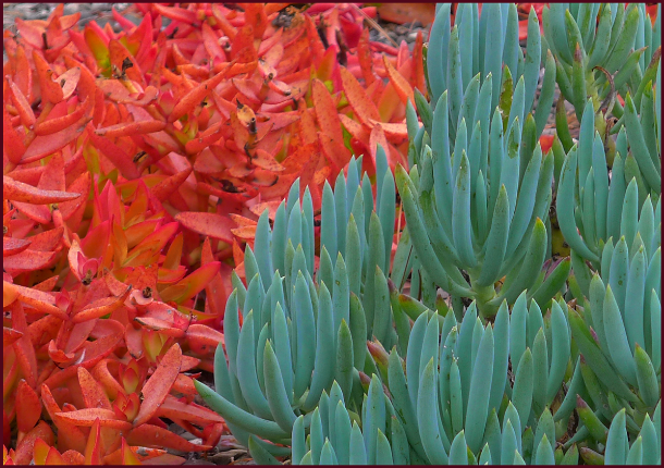
Red-orange and blue-green succulents bounce dazzling colour off each other because they are a complementary pairing. Photo: Sue Gaviller
Successive Contrast
Another visual effect related to Simultaneous Contrast is Successive Contrast – the best way to demonstrate this effect is to try the following: stare at the coloured circle below for 30 to 60 seconds, then immediately turn your gaze to a blank piece of white paper. What do you see? If you don’t see anything, try again. And if you have any serious eye condition or disease, you might want to avoid this exercise altogether.

When you look at the white paper after staring at the green circle, you should see a circle of the same size in a light reddish pink colour – this is called an afterimage. Let’s try another one. Stare at the orange circle below for half-a-minute or so then look at the white piece of paper again.

So what colour did y’all see this time? Light bluish right? We see this afterimage because the eye’s receptors for a particular color become desensitized to it, or more accurately, the receptors for the other colours become more sensitive – hence we see the perceptual complement of the colour we’ve just been staring at. The afterimage will dissipate shortly, its duration proportionate to the length of time you viewed the original colour and the intensity (saturation) of that colour.
Now try looking at each of the circles again, but this time when you avert your gaze, instead of focusing on the white paper, look towards a different coloured background. What do you notice? The colour of the afterimage should now blend with the new colour you are looking at. You can see where this might come into play in the garden – look at the following garden image for at least 30 seconds then at the white paper again. Do you experience the same effect?
Photo: Sue Gaviller
How about this one?
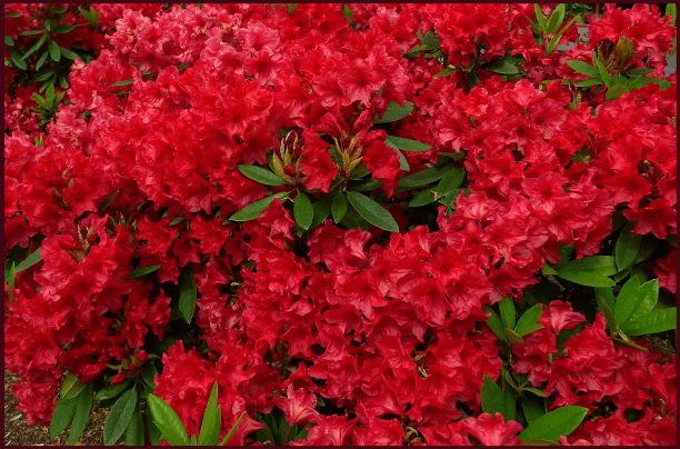
Photo: Sue Gaviller
The two previous images should produce afterimages the same size and shape as the photo images, in colours opposite to the predominant colour in the photos. Now see what happens when you look at one of them for a bit, then the other right after – how do they affect each other. What about the next image – how does staring at each of the previous two photos affect the way you see the colour of the Rudbeckia in the following photo?
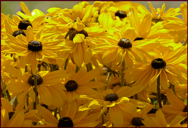
Photo: Pat Gaviller
The effect here will likely be muted – in fact you may have to do this exercise a few times before you recognize it. And because the effect is fleeting, its implications in the garden environs are limited. Large swaths of colour are more likely to produce afterimage effect because you will look at them for longer – all in all the experience of afterimages distorting the visual experience of successive plant colours, will at most be intermittent.
However, learning to recognize this phenomenon, as well as Simultaneous Contrast, affords the gardener one more advantage in working with colour in the garden. We’ll look at two more interesting colour effects in my next post.
Well whaddya know? I feel much better. Now if only pretty plants and pretty colours could heal our hurting world….
’Til next time, Sue

I sure enjoy your posts.
I’m really interested in garden design. Your in depth writings on it have helped me to see and design my large garden in a more educated way.
Mike
Hi Mike,
Pleased to hear my posts are helpful to you – of course it’s never as easy to work within an established garden framework as it is to start from scratch. I have found this to be a frustrating reality in my own garden – if only I had known what I know now when I first began. In sharing my thoughts on design with readers my hope is to help others avoid some of my early, costly mistakes. Large gardens such as yours are challenging – it can be hard to get one’s head around them. But they are also more forgiving of the inevitable design errors we all make – the corrections are therefore that much more satisfying.
Thanks for reading,
Sue
How fascinating. Your posts are impressive. I’ve spent a lot of time this winter thinking about the impact of desaturated colours when studying my garden of bleached grasses beside perennial seadheads. Now I’m armed with good food for thought for high summer colour …. Thank you!
Hi Kate,
Thanks for your comment. The desaturated colour provided by ornamental grasses, as you know, is an important ingredient in the naturalistic planting design you employ at Barn House – it is a beautiful (and necessary) foil for the swaths of rich saturated colour offered by more colourful perennials. You’ve done a really beautiful job with this on your heritage property – a sentiment shared no doubt by the many visitors to your gardens and the renowned garden photographers who’ve used it as subject matter.
It’s a very early spring here – hope yours is too………
Sue
Hi Sue! Fascinating post, btw, but since we have a few inches of snow on the ground, my gardening eyes will have to wait.
Love to all!
p.s. Could you please explain why none of you are on faceBook??
Hey Barsh,
Glad you found the post interesting. Sorry to hear you still have snow – we are having an unbelievably early spring this year; hard to get excited about it though since plants are trying to grow and there’s been no appreciable precipitation.
As for Facebook – when my boys were teenagers they implored us not to be on Facebook; that would be like, so embarrassing for them. Social media isn’t really my thing anyway – I have a hard enough time keeping up with posting to this blog. Maybe one day I’ll get with the times – for now though, I’ll just keep kickin’ it old school.
Great to hear from you!
Sue
Hi Sue!
Thanks for sharing! Lots of good tips in here which I will definitely have to put to use this summer! I’m a huge petunia fan (keeping it basic) and there’s so many colour options to choose from! May long weekend needs to hurry up and get here!
Hi Melanie – thanks for your comment. I rarely wait til May long weekend to start gardening – many perennials and shrubs can be planted much earlier, and they open up a whole new world of colour possibilities!
Happy gardening,
Sue