Greetings loyal readers. It seems I haven’t published a post in more than 5 months. I guess time flies when you’re having fun… or when you’re really busy. And a very busy summer it has been, both personally and professionally. Thanks to all who keep visiting here despite the lack of new content.
So to get back to where we were a loooong time ago, let’s continue with our study of colour in the garden. It’s time to take all that technical stuff about Hue, Value & Saturation and put it to work for you.
The interaction between colour and human perception is two-way – colour can influence perception, and perception can influence how we see colour. Today we’ll look at a couple of ways colour can affect perception and how this might be utilized in our gardens.
According to Encarta Dictionary, the psychological definition of perception is “any neurological process of acquiring and mentally interpreting information from the senses.” It is the interpreting of this information that makes colour a useful tool.
Temperature Perception
Looking out my window one morning last week, I saw blue-grey haze. Acrid smoke from distant forest fires filled the air, prompting air quality advisories and recommending folks stay inside. When I did venture outside briefly, I was surprised at how warm it was – the smoky, blue-grey light made it appear much cooler. Later that same day, as increasingly more smoke particles refracted what light could pierce the smoke, a reddish-orange light was cast over everything – I stepped outside again, this time anticipating oppressive heat, but it wasn’t as warm as I’d expected.
Both scenarios came about because my brain incorrectly interpreted the information my eyes had gathered – I expected coolness when the light wavelengths were in a cooler range, and warmth when longer wavelengths prevailed. Indeed we may actually feel cooler in the presence of cool colours, and warmer in the presence of warm colours. Those of you who live in colder climates have no doubt had the experience of looking out the window on a frigid winter day and feeling warmed to the core at the sight of a bright yellow sun.
This phenomenon can be exploited in the garden – perhaps you look out your window on a too-cool spring day and your whole being longs for the warmth of summer. Your eyes look toward your garden and espy drifts of orange tulips, yellow primrose and warm pink azalea – and you feel instantly warm. Or maybe you are sitting in your garden on a smoldering hot summer afternoon and note the swaths of soft mauve Russian sage, cool blue Delphinium and violet-blue globe thistle – how cool it feels.
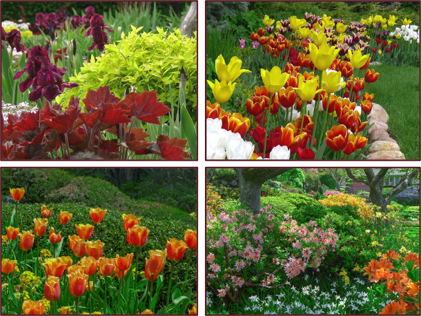
Warm hues make cool spring days feel balmy and bright.
Top – Photos: Pat Gaviller. Bottom – Photos: Sue Gaviller

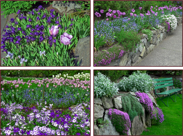
Summertime blues provide cool respite from the heat. Photos: Sue Gaviller
On the other hand, maybe you like the coolness of spring and choose to accentuate this with the use of cool springtime hues – bright blue forget-me-nots, lilac-pink rock cress, mauve tulips and rich purple dwarf iris. And for those who like it hot, summer’s heat can be turned up a notch by using plants that bloom warm colours in midsummer – bright golden Rudbeckia, mahogany-red Helenium, warm pink Echinacea, and a sprinkling of hot lime-green foliage. Remember though, that abundant warm colours in the garden still require lots of green – enough to balance and counteract the bright reds, oranges and yellows.
Cool spring colours highlight cool spring weather. Photos: Sue Gaviller
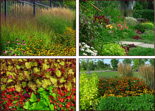
The heat is on – warm colours sizzle in the summer heat. Photos: Sue Gaviller
Depth/Distance Perception
Visual design often involves a bit of trickery – ways of deceiving the eye to see something that isn’t altogether accurate. For example, in the urban setting many of us reside, yards are often small and disproportionately shaped. The designer’s challenge is to create a sense of spaciousness and pleasing proportion. Understanding the nuances of colour and using it effectively is one way we can achieve this.
If you recall from earlier posts in this series, warm colours appear closer than they really are, as do high value colours and those that are highly saturated. Likewise, cool colours, as well as those of low value and/or low saturation, appear further away. This optical illusion can be used to elongate a short flat space or shorten a long narrow space.
Since all three colour attributes come into play here, it isn’t always possible to predict how the eye will perceive a particular colour. For example, cool colours tend to recede and high value colours appear to advance – so a pastel mauve might do either depending on the colours that surround it. In the image below – one of many Joseph Alber’s paintings paying homage to ‘the square’ – the black central area at first appears to recede. The mauve area however, appears to alternately approach and retreat, thus bringing the black square forward then back.
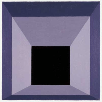
Joseph Albers square.
For any given colour to provide the desired depth illusion, you must consider its context, i.e. its relationship to other nearby colours. A warm hue will appear closer to the viewer when contrasted with a cool hue of equal or lower value and saturation, but further away when contrasted with another warm hue of greater saturation and/or higher value. And although cool colours usually appear to recede, a cool colour that is high value will advance if contrasted with a low value colour of the same hue and equal or less saturation.
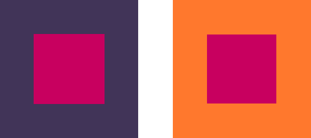
The central hot pink square appears to advance toward us when set against the cooler, darker and less saturated purple square, whereas it recedes when contrasted with the warmer, lighter and more saturated orange. It also appears to be a different colour – a phenomenon I’ll discuss in my next post. Graphics: Sue Gaviller

Lilium ‘Loretto’ and Berberis thunbergii both present very warm colouring. However, the lower value and weaker saturation of the barberry make it appear to recede, in contrast to the higher value and richer saturation of the lily, which appears to ‘pop right out’ at the camera. Photo: Sue Gaviller
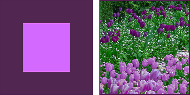
While cool colours often appear to recede from the observer, this cool mauve does the opposite when seen against a darker, less saturated version of the same hue. Note how the high-value, cool coloured tulips in the foreground jump out at us visually and the dark ones retreat further into the background. Photo and graphics: Sue Gaviller
So how do we use all of this to our benefit in the garden? If the colour of an object causes it to appear further away, placing this colour at the far end of a short flat space might serve to visually elongate the space – additionally, by contrasting this with the use of advancing colours on the side borders, the disproportionate width may appear compressed. Likewise, a long narrow space can be shortened and widened by placing advancing colours at the far end and receding colours on the lateral boundaries. The effect is subtle – colour is by no means the primary cue whereby we perceive depth – but when combined with other forms of ‘forced perspective’, a strong impression of distance or closeness can be implied.

In this well done rectilinear landscape, the designer has created a space that is longer in one direction than the other. Photo: Pat Gaviller

A photoshopped version of the same photo – note the wall of warm, high value, fully saturated orange daylilies appears to advance, thus shortening the space. The junipers, now slightly darker, appear to recede thus widening the space somewhat. Photo: Pat Gaviller. Retouch: Sue Gaviller

Viewing the two images side by side, the effect is more obvious, albeit still subtle.
Do You See What I See?
The perception that some colours advance and others recede, isn’t an experience shared by everyone, particularly the warm vs. cool dichotomy – indeed there are those who don’t experience this phenomenon at all, as well as those who actually see the reverse of what most people see. It can also vary within the same individual, dependent on numerous factors; for example, the effect is much less apparent if the two contrasting colours (warm and cool) are viewed against a very light background. Age too, can dictate how colour affects our perception.
It’s all about the physics of vision. Yawn. Physics – I had the dullest, most boring, uninspiring, high school physics teacher ever. Last period of the day. Double yawn. But I digress. To put it in simplest terms, it has to do with light rays of differing wavelengths and where they refract and converge on our retinas.
Regardless, one thing is certain; colour – with its countless combinations of warm or cool, light or dark, and muted or vibrant – affects us all in subtle ways we aren’t even aware of. In my next post I’ll look at how our perception, in turn, affects the way we see colour.
’Til then, Sue