Colour – the Absence of White

My back yard was still covered in snow as of yesterday – or to be more accurate, my back yard was covered in snow again as of yesterday. Spring had teased us with some warm-ish weather for a week or so;  enough that the snow had melted, leaving in its wake swaths of pallid yellow-brown turf and dull grey-brown soil – colour so de-saturated it could hardly be called colour at all. But at least it wasn’t white. Then a weekend of snow and below-freezing temperatures, and the ground was again blanketed in white – I might have called it pretty had we not already had 6 months of it.

Today the spring weather has returned and the snow has all but receded, this time exposing green. Green – the colour of awakening life. It warms us to the core – indeed it’s all the colour we need right now. It signals the beginning of another long-awaited gardening season.

But as the season progresses, gardeners are no longer as enamoured of plain old green; we want bigger colour, brighter colour, and zealously apply it to our gardens without understanding its impact – for good or for bad. What is there to understand you ask? Why is colour any different for gardeners than anybody else? Well, it’s not really – it’s just that we face some unique challenges when employing it.

Working with colour is different for a gardener than for example, a painter.  A painter works with paints and pigments, mixing them in various proportions until the desired colour is attained. A gardener on the other hand, has only what Mother Nature (or the hybridizer) offers. While there are plenty of colours to choose from, it can be a challenge to find a plant in the exact colour we want, have it grow and thrive in the exact location we want and have it bloom at the exact time we want.  And even a novice gardener quickly learns that a flower described as ‘blue’ is rarely blue, but more purple-blue or mauve-pink, and supposedly purple foliage isn’t really purple but rather a dark wine colour.

As well, we can’t control the existing colours in the larger landscape; the colour of our neighbour’s house for example. What if it’s red, or bright blue or yellow? How does one work with that as a backdrop for your garden?

And what about the impact of light? Outside under full sun, light shines at an intensity of 100,000 lux. Inside, directly in front of a sunny window, light intensity is about half that – 50,000 lux, and once you are a few feet further into the interior of a building, light intensity diminishes to as little as 1000 lux. Due to the sheer intensity of it, light has a greater potential to impact colour outdoors than it does indoors.

A garden isn’t a static reality either; it is a dynamic interplay of living, growing things – a vision in flux. So a garden that looks fresh and full of promise in the spring might be an overgrown mess come midsummer. Individual plants also change over the course of a season, or even a day or two – for example the lilac flower shown below is made up of many little florets, each with their own life span; the buds and newly opened florets are rich violet-red, whereas older florets are somewhat faded and will eventually turn brown. As more florets age and fade, the colour of the whole panicle is affected and eventually the appearance of the whole shrub.

Syringa 'Ludwig Spaeth'

So, now that we recognize some of the unique challenges gardeners face when working with colour, let’s see if we can’t find a way of understanding it so we can respond to those challenges.

Over the spring and summer months I’ll be discussing colour theory specifically as it relates to garden design – hope you can join me.

Until next time,
Sue

How Design Savvy Are You? The Answers.

Good morning class. This morning we’ll be taking up last month’s quiz (if you haven’t completed the quiz yet, stop reading, go do it and come back later).

So how did y’all do? Not as good as you thought you would, or should? Wondering where you went wrong? Well let’s have a look…

QUESTION 1. The procedural steps for effectively designing a residential landscape are:

a) First determine what kind of outdoor spaces you require (e.g. patio, planting beds, pathways etc.). Then choose the best place to locate each of them. Next, give form and shape to these spaces. Finally add plant material where applicable.

If you’ve been to one of my design lectures or read the design series on this blog, or even January’s review, you should have it well implanted in your brain by now, that landscaping is primarily about manipulating space, not arranging plants – indeed the definition my own design instructor/mentor drilled into my head was this: “Landscaping means making the best use of the available space in the most practical and pleasing way.”  Designing the plantings comes much later – it is the final part of the process.

QUESTION 2. The Designer’s mantra is:

d) Form follows function.

“Form follows function” of course means that the functionality of a space must come first, before its form is considered, but it also means that the shape or form of a landscape space is often dictated, at least to some degree, by its function. I had an ‘aha’ experience regarding this many years ago when trying to redesign my front walkway – our front yard is quite wide and the walkway starts well over to one side then curves up to the front door. My biggest objection is that the walkway bifurcates the yard in lop-sided fashion – it’s too far to one side, which creates imbalance. I knew that moving it a little towards the centre, to the 2/3’s mark, would create more pleasing proportions, but I was having trouble giving the walkway pleasing form. Also constraining my design options was a big ‘ol island bed that spanned a good part of the larger side of the yard.

One morning while there was still snow on the ground I noticed a set of human footprints going up the front walkway, up the steps, back down, then angling across the lawn on the other side of the walk, and right through the aforementioned island bed. That’s rude, I thought. It’s one thing to traverse someone’s lawn, but who walks right through what is clearly a garden?  Maybe it was the newspaper delivery person? The mailperson? Or maybe someone delivering flyers? Fortunately a few days later I was able to catch the culprit during commission of the crime. It was our letter carrier and as she tromped through the garden, I stuck my head out the door and made my request as nicely as possible (considering I was annoyed I had to say anything at all). “Can I ask you to please not walk through there,” I requested. She looked at me puzzled. “Well where would you like me to walk?” she replied, slightly put-off. “Uh, on the sidewalk?” I responded incredulously.  For a few days after that I didn’t see any more footprints through there, but it wasn’t long before I noticed them again.  Grrrrrr.

Of course using the sidewalk when approaching the house was the most obvious route, but given the width of the lot and the positioning of the sidewalk, it was indeed quicker to walk back down across the lawn when going the other way – so I understood the temptation to choose this route.  I knew however, that once a path was worn everybody would use it – I really didn’t want that much foot traffic on the lawn, and none at all through the bed. I also knew I didn’t want to be that crazy lady who hollered at everyone who stepped on her lawn, or worse, put up a tacky ‘Keep off the Grass’ sign. This required a design solution. Hmmm. Maybe I could plant a line of thorny shrubs along the walkway to keep people on it. No, that would look goofy. How about putting a fence around the front yard so the only way on or off it was via the sidewalk? No, I didn’t want to fence in the front yard. So I thought to myself, if that’s the direction people want to walk, don’t fight it – work with it.  Aha – I had the answer to my design conundrum! I could make the walkway more functional by making it two-directional. Of course I’d also have to get rid of the island bed, which I was happy to do since it disrupted landscape unity. Before I knew it, I had completely redesigned my front yard (well on paper at least – the planting beds have all been redone, but budget constraints have prevented us from re-doing the walkway). So you see, what started with addressing a functional issue became a wholesale re-forming of my front yard landscape – indeed form follows function.

Improving the function of the sidewalk, also improved its form and afforded me the opportunity to redesign the whole front yard.

Improving the function of the sidewalk, also improved its form and afforded me the opportunity to redesign the whole front yard.

QUESTION 3. When experimenting with design lines, remember to:

c) Ensure all design lines intersect at an angle of 90 degrees or more.

Option a) is incorrect because complexity is the antithesis of good garden design – simplicity is the goal and is best attained using long purposeful design lines rather than short tentative lines. Option b) is incorrect because the aim is to maintain continuity of design theme rather than vary it. This doesn’t mean that a curvilinear design can’t benefit from the odd straight line, or a rectilinear design can’t include a single arc or circle for dominance, it just means don’t deviate from your chosen design theme more than once or twice – again, the key is simplicity. Option c) is correct; if design lines intersect at less than 90 degrees, acute angles are formed – and y’all know how much I dislike acute angles. Functionally these spaces are unusable and difficult to maintain (try fitting a lawn mower into one of those little pointy spaces).  Visually they are awkward. They’re the first feature I notice in a design – do we really want an awkward unusable space to be what first draws the eye? No of course not. And yet, they are blatantly applied by many who should know better – even when entirely avoidable. Alright, alright, I’m done my little tirade – I know acute angles can’t always be avoided, but at least try okay?

acute angles edit

Left: Acute angles are formed when design lines meet at less than 90 degrees. Right: Acute angles are avoided because design lines intersect at 90 degree angles. This results in spaces that are more functional and usable, as well as more attractive.

QUESTION 4. Unity through interconnection can be achieved by:

d) All of the above.

underplanting

Arctostaphylos uva-ursi underplants an entire bed in this client’s garden. Photo: Sue Gaviller

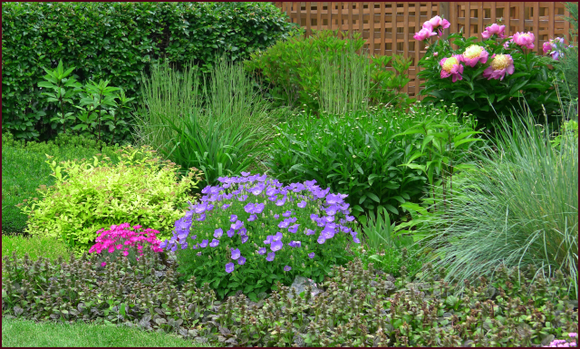
Making sure all landscape spaces are connected generates continuity and good flow from one space to another, which in turn creates unity.

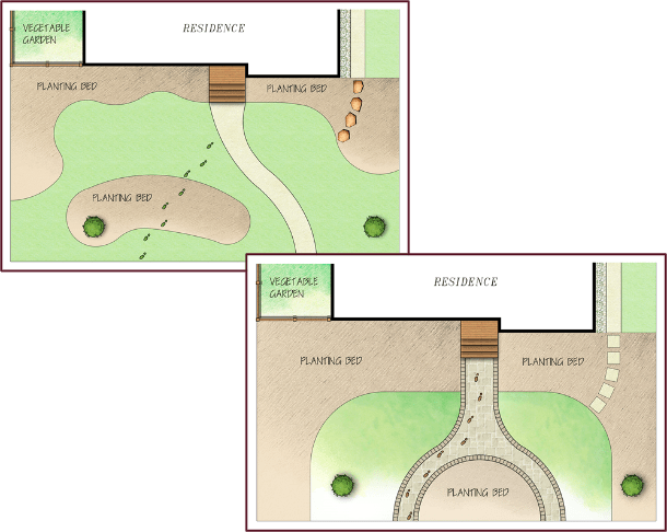
Sorry fellow gardeners – an interconnected, unified landscape necessarily means no island beds. Capiche?

As well, underplanting an entire area with a single type of groundcover connects the plants within a planting composition, hence further unifying it.

QUESTION 5. When grouping plant material it is important to:

d) None of the above.

The most obvious answer here seems to be ‘Always use odd numbers’, but the word ‘always’ makes the statement incorrect. There are times when arranging plants in odd-numbered groupings isn’t necessary, for example when plants are massed in groups of more than 7 or 8, the eye can no longer differentiate between even and odd numbers so it ceases to be of any significance.

This corner planting of daylilies is large enough that the eye cannot discern whether it consists of odd or even numbers. Photo: Sue Gaviller

This corner planting of daylilies is large enough that the eye cannot discern whether it consists of odd or even numbers. Photo: Sue Gaviller

QUESTION 6. In order for a landscape element to be dominant, it must be larger.

b) False

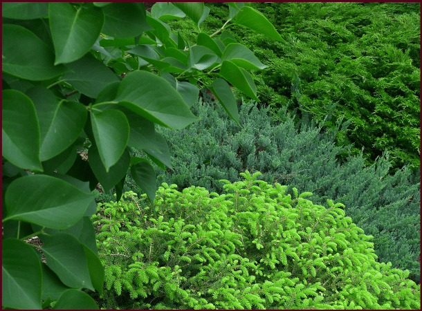
An element can be dominant because it is larger, but it can also express dominance in its unique form, its coarse texture and/or its bright colour – the key is it must differ significantly from surrounding elements. A hard (non-living) feature will also stand out as a focal point.

QUESTION 7. Symmetrical designs are more balanced than asymmetrical designs.

b) False

Symmetry is by definition balanced, but not necessarily more balanced. An asymmetrical design can be just as balanced if the weight is perceived to be equally distributed; for example, a tree planted on one side of the landscape can be balanced by two or three large shrubs on the other side – the visual weight of the smaller elements together approximates that of the larger element. Think of it this way: little Johnny and his grandpa are at the park trying to play on the teeter-totter, but to no avail – invariably Grandpa ends up sitting on the ground while Johnny is perched up high on the other end wailing “Let me down.” Along comes Johnny’s big brother Jimmy and hops up on the seat with his brother. Their combined weight is close enough to Grandpa’s that the teeter-totter can now move up and down in its intended fashion – balance.

QUESTION 8.  Reducing the number of different plants in your garden composition will create unity.

a) True

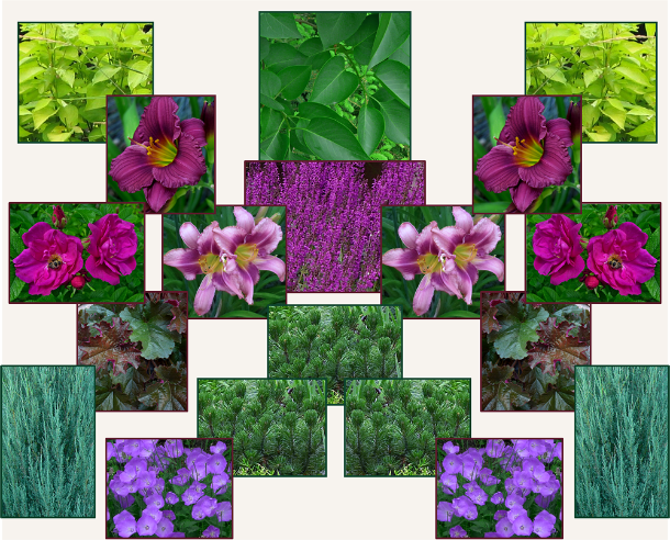
Reducing or limiting the number of different plants in your garden will allow for repetition, thereby creating unity (this of course means you can’t have one of everything). Many years ago, in one small area of my garden, I had all this going on……………..

variety-resample

Photos: Sue Gaviller

It was indeed one of everything and it was visual chaos, so… bit by bit I simplified. I removed this and that until I had reduced enough that I was able to repeat some plant material. The result was a much more unified composition….

Simplicity-resample

Photos: Sue Gaviller

QUESTION 9.   Planting a weeping standard on either side of an entrance creates a nice frame, inviting the viewer through.

b) False

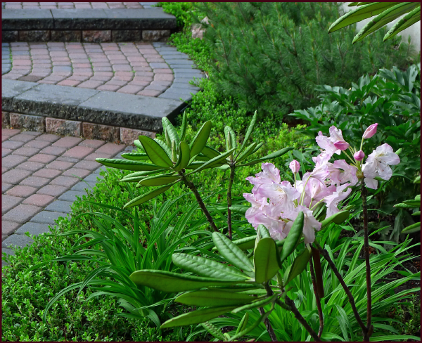
No, no, no, weeping standards don’t make good frames – these are unique features that invite the eye to move upwards along the standard then down along the weeping branches. Placed on either side of a view or entrance the two unique forms will cause the eye to move up and down, and back and forth between them rather than viewing through them. So what does make a good frame? Plants with strong upright growth habit make the best frames – columnar forms, pyramids or vases (especially narrow ones) and even some grafted standards (those whose ‘standards’ are taller in relation to the grafted portion).

Photo: Sue Gaviller

Weeping Caragana has lovely bronze bark that looks very attractive against the dark brown house, but they don’t work well to frame the entrance. Photo: Sue Gaviller

Photo: Sue Gaviller

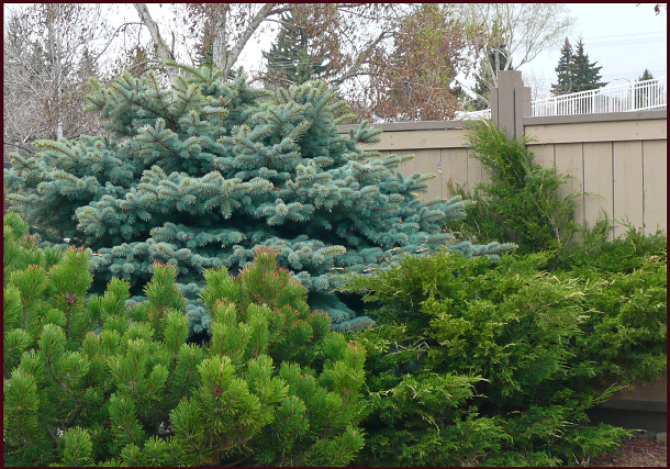
Upright forms like juniper or cedar create a more effective frame. Photo: Sue Gaviller

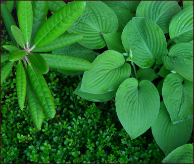
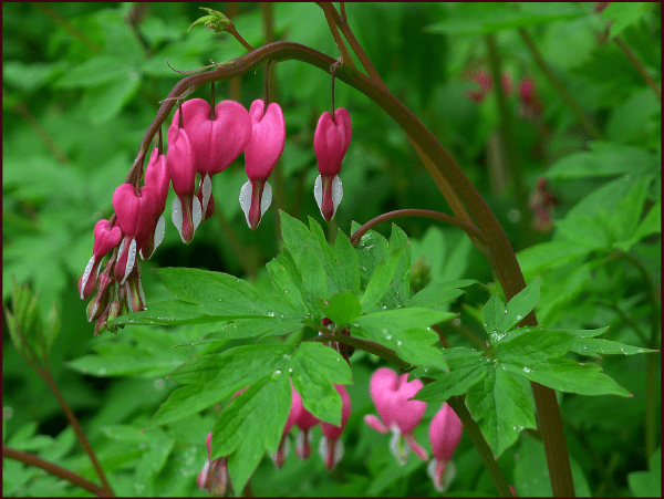
QUESTION 10.   Coarse textured plants and fine textured plants should be present in equal numbers to balance a garden composition.

b) False

fine, medium and coarse texture

Photo: Sue Gaviller

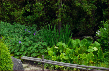
Coarse texture is dominant to fine texture, which means less of it is required to achieve balance. Generally speaking, fine texture should outweigh coarse texture by at least 3 to 1 – this is a loose guideline depending on how large or small a plant’s leaves are relative to surrounding plants. A good rule of thumb is: the larger a plant’s component parts the fewer are needed to balance finer texture.

For example, in the photo to the right, rhododendron leaves appear coarse when seen next to the diminutive leaves of kinnickinnick, but much less so compared to the larger leaves of the hosta. Therefore I have planted only one hosta, three rhododendrons and a whole mass of kinnickinnick.

QUESTION  11.   What is the song I allude to in The Form of Things to Come – Part 2

While writing about the bottom heavy presentation of pyramidal forms I found myself singing a Queen song – now can you guess? That’s right,  ‘Fat Bottom Girls’ (check out this youtube video of some ‘Disney babes’ strut to Freddie’s vocals – too funny).

Well that’s all for today boys and girls – class dismissed!

Til next time,
Sue

How Design Savvy Are You?


Good morning class. Today I have surprise for you – a quiz! That’s right, a quiz.

No wait, don’t go – it’ll be fun! Don’t you want to test your design savvy? No one but you will ever know if you had to cheat by going back through previous posts, or checking out last month’s review (that should’ve been a clue that a quiz was coming). And no one but you will ever know how well you did or didn’t do, or how many times you had to rewrite to say you got a perfect score. So be a sport, take this little quiz. You know you wanna.

Say it Again Sue

Happy New Year fellow gardeners! It’s a week or two into 2014 and I’d like to bid a fond farewell to 2013. Let me rephrase that. I’m so glad to see the arse-end of the year 2013!

It wasn’t my finest year.

Like many of you, I made some New Year’s Resolutions. Most are pretty straightforward; return to healthier eating, lose some weight, get more exercise, spend less time in front of my computer screen, blah, blah, blah. Challenging as it may be to abide by such resolutions, if I can commit to them for even a few weeks, perhaps these lifestyle changes will become re-established in my daily repertoire of healthy behaviours – they say it takes only 21 days to form a habit.

However, not all of my avowed changes are quite so straightforward; be more organized, procrastinate less; qualities that just aren’t part of my make-up – supposedly one can learn though. I’ve also decided that from now on I will try to think before speaking. Yikes! How does one possibly remember to catch oneself each time the mouth opens to speak; to always first consider: is what I’m about to say necessary, or useful? Will I come on too strong, or too loud, is this a “think” or a “say”, will I be oversharing or heaven forbid, repeating myself?

I was advised once, by a well-meaning person of course, that I have an annoying habit of repeating myself. Not entirely untrue I guess. In my defense though, experience has taught me that some people need to hear things several times before they get it. And as a design instructor and lecturer I also know that some things merit repeating – whether within the same address or at a later date as a review. It’s what good teachers do. For example, since this blog’s inception I have thrown oodles of design advice at you – do you remember all of it? Not likely. Do you remember exactly where to find whatever information you might want to revisit? Probably not. Repeating myself would be helpful here no? Perhaps a review to help you navigate both the design process and this site – all my design advice in a tidy little bundle with links to the applicable posts where you’ll find the information you seek.

You’re welcome! It’s what good teachers do.

Design Process and Principles – A Review

The Process

The first thing I want to reiterate, and this can’t be overstated, is that design is primarily about organizing and arranging space, not plants. The same way a house must first be properly designed and built before it can be furnished, so the outline of a garden or landscape must first be planned before plants are considered. The functionality of any given space should be the designer’s chief concern, followed by its form – hence the designer’s mantra “form follows function”. The design process then, looks like this (click on the red text to go to corresponding post):

Phase 1 – FUNCTIONAL DRAWINGS: one must first determine what one want or needs; for example, garden beds, a deck or patio, walkway, lawn, fireplace etc., and then decide where each will be situated. Various possible locations for each element can be explored before deciding on the best placement for your particular needs.

Phase 2 – CONCEPT DRAWINGS: once you know what you want and where you want it, you can give form to your garden beds, patio, walkway and other garden elements. Remember your design concept can consist of:

As you play with various design lines, there are some Key Things to Remember:

  • Maintain Continuity
  • Avoid acute angles
  • Use design lines to guide planting

Phase 3 – Planting Plan: when your landscape or garden outline has been conceptualized, plants can then be considered. However, before one can effectively arrange plant material, some governing principles must first be understood – we’ll return to the Planting Plan later.

The Guiding Principles

Although designing a garden or landscape requires both creativity and knowledge, anybody can learn how to improve their own gardens with the help of a few guidelines or Design Principles. These principles, as applied to landscape design are:

  1. UNITY – a sense of oneness and harmony in the garden, achieved through:
    • Repetition – repeating elements throughout a composition.
    • Dominance – one element or group of elements is given emphasis
    • Unity of Three – arranging elements in groups of three (or odd numbers)
    • Interconnection – physically connecting all landscape spaces
  2. BALANCE – perceived equilibrium in a garden or landscape composition. Balance can be Symmetrical or Asymmetrical.
  3. MOVEMENT – visual motion throughout a composition
  4. SCALE – size of landscape elements in relation to their surroundings
  5. PROPORTION – size of landscape elements in relation to each other

The Planting Plan Revisited

With a rudimentary understanding of design principles you’ll now be in a better position to choose and arrange plant material, but there are still procedural steps to follow:

  1. FUNCTION – determine if there are functional roles like shade or privacy that you need plants to play.
  2. AESTHETICS – plants provide visual appeal from their physical traits:
  • Colour
    • Gardeners looove colour don’t we? I have touched only lightly on the effective use of colour in the garden. Colour theory is a big topic and I’m still trying to decide how I want to approach it – how much information will be enough, without being too much (see I’m already adhering to one of my resolutions; I’m thinking before speaking, er writing).

Well my friends that wraps up my review – a little New Year’s gift for you. Keep this post handy for future reference – design advice is just a click away.

You’re welcome! It’s what good teachers do.

Yours,
Sue

Gardens are Like Kids

They Need a Little Structure 


Last month, a reader posted a comment recommending a couple of articles she thought might interest me – one written by author/garden designer Rory Stuart and another by garden photographer Charles Hawes. Both were discussing issues related to garden photography and both gentlemen brought up the point that gardeners seem to want their gardens viewed (and photographed) only when they look their finest.

Rory Stuart writes, “Gardens are always hymns to time, and gardeners the leading choristers – “if only you had been here last week”, or “come again next week and they’ll all be out.”

Charles Hawes concurs, “Garden owners want their gardens to be seen at their best and are hungry for praise….the garden can never be praised enough and yet such praise never satisfies the owner.”

It got me thinking – why this need to apologize for the state of our gardens, even when complimented?  If a garden is well designed, shouldn’t it look good all the time, and the gardener always feel good about his/her creation? In our harsh prairie/foothills climate, our gardens are perpetually one weather calamity away from near-destruction – late spring frosts, spring flooding, crazy hailstorms, early fall frosts, Chinooks, too-long winters, too-cold winters, too-warm winters with little or no snow. We must approach garden design in such a way that we can be pleased with our creations – no matter the season, or the weather.

I find myself apologizing on behalf of my front gardens much more than those in the back. The gardens in my front yard were created before “Sue-the-gardener” became “Sue-the-designer”, and though I’ve spent the better part of the last decade editing and correcting design faults, these gardens still lack overall structure. My back yard on the other hand, always looks appealing, always photographable. I don’t mean to suggest that it can compete with the great gardens of the world (the kind Mr. Hawes and Mr. Stuart would be referring to) – of course it can’t. It’s a simple low-maintenance residential landscape, designed to withstand the rambunctious play of boys and dogs. Though it looks different at various times of the year it never looks better. The design consistently fulfills its purpose with grace and elegance – even after a hailstorm. And I never feel the need to say, “Oh you should have seen it last week when such-and-such was blooming.”

Okay, maybe not never.

Photos: Sue Gaviller

Two large adjoining arcs produce an uncomplicated but voluptuous curvilinear design. Low-maintenance shrub plantings highlight the design lines creating this attractive four-season view out my back window. Photos: Sue Gaviller

So what is good design? If you’ve been reading and following this blog you’ve learned the basic design process and the principles that guide it. Putting it all into practice – first on paper and then in your own garden – should yield some positive results. However, although a design is rendered on paper in two-dimensional plan view, a good designer must envision the end result in 3D. The garden in real space is a three-dimensional entity. It has a floor and walls and often a ceiling – paying attention to both the floor plan (Concept/Layout Plan), and the wall and window treatments (tree, shrubs and spaces between them), will help you focus on creating a solid skeletal structure that can stand up to scrutiny…and the weather.

Ground Plane – The Garden Floor

Good garden structure starts on the ground with your design lines, i.e. the shape of all your garden elements, including hard surfaces like patios and walkways and soft surfaces like planting beds and turf. Design lines must be strong in order to contribute to the strength of the overall picture – this means longer lines, fewer lines, and fewer directional changes, i.e zigs and zags, wiggles and waves. For some reason, gardeners assume simple means boring when really the simpler the line the stronger the design. (Check out Good Lines Mean Good Designs Part 1 and Part 2 for more info on design lines).

Mike's back yard winter - resample

Mike's back yard - summer

This backyard belonging to garden designer Mike Palmer, demonstrates lovely lines – indeed the strength of the design is in its simplicity, and affords the yard year-long beauty. Photos: Mike Palmer.

Hardscapes in particular are bold design delineators and will emphasize good (and bad) design lines. I find it very frustrating when clients contract my services after a poorly designed patio or walkway is already in place – there is only so much I can do with plants to mitigate poor hardscape design. These hard surfaces should therefore be carefully planned and constructed.

Kiftsgate Water Garden. Photo: Marny Estep

A concrete border and step-stone slabs emphasize the clean contemporary lines of a water feature at Kiftsgate Court gardens. Photo: Marny Estep

The garden floor also consists of living material; groundcovers and other low-growing perennials/shrubs – think of this as the “carpet”. Some landscapes have few, if any design lines – for example, a small front yard which is entirely planted and has no lawn or hardscaping, save a straight walkway.  In the absence of design lines, plants alone must define the space, with flattish areas of groundcover and low growing plants serving as the ‘floor’.

In any case, keep in mind that whatever role plants play in your floor plan, herbaceous perennials die down at the end of the season so can no longer play their role. Make sure you include woody plant material, some of it evergreen, to provide year-long carpeting.

Low growing evergreens like dwarf mugo pine, kinnickinnick and Rhododendron make good 4-season floor coverings. Photo: Sue Gaviller

Low growing evergreens like dwarf mugo pine, kinnickinnick and Rhododendron make good 4-season floor coverings. Photo: Sue Gaviller

Vertical Plane – The Garden Wall

The vertical plane refers to upright elements in the garden, both walls and furnishings. Garden walls can be hardscapes, softscapes, or a combination thereof. Furnishings may be single accents (plants or focal points) or larger groupings of plants.

A hardscape wall is an actual wall – perhaps a courtyard wall, retaining wall, raised planter or fence. As with ground-plane hard surfaces, vertical hardscapes can be strong spatial definers, accentuating both good design and not-so-good – so remember simplicity is key.

Photo: Sue Gaviller

A low concrete wall outlines a simple rectangle, creating a very strong design. Linear plantings further strengthen the lines. Photo: Pat Gaviller

The role of garden wall can also be filled by plant material. These living walls can be quite variable in their effect – tall grasses suggest a softer kind of partition compared to the more sturdy presentation of woody shrubs, and a random shrub planting is less structured than the unyielding solidity of a clipped hedge. There are low walls, counter-height walls and full floor-to-ceiling walls, the function of which will determine how full, or how formal you want your wall to be, and what it will consist of.

Photo: Pat Gaviller

Grasses and daylilies softly delineate a property line with low iron railings and stone pillars providing more rigid structure. Photo: Pat Gaviller

Photo: Sue Gaviller

Evergreens, grasses and barberries contribute good structure to this landscape and provide a casual but effective wall between properties. Photo: Sue Gaviller

Photo: Sue Gaviller

A clipped Cotoneaster hedge forms a casual, but very solid partition along a client’s property line. Photo: Sue Gaviller

Perfectly trimmed hedges, upright evergreens, lattuce fence panels and brick walls provide formal sturcutre in the vertical plance while th wlow parterres [rovide the flooring in this old world courtyard. Photo: Evelyn Steinberg.

Perfectly trimmed hedges, upright evergreens, lattice fence panels and a brick wall provide formal walls in this old world courtyard. Note that here the low hedges or parterres provide flooring rather than walls. Photo: Evelyn Steinberg.

Plant material used for walls and accents should consist largely of trees and shrubs – while perennials can provide some structure during the growing season, trees and shrubs afford much heartier structure and offer their woody presence year round. As well, plants that are grouped or massed will be more visually substantive. A mix then, of herbaceous perennials and woody ornamentals, grouped plantings and single accents, will ensure year-long interest and good garden structure.

winter garden structure resamplegarden structure - summer resample

Photos: Sue Gaviller

This client’s garden presents good structure year round – trees, shrubs, a Cotoneaster hedge atop a concrete wall, and tall grasses occupy the vertical plane and spreading junipers carpet the ground. Photos: Sue Gaviller

Overhead Plane – The Garden Ceiling

The garden ceiling is provided by overhead features like pergolas and arbours and by the branches of canopy trees. While a ceiling isn’t necessary for good garden structure it does complete a space and create more human scale – by capping the spatial height, vertical scale is reduced to more human proportions. This results in an intimate space that is cool and quiet by day and warm and cozy by night.

Photo: Sue Gaviller

A cool, quiet path beneath the trees at Reader Rock Gardens. Photo: Sue Gaviller

An overhead presence also allows us to walk through to another space as though crossing a threshold – makes for some extra drama in the garden.

Photo: Sue Gaviller

An arbour and canopied walkway provide a graceful entrance to Countryside Garden Centre . Photo: Sue Gaviller

In addition, the garden ceiling can provide protection from the elements; shade for our delicate skin and a ‘hail helmet’ for our delicate perennials – Hosta after a hailstorm looks like coleslaw.

Coarse textures perennilas like HPsta and Bergenia are prone tp haol dmamge. Situating them beneathe a canopy tree proveds some proteciont. Photo: Sue GAviller

Coarse-textured perennials like Hosta and Bergenia are prone to hail damage. Situating them beneath a canopy tree offers some protection. Photo: Sue Gaviller

Earlier this week, as I was returning from a walk with Princess Pepper, I noted that my front gardens aren’t looking too bad, even in these barren winter months – deciduous shrubs, evergreens and ornamental grasses bring form, texture and subtle colour to the composition. More importantly they bring the garden some much-needed structure.

So the next time you find yourself impatient for the next wave of colour in your garden, or woefully observing how much better it looked last week, ask yourself, “What’s missing here?” Maybe it just needs a little structure.

Y’all stay warm,
Sue
 
 
© Sue Gaviller and Not Another Gardening Blog 2012. Unauthorized use and/or duplication of this material without express and written permission from this blog’s author and/or owner is strictly prohibited. Excerpts and links may be used, provided that full and clear credit is given to Sue Gaviller and Not Another Gardening Blog with appropriate and specific direction to the original content.

Weaving Your Garden, Part 2 – More Textural Treats

The difference between a well textured garden and one that is not, is much like the difference I see when I view my garden with my glasses on… and with them off.

Contrary to my optometrist’s recommendation, I don’t usually wear glasses during my day-to-day activities – except for television viewing and driving. So it is that every time I climb aboard my little red wagon (station wagon that is), the first thing I do is don my specs, and immediately I notice my garden leap out at me.

When I observe my garden without my glasses, I see colour, I see form, I even see contrasting fine and coarse textures – but there is very little depth or detail. However, when bespectacled, I see the finer details; layers of shadow and light, rough texture, smooth texture, shiny surfaces, matte surfaces, ruffles and ridges, creases and edges – a well textured garden. A sensuous garden even.

To achieve this end one must learn to see and appreciate the assorted textural treats that each plant brings to the garden party. As we view the various parts of a plant (leaves, flowers, bark etc.), we subconsciously imagine how they might be experienced by our other senses; how they might feel to the touch – soft, smooth, buttery, waxy, fuzzy; how they might smell, or even taste, and in so doing our visual experience is enhanced.

Rosa 'Morden Sunrise'. Petals of finest silk against leaves of rich embossed leather – oh so touchable. Photo: Sue Gaviller

Rosa ‘Morden Sunrise’. Petals of finest silk against leaves of rich embossed leather – oh so touchable.
Photo: Sue Gaviller

Glossy dark green foliage sets the stage for this single red peony – petals like layers of mouth-watering buttercream icing and stamens of mac n' cheese look good enough to eat. Photo: Sue Gaviller

Glossy dark green foliage sets the stage for this single red peony – petals like layers of mouth-watering buttercream icing and stamens of mac n’ cheese look good enough to eat. Photo: Sue Gaviller

All plants, and all of their constituent parts, have texture – some of course more interesting than others. For many plants it is the foliage that has the most notable texture, others it is their bark, or their seedheads, their flowers, or even specific parts of their flowers that provide the textural appeal.

The inflorescence of Spiraea douglasii appears fuzzy, but closer inspection reveals that it is many tiny protruding stamens creating the fuzzy-looking texture. Photo: Pat Gaviller

The inflorescence of Spiraea douglasii appears fuzzy, but closer inspection reveals that it is many tiny protruding stamens creating the fuzzy-looking texture. Photo: Pat Gaviller

Plant textures play off each other and their surroundings, offering layers of subtle beauty and visual depth.

Birch Bark

The richly textured bark of this stunning multistem paper birch contrasts and compliments the surrounding textures – the brick chimney, the siding on the house, and the underplanting of yellow daylilies.
Photo: Sue Gaviller

In my last post I discussed the importance of using fine texture to build volume, and coarse texture for contrast and emphasis. In this post I’ll look more closely at the visual and tactile characteristics of plant surfaces.

Rough or Smooth?

Plant surfaces can be either rough or smooth. In attempting to provide basic definitions for rough texture and smooth texture, I’ve found myself stalled – every time I start to formulate a definition I realize it isn’t as simple as the designer-speak I spout off to my students in design class. The simple definition for rough plant texture is anything with an irregular surface – this means the presence of fine hairs, scales, thorns, lumps or any other protuberance. Smooth texture is of course just the opposite – a regular surface with no protrusions.

However let’s look at a Hosta leaf – a classic example of smooth texture. But many Hosta leaves have very conspicuous veining, producing a somewhat puckered appearance. The leaf surface is still considered smooth – there are no actual protuberances, but perceptually the surface could be described as irregular.

Photo: Pat Gaviller

Huge conspicuously veined Hosta leaves have a puckered appearance. Photo: Pat Gaviller

Photo: Sue Gaviller

Soft furry Salix salicola. Photo: Sue Gaviller

The foliage of the polar bear willow (Salix salicola) on the other hand, is covered with many tiny hairs, resulting in a uniformly fuzzy surface – indeed it begs to be caressed.

Some would argue that the words “rough texture” couldn’t possibly describe these leaves that look and feel so soft and downy.

So you see my conundrum here?

Well it doesn’t really matter. The important thing is that you recognize the basic textural differences between rough and smooth, and understand how the eye experiences them – light is refracted and reflected, or in laymen’s terms, bent and bounced off, surfaces that are irregular, differently than smooth surfaces. This creates changes in perceived colour as well as subtle areas of light and dark.

Shiny vs. Matte

Smooth texture is further categorized as either shiny or matte. Shiny surfaces reflect light, thus attract more attention – just ask a child. Conversely, matte surfaces absorb light and tend to blend more into their background.

Photo: Pat Gaviller

Bergenia cordifolia, with its coarse texture and glossy leaf surface, makes a great feature plant. Photo: Pat Gaviller

We can keep this in mind when fashioning areas of emphasis or dominance in a garden composition; for example, foliage features – while coarse texture will be the initial determinant of a plant’s dominance, a plant with leaves that are both large and shiny will be a real standout.

Russian olive and Amur cherry

Rough vs. Smooth – Left: Elaeagnus angustifolia – deep vertical fissures in the bark create unique striated texture. Right: Prunus mackii – the bark surface is shiny and the leaf surface is matte . Photos: Pat Gaviller

Bear in mind that too many plants with shiny leaf surfaces, can be both distracting and disunifying – particularly if the leaves are large. In my last post I mentioned that planting Heuchera in my garden had provided some visual relief from the excess of fine texture. What I didn’t mention was that after deciding the big glossy Heuchera leaves were indeed a welcome addition, I made the typical “the-only-thing-better-than-a-good-thing-is-more-of-a-good-thing” mistake, and added a whole bunch more plants with big shiny leaves – eventually creating a bed that consisted almost entirely of coarse, shiny texture. During the course of my design study, as I began to understand the role of texture in my own garden, I surmised that “too much coarse texture” had now supplanted the “too much fine texture” scenario, but it was a while later before I figured out that all those shiny surfaces had amplified the problem.

P1040259

Hosta, Rhododendron and Arctostaphylos – note the contrasting surface textures. Photo: Sue Gaviller

As always, contrast and balance are key – be sure to include plants with smooth matte surfaces, some shiny surfaces, fuzzy, wrinkled, spiny, furrowed……..

Mother Nature often brings her own contrasting textures to the party in a single plant; for example, foliage may have a glossy surface, and flowers have a lustreless surface, sometimes with a bit of nap, like velvet or nubuck.

Purple Pavement Rose

The glossy pinnate leaves of Rosa ‘Purple Pavement’ contrast beautifully with the softly sueded surface of the blooms. Photo: Sue Gaviller

Prickly Pear Cactus

A study in textural contrast: Prickly Pear Cactus has dangerously spiny foliage, but delicate papery blooms. Photo: Pat Gaviller

On the Edge

Variations in surface edges also impact textural appearance – smooth surfaces with edges that are ruffled, serrated, fringed etc. will seem more irregular, and finer textured as well. Keep this in mind when using plants that exhibit these characteristics.

The large leaves of Heuchera 'Prince' are smooth with an intense sheen, but the ruffled edges cause the surface to appear more irregular. Photo: Sue Gaviller

The large leaves of Heuchera ‘Prince’ are smooth with an intense sheen, but the ruffled edges cause the surface to appear more irregular. Photo: Sue Gaviller

The feathery edges of Viburnum dentatum foliage perceptually alters their surface texture. Photo: Sue Gaviller

The jagged leaf edges of Viburnum dentatum perceptually alter their surface texture.
Photo: Sue Gaviller

As Time Goes By

Plant texture changes as a plant goes through its seasonal cycles and its life cycle – new growth may be smooth and shiny and older growth, duller or rougher. The formation of deadheads, seedheads or berries adds a new textural dimension as the season progresses.  Leaving these to develop may be desirable for visual effect, but depending on the plant, sometimes removal is better. And of course when woody plants enter winter dormancy, most will lose their leaves, exposing their textural bones.

Elaeagnus angustifolia

Elaeagnus angustifolia presents many unique textures – stems, petioles and pedicels appear silver and fuzzy, bark on young branches is shiny mahogany brown and mature bark on the trunk is rough and fissured, as seen in the photo earlier in this post. Edible berries form in late summer. Photo: Sue Gaviller.

Much of this bed is edged with Ajuga reptans 'Catlin's Giant', a lovely creeping groundcover with large glossy dark leaves and pretty blu flowers. Here the flowers gave faded so should be removed so the leaf texture can be enjoyed.

Much of this bed is edged with Ajuga reptans ‘Catlin’s Giant’, a lovely creeping groundcover with large, glossy, wine-coloured leaves and pretty blue flowers. Here the faded flowers obscure the beautiful foliage – I’ll need to deadhead so the leaf texture can be enjoyed. Photo: Sue Gaviller

Bark and branches provide textural interest during long winter months. From left: Betula pendula, Picea pungens var. glauca and Prunus mackii. Photo: Sue Gaviller

Bark and branches provide textural interest during long winter months. From left: Betula pendula, Picea pungens var. glauca and Prunus mackii. Photo: Sue Gaviller

Texture in the garden has so much more impact than we realize – as I examine my own garden I recognize there are still areas that could benefit from some ‘texturizing’. As I wrap up this post I recognize there is still more I could add, like why have certain plants evolved with particular texture – Mother Nature has her reasons you know. But alas that will have to be the subject of another post.

So when you shop for new plant material, or play with what you already have, take note of what each has brought to the party before adjusting or expanding the menu.

Bon Appétit,
Sue

© Sue Gaviller and Not Another Gardening Blog 2012.

Unauthorized use and/or duplication of this material without express and written permission from this blog’s author and/or owner is strictly prohibited. Excerpts and links may be used, provided that full and clear credit is given to Sue Gaviller and Not Another Gardening Blog with appropriate and specific direction to the original content.

Weaving Your Garden – the Importance of Plant Texture

Over the last year or so I’ve talked much about form, texture and colour, both as they relate to individual plants, and in the garden as a whole – indeed these traits are the means by which plants relate visually to each other. When I wrapped up my 6-part series on Plant Form, I promised future detailed coverage on texture and colour in the garden. Today then I’ll begin the discussion on texture.

Where plant form gives a garden its structure, I believe it is plant texture that gives a garden its sensuality. Even the descriptors we use – words like velvety, satiny, ruffled, rough, fuzzy, lacy, delicate, succulent, leathery, strappy – denote a certain sensuality.

Foliage exhibits many different textures, creating a rich layered tableau in this client's front yard garden. Photo: Sue Gaviller

Foliage exhibits many different textures, creating a rich layered tableau in this client’s front yard garden. Photo: Sue Gaviller

Lacy leaves and delicate, satiny flowers give the common bleeding heart very alluring texture. Photo: Sue Gaviller

Lacy leaves and delicate, satiny flowers give the common bleeding heart very alluring texture. Photo: Sue Gaviller

Velvety and ruffled, it is the texture as much as the colour of Hemerocallis 'Strutter's Ball' that afford it its luxurious appearance. Photo: Sue Gaviller

Velvety and ruffled, it is the texture as much as the colour of Hemerocallis ‘Strutter’s Ball’ that afford it its luxurious appearance. Photo: Sue Gaviller

So what exactly is plant texture? The word texture comes from the Latin word texere which means “to weave”. If we look at gardening as the weaving of a giant tapestry, we begin to understand why texture is such an important consideration in garden design – it makes a significant contribution to the overall picture. As a designer I use the word texture in referring to a) the size, shape and arrangement of a plant’s component parts, i.e. fine texture vs. coarse texture or b) the visual and tactile characteristics of a plant surface, i.e. rough vs. smooth.

Coarse-textured Syringa vulgaris foliage (left) has a smooth leathery surface, fine-textured Picea abies 'Nidiformis' (bottom) has nubby-looking new growth, and Juniperus horizontalis 'Blue Chip' (middle) and Juniperus Sabina 'Calgary Carpet' (top) are both fine-textured and feathery. Photo: Sue Gaviller

Coarse-textured Syringa vulgaris foliage (left) has a smooth leathery surface, fine-textured Picea abies ‘Nidiformis’ (bottom) has nubby-looking new growth, and Juniperus horizontalis ‘Blue Chip’ (middle) and Juniperus Sabina ‘Calgary Carpet’ (top) are both fine-textured and feathery. Photo: Sue Gaviller

So let’s take a closer look….

Fine Texture

This casual composition would appear quite messy if it weren't for the very large leaves of Rogersia. Photo: Marny Estep

This casual composition would appear quite messy if it weren’t for the very large leaves of Rogersia.
Photo: Marny Estep

Plants with smaller individual parts (small or very narrow leaves) that are spaced closely together, are considered fine textured. These plants are important for building volume in the garden as well as setting the stage for coarse textured plants.

While fine texture should predominate in a composition, periodic interruptions with coarser texture are needed or the garden can appear busy – untidy even. I experienced this many years ago when I drove up to our house one summer afternoon and noted that a large area of the garden looked decidedly unkempt.

Approaching the offending composition, I tried to determine why it looked so messy – nothing was in need of deadheading, nothing was flopping over and it wasn’t particularly crowded. So I did what all gardeners do – took out some stuff, added some stuff, added some more stuff, yadda, yadda, yadda, more trial and error planting decisions, none of which solved the problem… until I planted some Heuchera. Its big bold leaves seemed to be just what was needed, and while I likely intuited that it was the textural contrast of large leaves with the airier texture of yarrow, spirea and juniper, I certainly couldn’t have articulated that “too much fine texture with no coarse texture to punctuate” was the problem. In fact it really wasn’t until I began to study design that I figured it out – one of those light-bulb moments while listening to my design instructor discuss texture.

It’s important to note that small leaves or flowers which are very tightly packed result in visual weightiness. For example spruce needles, though fine and narrow, are very closely spaced and very rigid, hence the plant appears heavy. Cedar and juniper are also fine-textured, but the foliage is much more open thus appears airy and weightless. Making this distinction will help you effectively balance and contrast lightness and weight when choosing and placing fine textured plants in your garden.

evergreen texture

While all evergreens exhibit fine texture, very tightly spaced, rigid needles like those of Pinus mugo (bottom) and Picea pungens ‘Globosa’ (top) result in a weightier presentation than the lighter feathery foliage of Juniperus chinensis ‘Mint Julep’ (right). Photo: Sue Gaviller

Coarse Texture

Plants with large individual parts spaced further apart are coarse textured. They have a dramatic, almost tropical appearance which draws the eye and gives it a place to rest – this grounds and unifies a composition. Coarse texture is dominant to fine texture and should therefore be used more sparingly – too much of it creates competition for dominance, which in turn can cause visual unrest.

Hosta, daylily and kinnickinnick

Large lush leaves of Hosta ‘Zounds’ unify and ground a tangle of kinnickinnick and daylily foliage. The understated toad sculpture plays a supporting role. Photo: Sue Gaviller

Unfortunately, many plants with very large leaves are susceptible to damage from hail, wind and frequently, slugs. It is therefore important to situate them appropriately – protected by a fence, tree or building and in conditions that are moist enough for the plant to thrive but not so wet that slugs also thrive.

Large leaves, lovely as they are, can be reduced to tatters from hailstorms and slugs. Photo: Diana Lane

Large leaves, lovely as they are, can be reduced to tatters from hailstorms and slugs.
Photo: Diana Lane

Rhododendron seems coarse in relation to the red-leaved Berberis thunbrgiss 'Cherry Bomb', but much finer relative to Hosta 'Sum and Substance'.Photo: Sue Gaviller

Rhododendron seems coarse in relation to the tiny red leaves of Berberis thunbergii ‘Cherry Bomb‘, but much finer relative to the much larger leaves of the Hosta.
Photo: Pat Gaviller

Texture is of course relative; for example, rhododendron foliage may appear coarse next to periwinkle or kinnickinnick, but seem much less so beside Hosta. The key here is contrast – if every plant has leaves and/or flowers of similar size, monotony will result. Instead, a variety of textures; fine, medium, coarse and in-between, will ensure an exciting, balanced composition – the coarser the texture, the less you use.

The flowers and foliage of Gypsophylis repens ‘Rosea’ are very fine textured, whereas Iris leaves and blooms exhibit much coarser texture – the result textural contrast paints a lovely picture. Photo: Cathy Gaviller

The flowers and foliage of Gypsophila repens ‘Rosea’ are very fine textured, whereas Iris leaves and blooms exhibit much coarser texture – the resulting textural contrast paints a lovely picture. Photo: Cathy Gaviller

Keep in mind too that foliage consisting of more than one colour – variegated, veined, mottled etc., will appear finer textured. This is especially evident if the variegations are small and closely spaced, and less so if larger blocks of colour make up the variegations, for example a green Hosta with white or cream margins.

bicolour foliage resize

The large leaves of Heucherella ‘Berry Fizz’(left), Tiarella ‘Crow Feather’ (right) and Aegopodium podagraria (bottom) appear more finely textured than they actually are, due to their bicolour pattern. Photos: Sue Gaviller

Hosta and Lamiastrium resize

Lamiastrum galeobdolon ‘Herman’s Pride’ and Hosta spnote how the very busy variegation affects the perceived texture of the finer textured plant, but the big blocky variegations of the larger hosta leaves only slightly affect its coarseness. Photo: Pat Gaviller

Now go outside and take a look at your garden composition – is there something you don’t like about it? Instead of just throwing more plant material at it this season, examine it from the perspective of contrasting and balancing fine texture, coarse texture and in-between texture – maybe you just need to rethink it.

Join me for more sensuous plant talk in my next post as I take a look at surface texture.

Til Then,
Sue

© Sue Gaviller and Not Another Gardening Blog 2012.

Unauthorized use and/or duplication of this material without express and written permission from this blog’s author and/or owner is strictly prohibited. Excerpts and links may be used, provided that full and clear credit is given to Sue Gaviller and Not Another Gardening Blog with appropriate and specific direction to the original content.

The Form of Things to Come – Part 6

I promised myself I wouldn’t begin today’s post with comments or complaints about our wintry weather as I did in three of my last four posts. I don’t want readers to get the erroneous impression that Canada is the land of perpetual ice and snow. Nor do I want readers to think all Calgarians are a bunch of weather-whiners. And I certainly don’t want you to think that whining about the weather is my shtick – the hippy dippy weather girl, or that it’s the only intro I can come up with. Because it’s not. I have plenty of clever intros up my sleeve – clever is my middle name. So how about this… nah, okay then how about…. dagnabbit, folks that’s all I got today. I just wanna whine about the weather okay?

Correct me if I’m wrong fellow Calgarians, but has it not been an extraordinarily long winter? I know it’s only the middle of April but Spring isn’t even trying anymore. She just teased us and left us high and dry – well more like cold and wet. Even my stoic husband, who chides weather-whiners for bemoaning that which they can’t control, has on two recent occasions grumbled about the weather. “This weather is sucking the life out of me,” he lamented last night.

Today I look out my window at snow-covered branches, knowing there’s more snow in the forecast – I don’t even think it makes for a pretty picture anymore. I feel like I’m in Narnia under the white witch’s rule – where “it’s always winter, but never Christmas” (uttered with the most refined of British accents). Enough already old man winter – go away.

Okay I’m done complaining now. I’m not even going to attempt a smart segue into today’s topic, I’m just going to start right in on rounds and mounds and flats and mats. If you’re joining me for the first time, you may wonder what on earth I’m talking about – if you’ve been following my latest series of posts, you’ll know of course that I’m referring to plant form.

Round/Mound

Rounded plant forms grow in a roughly spherical shape. Mounds are somewhat flattened rounds.  These “roundy-moundys”, as my design instructor called them, are the most common form. They are non-directional, meaning they don’t send the eye up or down – rather the eye just glides over them and moves through the landscape in an undulating kind of progression.

Round and mound forms

This rolling English landscape consists mostly of rounded/mounding trees and shrubs. Photo: Marny Estep

Rounds and mounds are relatively neutral and soft, thus aren’t particularly dominant forms. They can be massed, work well grouped in threes, and a single round form, if large, can make an effective anchor. As well these forms can “echo” other curvy forms.

A trio of Cherry Bomb Barberry orbs visually supports the more dominant weeoing caragana. Photo: Sue Gaviller

A trio of globe-shaped Cherry Bomb barberry visually supports the more dominant weeping form of Walker’s caragana in a client’s gardenThey also nicely echo the orbicular shape of the wall-mounted light fixture. Photo: Sue Gaviller

Globe cedar

A large globe cedar provides a visual corner anchor. Photo: Sue Gaviller

Round forms are excellent foils for colmnar forms like this Pinus sylvestris 'Fastigiata', but the effect would have more credibility if the heavily pruned round evergreen had more natural form. Photo: Sue Gaviller

Round forms are excellent foils for columnar forms like this Pinus sylvestris ‘Fastigiata’, but the effect would have more credibility if the heavily pruned globe-shaped evergreen had more natural form. Photo: Sue Gaviller

Despite the ubiquity of the round/mound form, gardeners and landscapers seem to want more of it, often pruning shrubs unnaturally into this shape. It may be that the form’s common presence leads to the mistaken notion that all shrubs are round; hence they all get pruned that way. Or it may be that gardeners intuit the gentle movement that results from the use of rounded or mounding forms in the landscape.

Regardless, this pruning style can sometimes produce attractive results and sometimes not.

Cornus sericea natural form

Cornus sericea has a naturally round form. Photo: Sue Gaviller

Cotoneaster

While Cotoneaster lucidus grows naturally as a very large loosely shaped ball, this homeowner has pruned them into an attractive rhythmic sequence of perfect spheres. Photo: Pat Gaviller

Round forms

Geometric forms like these roundly sheared boxwood, abound in formal landscapes. Note the very rolling movement that results, especially when planted sequentially. Photo: Jane Reksten

This form is common in certain theme gardens – for example, in the Japanese garden, shrubs are pruned into globose forms to mimic rocks, an important component in their garden compositions.

Formal gardens too, utilize very round shapes as well as other strong geometric forms.

Round forms in Formal Garden

In this formal landscape, shrubs have been pruned to repeat the shape of the stone spheres .
Photo: Marny Estep.

pruned mounds in Japanese Garden

Three mounded shrubs pruned to symbolize rocks. Japanese Garden, UBC. Photo: Ann Van de Reep

Keep in mind that despite their relative neutrality, round forms can be overused – so use them freely but make sure you punctuate periodically with other forms.

Flat/Mat

Flat forms are much wider than they are tall, and of course flat. If they have any appreciable curve to their upper surface then they are actually mounds – due to the undulating movement the curved surface creates. Flat forms that hug the ground and create spreading groundcovers are mats.

Mat form - underplanting

Spreading Juniperus sabina ‘Calgary Carpet’ underplants Syringa reticulata ‘Golden Eclipse’ in a client’s front yard.
Photo: Sue Gaviller

Like rounded and mounding forms, flat and mat forms are very common.

They are the most neutral of all the plant forms, making them excellent backdrops or underplantings for other more significant elements, like a focal point or specimen tree.

Their shorter stature and flattened surface, relate the scale of the garden to the horizontal plane of the ground.

mat form - junipers

Various Juniperus sabina and horizontalis cultivars underplant other trees and shrubs and effectively delineate the planting space and the lawn. Photo: Sue Gaviller

In addition, flat and mat forms transition the landscape from pathways or lawn into the garden, thereby connecting them.

Mat forms - transition

Numerous flat and mat forms in my front garden provide a transition zone, connecting the lawn to the garden. Photo: Sue Gaviller

Thymus pseudolanuginosis

The mat form of Thymus pseudolanuginosis provides transition from sidewalk to garden and softens the straight lines of the pathways. Photo: Cathy Gaviller

Well my friends I’ve reached the end of my discussion on plant form. Texture and colour are next, but I think I’ll postpone those until our gardens wake up a bit and allow for some new ‘photo pursuits’. I’ll come up with some other topics to write about in the interim, so do stay tuned.

As I’m preparing to publish this post, I’ve become aware of the scary events that occurred in Boston earlier today – our weather woes seem suddenly pretty trivial. I won’t complain again anytime soon.

Be sure to hug your loved ones tonight.

Til next time,
Sue
 

© Sue Gaviller and Not Another Gardening Blog 2012.

Unauthorized use and/or duplication of this material without express and written permission from this blog’s author and/or owner is strictly prohibited. Excerpts and links may be used, provided that full and clear credit is given to Sue Gaviller and Not Another Gardening Blog with appropriate and specific direction to the original content.

The Form of Things to Come – Part Five

They say gardeners and golfers are the most impatient people on the planet. While I can’t speak for golfers as I don’t golf, I can certainly attest to the impatience of gardeners. Whether it’s for a prized plant to bloom or for the arrival of gardening season, we have difficulty waiting.

It’s tempting to let the warmer days and chirping robins declare the beginning of the season, but the snow has barely melted and the ground is still soggy. Patience gardeners – old man winter has at least one more kick left in him. So to keep y’all busy while patiently waiting for another gardening season to begin, let’s have some more ‘Fun with Forms’. Today I look at….

Fountain Forms

Fountain-shaped plants grow upward, then arch out and curve downward, often to the ground. They are graceful and soft, so most of the plants that exhibit this form are herbaceous perennials – daylilies, grasses/sedges, and ferns for example. There are also some woody shrubs that grow in this manner – bridal wreath spirea and Rose Glow barberry to name a couple.

Rose Glow Barberry and Ornamental Grasses

The fountain forms of Berberis thunbergii ‘Rose Glow’ and ornamental grasses create an elegant picture in this Victoria, B.C. garden. Photo: Pat Gaviller

Like weeping forms, fountains draw the eye up and back down again, but their form is much less rigid, so has a different landscape application.

While its exquisite form can make a fountain-shaped plant an appropriate accent or feature, the emphasis it provides is quite subtle because of the soft drape of its foliage. Larger size then, must also be a factor if this form is to truly stand out.

Ornamental grass and statue

A large fountain form like this striking Miscanthus can provide emphasis on its own, but the effect is that much more pronounced when paired with a non-living focal point. The two together make a stunning feature. Photo: Pat Gaviller

Fountain forms can be used fairly freely in the landscape but they do require some woody neighbours with stiffer structure to visually support their more yielding form. They’re neutral enough to be massed, the resulting effect a bit like waves in the ocean. Smaller selections planted en masse are great for underplanting a specimen tree and look especially lovely in front of a taller vertical accent to ‘stage it’.

Daylily underplanting

Left – A mass of fountain-shaped Hemerocallis provides a neutral underplanting for Syringa reticulata. Photo: Sue Gaviller.
Right – Hemerocallis ‘Stella d’Oro’ effectively stages the very vertical Caragana arborescens ‘Sutherland’ and bird bath, creating a lovely focal vignette. Photo: Sue Gaviller

This form is particularly effective when planted along the length of a design line, serving to accentuate it. When planted along both sides of a walk, fountain shapes define the passageway while still maintaining an open, welcome space.

Helictotrichon and Hemerocallis

Fountain shapes look lovely as spatial definers. Here a swath of Helictotrichon sempervirens lines the sidewalk and Hemerocallis delineates the property line. Photo: Sue Gaviller

Fountain forms can also be useful for repeating the cascading branches of weeping trees, or mimicking the spray pattern of a water fountain. This repetition of line and form brings unity to a garden composition.

Carex

Repeating clumps of ornamental grasses echo the form of both the weeping Norway spruce (right) and the droopy foliage of the pom-pom cypress (left). Photo: Pat Gaviller

Helictotrichon

The beautiful inflorescence of Helictotrichon sempervirens appear like sprays of water in this scene from my front garden. The effect is especially marked when backlit by late-day sun. Photo: Sue Gaviller

Keep in mind that some perennials have foliage that grows in an arching fountain shape, but the flowers have a more upright growth habit. For example, Calamagrostis foliage is fountain-like but the inflorescence is upright, so when in bloom the overall effect is that of an upright column. Or the reverse may be the case where only the flowers exhibit a fountain form and the foliage presents as some other form. Determining whether a plant should be utilized as one form or the other will depend on when it blooms. In the case of Calamagrostis, the inflorescence appears fairly early, so the whole plant presents as an upright form for most of the season and should thus be used accordingly.

Well fellow gardeners, we have only a couple more plant forms to look at – I’ll cover those in the next and final post in this series on Plant Form in the landscape. Do come back!

Until then,
Sue

© Sue Gaviller and Not Another Gardening Blog 2012.

Unauthorized use and/or duplication of this material without express and written permission from this blog’s author and/or owner is strictly prohibited. Excerpts and links may be used, provided that full and clear credit is given to Sue Gaviller and Not Another Gardening Blog with appropriate and specific direction to the original content.

The Form of Things to Come – Part Four

Top o’ the mornin’ to all ye lads and lasses. Today is St. Patrick’s Day – a good day to celebrate all things green don’t ya think?  Not so green ’round here though is it?

Well soon enough my friends, soon enough. Spring will come – in the meantime we still have a ways to go in our study of plant form, texture and colour. I’ll try to have you ready in time for the frenetic plant-shopping sprees that will begin in the next month or so.

Continuing our exploration of plant form then…. next up are grafted standards and topiary forms.

Grafted Standards

A grafted standard is essentially a shrub grafted onto a stem or “standard” – also called a top-graft, the overall effect is that of a stick with a ball on top. If that sounds disparaging, it isn’t intended to – they’re actually very attractive additions to the landscape. Many different shrubs can be grafted this way, but the ones that work best are those that are smallish with a naturally round(ish) growth habit – this means minimal pruning will be required. Dwarf Korean lilac, globe spruce and globe Caragana are all commonly used and available in grafted form at most nurseries.

Depending on the particular shrub used, the height of the standard, and how it is pruned, this form can have several landscape or garden applications. They work well as linear plantings to emphasize a design line – both curving and straight design lines can be planted this way.

I designed this fence/wall combo to prevent weed encroachment from a neighbouring property onto my client’s property. It nicely showcases these three top-graft globe spruce. Photo: Sue Gaviller

Rhythmic repetition of grafted Syringa meyeri standards reinforce movement along this uniquely curving fence. Photo: Sue Gaviller

A row of grafted Syringa meyeri standards accentuates a curving fence line. Photo: Sue Gaviller

Euonymus fortunei standard

This oddly shaped Euonymus fortunei standard makes a unique feature tree. Photo: Pat Gaviller

If they’re tallish and not too wide, two top-grafted standards on either side of an entryway, can make an attractive frame – not so much, if they’re short and stout though; these are best used as single specimens.

I find this form to be especially useful when designing certain theme gardens, most notably Mediterranean, Colonial and English Landscape Style.

Mediterranean Theme

Left – Top-graft Syringa meyeri is underplanted with Lavandula angustifolia ‘Hidcote’ in a client’s Mediterranean-inspired back yard. Photo: Pat Gaviller
Right – Two potted standards gracefully frame an arched entryway for a Tuscan wedding reception. Photo: Cathy Gaviller

As a general rule grafted standards don’t work in groups (unless planted in a row along a design line), but there are of course exceptions to every rule – see below.

3 Syringa meyeri

Planting standards in a triad isn’t usually recommended, but in this scenario they are all different heights and widths – the end result is therefore quite pleasing. I suspect this was purposeful – very clever in fact.
Photo: Pat Gaviller 

Topiary

Topiary is the practice of shearing woody plant material into… well, just about any shape you can imagine. My intention here isn’t to instruct you in the art of plant sculpture (my attempt at topiary would likely result in something akin to Richard Dreyfuss’s infamous mashed potato mountain), but rather to instruct you in their appropriate use. Of course a shrub can be sculpted into a mouse, a monkey, or a monster but the most common forms you’ll find at a nursery are standards, pompoms, poodle tiers and spirals.

Standards

These are created by pruning a large shrub, which is naturally multi-stemmed, into a single-stem, tree-like form with a ball-shaped top.  They look pretty much the same as a grafted standard – in fact now that I think of it, a couple of the photos in this post were of standards I just assumed were grafted, but they could well have been shrubs that had been pruned to a single trunk, rather than grafted. No matter, their application is exactly the same.

Pom-poms

Pom-pom topiary is formed from a shrub that is pruned into several main stems with a “ball” of foliage at the end of each. This is a very unique form and  should be used as a lone specimen – this means only one in your entire composition. No grouping, repeating, planting in a row, or framing – they’re the wrong shape for any of these applications.

Topiary Pine

Pom-pom topiary has such distinctive form that it must stand alone, like this lovely pine, which has been situated beautifully. Photo: Pat Gaviller

Topiary pine and Syringa standards

This landscape is one I’ve featured before – I love its clean lines and minimalistic style. While I don’t as a rule choose to critique another’s work on this blog, for the sake of a teaching moment, I will suggest that the pom-pom pine might have greater effect without the Syringa meyeri standards to compete with.
Photo: Sue Gaviller

Pom-poms, especially pines, can lend an Asian feel to a garden composition because they, like bonsai, are part of the Japanese aesthetic. Topiary and bonsai are used to create Reduced Scale, an important Japanese design principle which refers to the reproduction in miniature, of scenes in nature – bonsai and topiary are used to fashion “trees”, but in much-reduced scale. For this reason, it is acceptable to use more than one of these forms in a Japanese garden composition.

Japanese Topiary

A modified form of pom-pom topiary, cloud pruning is used to create the impression of aged and weathered trees. Photo: Pat Gaviller, Butchart Gardens Victoria, B.C.

Poodle Tiers

Bay Laurel Topiary

A potted two-tier poodle topiary makes a pretty statement. Photo: Deborah Silver, Dirt Simple

This form is a single trunk with two or more individual balls of foliage along its length. Poodle tiers are fairly upright specimens, which makes them an appropriate choice for framing views and entryways. They also make excellent single features. Like topiary standards and grafted standards, poodle tiers are especially suited to Mediterranean style gardens, formal Colonial style gardens and English Landscape gardens.

tiered topiary 2

Left: This Spanish Mediterranean-style home is suitably landscaped, except for the two pom-pom topiaries. While the goal may have been to frame the entrance, their form doesn’t effectively serve this purpose.
Photo: Patti Cartier
Right: A graphic depiction of the more appropriate 3-tiered poodle topiary providing the desired frame.

Spirals

Spiral topiary is an upright form that has been pruned into a spiral or corkscrew shape. These forms have the same application as poodle tiers and standards – they’re elegant as single specimens, or repeated sequentially along a design line, are suitable for framing, and are fine additions to theme gardens like Colonial, Mediterranean or English Landscape.

Two spiral junipers frame the entrance to a lavish outdoor ‘sitting room’.
Photo: Deborah Silver, Dirt Simple

In our climate most garden topiary is Juniperus chinensis, Juniperus scopulorum or Juniperus virginiana, as well as several Pinus species. In warmer climes, Boxwood, Yew, False Cypress, Rosemary and Bay Laurel are used. These are often available as potted annuals for us Northern gardeners, and given a sunny window, they might overwinter indoors.

Topiary and grafted standards present very strong form in the landscape – suitably sited, they will bring style and sophistication to your garden.

Happy St. Pat’s Day – just think green.
Sue