Colouring Your Garden – Part 3; Value Added

“Nowhere in nature can you find purer color than sunlight passing through the petal of a flower.”     ~ Larry K. Stephenson, Artist ~

Sunlit petals – the imagery evokes such warmth. Indeed there would be no flower petals without sunlight – plants require light to bloom, and light gives the flower (or any object) its colour.  In my last post I discussed the attribute of Hue which results from the particular wavelength of that light. In this post I’ll look at Value, which results from the amount of light reflected back from an object.

In simpler terms, Value is how light or dark a colour is. If you recall from Part 1 of this series, the value scale is located along the central vertical axis of the Munsell 3D Colour Space. Black is at the bottom of the scale and since it reflects no light, has a value of zero. White, located at the top of the value scale, has the highest value (10) because it reflects the most light – so the darker the colour, the lower the value. Here we start to see colour relationships within a single hue. For instance, maroon, red and pink are all the same hue but at different values, and mauve is the same hue as purple but at a higher value.

Photo: Sue Gaviller

Prunus cistena and Potentilla  ‘Pink Beauty’ displaying light, medium and dark values of the same hue. Photo: Sue Gaviller

Munsell value scale resample

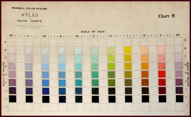
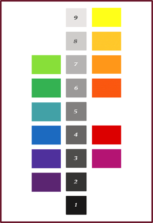
An image from Munsell’s Colour Atlas depicting the basic hues at values from 2 through 8.

High Value Colours

Colours that have high value, pastels for example, are highly visible because they reflect so much light. Like warm hues, they appear to advance towards the observer, thus seem closer than they really are. For these reasons, plants with pastel colouring provide real ‘pop’ in the garden. And of course for these same reasons, overuse of light bright colours can fatigue the eye.

Graphics and photos: Sue Gaviller

High Value Colours. Graphics and photos: Sue Gaviller

High value colours are especially noticeable in shady locations, at twilight, or against a dark background. On the contrary, these colours get washed out in strong midday sun or near highly reflective surfaces such as concrete or light coloured stone.

Left: High value colours, like the pastel mauve of these Campanula, appear washed out under strong sun. Right: These same plants seem to glow in the fading light of dusk. Photos: Cathy Gaviller.

Left: High value colours, like the pastel mauve of Campanula, appear washed out under strong sun. Right: These same plants seem to glow in the fading light of dusk. Photos: Cathy Gaviller.

This washout effect can be minimized with the abundant use of dark green – its lower value helps to absorb reflected light. In fact pastel-coloured plants are at their best when seen against a backdrop of lush green foliage.

Photo: Sue Gaviller

Panicles of pastel mauve Syringa blossoms are a real standout against dark evergreen foliage.
Photo: Sue Gaviller

pastel rose - resample 2

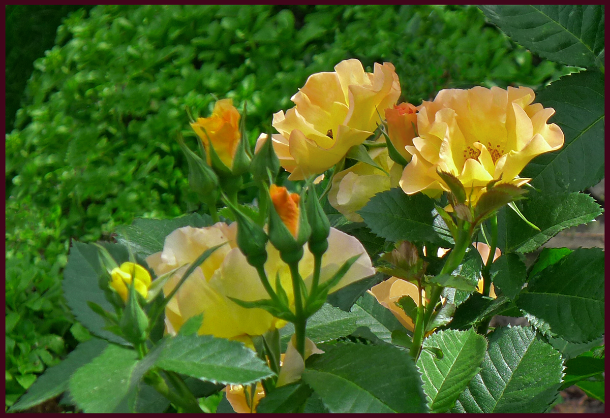
Soft lemon-peach blooms of Rosa ‘Morden Sunrise’ are a striking contrast to the rich green surrounding foliage. Photo: Sue Gaviller

Photo: Pat Gaviller

Variegated foliage. Photo: Pat Gaviller

Plants that contain two colours of contrasting value, variegated green and white foliage for example, will appear pastel-coloured when seen from a distance – particularly if the variegations are small. This is called assimilation – the eye optically mixes the colours, averaging the high value of the white and the lower value of the green to make a lighter green. The smaller the variegation the more evident is this effect. In the photo on the right, assimilation is most apparent with the Lamiastrum in the centre – the variegation is barely evident and the leaves appear silvery pastel green. The Hosta in the foreground exhibits no assimilation at all and the Euonymus in the background, only slightly.
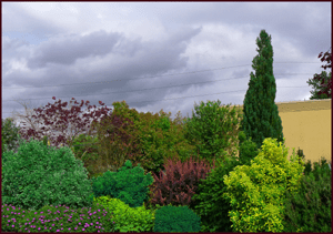
Low Value Colours

Low value colours reflect less light than their high value counterparts so are less visible in the landscape, especially in shade, at dusk, or against a dark background.

Low Value Colours. Photos and graphics: Sue Gaviller

Low Value Colours. Photos and graphics: Sue Gaviller

When viewed from a distance, dark-coloured garden elements lose their visual impact and recede into the background, an effect that is compounded by the optical illusion of appearing further away than they actually are. While low value foliage plants (especially dark green) make good garden backdrop, any dark feature you want to draw attention to is best situated close to the viewer, where the deep opulent colour can be appreciated.

barberry hedgebarberry hedge 2

Left: The low value red of this barberry hedge is rich and vibrant up close. Right: When viewed from further away the dark colour has a subtler effect, becoming part of the background. Photos: Sue Gaviller

Dark-coloured plants look exceptional against light-coloured stone, concrete, stucco, etc. and because they absorb light reflected from these surfaces, they also help to reduce glare and the washout effect of midday sun.

purple verbena resample

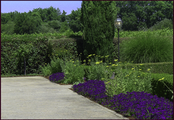
Low value colour from dark green hedging and dark purple Verbena, provides a good foil for the higher value of the tile-stone promenade. Photo: Sue Gaviller

Since dark colours make good background plantings, and because they don’t draw a lot of attention, they can be used  generously in the landscape. But don’t overdo it – too much low value without some medium and higher value to punctuate, will result in a garden composition that feels heavy and sombre.

Natural Value of Hues

Natural Value of HuesIt’s important to note that the basic hues in their pure state don’t have equal values. If I were to pose the question, “Which of the spectral hues has the highest inherent or native value?” you wouldn’t have to think long before responding. You’d answer yellow right? It is obviously the lightest hue on the spectrum. Likewise you would probably intuit that the hue with the lowest natural value is violet or purple.

This ranking of hues by value is of particular significance as it relates to colour balance. For example, if you want to use the conventional opposites of violet and yellow you can’t use them in equal proportion – their disparate values will create too much visual tension.

I experienced this in my own garden years ago – in my infinite gardener’s wisdom I’d decided I wanted a colour scheme consisting of only purples/violets and yellows. And in my ultimate gardener’s naiveté, I planted an alternating border of pure yellow marigolds and dark purple Lobelia (yes, yes I can hear your snickers and snorts at the mention of such amateur plant choices). It didn’t take long for me to realize how very grating this composition was, although I didn’t know why – I would later learn it takes three or four units of low Value to balance one unit of high Value, and this 3 or 4 to 1 ratio should be applied to violet and yellow.

Photo: Pat Gaviller

Bright yellow Osteospermum and dark violet Petunia appear quite jarring when present in equal quantity. Photo: Pat Gaviller

Photo:

The same pairing, now seen in more balanced proportions with 3 or 4 parts low value to one part high value. Photo: Pat Gaviller

Another way to balance these two hues, and maybe a better way, would be to use darker yellow and lighter violet elements, which lessens the disparity between the two values. They can then be present in more or less equal proportions without the visual discomfort.

Photo: Sue Gaviller

Violet and yellow can be present in equal quantities by using a higher value violet, and lower value yellow, as in this container arrangement of mauve Petunia and dark golden Calendula at the Royal Botanical Gardens in Hamilton, Ont. Photo: Sue Gaviller

Contrasting Values

Value contrast in the garden results from both the strength & direction of sunlight, and from the pigments present in the plants. The sun shining on our gardens creates shadows and highlights that we take very much for granted – we don’t always notice the resultant areas of perceived lighter or darker colour. In fact it is this contrast of light and dark that defines an object in space and enables us to discriminate between like-coloured entities. It’s what allows us to see edges and depth, therefore texture. No one knows this better than the painter – he knows if he is painting a red flower that it involves many variations on red. He adds a little black here, some white there, or grey, thus bringing his 2D image alive. The photographer too, recognizes this – she adjusts her camera settings to compensate for natural lighting that may be less than ideal (well she knows she should, regardless of how finicky and annoying it is). In this way harsh contrast between light and dark can be minimized in her finished product.

Photo: Sue Gaviller

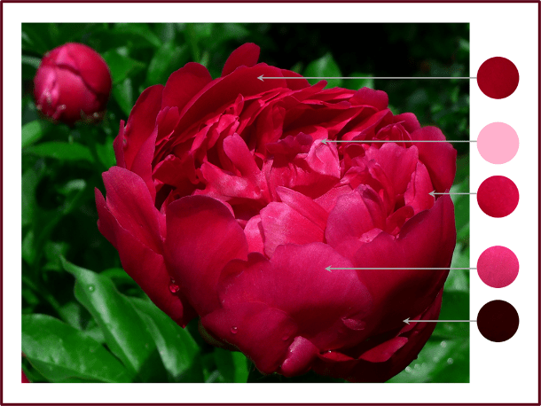
Paeonia ‘Unknown Soldier’ – note how many different values of the hue of red are seen in the shadows, midtones and highlights. Photo: Sue Gaviller

Using contrasting values of a single hue in a planting composition creates dramatic effect in the garden; indeed nature often does this within a single plant….

peach iris-resamplebicolour iris

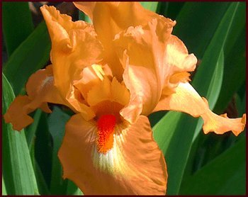
Left: soft orange-peach standards and falls are set off by a darker orange beard. Photo: Sue Gaviller Right: velvety purple falls contrast nicely with softer mauve standards. Photo: Pat Gaviller. 

And the gardener does it within a planting scheme or vignette….

purple bicolor daylily and rose glow barberry 2

Value contrast within a planting composition – here I’ve paired cool-pink daylilies with dark plum-red barberry. Each plant contains value contrast as well – the daylily has a plum-red eyezone and the barberry has cool-pink variegations. Photo: Sue Gaviller

Photo: Cathy Gaviller

Dwarf Iris and creeping thyme – beautiful value contrast of red-purple hue. Photo: Cathy Gaviller

Lovely though these colour combos are, as with almost everything in the garden (and in life), too much of a good thing is… well, too much. Imagine how unpleasant it would be to look at a garden filled with high contrast plant combinations. While value contrast helps us discriminate between the various elements in a planting scheme, it doesn’t always have to be dramatic.

And don’t forget balance when contrasting values – use more low value than high value (remember that ratio of 3:1 or 4:1). And green; use lots of it (have I said that before?) low value green, as well as basic green, which has medium value and helps to balance the higher and lower values.

In the words of Spanish Poet and Playwright, Pedro Calderon de la Barca, Green is the prime color of the world, and that from which its loveliness arises.

On that note fellow gardeners, I will conclude today’s lesson – hope you’ve learned something of value.

’Til next time,
Sue

Colouring Your Garden, Part 2 – Hue’s the Thing


Happy New Year y’all!

If you overindulged in last night’s new year’s celebrations and are currently paying the price, you might want to leave this post for another day – it contains lots of words and numbers and bright colours; perhaps more than your pickled brain can take in at the moment. Go nurse your hangover and come back later. For those of you who were better behaved last night, read on….

In my last post I presented an overview of Munsell’s Colour Classification System – I know it seems an overly complex approach to colour, especially as it relates to garden design, but understanding the concepts of Hue, Value and Chroma is key to effective use of colour in the garden.

Munsell’s three-attribute system is the basis for numerous colour models; for example, the Royal Horticultural Society uses a similar numeric system, employing the terms Hue, Brightness (Munsell’s Value) and Saturation (Munsell’s Chroma). Other models use such terms as Hue/Luminance/Saturation, Hue/Lightness/Saturation or Hue/Value/Saturation. In this post and in general, I use the latter; Hue, Value and Saturation – but in a Munsell framework. A purist might say I’m mixing modalities, arguing that chroma and saturation are not quite the same, but for our purposes they are close enough (I am simplifying things considerably). Today then, I’ll take a closer look at Hue.

Technically speaking, Hue refers to position on the spectrum. That ‘regular Joe’ I spoke of in my last post, was actually defining the attribute of hue – it is the response of colour receptors in our eyes (cones) to light absorbed by and reflected back from an object. The frequency and wavelength of that light determines its colour, red being the longest wavelength and violet the shortest.

Visible spectrum of light – violet light has the shortest wavelength and red the longest. Graphics: Sue Gaviller

Visible spectrum of light – violet light has the shortest wavelength and red the longest.
Graphics: Sue Gaviller

Hue is also the attribute that provides the emotional impact – red is passionate; the colour of anger or cupid’s arrow, yellow is happy and optimistic. It should be noted here that the human response to a particular hue isn’t universal – it’s determined largely by our culture, and by personal experience. The colour red in China symbolizes good luck and prosperity, in India it means purity, and in Hebrew tradition it represents sacrifice and sin. Blue may feel cool and calm to most, but if an individual experienced something traumatic in a room painted blue, that colour may forever trigger negative emotions. Case in point; many people experience bright yellow as a cheerful colour – I find it nauseating. When I was in my mid twenties I took up knitting (for whatever reason knitting had become a fad among young women at the time). I’d been working on a bright yellow mohair sweater (what can I say, it was the eighties and we all wore big hair, big shoulders and big colour). I stayed up late one night trying to finish this furry fright, and after hours of focusing on the gaudy garment, I went to sleep still visualizing bright yellow – indeed the colour permeated my dreams. I awoke several hours later feeling quite nauseous (apparently I’d come down with a nasty gastrointestinal bug). As I drifted in and out of near-delirious, nausea-interrupted sleep, I was still dreaming yellow. Once an association is made between a visual stimuli (or any stimuli) and an emotional or physical response, it may be with us for a lifetime. To this day bright yellow can still make me queasy.

butchart gardens red bridge 2

The colour red has great significance in Japanese culture, symbolizing among other things, that which is sacred – hence the red bridge or ‘Guzei’ in the Japanese Garden represents the path to salvation or redemption. Photo: Pat Gaviller

Primary Hues

Perhaps you’ve heard conflicting information as to which hues are the primaries – are they red, green and blue? Cyan, magenta and yellow? Red, yellow and blue? The correct answer is… all of them – it just depends which model you’re considering. The additive colour system, or RGB (red, green, blue) model, refers to the combining of red, green and blue light to produce a broad range of perceived colours – your computer monitor, television screen, and that awesome light show accompanying your favourite rock band in concert, utilize this model.  The subtractive model, or CMYK is used in ink colorant systems, your inkjet printer for example – cyan, magenta and yellow are the primaries in this model.

The RYB (red, yellow, blue) model was the original subtractive model, predating colour science – it was replaced by CMYK since it is believed that more colours can be produced using the primaries of cyan, magenta and yellow than with red, yellow and blue. Nonetheless, RYB is still used by artists, especially painters. It is also an effective illustrative model which I too utilize and will discuss later in this post.

So what does all this have to with us? As gardeners, we manipulate neither light for digital media application, nor pigment for printing or painting. However, we do manipulate plants, the colour of which comes from pigments, and the light that shines on them – an understanding of the applicable colour models is therefore beneficial.

To complicate things further, the human eye blends colours differently again, in a phenomenon called optical mixing. Ever have the experience of trying to match a print fabric skirt or shirt with a solid colour blouse or tie? You may have perfectly matched one of the colours in the print, but when you view the pairing from a few feet away, the colours appear to clash. The eye has blended together the various colours in the print to make an entirely different colour – this optical mixing is especially evident with small patterns, less so with larger blocks of colour. As we continue our exploration of colour properties, you will see that this comes into play often in the garden.

mixing models

Left: Additive mixing – primaries are Red, Green and Blue. Middle: Subtractive mixing – primaries are Cyan, Magenta and Yellow. Note that the secondary colours of one system are the primaries of the other. Right: Optical Mixing – Colour mixing according to the human eye. Graphics: Sue Gaviller

Munsell’s aim was to develop an approach to colour that approximated the way the eye perceives it. Like his predecessors, beginning with Isaac Newton, he conceptualized the visible spectrum of light as a circle of hues. This was of much more use to artists and designers than the linear spectrum – by placing red next to violet it allowed for red-violet combinations and also provided a better tool for visualizing colour relationships, e.g. opposites or complements.

The Basic Hues

Munsell organized hues into a circle of five major hues (Red, Yellow, Green, Blue and Purple) and five minor hues (Yellow-Red, Green-Yellow, Blue-Green, Purple-Blue and Red-Purple). Together these comprise the Basic Hues and these basic hues are the colours which are most pure or saturated.

Graphics and Photos: Sue Gaviller

Graphics and Photos: Sue Gaviller

Intermediate Hues

The transition from one hue to another is a gradual one with many hues in between, so the spaces between the basic hues he divided further, allowing for intermediate hues. All the basic hues begin with 5, 5R being the basic hue of red, 5YR is yellow-red, 5Y is yellow etc. The intermediate hues all begin with 10 – 10R, 10YR, 10Y and so on around the circle.

Munsell Wheel resample

Munsell’s Basic and Intermediate hues. Graphics: Sue Gaviller

Consider the hues between 10RP and 10R; all are designated R – 2.5R is nearer to Red-Purple so will contain more of that hue, 5R is basic or pure red,  7.5R and 10R will contain increasing amounts of Yellow-Red (orange).

Numbers then begin at 2.5 again – 2.5YR has more red in it, 5YR is the basic hue of Yellow-Red and the hues 7.5YR and 10YR become increasingly more Yellow.

Each of these 40 numerically designated hues, has a corresponding page in the Munsell Book of Color. Each hue is a ‘family’ of colours with numerous value and chroma variations making up the page – below are some examples. Note that as the hues progress from one to another, the changes are subtle but still evident.

R & YR

Eight different hue pages as they might appear in the Munsell book of colour. Graphics: Sue Gaviller

The Artist’s Wheel

Okay enough of all this technical stuff – let’s look at the more familiar Standard Artist’s Wheel, the RYB model we all learned in grade school. It differs from Munsell’s hue circle in a number of ways; instead of five major hues and five minor hues, there are three primary colours (Red, Yellow and Blue), three secondary colours (orange, green and violet), and six tertiary colours (red-orange, yellow-orange, yellow-green, blue-green, blue-violet, and red-violet).

Artist's Colour Wheel. Graphics: Sue Gaviller

Artist’s Wheel. Graphics: Sue Gaviller

Munsell Hue Circle. Graphics: Sue Gaviller

Munsell Hue Circle. Graphics: Sue Gaviller

As well, some of the colours are named differently; violet instead of purple, orange instead of yellow-red, yellow-green instead of green-yellow etc.. More significantly, Munsell’s circle contains ten basic hues whereas the Artist’s wheel has 12. This means that the complementary pairs will differ as well – red & green vs. red & blue-green, red-violet & yellow-green vs. red-purple & green. The only exception is blue and orange (Munsell’s Yellow-Red) which are the same on both wheels. Munsell used the term opposite rather than complementary and he believed that in order for two colours to be truly opposite, they had to completely neutralize each other when mixed together, hence producing grey. This was how he arrived at the ten basic hues.

So which of these circular representations of hues is most useful to us? Well either… or both – some would argue that Munsell’s opposites are less jarring when used together than the traditional complements. The Artists wheel, on the other hand, works out colour schemes better because 12 colours can be divided more ways than 10.  I use both, but always with Munsell’s basic premises in mind.

Contrasting Hues

Pairing hues that are distant from each other on the colour wheel (e.g. opposites or complements) creates high contrast. These dynamic colour combinations really draw the eye, thus overuse can cause visual fatigue or appear garish.

Photo: Pat Gaviller

This vignette from an area in my front garden demonstrates the highly contrasting hue combination of red-violet and yellow-green. A lovely combo, but too much of such intense contrast could easily overwhelm a composition. Photo: Pat Gaviller

Hues that are close to or beside each other on the colour wheel result in low contrast when used together. This causes less visual tension and is therefore more restful.

Blues and purples are near to each other on the colour wheel resulting in a lower contrast composition that is visually softer than high contrast scenarios. Photo: Sue Gaviller

Blues and purples are near to each other on the colour wheel resulting in a low contrast composition that is visually softer than high contrast scenarios. Photo: Jane Reksten

Of course too little contrast can also end up creating monotony, so be sure to use some areas of high contrast and some areas of lower contrast. I also recommend that you limit the number of hues in your design. This is less constricting than you may think – remember each hue has a whole family of colours associated with it, with varying value and saturation levels, meaning many different but related colours.

Warm Hues

warm hues 2

Warm hues. Graphics: Sue Gaviller

Hues are described as either warm or cool – warm hues are those on the right side of the spectrum and cool hues are those on the left. Red-violet, though it doesn’t exist on the spectrum, can be considered warm or cool because it has both red and violet in it.

Warm hues are lively and vibrant and create the optical illusion of advancing toward the viewer, which means they appear closer than they actually are. For these reasons they are real attention-grabbers, especially at full saturation – gardeners make the mistake of overusing these eye-catching hues thereby overpowering all other aspects of the garden. Warm is dominant and little is needed to make a powerful statement.

Warm colours like red and yellow require on;y a few splashes to be seen and appreciated. Photo: Sue Gaviller

Kendall Jackson winery, Sonoma County CA. Splashes of warm reds and yellows are all that’s needed to provide sufficient visual punch without overshadowing other important elements of the design: line, form and texture. Photo: Sue Gaviller.

Cool Hues

cool hues

Cool hues. Graphics: Sue Gaviller

Cool hues are subtle and restrained, therefore won’t overwhelm a garden design. Optically they recede from the observer, appearing further away – best to situate them up close where they are most visible.

As I mentioned earlier, there may be personal and cultural associations that come into play regarding our emotional response to various colours, but there is in fact a physiological reason for our ocular response. The eye focuses on distant objects in much the same way it focuses on green or blue, and on near objects much the same way as on red. Since the eye is more at rest when viewing objects in the distance, it perceives cool blues and greens as more restful.


Photo: Sue Gaviller

A peaceful composition of cool greens, blue-green, blue, and soft violet in an Oregon shade garden. Photo: Sue Gaviller

When contrasting warm and cool hues, cool should outweigh warm by at least three to one. If you follow the rule of thumb that green should be the predominant hue in your garden, this ratio will be easy to satisfy. Unfortunately, in our attempt to create season long colour, we include too many brightly coloured foliage plants, sometimes to the near-exclusion of green. Fellow gardeners please remember, green is good. Green is to the gardener as a canvas to the artist – it is the backdrop against which all other hues are set.

warm hues garden resamplewarm hues + green resample

The image on the left contains too many warm colours without enough green. The image on the right has been been photoshopped to illustrate the balancing effect of green. Photo: Sue Gaviller


Well my friends you are one step closer to painting your garden masterpiece, but there’s still more to learn – next post I’ll explore the colour attribute of Value.

’Til then,
Sue