It’s baaaaaack – the white stuff that is.
Earlier this year I began a discussion on garden colour with a post entitled: Colour – the Absence of White. The title was a play on words of sorts – both a twist on the artist’s definition of white (the absence of colour) and the fact that the snow, that dreaded white stuff, was finally gone, revealing the colours of spring. I had hoped to follow up with a series of posts on colour, but was so busy over the summer trying to get caught up with my design work, that it just never happened. Now the snow has returned, our northern gardens are all tucked in for their long winter’s nap, and I have a little time on my hands. It seems appropriate then, that I pick up where I left off back in May. In that introductory post, I presented and discussed the challenges and complexities of colouring our gardens – a finite colour palette, variable bloom times, harsh sunlight, existing colours in the surrounding landscape, the life cycle of a plant or garden – to name a few.
So how do we as gardeners, mitigate and manage these inevitabilities? To begin with we might ask ourselves, ‘What is colour?’ I thought it would be interesting to see how a ‘regular Joe’ might answer this question – so I asked my sons (one of whom happens to be named Joe, but nothing regular about him). “The frequency of the light waves bouncing off an object,” he replied – not bad, but it only describes one aspect of colour. The other son smirked and pointing at his brother quipped, “Yeah… what he said” – always the class clown. I then asked my husband, a bit of a renaissance man with a love of both art and science. He thought for a moment, “Colour occupies the space between black and white,” was his response – trust him to wax philosophical. A text-book definition might read something like, ‘Colour is the property of an object that remains when all other properties (size, shape, texture etc.) are eliminated’, or ‘Color is that perception by which we can differentiate otherwise identical objects… blah blah blah’ .
Interesting perspectives y’all but in fact, colour isn’t a single attribute. Albert Munsell, an early 20th century American artist, was one of the first colour theorists to propose that an individual colour is actually comprised of three different attributes:
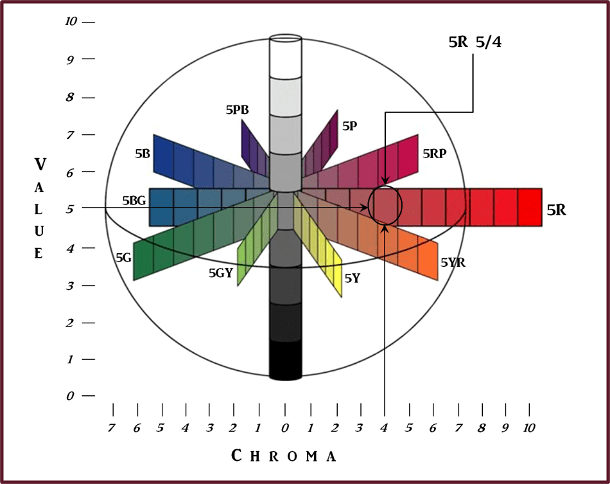
- Hue, which Munsell defined as: “the quality by which we distinguish one color from another, as a red from a yellow, a green, a blue or a purple.” It is represented by the hue circle.
- Value, which according to Munsell is: “the quality by which we distinguish a light color from a dark one,” and is represented by the value scale.
- Chroma, which Munsell defined as: “the degree of departure of a colour from the neutral color of the same value,” and it is represented by the Chroma scale.

Munsell’s 3 attributes of colour. Graphics: Sue Gaviller
Confused yet? Well bear with me – it should become clearer. Munsell arranged these three attributes into a three-dimensional figure known as the Munsell Colour Space. Hue is displayed circumferentially, value is placed along the vertical axis, with darkest at the bottom and lightest at the top, and chroma radiates horizontally from the centre, moving from neutral outward to full chroma.

Munsell Colour Space showing Hue, Value and Chroma.
Graphics: Sue Gaviller (adapted from Hue, Value and Chroma Chart, applepainter.com)
The above image represents only one horizontal segment – the entire 3D figure, called the Munsell Colour Solid, looks more like a warped sphere (image below left). The sphere is warped because colours don’t all behave the same way – individual hues have differing chromatic intensity and reach full chroma at varying value levels. But I’m getting ahead of myself here – I’ll elaborate on each of the three attributes in subsequent posts.

A look inside the Munsell Color Solid, from: A Grammar of Color, A.H. Munsell, 1921
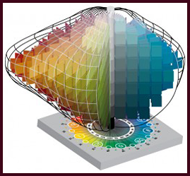
All colours are contained within the Munsell color solid. Image courtesy of Munsell Color
Looking inside the sphere (above right), we see that the colours get lighter from bottom to top, and brighter or less gray, from the centre to the outer rim. A vertical cross-section through the centre of the solid would produce a 2D image such as this:

Graphics: Sue Gaviller
or this….

Graphics: Sue Gaviller
If we were to segment the 3D figure like an orange, then each segment (1/2 of a vertical slice) is a page in the Munsell Book of Colour. Each page is of a single hue with all the chroma and value permutations of that hue.

Several editions of the Munsell Book of Color, as well as the Atlas of the Munsell Color System.
Photo Credit: Mark Fairchild
Value and Chroma levels are all numbered so any colour can be given a precise numerical description; for example, the colour circled below is a red (5R, which I’ll explain later), with a Value of 5 and Chroma of 4, hence it would be called 5R 5/4.
Munsell’s system allows for numerical expression of colour using exact Hue, Value and Chroma measurements. Here we see a dusty rose colour belonging to the hue of red (5R), with medium value and medium-low chroma, thus is designated 5R 5/4.
Graphics: Sue Gaviller (adapted from Hue, Value and Chroma Chart, applepainter.com)
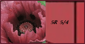
Photo: The Garden Color Book, Paul Williams.
The Munsell Color Classification System is an accepted method, worldwide, for describing colors numerically – it is used by artists, soil scientists, brewmasters, gemologists or anyone who requires a precise way of expressing colour. So what does all this mean for us? Surely I don’t intend for you to assign letters and numbers to all your plants – do I? Of course not silly gardener. That kind of precision would be of no practical use. Rather, my aim is to provide you with a framework for working with colour – the colour of the poppy above for instance – so you can approximate what hue family it belongs to (red), how it relates to other colours, and how to use it accordingly.
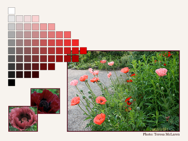
This planting of red, coral and pink poppies is unified by the common hue of red; the two inset photos provide further examples of colours in the same family.
Still confused? Don’t give up just yet. Over the next few months I’ll be exploring each aspect of colour individually, focusing on the relevance to garden design.
So to help brighten the dreary days of winter, stop by once in a while and warm up with a shot of colour. Next post I’ll take a closer look at the first attribute of colour; Hue. Hope hue, uh you, can join me!
’Til then, Sue

Thanks for the post Sue. Just what I needed. Good memories of your class.
Hi Brian,
Great to hear from you – glad my post was timely for you. Hope you’re staying warm – I think it’s going to be another cold one.
Thanks for reading,
Sue
Now I know how I could describe a colour to someone else – and I always thought that was impossible. Love, Mom
Hi Mom – glad you found this info helpful. Although you could now describe a colour in terms of 3 attributes, it wouldn’t be with any degree of accuracy (unless you had a Munsell colour chart handy – but keep reading; in a later post I’ll provide readers an inexpensive way they can obtain a facsimile of the charts).
Sue
Hi,
This is Ben, I am a high school student in grade 11. I am learning how to garden. The link to my gardening blog is below.
Can you please look at my blog and make sure it is mentioned by someone on wordpress or on a different gardening site.
Thanks,
Ben
Hi Ben,
Thanks for visiting my blog – I have also visited yours and see that you have lots of helpful information for beginning gardeners. It’s nice to see young people such as yourself interested in gardening and growing things. The best way to get your blog noticed and read by other people is to do just what you’ve done – visit and comment on other blogs. Keep it up and good luck! And I’ll be sure to visit your blog again.
Sue
Hi Sue,
Thank you so much for the advice on getting my blog noticed. I will keep doing what I am doing by visiting other peoples gardening blogs and commenting on them.
Thanks,
Ben
Hi Ben – you’re very welcome.
I guess school will be out soon – have a great summer and hope you’re able to do lots of gardening and blogging.
Cheers,
Sue
Thanks. Can you please help me promote my blog so that I can grow my audience on WordPress? How are you doing?
[…] in the garden please read Sue Gaviller’s incredible 9 part deep dive into plant colour theory:Part 1, Part 2, Part 3, Part 4, Part 5, Part 6, Part 7, Part 8 and Part […]
“Such beautiful inspiration! I’m now thinking of adding more bold colors like reds and purples to brighten up my garden.”