Colouring Your Garden – Part 9: Colour Schemes

Over my last 8 posts I have looked at colour theory in considerable depth, focussing of course on its application in  garden design. One of the most powerful ways we can utilize this knowledge is by experimenting with colour schemes in our gardens.

Many gardeners balk at the idea of purposefully employing a garden colour scheme, assuming it’s just one more rule to follow, or at the very least, too restrictive.

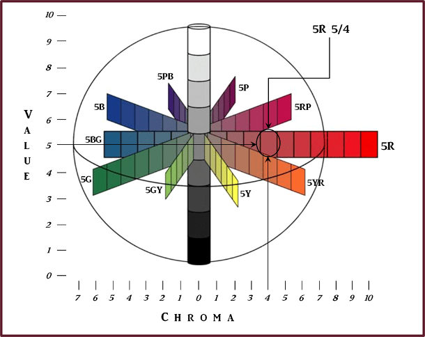
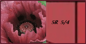
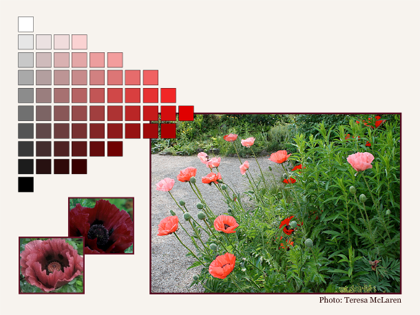
Utilizing a colour scheme doesn’t have to be restrictive though, if we think rather in terms of a hue scheme. Looking to the Munsell Book of Colour, we find that for each hue, there are many permutations of value and saturation all arranged on an individual page. So if we want to work with a scheme which includes red, we have a whole hue page to choose from  just for red! The other hues in our scheme afford us the same broad selection of colours. A little less restrictive than you thought, right?

Colour Schemes

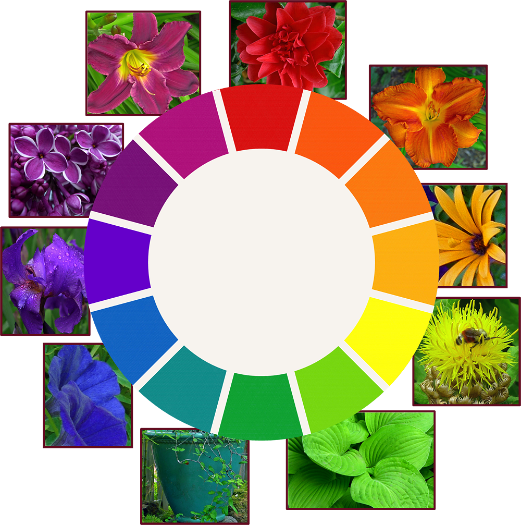
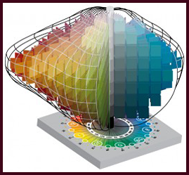
A colour scheme is a planned or logical combination of hues on a colour wheel. As we discussed in earlier posts, there is more than one colour wheel, but you’ll probably find the artist’s colour wheel to be the most user-friendly. You can then refer to Munsell hue pages (or reasonable facsimile) for guidance with the various colours that fall within that hue. I do sometimes utilize Munsell’s hue circle to work out colour schemes, but they aren’t always as straightforward. For ease of use then, I am mixing models here.

So how does one go about choosing a colour scheme for the garden? If your house or other backdrop is a particularly strong chromatic colour, then it’s most effective if you include that colour in your scheme. If on the other hand, your house is more neutral, then start with a colour you really like and build from there.

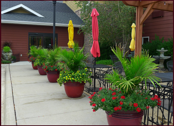
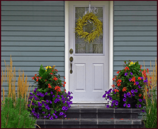
The colours used in this restaurant patio planting echo the muted red and yellow hues of the siding on the building. Photo: Sue Gaviller

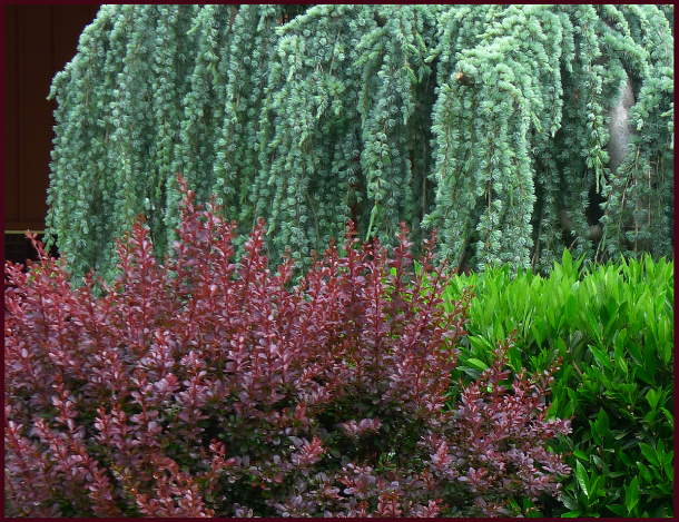
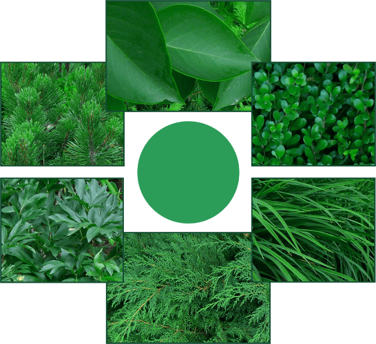
Keep in mind that most plants – both in your garden and in the surrounding landscape – have green foliage, hence green will always be present. Since this hue is so much a part of the outside world, the eye tends to ignore it, and will instead focus on other colours. Green is therefore experienced mostly as a backdrop for your garden composition. But it can certainly be one of the hues in your colour scheme too.

You can vary the colour schemes from one part of the garden to another (particularly if you have a large canvas), and the scheme can also change or evolve as the season progresses. For example a garden that has a yellow-green and red-violet combination in the spring might add other colours later in the season, but those hues must always be part of the scheme.

Realistically speaking, some scenarios don’t lend themselves to formal colour schemes (if only for the reason that the proprietor of a well established garden may not want to part with anything – just to incorporate a colour scheme). One can still play with colour schemes though; containers are a great way to experiment without committing to a particular composition.

So let’s have a look at what we can construct using the artist’s colour wheel and some Munsell hue pages.

Monochromatic colour schemes use various values and degrees of saturation of a single hue. Working with a single hue creates naturally harmonious colour compositions.

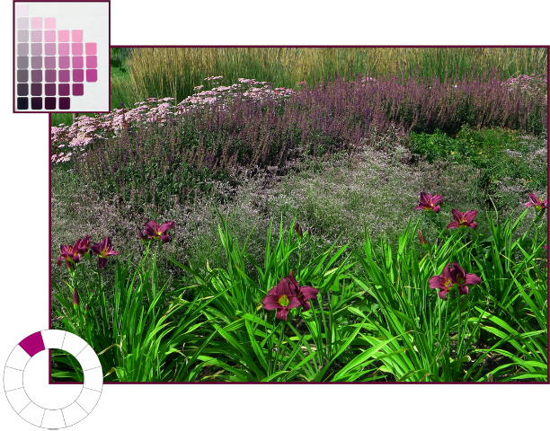
Monochromatic colour scheme using the hue of red-violet (5RP). Photo and graphics: Sue Gaviller

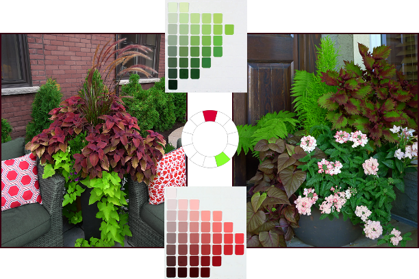
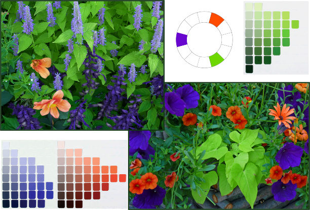
Complementary colour schemes contain two hues that are opposite each other on the colour wheel.

This is a high contrast colour combo, which means it can be loud and demand attention. So you’ll want to tame it by including numerous value/saturation variations of the pure hues – and of course lots of green.

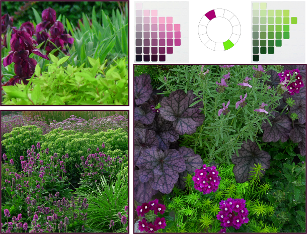
Complementary Colour Scheme: Red-violet (5RP) and yellow-green (5GY). Photos: Top left – Pat Gaviller. Bottom and right – Sue Gaviller

Analogous colour schemes use two or three hues that are next to each other on the colour wheel.

Although this is a low contrast combination, analogous hues still benefit from utilizing variations in saturation and value of the chosen hues, thus introducing more variety. Remember if you choose warm hues, there will need to be significant green (foliage) in your composition to provide the necessary cool/warm balance.

analagous-r-o-o-y-o-resize

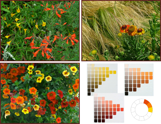
Analogous Colour Scheme: red-orange (10R), orange (5YR) and yellow-orange (2.5Y). Photos and graphics: Sue Gaviller

Counterpoint schemes consist of a hue and one of the hues on either side of its complement.

This too is a dynamic colour combo, but somewhat less so than complementary compositions – many people prefer this colour duo as it generates less visual conflict. Again the use of variations in value and saturation of the two hues will create both unity and variety.

Photos: Sue Gaviller

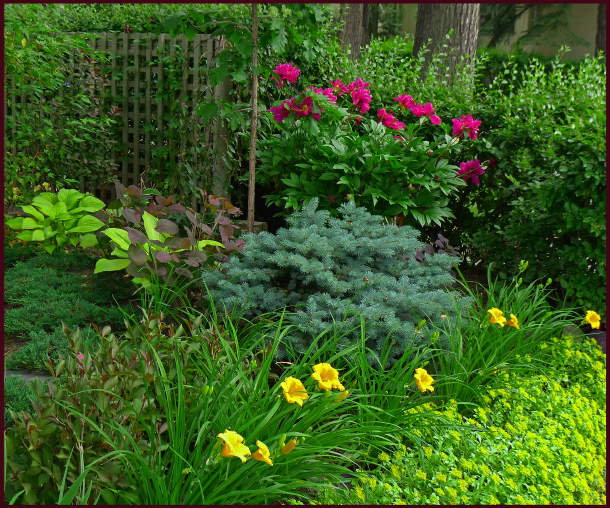
Counterpoint Colour Scheme: red (5R) and yellow-green (5GY). Photos and graphics: Sue Gaviller

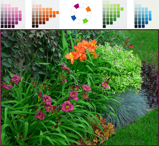
Split-complementary schemes are three-hue combos that use one hue and the two hues on either side of its complement.

The split-complementary colour combo has all the dynamism of complementary and counterpoint, with the balancing addition of two hues that are closer together. A garden may transition from the aforementioned counterpoint theme to split-complementary as the growing season progresses and more plants (thus more colours) take the stage.

Split Complementary colour scheme - yellow, blue-violet and red-violet. Photos: Top left: Cathy Gaviller. Right: Jane Reksten

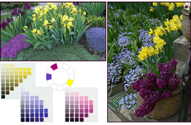
Split Complementary colour scheme: yellow (5Y), blue-violet (7.5PB) and red-violet (5RP). Photos: Top left – Cathy Gaviller. Right – Jane Reksten. Graphics: Sue Gaviller

Analogous-complementary schemes use two adjacent hues and the complement of one of those hues.

Similar in effect to split-complementary, analogous-complementary schemes are especially soothing if the analogous constituents are cool hues.

Analogous-Complementary Colour Scheme: violet (5P), red-violet (5RP) and yellow-green (5YG). Photos: Sue Gaviller

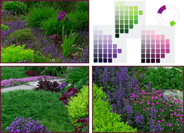
Analogous-complementary Colour Scheme: violet (5P), red-violet (5RP) and yellow-green (5GY). Photos: Top left – Pat Gaviller. Bottom left/right – Sue Gaviller. Graphics: Sue Gaviller

Double-complementary schemes use two adjacent colors and the complements of both of those hues.

Graphics: Sue Gaviller

This four-hue scheme brings both drama (from opposites) and subtlety (from analogues) to a garden composition, and can be a natural seasonal transition from analogous-complementary as more plants come into bloom.

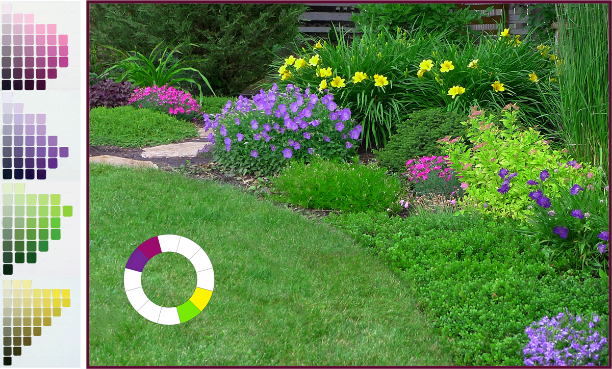
Double-complementary Colour Scheme: violet (5P), red-violet (5RP), yellow (5Y) and yellow-green (5GY). Photo and graphics: Sue Gaviller

Diads are colour schemes that consist of two hues located two spaces apart on the colour wheel.

Though this colour duo provides more contrast than an analogous scheme, it is still a low-contrast theme and less dramatic than higher contrast combinations. More contrast can be introduced if one of the hues is warm and one is cool, for example red and purple.

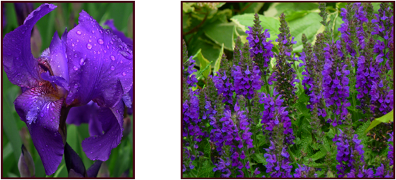
Diadic Colour Scheme: red (5R) and violet (5P). Photos: top – Pat Gaviller. Bottom – Sue Gaviller. Graphics: Sue Gaviller

Triads use three hues that are equally spaced around the colour wheel.

Triadic schemes offer interesting colour combinations and are inherently balanced because the hues are all equidistant from each other.

Triadic Colour Scheme: Violet-blue (7.5PB), orange-red (10R), and yellow-green (5GY). Photos: Sue Gaviller

Triadic Colour Scheme: blue-violet (7.5PB), orange-red (10R), and yellow-green (5GY). Photos and graphics: Sue Gaviller

Tetrads are colour schemes using four hues that are consistently spaced on the colour wheel.

  • Square tetrad – 4 hues touched by the four corners of a square placed in the centre of the colour wheel.
  • Rectangular tetrad – 4 hues touched by the four corners of a rectangle placed in the centre of the colour wheel

Four-hue schemes provide considerable colour choice thus can be quite vibrant, especially when hues are at full saturation. They can be toned down somewhat with the addition of less saturated versions of the pure hues.

Tetradic Colour Scheme: red-violet (5RP), orange (5R), yellow-green (5GY) and blue (5B). Photos and graphics: Sue Gaviller

You can see that with all the variations in value and saturation for each hue, many different but related colours are available to you – even when using only a couple of hues. Unfortunately, most of us don’t have access to the Munsell Book of Color, but there are numerous apps and online tools that will provide more than enough visual info for application in the garden.

I highly recommend the Virtual Munsell Color Wheel. It’s very easy to use – just bear in mind that it includes all the intermediate hues that lie between the basic hues (totaling 40 hues), which you may find overwhelming. The digital ‘hue pages’ aren’t identical to those in the Munsell Book of Colour either (copyright and such). You’ll also note that, compared to the traditional RYB colour wheel, Munsell’s blue (5B) appears more green and his purple-blue (5PB) more blue – this is because he divided the circular colour spectrum differently. I wouldn’t get too carried away with detail or accuracy though. Just choose your colour scheme using the artist’s colour wheel and find the hues that most closely approximate them on the Virtual Wheel.

Finding foliage or flowers in exactly the right colour may be next to impossible anyway. But don’t get discouraged. Remember green foliage abounds in the garden, and with all that ‘green between’, you’ll find that almost-the-right-colour will be close enough.

‘Til next time,
Sue


Colouring Your Garden – Part 4; Saturated Solutions

A week or so ago, while out for a walk with my sister in her inner-city neighbourhood, I heard the familiar sound of Robin chirps. It took me a minute to realize that the sound was out of place on this mid-February afternoon. Indeed my sister doubted me initially, but then she heard it too. “Holy $#!+.” she said.  According to local bird experts a few robins do spend the winter here, but neither of us had ever seen one this early in the year.

Several blocks later I happened to look up and espied what appeared to be pussy willows. At first I thought it might be water droplets on the branches reflecting the late day sun – but then I reached up and felt the fat fuzzy protuberances. Yep, those are pussy willows. While there are many species of willow that produce the downy catkins, a few as early as February,  Salix discolor, the true North American pussy willow doesn’t usually bloom here until mid March – this was February 12th! I didn’t know whether to be elated or alarmed. Either spring is coming really early or the birds and the trees are in for a cold, snowy, nasty surprise in the weeks to come – despite a mild winter from a moderate El Nino effect, this is still zone 3 Calgary and the early bird rarely gets the worm. Only time will tell I guess, but my vote is for an early spring. In the meantime fellow gardeners, we have more to learn about colour.

Over the last few months I’ve been discussing colour theory as it relates to garden design. We’ve looked at two of the three attributes of colour (Hue and Value) and today we’ll examine the third; Saturation, or what Munsell called Chroma.

Saturation is the strength or concentration of a colour and is determined by how much of a particular hue is present in that colour. Think high school science for a moment and consider the amount of solute in a solution – in the scientific sense, saturation occurs when a liquid has reached its capacity to absorb a dissolved substance. Brine for example, is a solution of water and salt – if we start with pure water, then add salt until the water can’t absorb any more, we have a saturated solution. Similarly with colour, if we start with gray then add a particular hue until maximum hue content (i.e the pure hue) is reached, then we have full colour saturation.

High Saturation

A highly saturated colour reflects a great deal of light from one specific part of the spectrum, and very little light from anywhere else on the spectrum; for example, the pure hue of red reflects most light from the end of the visible spectrum where red is located, and yellow reflects most light from near the middle of the spectrum.

The pure hues (i.e. Munsell’s 10 basic hues around the outer edge of the Munsell Colour Space, or the 12 hues on the Artist’s Colour Wheel) are considered fully saturated. These are the vibrant colours some gardeners adore and others abhor; they are intense and flamboyant, and employed effectively are stunning additions to a garden composition. Used indiscriminately however, they’re sure to create garden chaos.

Photos and Graphics: Sue Gaviller

Full saturation. Photos and Graphics: Sue Gaviller

Saturated hues hold up well under full sun with very little colour washout, and like warm hues and high value colours, appear closer than they really are. They are thus highly conspicuous in the landscape, perfect for creating emphasis or accenting an area you want to draw attention to; an approach or a destination.

Photo: Sue Gaviller

Planting bright saturated colours in entryway container arrangements as this gardener has done, effectively draws the eye to the front entrance, creating a welcoming focal point. Photo: Sue Gaviller

Public gardens and parks often use abundant saturated colours in their annual display gardens – while this style of planting design isn’t one I’m likely to adopt, the plethora of intense colour certainly does what it’s intended to do; attract attention.

Photo: Sue Gaviller

Massed annuals in strong spicy hues draw the eye directly to the Tea House, advertising its presence and inviting visitors in. Note how the saturated reds and yellows hold their colour without fading in the bright sunlight. Photo: Sue Gaviller

Fullest saturation is experienced when hues are used individually rather than together – if two highly saturated colours are in close proximity to each other, the effect will be to decrease the intensity of both. This isn’t to say you should never use more than one saturated colour in a composition – you certainly can – but any given colour will be seen at its purist if there aren’t other equally intense, and therefore competing, colours close by (remember the design principle Unity by Dominance). The exception to this is complementary hues, which will both be intensified by their nearness to one another.

Photo: Pat Gaviller

Lime green Hosta, violet-red Paeonia, golden Hemerocallis and yellow Sedum all present very saturated colour – while it’s an attractive composition, the strong colours do compete somewhat meaning none of them can take centre stage. Photo: Pat Gaviller

Photo: Pat Gaviller

The same photo, now cropped to isolate the peony from the other intense colours, illustrates how a saturated colour on its own has stronger colour presentation than numerous competing colours together. Photo: Pat Gaviller

The eye perceives large areas of colour as more saturated than smaller areas; hence fine textured plants (small leaves and/or flowers) don’t appear as saturated as those with coarse texture (large leaves and/or flowers). This is particularly apparent when seen from a distance, so fullest possible saturation will only be experienced up close – distance tends to mute or desaturate colour. I learned this quite by accident in my own garden in my pre-designer years. I’d wanted a hefty shot of hot pink in a particular spot in the garden and chose Anthony Waterer spirea for its long-blooming bright fuchsia flowers. I thought I was happy with the choice, since it was just the right colour and bloomed continuously. However, I soon realized that unless I was right up at the edge of the garden, the fine-textured umbels of hot pink blooms looked dull an unimpressive, if seen at all. Needless to say I removed it – at some point I figured out that I needed a bigger, bolder flower to anchor the spot. I have since planted Purple Pavement rose, its large velvety, red-violet blooms showing strong colour even from far away.

Viewed from very close, coarse-textured Iris and fine-textured Salvia both present saturated Blue-Violet colouring. Photos: Sue Gaviller

Viewed from very close, coarse-textured Iris and fine-textured Salvia both present saturated Blue-Violet colouring. Photos: Sue Gaviller

Viewed from a few feet away, the big bold Iris blooms maintain almost full colour content and still appear richly-hued, whereas the finer-textured Salvia flowers appear somewhat desaturated. Photos: Sue Gaviller

Viewed from a few feet away, the big bold Iris blooms maintain almost-full colour content and still appear richly-hued, whereas the finer-textured Salvia flowers appear somewhat desaturated. Photos: Sue Gaviller

Low Saturation

Colours become less and less saturated the closer they are to the central neutral axis of Munsell’s Colour Space. The neutrals have no hue content whatsoever – they are the achromatic colours of white, black and numerous shades of gray in between. Colours that have some hue content but are relatively low in saturation, have a dull or muted appearance compared to their more highly saturated counterparts; hence they attract much less attention. We see this in some foliage, especially evergreen foliage, ornamental grasses, fading flowers and seed heads.

Low saturation plants 2

Low or weak saturation. Photos and graphics: Sue Gaviller

These muted colours are a nice foil or contrast to brighter flowers and foliage, affording the appearance of fuller saturation to neighbouring plants, even those that may be less than fully saturated.

Photo: Sue Gaviller

Spent flowers of purple smoke bush appear like billowy wisps of copper-rose smoke. The colour is actually a red of only medium saturation, but looks more intensely coloured next to the much less saturated inflorescence of the ornamental grasses. Photo: Sue Gaviller

Photo: Sue Gaviller

The muted blue-green of weeping blue cedar provides a soft backdrop allowing rich crimson barberry to really stand out. Photo: Sue Gaviller

Colours that have low or weak saturation appear to recede from the viewer thus seem farther away than they actually are. As mentioned earlier in this post, distance desaturates colour, as does bright sun and fine texture – any of these scenarios will lead to further desaturation of already dullish colours.

fescue sun

fescue shadeLeft: Fine-textured Festuca glauca (foreground) appears almost colourless under the glare of mid day sun. Right: the same blue fescue grasses, now in shade, display much higher colour content. Photos: Pat Gaviller

Unlike highly saturated colours, less saturated colours allow for the use of many hues within the same composition – without the garish results.

muted colours 4

Muted hues of red, orange, yellow, green, and red-violet are present in this composition but due to their low colour content, don’t overwhelm. Note that the one very saturated colour, the yellow-green cypress in the centre of the photo, is more prominent than any other colour. Photo: Sue Gaviller

 Saturation Contrast

Contrasting saturation levels of a single hue creates subtle unity as the eye recognizes the underlying hue and connects the elements.

Photo: Sue Gaviller

Terra cotta is a weakly saturated (and higher value) red-orange and provides elegant contrast to the highly saturated red-orange of the begonia. Photo: Sue Gaviller

You may recall from my last post that the pure hues don’t have equal native values – neither do they have equal hue content or saturation. The pure hue of Red for example has the highest degree of saturation, twice that of the lowest, which is Blue-Green. This means there are twice as many steps from neutral to pure red, than there are from neutral to pure Blue-Green.

An image from Munsell's Atlas of Color showing the scale of Chromas (Saturation) for Red and Blue-Green.

An image from Munsell’s Atlas of Color showing the scale of Chromas (Saturation) for Red and Blue-Green. Note that from the central neutral (gray) axis, there are 10 steps outward to fully saturated Red, and only 5 steps to fully saturated Blue-Green

When combining these colours, in order  to achieve a balanced composition, you’ll need at least twice as much Blue-Green as Red. Alternatively you could use a Red that is less saturated so it approximates the saturation of the Blue-Green.

Photo and graphics: Sue Gaviller

One way to balance Red and Blue-Green is to use a less saturated Red that is closer to the more weakly saturated Blue-Green. Photo and graphics: Sue Gaviller

Of course gardeners can’t be expected to know or remember the precise chroma or saturation of any given hue – but with a little colour knowledge we can be confident that if a colour seems very strong or intense, it probably is, and we can use it accordingly (i.e. sparingly). Likewise if a colour appears to be more subtle or muted, we can be pretty sure that it is less saturated and we can use a little more of it to balance out the more saturated colours.

Maintaining colour balance in the garden is another reason for using plenty of – you guessed it: green. And I don’t mean yellow-green, blue-green, gray-green or variegated green; I mean the basic hue of green – think lilac foliage or kinnickinnick, daylily, Russian cypress, peony or pine. These foliage greens have medium value and medium saturation – which means they can balance and bring together the stronger and weaker colours. Are you starting to get the picture now?

Foliage examples of basic green. Clockwise from top: common lilac, kinnickinnick, daylily, Russian cypress, Itoh peony and dwarf mugo pine. Photos: Sue Gaviller

The basic hue of green has medium value and medium saturation. Clockwise from top: common lilac, kinnickinnick, daylily, Russian cypress, Itoh peony and dwarf mugo pine. Photos: Sue Gaviller

During the long months of winter, weak desaturated colours abound (dead grass, naked bark, dull evergreen foliage, mud, gravel, etc.), especially evident in mild winters when there is no snow to brighten the landscape – we long for the full, rich colours of spring and summer. My friends I think it’s not far off – I’m anticipating a very early spring.

However, despite the robins and willows fuelling my hopes, a good friend and client has cautioned me, “Don’t you dare, dare to hope for such an early spring – February is WAYYYYY too early!” she jokingly admonished.

Hey girl, don’t rain on my parade.

’Til next time,
Sue

Colouring Your Garden

It’s baaaaaack – the white stuff that is.

Earlier this year I began a discussion on garden colour with a post entitled: Colour – the Absence of White. The title was a play on words of sorts – both a twist on the artist’s definition of white (the absence of colour) and the fact that the snow, that dreaded white stuff, was finally gone, revealing the colours of spring. I had hoped to follow up with a series of posts on colour, but was so busy over the summer trying to get caught up with my design work, that it just never happened. Now the snow has returned, our northern gardens are all tucked in for their long winter’s nap, and I have a little time on my hands. It seems appropriate then, that I pick up where I left off back in May. In that introductory post, I presented and discussed the challenges and complexities of colouring our gardens – a finite colour palette, variable bloom times, harsh sunlight, existing colours in the surrounding landscape, the life cycle of a plant or garden – to name a few.

So how do we as gardeners, mitigate and manage these inevitabilities?  To begin with we might ask ourselves, ‘What is colour?’ I thought it would be interesting to see how a ‘regular Joe’ might answer this question – so I asked my sons (one of whom happens to be named Joe, but nothing regular about him). “The frequency of the light waves bouncing off an object,” he replied – not bad, but it only describes one aspect of colour.  The other son smirked and pointing at his brother quipped, “Yeah… what he said” –  always the class clown. I then asked my husband, a bit of a renaissance man with a love of both art and science. He thought for a moment, “Colour occupies the space between black and white,” was his response – trust him to wax philosophical. A text-book definition might read something like, ‘Colour is the property of an object that remains when all other properties (size, shape, texture etc.) are eliminated’, or ‘Color is that perception by which we can differentiate otherwise identical objects… blah blah blah’ .

Interesting perspectives y’all but in fact, colour isn’t a single attribute. Albert Munsell, an early 20th century American artist, was one of the first colour theorists to propose that an individual colour is actually comprised of three different attributes:

  • Hue, which Munsell defined as: “the quality by which we distinguish one color from another, as a red from a yellow, a green, a blue or a purple.” It is represented by the hue circle.
  • Value, which according to Munsell is: “the quality by which we distinguish a light color from a dark one,” and is represented by the value scale.
  • Chroma, which Munsell defined as: “the degree of departure of a colour from the neutral color of the same value,” and it is represented by the Chroma scale.
Munsell's 3 attributes of colour. Graphics: Sue Gaviller

Munsell’s 3 attributes of colour. Graphics: Sue Gaviller

Confused yet? Well bear with me – it should become clearer. Munsell arranged these three attributes into a three-dimensional figure known as the Munsell Colour Space. Hue is displayed circumferentially, value is placed along the vertical axis, with darkest at the bottom and lightest at the top, and chroma radiates horizontally from the centre, moving from neutral outward to full chroma.

Munsell Colour Space showing Hue, Value and Chroma. Graphics: Sue Gaviller (adapted from Hue, Value and Chroma Chart, applepainter.com)

Munsell Colour Space showing Hue, Value and Chroma.
Graphics: Sue Gaviller (adapted from Hue, Value and Chroma Chart, applepainter.com)

The above image represents only one horizontal segment – the entire 3D figure, called the Munsell Colour Solid, looks more like a warped sphere (image below left). The sphere is warped because colours don’t all behave the same way – individual hues have differing chromatic intensity and reach full chroma at varying value levels. But I’m getting ahead of myself here – I’ll elaborate on each of the three attributes in subsequent posts.

Munsell Color Solid - insde

A look inside the Munsell Color Solid, from: A Grammar of Color, A.H. Munsell, 1921

All colours are contained within the Munsell color solid. Image courtesy of Munsell ColorImage courtesy of Munsell Color

All colours are contained within the Munsell color solid. Image courtesy of Munsell Color

Looking inside the sphere (above right), we see that the colours get lighter from bottom to top, and brighter or less gray, from the centre to the outer rim. A vertical cross-section through the centre of the solid would produce a 2D image such as this:

Graphics: Sue Gaviller

Graphics: Sue Gaviller

or this….

Graphics: Sue Gaviller

Graphics: Sue Gaviller

If we were to segment the 3D figure like an orange, then each segment (1/2 of a vertical slice) is a page in the Munsell Book of Colour. Each page is of a single hue with all the chroma and value permutations of that hue.

 Munsell Colour books. Photo Credit: Mark Fairchild

Several editions of the Munsell Book of Color, as well as the Atlas of the Munsell Color System.
Photo Credit: Mark Fairchild

Value and Chroma levels are all numbered so any colour can be given a precise numerical description; for example, the colour circled below is a red (5R, which I’ll explain later), with a Value of 5 and Chroma of 4, hence it would be called 5R 5/4.

Munsell numerical description of muted red, 5R 5/4. Graphics: Sue Gaviller (adapted from Hue, Value and Chroma Chart, applepainter.com)

Munsell’s system allows for numerical expression of colour using exact Hue, Value and Chroma measurements. Here we see a dusty rose colour belonging to the hue of red (5R), with medium value and medium-low chroma, thus is designated 5R 5/4.
Graphics: Sue Gaviller (adapted from Hue, Value and Chroma Chart, applepainter.com)

poppy 5R 5 4

Photo: The Garden Color Book, Paul Williams.

The Munsell Color Classification System is an accepted method, worldwide, for describing colors numerically – it is used by artists, soil scientists, brewmasters, gemologists or anyone who requires a precise way of expressing colour. So what does all this mean for us? Surely I don’t intend for you to assign letters and numbers to all your plants – do I? Of course not silly gardener. That kind of precision would be of no practical use. Rather, my aim is to provide you with a framework for working with colour – the colour of the poppy above for instance – so you can approximate what hue family it belongs to (red), how it relates to other colours, and how to use it accordingly.

This planting of red, coral and pink poppies is unified by the common hue of red; the two inset photos provide further examples of colours in the same family.

This planting of red, coral and pink poppies is unified by the common hue of red; the two inset photos provide further examples of colours in the same family.

Still confused? Don’t give up just yet. Over the next few months I’ll be exploring each aspect of colour individually, focusing on the relevance to garden design.

So to help brighten the dreary days of winter, stop by once in a while and warm up with a shot of colour. Next post I’ll take a closer look at the first attribute of colour; Hue. Hope hue, uh you, can join me!

’Til then,
Sue