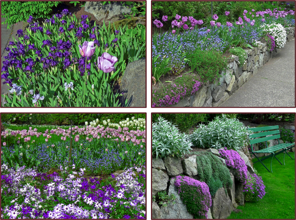
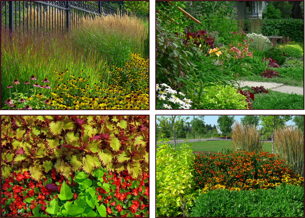
Where’s Your Sit Spot?

They say sitting is the new smoking – which is to say, too much sitting is really bad for your health. Indeed recent research suggests it contributes to any number of illnesses. I’m pretty sure I don’t have any of these, but I can still attest to the perils of sitting too long. During gardening season, the long hours I spend sitting at my computer are offset by as many hours spent on my feet (or my knees) – digging and planting, pruning, deadheading, weeding and mulching. During the off season however, in addition to my design work I often write and/or lecture, so the many hours spent sitting at my computer become many more hours, especially when I have several deadlines to meet at once. It is then that my body rebels. I get sore and stiff – not from lifting and bending, squatting and kneeling – but from sitting.

As I write this I am nursing a back injury so painful I can hardly move. Did I hurt myself skiing or snowshoeing you ask? No I did not. Did I slip on the ice while out for a brisk walk? No I did not. Did it happen while vacuuming or moving furniture? No it did not. It happened while leaning over to put coffee grinds in the compost. In fact I suspect the very reason it happened is because I haven’t been lifting and bending, and squatting and kneeling. I have been sitting.

Ironic then, that the subject of this post is where, and on what, to sit in the garden! If you are reading this you are probably a gardener – during the growing season you do plenty of lifting and bending, squatting and kneeling. It’s okay to sit then – indeed you deserve to sit after long hours working in the hot sun.

So where’s the sweet spot for your sit spot? That depends on what you’ll be doing while you sit. Will you be eating dinner? Enjoying wine and canapés with a few friends? Or are you still working – sharpening your shears, mixing fertilizer or shelling peas? Or maybe you just want a place from which to admire your handiwork.

A few years ago I was conducting a pre-design interview with a new client. This fellow had been gardening for many years and wanted a couple of his own ideas incorporated into the design. I didn’t have a problem with this, but I did question one of his ideas. “I want to put a bench right there. Wouldn’t that look great?” he enthused, pointing to a spot a few meters away. “Hmmmm,” I answered noncommittally. All I could see was what he would be looking at from said bench – the large barren wall of his large home. I brought this to his attention. “I never thought of that,” he replied. We scrapped the bench idea and chose instead to put a small water feature in its place. Remember fellow gardeners, a sitting area isn’t just a pretty picture; it’s a destination – a place you want to go to and actually sit. So where it is situated is important; unless it’s only a place of work, it should offer a pleasing view. Even then, you might as well enjoy yourself while you shell the peas and shake the dirt off the potatoes.

Most important though, is functionality. To quote the late Steve Jobs, “It’s not just what it looks like….design is how it works.” In other words, wherever you’re going to situate that sit spot in your garden, and whatever it looks like, make sure it works for you. Some things to consider….

  • Is there a smelly compost or dog run nearby? If so, maybe don’t sit there.
  • Is there noise from a road or playground that would intrude on your quiet space?
  • If your sit spot is a work space, do you need a water faucet close by?
  • A dining area for enjoying full meals requires a site large enough for a patio table and chairs (trying to cut steak and eat corn-on-the-cob while sitting on an Adirondack chair isn’t very practical).
  • Do you want a place to have a siesta in the sun, or some shut-eye in the shade?
  • How much privacy will you want?
  • Think about the comfort of what you are sitting on – do you need cushions or some kind of back support?

Of course there are still aesthetic considerations. The style of your seating should fit with the design as a whole – both proportionately and thematically. Colours and materials should be chosen accordingly. And don’t feel you have to stop at one seating area – even smallish properties can often accommodate more than one sit spot. Perhaps an area to sit and dine, and another quiet spot to sit and read.

Need some inspiration? Have a look….

A weathered wooden patio set fits perfectly with the rough-hewn posts and beams of the pergola – and what a view! Kraze Legz Winery, Kaleden. Photo: Sue Gaviller

This client’s yard backs onto a natural area – the patio was thus situated to view both the garden and the aspen grove beyond the fence. Photo: Sue Gaviller

The warm brown colour of the furniture works well with the warm tan shades of the flagstone patio. Two dwarf reblooming Syringa ‘Sugar Plum Fairy’ flank the seating area providing heavenly aroma – twice a year! Photo Sue Gaviller

The shape and colour of this modern patio furniture is a good choice for the contemporary rectilinear design lines of the landscape. Photo: Pexels

For small spaces, bistro sets are a good alternative to full size patio furniture; appropriate for meals (for 2 people) or for coffee and cookies. This homeowner has created privacy and an attractive view in a front yard setting by enclosing it with plantings. Photo: Sue Gaviller

When I designed this small seating area for a client, I didn’t know I’d end up sitting there frequently with her – sipping mojitos, Moscow mules, or our favourite; vodka tonics. It’s a cool, shady spot to relax on a hot summer day, with a spectacular view of the now-mature gardens. Photo: Sue Gaviller

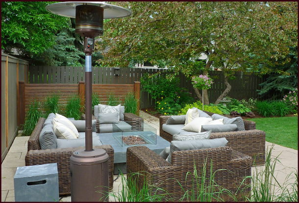
These clients wanted a large conversation set to entertain friends around a gas fire table – the space had to be designed to accommodate large chunky furniture while still allowing access to the hot tub (behind the screen). Photo: Sue Gaviller

A bench under a vine-covered pergola offers respite from the hot California sun. Chateau St. Jean winery, Sonoma County. Photo: Sue Gaviller

A cozy spot to sit, sheltered by 3 mature Cologreen junipers and surrounded by flowering shrubs and perennials. CNIB Gardens, Calgary. Photo: Sue Gaviller

A faded wooden bench surrounded by ferns and fuchsias, fits the rustic exterior of the building.
Photo: Sue Gaviller

A bench outside the tasting room at La Frenz winery in Penticton is a feast for the eyes – a view of the pretty scented gardens up close and a view of the hills beyond. Photo: Sue Gaviller

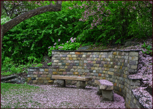
In the Shade of the Old Apple Tree – crabapple blossoms carpet the ground around two stone benches at Reader Rock Garden, Calgary. Photo: Sue Gaviller

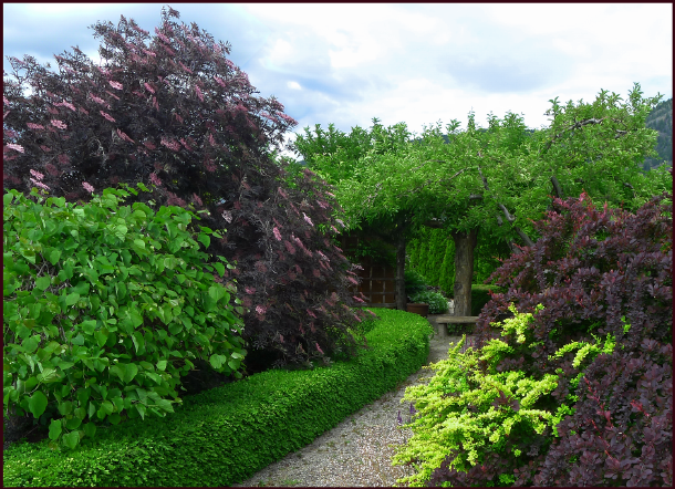
A gravel pathway leads to a stone bench beneath a fruit tree. Bylands Nursery, West Kelowna.
Photo: Sue Gaviller

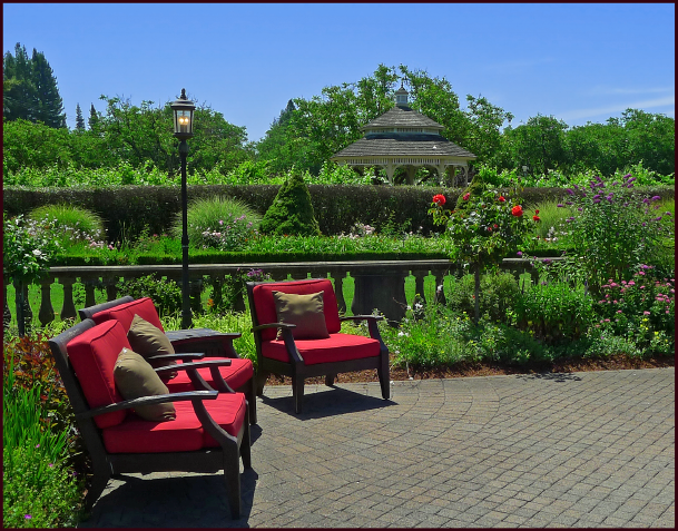
A sunny spot from which to view the beautiful gardens at Kendall Jackson winery. Photo: Sue Gaviller

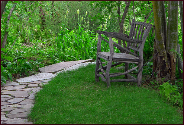
An old wooden chair, probably an original fixture, provides a moment of rest in the deep shade at Reader Rock Gardens, Calgary. Photo: Sue Gaviller

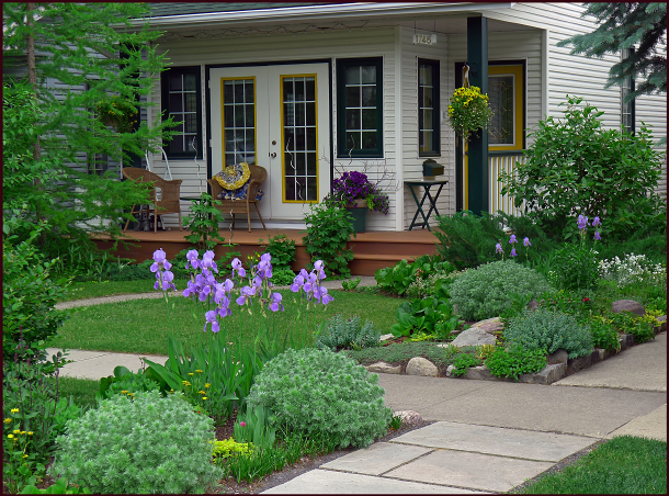
Covered verandas are a great place to sit and watch the world go by. This homeowner has beautified the sight-line with effective positioning of the gardens, including the use of the boulevard.
Photo: Sue Gaviller

Keep in mind there are dimensional recommendations for specific spaces. For example, allow about 2½ linear feet per person for sitting space – this provides ample elbow room. Provide at least 3 feet of clearance around a patio table so guests can comfortably push their chairs out when dinner is over. Leave 1 – 1½ feet between chairs or couches and the coffee table. This makes for much easier navigation when you have a tray of drinks and appies – spilled drinks, bruised shins, or stubbed toes just ruin the party. And allow for a little room around the outside of a conversation set too – at least a foot, more if access around the furniture is needed.

Regardless of shape, 3 feet or more of clearance around the patio table means comfortable movement when sitting down to dinner, or getting up afterwards. Graphics: Sue Gaviller

Left: A large conversation set requires ample room to move in and around comfortably.
Right: A bistro set, though small, still needs enough room to be functional – 2½ feet for the table, 2½ feet for each chair space and at least a foot all the way around.
Graphics: Sue Gaviller

My sister’s dog Java, as a puppy, and still now as an old dog, thinks chairs are exclusively for his benefit. Of course he doesn’t care a whit about function or aesthetics. Photo: Cathy Gaviller

Well folks hope y’all enjoyed today’s post it is the first in more than a year, and what I hope is the first in a series on garden elements; fences and gates, pathways, and other elements that help to personalize our gardens.

Till then,
Sue


Colouring Your Garden – Part 9: Colour Schemes

Over my last 8 posts I have looked at colour theory in considerable depth, focussing of course on its application in  garden design. One of the most powerful ways we can utilize this knowledge is by experimenting with colour schemes in our gardens.

Many gardeners balk at the idea of purposefully employing a garden colour scheme, assuming it’s just one more rule to follow, or at the very least, too restrictive.

Utilizing a colour scheme doesn’t have to be restrictive though, if we think rather in terms of a hue scheme. Looking to the Munsell Book of Colour, we find that for each hue, there are many permutations of value and saturation all arranged on an individual page. So if we want to work with a scheme which includes red, we have a whole hue page to choose from  just for red! The other hues in our scheme afford us the same broad selection of colours. A little less restrictive than you thought, right?

Colour Schemes

A colour scheme is a planned or logical combination of hues on a colour wheel. As we discussed in earlier posts, there is more than one colour wheel, but you’ll probably find the artist’s colour wheel to be the most user-friendly. You can then refer to Munsell hue pages (or reasonable facsimile) for guidance with the various colours that fall within that hue. I do sometimes utilize Munsell’s hue circle to work out colour schemes, but they aren’t always as straightforward. For ease of use then, I am mixing models here.

So how does one go about choosing a colour scheme for the garden? If your house or other backdrop is a particularly strong chromatic colour, then it’s most effective if you include that colour in your scheme. If on the other hand, your house is more neutral, then start with a colour you really like and build from there.

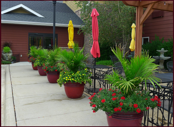
The colours used in this restaurant patio planting echo the muted red and yellow hues of the siding on the building. Photo: Sue Gaviller

Keep in mind that most plants – both in your garden and in the surrounding landscape – have green foliage, hence green will always be present. Since this hue is so much a part of the outside world, the eye tends to ignore it, and will instead focus on other colours. Green is therefore experienced mostly as a backdrop for your garden composition. But it can certainly be one of the hues in your colour scheme too.

You can vary the colour schemes from one part of the garden to another (particularly if you have a large canvas), and the scheme can also change or evolve as the season progresses. For example a garden that has a yellow-green and red-violet combination in the spring might add other colours later in the season, but those hues must always be part of the scheme.

Realistically speaking, some scenarios don’t lend themselves to formal colour schemes (if only for the reason that the proprietor of a well established garden may not want to part with anything – just to incorporate a colour scheme). One can still play with colour schemes though; containers are a great way to experiment without committing to a particular composition.

So let’s have a look at what we can construct using the artist’s colour wheel and some Munsell hue pages.

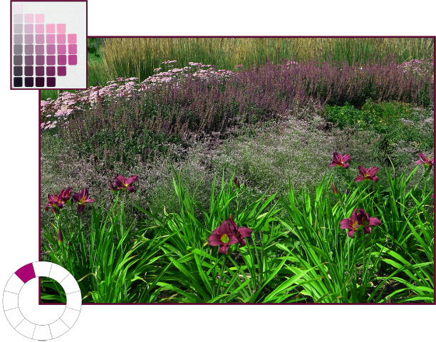
Monochromatic colour schemes use various values and degrees of saturation of a single hue. Working with a single hue creates naturally harmonious colour compositions.

Monochromatic colour scheme using the hue of red-violet (5RP). Photo and graphics: Sue Gaviller

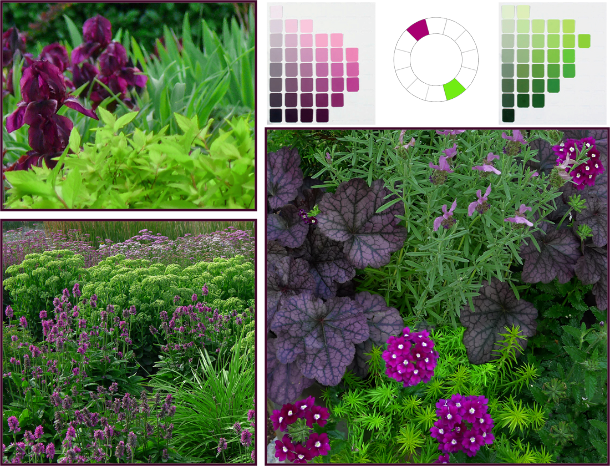
Complementary colour schemes contain two hues that are opposite each other on the colour wheel.

This is a high contrast colour combo, which means it can be loud and demand attention. So you’ll want to tame it by including numerous value/saturation variations of the pure hues – and of course lots of green.

Complementary Colour Scheme: Red-violet (5RP) and yellow-green (5GY). Photos: Top left – Pat Gaviller. Bottom and right – Sue Gaviller

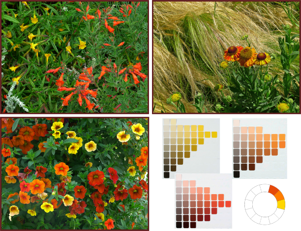
Analogous colour schemes use two or three hues that are next to each other on the colour wheel.

Although this is a low contrast combination, analogous hues still benefit from utilizing variations in saturation and value of the chosen hues, thus introducing more variety. Remember if you choose warm hues, there will need to be significant green (foliage) in your composition to provide the necessary cool/warm balance.

analagous-r-o-o-y-o-resize

Analogous Colour Scheme: red-orange (10R), orange (5YR) and yellow-orange (2.5Y). Photos and graphics: Sue Gaviller

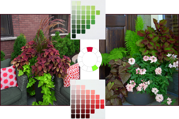
Counterpoint schemes consist of a hue and one of the hues on either side of its complement.

This too is a dynamic colour combo, but somewhat less so than complementary compositions – many people prefer this colour duo as it generates less visual conflict. Again the use of variations in value and saturation of the two hues will create both unity and variety.

Photos: Sue Gaviller

Counterpoint Colour Scheme: red (5R) and yellow-green (5GY). Photos and graphics: Sue Gaviller

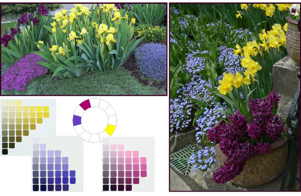
Split-complementary schemes are three-hue combos that use one hue and the two hues on either side of its complement.

The split-complementary colour combo has all the dynamism of complementary and counterpoint, with the balancing addition of two hues that are closer together. A garden may transition from the aforementioned counterpoint theme to split-complementary as the growing season progresses and more plants (thus more colours) take the stage.

Split Complementary colour scheme - yellow, blue-violet and red-violet. Photos: Top left: Cathy Gaviller. Right: Jane Reksten

Split Complementary colour scheme: yellow (5Y), blue-violet (7.5PB) and red-violet (5RP). Photos: Top left – Cathy Gaviller. Right – Jane Reksten. Graphics: Sue Gaviller

Analogous-complementary schemes use two adjacent hues and the complement of one of those hues.

Similar in effect to split-complementary, analogous-complementary schemes are especially soothing if the analogous constituents are cool hues.

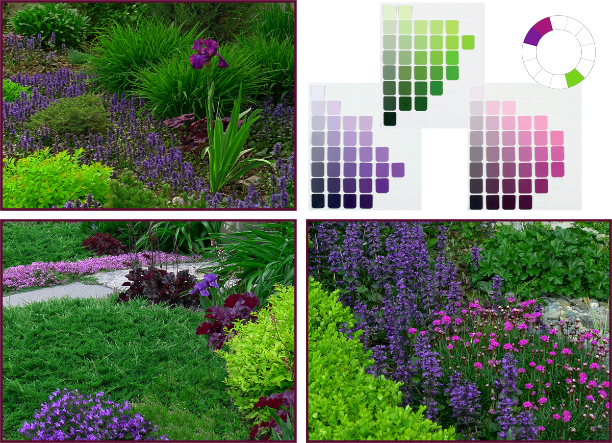
Analogous-Complementary Colour Scheme: violet (5P), red-violet (5RP) and yellow-green (5YG). Photos: Sue Gaviller

Analogous-complementary Colour Scheme: violet (5P), red-violet (5RP) and yellow-green (5GY). Photos: Top left – Pat Gaviller. Bottom left/right – Sue Gaviller. Graphics: Sue Gaviller

Double-complementary schemes use two adjacent colors and the complements of both of those hues.

Graphics: Sue Gaviller

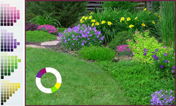
This four-hue scheme brings both drama (from opposites) and subtlety (from analogues) to a garden composition, and can be a natural seasonal transition from analogous-complementary as more plants come into bloom.

Double-complementary Colour Scheme: violet (5P), red-violet (5RP), yellow (5Y) and yellow-green (5GY). Photo and graphics: Sue Gaviller

Diads are colour schemes that consist of two hues located two spaces apart on the colour wheel.

Though this colour duo provides more contrast than an analogous scheme, it is still a low-contrast theme and less dramatic than higher contrast combinations. More contrast can be introduced if one of the hues is warm and one is cool, for example red and purple.

Diadic Colour Scheme: red (5R) and violet (5P). Photos: top – Pat Gaviller. Bottom – Sue Gaviller. Graphics: Sue Gaviller

Triads use three hues that are equally spaced around the colour wheel.

Triadic schemes offer interesting colour combinations and are inherently balanced because the hues are all equidistant from each other.

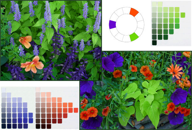
Triadic Colour Scheme: Violet-blue (7.5PB), orange-red (10R), and yellow-green (5GY). Photos: Sue Gaviller

Triadic Colour Scheme: blue-violet (7.5PB), orange-red (10R), and yellow-green (5GY). Photos and graphics: Sue Gaviller

Tetrads are colour schemes using four hues that are consistently spaced on the colour wheel.

  • Square tetrad – 4 hues touched by the four corners of a square placed in the centre of the colour wheel.
  • Rectangular tetrad – 4 hues touched by the four corners of a rectangle placed in the centre of the colour wheel

Four-hue schemes provide considerable colour choice thus can be quite vibrant, especially when hues are at full saturation. They can be toned down somewhat with the addition of less saturated versions of the pure hues.

Tetradic Colour Scheme: red-violet (5RP), orange (5R), yellow-green (5GY) and blue (5B). Photos and graphics: Sue Gaviller

You can see that with all the variations in value and saturation for each hue, many different but related colours are available to you – even when using only a couple of hues. Unfortunately, most of us don’t have access to the Munsell Book of Color, but there are numerous apps and online tools that will provide more than enough visual info for application in the garden.

I highly recommend the Virtual Munsell Color Wheel. It’s very easy to use – just bear in mind that it includes all the intermediate hues that lie between the basic hues (totaling 40 hues), which you may find overwhelming. The digital ‘hue pages’ aren’t identical to those in the Munsell Book of Colour either (copyright and such). You’ll also note that, compared to the traditional RYB colour wheel, Munsell’s blue (5B) appears more green and his purple-blue (5PB) more blue – this is because he divided the circular colour spectrum differently. I wouldn’t get too carried away with detail or accuracy though. Just choose your colour scheme using the artist’s colour wheel and find the hues that most closely approximate them on the Virtual Wheel.

Finding foliage or flowers in exactly the right colour may be next to impossible anyway. But don’t get discouraged. Remember green foliage abounds in the garden, and with all that ‘green between’, you’ll find that almost-the-right-colour will be close enough.

‘Til next time,
Sue


Colouring Your Garden, Part 7 – You Can’t Believe Everything You See

It’s the last week of March and it’s again been more than five months since I last posted to this blog. I just don’t know where the time goes. I’m as busy as I’ve ever been, and yet I feel like I’m accomplishing less. Perhaps it’s a function of age – everything seems to take longer the older I get. Or maybe it’s a function of the increasingly higher standards I set for myself. For example, last month I gave two  lectures to the current class of Master Gardener students. One of these was a full day design presentation – a talk I’d given (in some form or another) dozens of times and to a variety of audiences. It gets tweaked each time – compressed or expanded depending on the audience, but this time I ended up rebuilding the whole damn thing! Why? Well, as I reviewed my PowerPoint slides I found myself scoffing at everything; the photos looked unprofessional, the font was dated, the animation amateurish… and so a ‘tweak’ became a major reconstruction.

I was relatively happy with the finished product, but I don’t know if it was worth the several all-nighters I pulled to get it done (staying up all night was way easier, and waaaay more fun, in my twenties than in my fifties). And in the end, did I actually impart any more, or any better information to the students? Who knows? I do know though, that perfectionism isn’t always in one’s best interest. Because now I am sick. Not deathly ill, but miserable enough that I don’t feel like doing much of anything. So loyal readers, it seems my misfortune is your good fortune since the one thing I do feel up to, is writing. In fact it just might make me feel better.

If you remember my last post (it was so long ago, I barely remember) we examined the relationship between colour and various aspects of human perception – more specifically, how the former can impact the latter. Continuing with this exploration then, let’s look at some of the ways our visual perception can in turn affect and distort colour.

Understanding various visual mechanisms – ways our vision adapts and adjusts – is a key piece of the garden colour puzzle. For the most part, our eyes successfully adapt to ever-changing visual data, allowing us to maintain a stable and consistent interpretation of the world around us. We know that an object appearing smaller from across a room is the same size regardless of where we view it from, or that the darker colour created by a shadow doesn’t change the actual colour of an object. We know these things without even thinking about them – unless we are trying to draw or paint said objects. Sometimes though, this ‘constancy apparatus’ fails and our eyes make erroneous adjustments. Four such adjustments are commonly experienced; Simultaneous Contrast, Successive Contrast, Colour Assimilation and Colour Separation. Today we’ll look at the first two of these visual phenomena.

Simultaneous Contrast

Adjacent colours interact with one another other in a most curious way – actually changing the appearance of each other; an effect known as Simultaneous Contrast. Of course this phenomenon isn’t due to any magical properties the colours possess; rather the adjustments are taking place within our own visual system as it attempts to decipher and differentiate that which it sees by accentuating colour differences. All three colour attributes can be influenced by neighbouring colours, the effect being most noticeable when one colour is completely surrounded by another.

sc - colour wheel

Simultaneous Contrast of Hue. An identical magenta-coloured circle is placed all around the Artist’s Wheel illustrating how a hue can differ dramatically in appearance depending on the background hue. Graphics: Sue Gaviller

So what is actually happening here? Are our eyes just playing tricks on us? Well yes in fact they are. As I mentioned before, one of the ways our eyes recognize and discriminate between adjacent colours is by accentuating their differences, and in so doing, imbues each colour with traits of the other colour’s opposite. Yikes, that was a mouthful wasn’t it? Maybe I can better explain with some examples.

In the first example below, a magenta-coloured square is surrounded by a green square on the left and an orange square on the right – we can all agree it doesn’t look like the same magenta, right? (I assure you it is though). Our eyes acknowledge the green then ‘over-differentiate’ and induce green’s opposite hue, red, which then mixes with the magenta, making it appear warmer – hot pink even. The orange square on the other hand stimulates our eyes to add its opposite, blue, thus creating a cooler looking purple-pink. Another way to think of it is that colours will shift in hue, value and saturation away from those of the surrounding colour. Because the magenta square is smaller and completely enveloped in another colour it has little effect on those surrounding colours.

Graphics: Sue Gaviller

Simultaneous Contrast of Hue – note how the hue of the smaller square appears different depending on the background colour. Graphics: Sue Gaviller.

The next example shows Simultaneous Contrast as it relates to Value alone. On the left a medium gray square is enclosed on a background of darker charcoal gray, and on the right the same medium gray is surrounded by lighter gray. Again our vision discriminates between the darker gray and the medium gray by overstating the lightness of the medium gray (left). Likewise our eyes discriminate between the lighter gray and the medium gray by overstating the darkness of the medium gray (right).

Graphics: Sue Gaviller

Simultaneous Contrast of Value – a medium gray square looks markedly different surrounded by darker gray than by the lighter gray. Graphics: Sue Gaviller

In the third example the smaller square is a red of medium to low saturation, but its saturation seems to strengthen as its background colour weakens.

Graphics: Sue Gaviller

Simultaneous Contrast of Chroma/Saturation. All of the above squares are the same hue (5R or Red) but vary in saturation (colour content). The smaller square is weakly saturated but appears even less so in contrast to the fully saturated square on the left. However when contrasted with the almost-gray square on the right, it appears to have much richer colour content.  Graphics: Sue Gaviller

It is difficult to illustrate this effect with garden photographs – photos can deceive, particularly where colour is concerned. Perceived hue differences (or lack thereof) could thus be the fault of the photo and not a real representation of what is happening in the garden. And the degree to which Simultaneous Contrast is seen in the garden is less than one might think – there are many other factors at play, for example; weather changes, seasonal changes, daily sun movements, and even the amount of particulate matter in the air, can all affect lighting conditions, which in turn affect the colours we observe. Colour is reflected from other objects and surfaces too, thus altering hue perception, and the constant presence of unifying green can mitigate various colour illusions.

Nevertheless we do witness Simultaneous Contrast in our gardens and landscapes, though it is more subtle than squares of colour on a computer monitor. The effect, especially where hue is concerned, is most noticeable when two adjacent hues present as solid blocks of uninterrupted colour. Of course plants don’t always present this way since foliage, flower petals, stamens etc. are often different colours, which means colours will intermingle (this can produce yet another effect, one I will look at in my next post). Tertiary or intermediate colours (red-violet, blue-green, etc.) will be influenced to a greater degree by their surroundings than basic or primary hues because their make-up is more complex.

sc - liatris resize 3

Liatris spicata is a medium to high value red-violet – when contrasted with bright yellow Heliopsis helianthoides, it appears slightly blue-ish. However, next to Helictotrichon sempervirens, it looks somewhat pinker. Photos: Sue Gaviller

sc - hue juniper 3

Juniperus horizontalis ‘Blue Chip’ is a widely spreading evergreen groundcover – note how its blue-green hue shifts from slightly mauve-ish on the left to dull green on the right. Photo: Sue Gaviller

Photos: Sue Gaviller

Echinops ritro ‘Veitch’s Blue’ (left) looks a rich saturated purple-blue when paired with very desaturated Eryngium (right). Photos: Sue Gaviller

Photos: Sue Gaviller

The same Echinops would appear somewhat less saturated if situated beside the very rich-hued Gentian on the right Photos: Sue Gaviller

Simultaneous Contrast is the reason two complementary colours, when used together, create such a forceful pairing – they increase the intensity of each other. Think about it; each colour bestows upon the other, the traits of its own opposite – which is the other colour. A double dose of each!

sc - complementary colours 2 crop

This complementary pairing of red-violet Iris germanica against a backdrop of yellow-green Spiraea japonica ‘Goldmound’ creates an intense vignette. Photo: Sue Gaviller

Photo: Sue Gaviller

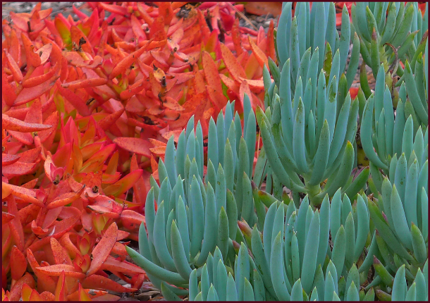
Red-orange and blue-green succulents bounce dazzling colour off each other because they are a complementary pairing. Photo: Sue Gaviller

Successive Contrast

Another visual effect related to Simultaneous Contrast is Successive Contrast – the best way to demonstrate this effect is to try the following: stare at the coloured circle below for 30 to 60 seconds, then immediately turn your gaze to a blank piece of white paper. What do you see? If you don’t see anything, try again. And if you have any serious eye condition or disease, you might want to avoid this exercise altogether.

green circle 2


When you look at the white paper after staring at the green circle,  you should see a circle of the same size in a light reddish pink colour – this is called an afterimage. Let’s try another one. Stare at the orange circle below for half-a-minute or so then look at the white piece of paper again.

orange circle


So what colour did y’all see this time? Light bluish right? We see this afterimage because the eye’s receptors for a particular color become desensitized to it, or more accurately, the receptors for the other colours become more sensitive – hence we see the perceptual complement of the colour we’ve just been staring at. The afterimage will dissipate shortly, its duration proportionate to the length of time you viewed the original colour and the intensity (saturation) of that colour.

Now try looking at each of the circles again, but this time when you avert your gaze, instead of focusing on the white paper, look towards a different coloured background. What do you notice? The colour of the afterimage should now blend with the new colour you are looking at. You can see where this might come into play in the garden – look at the following garden image for at least 30 seconds then at the white paper again. Do you experience the same effect?

Photo: Sue Gaviller

Photo: Sue Gaviller

How about this one?

Photo: Sue Gaviller

Photo: Sue Gaviller

The two previous images should produce afterimages the same size and shape as the photo images, in colours opposite to the predominant colour in the photos. Now see what happens when you look at one of them for a bit, then the other right after – how do they affect each other. What about the next image – how does staring at each of the previous two photos affect the way you see the colour of the Rudbeckia in the following photo?

Photo: Pat Gaviller

Photo: Pat Gaviller

The effect here will likely be muted – in fact you may have to do this exercise a few times before you recognize it. And because the effect is fleeting, its implications in the garden environs are limited. Large swaths of colour are more likely to produce afterimage effect because you will look at them for longer – all in all the experience of afterimages distorting the visual experience of successive plant colours, will at most be intermittent.

However, learning to recognize this phenomenon, as well as Simultaneous Contrast, affords the gardener one more advantage in working with colour in the garden. We’ll look at two more interesting colour effects in my next post.

Well whaddya know? I feel much better. Now if only pretty plants and pretty colours could heal our hurting world….

’Til next time,
Sue


Colouring Your Garden – Part 6; Putting Colour to Work

Greetings loyal readers. It seems I haven’t published a post in more than 5 months. I guess time flies when you’re having fun… or when you’re really busy. And a very busy summer it has been, both personally and professionally. Thanks to all who keep visiting here despite the lack of new content.

So to get back to where we were a loooong time ago, let’s continue with our study of colour in the garden. It’s time to take all that technical stuff about Hue, Value & Saturation and put it to work for you.

The interaction between colour and human perception is two-way – colour can influence perception, and perception can influence how we see colour. Today we’ll look at a couple of ways colour can affect perception and how this might be utilized in our gardens.

According to Encarta Dictionary, the psychological definition of perception is “any neurological process of acquiring and mentally interpreting information from the senses.” It is the interpreting of this information that makes colour a useful tool.

Temperature Perception

Looking out my window one morning last week, I saw blue-grey haze. Acrid smoke from distant forest fires filled the air, prompting air quality advisories and recommending folks stay inside. When I did venture outside briefly, I was surprised at how warm it was – the smoky, blue-grey light made it appear much cooler. Later that same day, as increasingly more smoke particles refracted what light could pierce the smoke, a reddish-orange light was cast over everything – I stepped outside again, this time anticipating oppressive heat, but it wasn’t as warm as I’d expected.

Both scenarios came about because my brain incorrectly interpreted the information my eyes had gathered – I expected coolness when the light wavelengths were in a cooler range, and warmth when longer wavelengths prevailed. Indeed we may actually feel cooler in the presence of cool colours, and warmer in the presence of warm colours. Those of you who live in colder climates have no doubt had the experience of looking out the window on a frigid winter day and feeling warmed to the core at the sight of a bright yellow sun.

This phenomenon can be exploited in the garden – perhaps you look out your window on a too-cool spring day and your whole being longs for the warmth of summer. Your eyes look toward your garden and espy drifts of orange tulips, yellow primrose and warm pink azalea – and you feel instantly warm. Or maybe you are sitting in your garden on a smoldering hot summer afternoon and note the swaths of soft mauve Russian sage, cool blue Delphinium and violet-blue globe thistle – how cool it feels.

warm spring colours

Warm hues make cool spring days feel balmy and bright.
Top
– Photos: Pat Gaviller. Bottom – Photos: Sue Gaviller

cool summer colours

Summertime blues provide cool respite from the heat. Photos: Sue Gaviller

On the other hand, maybe you like the coolness of spring and choose to accentuate this with the use of cool springtime hues – bright blue forget-me-nots, lilac-pink rock cress, mauve tulips and rich purple dwarf iris. And for those who like it hot, summer’s heat can be turned up a notch by using plants that bloom warm colours in midsummer – bright golden Rudbeckia, mahogany-red Helenium, warm pink Echinacea, and a sprinkling of hot lime-green foliage. Remember though, that abundant warm colours in the garden still require lots of green – enough to balance and counteract the bright reds, oranges and yellows.

cool spring colours 4 resize

Cool spring colours highlight cool spring weather. Photos: Sue Gaviller

warm summer colours -resize

The heat is on – warm colours sizzle in the summer heat. Photos: Sue Gaviller

Depth/Distance Perception

Visual design often involves a bit of trickery – ways of deceiving the eye to see something that isn’t altogether accurate. For example, in the urban setting many of us reside, yards are often small and disproportionately shaped. The designer’s challenge is to create a sense of spaciousness and pleasing proportion. Understanding the nuances of colour and using it effectively is one way we can achieve this.

If you recall from earlier posts in this series, warm colours appear closer than they really are, as do high value colours and those that are highly saturated. Likewise, cool colours, as well as those of low value and/or low saturation, appear further away. This optical illusion can be used to elongate a short flat space or shorten a long narrow space.

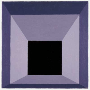
Since all three colour attributes come into play here, it isn’t always possible to predict how the eye will perceive a particular colour. For example, cool colours tend to recede and high value colours appear to advance – so a pastel mauve might do either depending on the colours that surround it. In the image below – one of many Joseph Alber’s paintings paying homage to ‘the square’ – the black central area at first appears to recede. The mauve area however, appears to alternately approach and retreat, thus bringing the black square forward then back.

For any given colour to provide the desired depth illusion, you must consider its context, i.e. its relationship to other nearby colours. A warm hue will appear closer to the viewer when contrasted with a cool hue of equal or lower value and saturation, but further away when contrasted with another warm hue of greater saturation and/or higher value. And although cool colours usually appear to recede, a cool colour that is high value will advance if contrasted with a low value colour of the same hue and equal or less saturation.

squares resize

The central hot pink square appears to advance toward us when set against the cooler, darker and less saturated purple square, whereas it recedes when contrasted with the warmer, lighter and more saturated orange. It also appears to be a different colour – a phenomenon I’ll discuss in my next post. Graphics: Sue Gaviller

Photo: Sue Gaviller

Lilium ‘Loretto’ and Berberis thunbergii both present very warm colouring. However, the lower value and weaker saturation of the barberry make it appear to recede, in contrast to the higher value and richer saturation of the lily, which appears to ‘pop right out’ at the camera. Photo: Sue Gaviller

Photo and graphics: Sue Gaviller

While cool colours often appear to recede from the observer, this cool mauve does the opposite when seen against a darker, less saturated version of the same hue. Note how the high-value, cool coloured tulips in the foreground jump out at us visually and the dark ones retreat further into the background. Photo and graphics: Sue Gaviller

So how do we use all of this to our benefit in the garden? If the colour of an object causes it to appear further away, placing this colour at the far end of a short flat space might serve to visually elongate the space – additionally, by contrasting this with the use of advancing colours on the side borders, the disproportionate width may appear compressed. Likewise, a long narrow space can be shortened and widened by placing advancing colours at the far end and receding colours on the lateral boundaries. The effect is subtle – colour is by no means the primary cue whereby we perceive depth – but when combined with other forms of ‘forced perspective’, a strong impression of distance or closeness can be implied.

In this well done rectilinear landscape, the designer has created a space that is longer in one direction than the other. Photo: Pat Gaviller

orange daylilies resize

A photoshopped version of the same photo – note the wall of warm, high value, fully saturated orange daylilies appears to advance, thus shortening the space. The junipers, now slightly darker, appear to recede thus widening the space somewhat. Photo: Pat Gaviller. Retouch: Sue Gaviller

long narrow yard reversed resize

Viewing the two images side by side, the effect is more obvious, albeit still subtle.

Do You See What I See?

The perception that some colours advance and others recede, isn’t an experience shared by everyone, particularly the warm vs. cool dichotomy – indeed there are those who don’t experience this phenomenon at all, as well as those who actually see the reverse of what most people see. It can also vary within the same individual, dependent on numerous factors; for example, the effect is much less apparent if the two contrasting colours (warm and cool) are viewed against a very light background. Age too, can dictate how colour affects our perception.

It’s all about the physics of vision. Yawn. Physics – I had the dullest, most boring, uninspiring, high school physics teacher ever. Last period of the day. Double yawn. But I digress. To put it in simplest terms, it has to do with light rays of differing wavelengths and where they refract and converge on our retinas.

Regardless, one thing is certain; colour – with its countless combinations of warm or cool, light or dark, and muted or vibrant – affects us all in subtle ways we aren’t even aware of. In my next post I’ll look at how our perception, in turn, affects the way we see colour.

’Til then,
Sue

Colouring Your Garden – Part 3; Value Added

“Nowhere in nature can you find purer color than sunlight passing through the petal of a flower.”     ~ Larry K. Stephenson, Artist ~

Sunlit petals – the imagery evokes such warmth. Indeed there would be no flower petals without sunlight – plants require light to bloom, and light gives the flower (or any object) its colour.  In my last post I discussed the attribute of Hue which results from the particular wavelength of that light. In this post I’ll look at Value, which results from the amount of light reflected back from an object.

In simpler terms, Value is how light or dark a colour is. If you recall from Part 1 of this series, the value scale is located along the central vertical axis of the Munsell 3D Colour Space. Black is at the bottom of the scale and since it reflects no light, has a value of zero. White, located at the top of the value scale, has the highest value (10) because it reflects the most light – so the darker the colour, the lower the value. Here we start to see colour relationships within a single hue. For instance, maroon, red and pink are all the same hue but at different values, and mauve is the same hue as purple but at a higher value.

Photo: Sue Gaviller

Prunus cistena and Potentilla  ‘Pink Beauty’ displaying light, medium and dark values of the same hue. Photo: Sue Gaviller

Munsell value scale resample

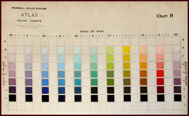
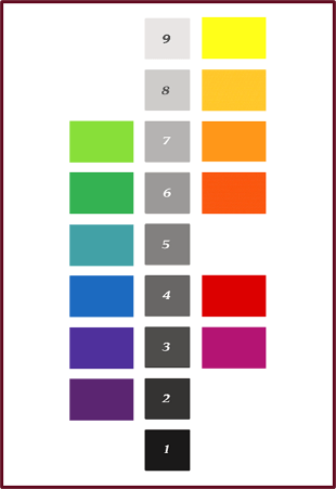
An image from Munsell’s Colour Atlas depicting the basic hues at values from 2 through 8.

High Value Colours

Colours that have high value, pastels for example, are highly visible because they reflect so much light. Like warm hues, they appear to advance towards the observer, thus seem closer than they really are. For these reasons, plants with pastel colouring provide real ‘pop’ in the garden. And of course for these same reasons, overuse of light bright colours can fatigue the eye.

Graphics and photos: Sue Gaviller

High Value Colours. Graphics and photos: Sue Gaviller

High value colours are especially noticeable in shady locations, at twilight, or against a dark background. On the contrary, these colours get washed out in strong midday sun or near highly reflective surfaces such as concrete or light coloured stone.

Left: High value colours, like the pastel mauve of these Campanula, appear washed out under strong sun. Right: These same plants seem to glow in the fading light of dusk. Photos: Cathy Gaviller.

Left: High value colours, like the pastel mauve of Campanula, appear washed out under strong sun. Right: These same plants seem to glow in the fading light of dusk. Photos: Cathy Gaviller.

This washout effect can be minimized with the abundant use of dark green – its lower value helps to absorb reflected light. In fact pastel-coloured plants are at their best when seen against a backdrop of lush green foliage.

Photo: Sue Gaviller

Panicles of pastel mauve Syringa blossoms are a real standout against dark evergreen foliage.
Photo: Sue Gaviller

pastel rose - resample 2

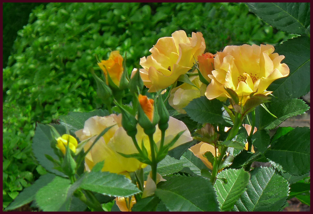
Soft lemon-peach blooms of Rosa ‘Morden Sunrise’ are a striking contrast to the rich green surrounding foliage. Photo: Sue Gaviller

Photo: Pat Gaviller

Variegated foliage. Photo: Pat Gaviller

Plants that contain two colours of contrasting value, variegated green and white foliage for example, will appear pastel-coloured when seen from a distance – particularly if the variegations are small. This is called assimilation – the eye optically mixes the colours, averaging the high value of the white and the lower value of the green to make a lighter green. The smaller the variegation the more evident is this effect. In the photo on the right, assimilation is most apparent with the Lamiastrum in the centre – the variegation is barely evident and the leaves appear silvery pastel green. The Hosta in the foreground exhibits no assimilation at all and the Euonymus in the background, only slightly.

Low Value Colours

Low value colours reflect less light than their high value counterparts so are less visible in the landscape, especially in shade, at dusk, or against a dark background.

Low Value Colours. Photos and graphics: Sue Gaviller

Low Value Colours. Photos and graphics: Sue Gaviller

When viewed from a distance, dark-coloured garden elements lose their visual impact and recede into the background, an effect that is compounded by the optical illusion of appearing further away than they actually are. While low value foliage plants (especially dark green) make good garden backdrop, any dark feature you want to draw attention to is best situated close to the viewer, where the deep opulent colour can be appreciated.

barberry hedgebarberry hedge 2

Left: The low value red of this barberry hedge is rich and vibrant up close. Right: When viewed from further away the dark colour has a subtler effect, becoming part of the background. Photos: Sue Gaviller

Dark-coloured plants look exceptional against light-coloured stone, concrete, stucco, etc. and because they absorb light reflected from these surfaces, they also help to reduce glare and the washout effect of midday sun.

purple verbena resample

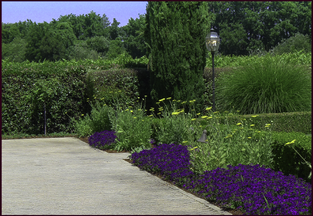
Low value colour from dark green hedging and dark purple Verbena, provides a good foil for the higher value of the tile-stone promenade. Photo: Sue Gaviller

Since dark colours make good background plantings, and because they don’t draw a lot of attention, they can be used  generously in the landscape. But don’t overdo it – too much low value without some medium and higher value to punctuate, will result in a garden composition that feels heavy and sombre.

Natural Value of Hues

Natural Value of HuesIt’s important to note that the basic hues in their pure state don’t have equal values. If I were to pose the question, “Which of the spectral hues has the highest inherent or native value?” you wouldn’t have to think long before responding. You’d answer yellow right? It is obviously the lightest hue on the spectrum. Likewise you would probably intuit that the hue with the lowest natural value is violet or purple.

This ranking of hues by value is of particular significance as it relates to colour balance. For example, if you want to use the conventional opposites of violet and yellow you can’t use them in equal proportion – their disparate values will create too much visual tension.

I experienced this in my own garden years ago – in my infinite gardener’s wisdom I’d decided I wanted a colour scheme consisting of only purples/violets and yellows. And in my ultimate gardener’s naiveté, I planted an alternating border of pure yellow marigolds and dark purple Lobelia (yes, yes I can hear your snickers and snorts at the mention of such amateur plant choices). It didn’t take long for me to realize how very grating this composition was, although I didn’t know why – I would later learn it takes three or four units of low Value to balance one unit of high Value, and this 3 or 4 to 1 ratio should be applied to violet and yellow.

Photo: Pat Gaviller

Bright yellow Osteospermum and dark violet Petunia appear quite jarring when present in equal quantity. Photo: Pat Gaviller

Photo:

The same pairing, now seen in more balanced proportions with 3 or 4 parts low value to one part high value. Photo: Pat Gaviller

Another way to balance these two hues, and maybe a better way, would be to use darker yellow and lighter violet elements, which lessens the disparity between the two values. They can then be present in more or less equal proportions without the visual discomfort.

Photo: Sue Gaviller

Violet and yellow can be present in equal quantities by using a higher value violet, and lower value yellow, as in this container arrangement of mauve Petunia and dark golden Calendula at the Royal Botanical Gardens in Hamilton, Ont. Photo: Sue Gaviller

Contrasting Values

Value contrast in the garden results from both the strength & direction of sunlight, and from the pigments present in the plants. The sun shining on our gardens creates shadows and highlights that we take very much for granted – we don’t always notice the resultant areas of perceived lighter or darker colour. In fact it is this contrast of light and dark that defines an object in space and enables us to discriminate between like-coloured entities. It’s what allows us to see edges and depth, therefore texture. No one knows this better than the painter – he knows if he is painting a red flower that it involves many variations on red. He adds a little black here, some white there, or grey, thus bringing his 2D image alive. The photographer too, recognizes this – she adjusts her camera settings to compensate for natural lighting that may be less than ideal (well she knows she should, regardless of how finicky and annoying it is). In this way harsh contrast between light and dark can be minimized in her finished product.

Photo: Sue Gaviller

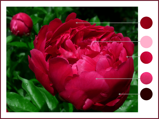
Paeonia ‘Unknown Soldier’ – note how many different values of the hue of red are seen in the shadows, midtones and highlights. Photo: Sue Gaviller

Using contrasting values of a single hue in a planting composition creates dramatic effect in the garden; indeed nature often does this within a single plant….

peach iris-resamplebicolour iris

Left: soft orange-peach standards and falls are set off by a darker orange beard. Photo: Sue Gaviller Right: velvety purple falls contrast nicely with softer mauve standards. Photo: Pat Gaviller. 

And the gardener does it within a planting scheme or vignette….

purple bicolor daylily and rose glow barberry 2

Value contrast within a planting composition – here I’ve paired cool-pink daylilies with dark plum-red barberry. Each plant contains value contrast as well – the daylily has a plum-red eyezone and the barberry has cool-pink variegations. Photo: Sue Gaviller

Photo: Cathy Gaviller

Dwarf Iris and creeping thyme – beautiful value contrast of red-purple hue. Photo: Cathy Gaviller

Lovely though these colour combos are, as with almost everything in the garden (and in life), too much of a good thing is… well, too much. Imagine how unpleasant it would be to look at a garden filled with high contrast plant combinations. While value contrast helps us discriminate between the various elements in a planting scheme, it doesn’t always have to be dramatic.

And don’t forget balance when contrasting values – use more low value than high value (remember that ratio of 3:1 or 4:1). And green; use lots of it (have I said that before?) low value green, as well as basic green, which has medium value and helps to balance the higher and lower values.

In the words of Spanish Poet and Playwright, Pedro Calderon de la Barca, Green is the prime color of the world, and that from which its loveliness arises.

On that note fellow gardeners, I will conclude today’s lesson – hope you’ve learned something of value.

’Til next time,
Sue

Say it Again Sue

Happy New Year fellow gardeners! It’s a week or two into 2014 and I’d like to bid a fond farewell to 2013. Let me rephrase that. I’m so glad to see the arse-end of the year 2013!

It wasn’t my finest year.

Like many of you, I made some New Year’s Resolutions. Most are pretty straightforward; return to healthier eating, lose some weight, get more exercise, spend less time in front of my computer screen, blah, blah, blah. Challenging as it may be to abide by such resolutions, if I can commit to them for even a few weeks, perhaps these lifestyle changes will become re-established in my daily repertoire of healthy behaviours – they say it takes only 21 days to form a habit.

However, not all of my avowed changes are quite so straightforward; be more organized, procrastinate less; qualities that just aren’t part of my make-up – supposedly one can learn though. I’ve also decided that from now on I will try to think before speaking. Yikes! How does one possibly remember to catch oneself each time the mouth opens to speak; to always first consider: is what I’m about to say necessary, or useful? Will I come on too strong, or too loud, is this a “think” or a “say”, will I be oversharing or heaven forbid, repeating myself?

I was advised once, by a well-meaning person of course, that I have an annoying habit of repeating myself. Not entirely untrue I guess. In my defense though, experience has taught me that some people need to hear things several times before they get it. And as a design instructor and lecturer I also know that some things merit repeating – whether within the same address or at a later date as a review. It’s what good teachers do. For example, since this blog’s inception I have thrown oodles of design advice at you – do you remember all of it? Not likely. Do you remember exactly where to find whatever information you might want to revisit? Probably not. Repeating myself would be helpful here no? Perhaps a review to help you navigate both the design process and this site – all my design advice in a tidy little bundle with links to the applicable posts where you’ll find the information you seek.

You’re welcome! It’s what good teachers do.

Design Process and Principles – A Review

The Process

The first thing I want to reiterate, and this can’t be overstated, is that design is primarily about organizing and arranging space, not plants. The same way a house must first be properly designed and built before it can be furnished, so the outline of a garden or landscape must first be planned before plants are considered. The functionality of any given space should be the designer’s chief concern, followed by its form – hence the designer’s mantra “form follows function”. The design process then, looks like this (click on the red text to go to corresponding post):

Phase 1 – FUNCTIONAL DRAWINGS: one must first determine what one want or needs; for example, garden beds, a deck or patio, walkway, lawn, fireplace etc., and then decide where each will be situated. Various possible locations for each element can be explored before deciding on the best placement for your particular needs.

Phase 2 – CONCEPT DRAWINGS: once you know what you want and where you want it, you can give form to your garden beds, patio, walkway and other garden elements. Remember your design concept can consist of:

As you play with various design lines, there are some Key Things to Remember:

  • Maintain Continuity
  • Avoid acute angles
  • Use design lines to guide planting

Phase 3 – Planting Plan: when your landscape or garden outline has been conceptualized, plants can then be considered. However, before one can effectively arrange plant material, some governing principles must first be understood – we’ll return to the Planting Plan later.

The Guiding Principles

Although designing a garden or landscape requires both creativity and knowledge, anybody can learn how to improve their own gardens with the help of a few guidelines or Design Principles. These principles, as applied to landscape design are:

  1. UNITY – a sense of oneness and harmony in the garden, achieved through:
    • Repetition – repeating elements throughout a composition.
    • Dominance – one element or group of elements is given emphasis
    • Unity of Three – arranging elements in groups of three (or odd numbers)
    • Interconnection – physically connecting all landscape spaces
  2. BALANCE – perceived equilibrium in a garden or landscape composition. Balance can be Symmetrical or Asymmetrical.
  3. MOVEMENT – visual motion throughout a composition
  4. SCALE – size of landscape elements in relation to their surroundings
  5. PROPORTION – size of landscape elements in relation to each other

The Planting Plan Revisited

With a rudimentary understanding of design principles you’ll now be in a better position to choose and arrange plant material, but there are still procedural steps to follow:

  1. FUNCTION – determine if there are functional roles like shade or privacy that you need plants to play.
  2. AESTHETICS – plants provide visual appeal from their physical traits:
  • Colour
    • Gardeners looove colour don’t we? I have touched only lightly on the effective use of colour in the garden. Colour theory is a big topic and I’m still trying to decide how I want to approach it – how much information will be enough, without being too much (see I’m already adhering to one of my resolutions; I’m thinking before speaking, er writing).

Well my friends that wraps up my review – a little New Year’s gift for you. Keep this post handy for future reference – design advice is just a click away.

You’re welcome! It’s what good teachers do.

Yours,
Sue

Gardens are Like Kids

They Need a Little Structure 


Last month, a reader posted a comment recommending a couple of articles she thought might interest me – one written by author/garden designer Rory Stuart and another by garden photographer Charles Hawes. Both were discussing issues related to garden photography and both gentlemen brought up the point that gardeners seem to want their gardens viewed (and photographed) only when they look their finest.

Rory Stuart writes, “Gardens are always hymns to time, and gardeners the leading choristers – “if only you had been here last week”, or “come again next week and they’ll all be out.”

Charles Hawes concurs, “Garden owners want their gardens to be seen at their best and are hungry for praise….the garden can never be praised enough and yet such praise never satisfies the owner.”

It got me thinking – why this need to apologize for the state of our gardens, even when complimented?  If a garden is well designed, shouldn’t it look good all the time, and the gardener always feel good about his/her creation? In our harsh prairie/foothills climate, our gardens are perpetually one weather calamity away from near-destruction – late spring frosts, spring flooding, crazy hailstorms, early fall frosts, Chinooks, too-long winters, too-cold winters, too-warm winters with little or no snow. We must approach garden design in such a way that we can be pleased with our creations – no matter the season, or the weather.

I find myself apologizing on behalf of my front gardens much more than those in the back. The gardens in my front yard were created before “Sue-the-gardener” became “Sue-the-designer”, and though I’ve spent the better part of the last decade editing and correcting design faults, these gardens still lack overall structure. My back yard on the other hand, always looks appealing, always photographable. I don’t mean to suggest that it can compete with the great gardens of the world (the kind Mr. Hawes and Mr. Stuart would be referring to) – of course it can’t. It’s a simple low-maintenance residential landscape, designed to withstand the rambunctious play of boys and dogs. Though it looks different at various times of the year it never looks better. The design consistently fulfills its purpose with grace and elegance – even after a hailstorm. And I never feel the need to say, “Oh you should have seen it last week when such-and-such was blooming.”

Okay, maybe not never.

Photos: Sue Gaviller

Two large adjoining arcs produce an uncomplicated but voluptuous curvilinear design. Low-maintenance shrub plantings highlight the design lines creating this attractive four-season view out my back window. Photos: Sue Gaviller

So what is good design? If you’ve been reading and following this blog you’ve learned the basic design process and the principles that guide it. Putting it all into practice – first on paper and then in your own garden – should yield some positive results. However, although a design is rendered on paper in two-dimensional plan view, a good designer must envision the end result in 3D. The garden in real space is a three-dimensional entity. It has a floor and walls and often a ceiling – paying attention to both the floor plan (Concept/Layout Plan), and the wall and window treatments (tree, shrubs and spaces between them), will help you focus on creating a solid skeletal structure that can stand up to scrutiny…and the weather.

Ground Plane – The Garden Floor

Good garden structure starts on the ground with your design lines, i.e. the shape of all your garden elements, including hard surfaces like patios and walkways and soft surfaces like planting beds and turf. Design lines must be strong in order to contribute to the strength of the overall picture – this means longer lines, fewer lines, and fewer directional changes, i.e zigs and zags, wiggles and waves. For some reason, gardeners assume simple means boring when really the simpler the line the stronger the design. (Check out Good Lines Mean Good Designs Part 1 and Part 2 for more info on design lines).

Mike's back yard winter - resample

Mike's back yard - summer

This backyard belonging to garden designer Mike Palmer, demonstrates lovely lines – indeed the strength of the design is in its simplicity, and affords the yard year-long beauty. Photos: Mike Palmer.

Hardscapes in particular are bold design delineators and will emphasize good (and bad) design lines. I find it very frustrating when clients contract my services after a poorly designed patio or walkway is already in place – there is only so much I can do with plants to mitigate poor hardscape design. These hard surfaces should therefore be carefully planned and constructed.

Kiftsgate Water Garden. Photo: Marny Estep

A concrete border and step-stone slabs emphasize the clean contemporary lines of a water feature at Kiftsgate Court gardens. Photo: Marny Estep

The garden floor also consists of living material; groundcovers and other low-growing perennials/shrubs – think of this as the “carpet”. Some landscapes have few, if any design lines – for example, a small front yard which is entirely planted and has no lawn or hardscaping, save a straight walkway.  In the absence of design lines, plants alone must define the space, with flattish areas of groundcover and low growing plants serving as the ‘floor’.

In any case, keep in mind that whatever role plants play in your floor plan, herbaceous perennials die down at the end of the season so can no longer play their role. Make sure you include woody plant material, some of it evergreen, to provide year-long carpeting.

Low growing evergreens like dwarf mugo pine, kinnickinnick and Rhododendron make good 4-season floor coverings. Photo: Sue Gaviller

Low growing evergreens like dwarf mugo pine, kinnickinnick and Rhododendron make good 4-season floor coverings. Photo: Sue Gaviller

Vertical Plane – The Garden Wall

The vertical plane refers to upright elements in the garden, both walls and furnishings. Garden walls can be hardscapes, softscapes, or a combination thereof. Furnishings may be single accents (plants or focal points) or larger groupings of plants.

A hardscape wall is an actual wall – perhaps a courtyard wall, retaining wall, raised planter or fence. As with ground-plane hard surfaces, vertical hardscapes can be strong spatial definers, accentuating both good design and not-so-good – so remember simplicity is key.

Photo: Sue Gaviller

A low concrete wall outlines a simple rectangle, creating a very strong design. Linear plantings further strengthen the lines. Photo: Pat Gaviller

The role of garden wall can also be filled by plant material. These living walls can be quite variable in their effect – tall grasses suggest a softer kind of partition compared to the more sturdy presentation of woody shrubs, and a random shrub planting is less structured than the unyielding solidity of a clipped hedge. There are low walls, counter-height walls and full floor-to-ceiling walls, the function of which will determine how full, or how formal you want your wall to be, and what it will consist of.

Photo: Pat Gaviller

Grasses and daylilies softly delineate a property line with low iron railings and stone pillars providing more rigid structure. Photo: Pat Gaviller

Photo: Sue Gaviller

Evergreens, grasses and barberries contribute good structure to this landscape and provide a casual but effective wall between properties. Photo: Sue Gaviller

Photo: Sue Gaviller

A clipped Cotoneaster hedge forms a casual, but very solid partition along a client’s property line. Photo: Sue Gaviller

Perfectly trimmed hedges, upright evergreens, lattuce fence panels and brick walls provide formal sturcutre in the vertical plance while th wlow parterres [rovide the flooring in this old world courtyard. Photo: Evelyn Steinberg.

Perfectly trimmed hedges, upright evergreens, lattice fence panels and a brick wall provide formal walls in this old world courtyard. Note that here the low hedges or parterres provide flooring rather than walls. Photo: Evelyn Steinberg.

Plant material used for walls and accents should consist largely of trees and shrubs – while perennials can provide some structure during the growing season, trees and shrubs afford much heartier structure and offer their woody presence year round. As well, plants that are grouped or massed will be more visually substantive. A mix then, of herbaceous perennials and woody ornamentals, grouped plantings and single accents, will ensure year-long interest and good garden structure.

winter garden structure resamplegarden structure - summer resample

Photos: Sue Gaviller

This client’s garden presents good structure year round – trees, shrubs, a Cotoneaster hedge atop a concrete wall, and tall grasses occupy the vertical plane and spreading junipers carpet the ground. Photos: Sue Gaviller

Overhead Plane – The Garden Ceiling

The garden ceiling is provided by overhead features like pergolas and arbours and by the branches of canopy trees. While a ceiling isn’t necessary for good garden structure it does complete a space and create more human scale – by capping the spatial height, vertical scale is reduced to more human proportions. This results in an intimate space that is cool and quiet by day and warm and cozy by night.

Photo: Sue Gaviller

A cool, quiet path beneath the trees at Reader Rock Gardens. Photo: Sue Gaviller

An overhead presence also allows us to walk through to another space as though crossing a threshold – makes for some extra drama in the garden.

Photo: Sue Gaviller

An arbour and canopied walkway provide a graceful entrance to Countryside Garden Centre . Photo: Sue Gaviller

In addition, the garden ceiling can provide protection from the elements; shade for our delicate skin and a ‘hail helmet’ for our delicate perennials – Hosta after a hailstorm looks like coleslaw.

Coarse textures perennilas like HPsta and Bergenia are prone tp haol dmamge. Situating them beneathe a canopy tree proveds some proteciont. Photo: Sue GAviller

Coarse-textured perennials like Hosta and Bergenia are prone to hail damage. Situating them beneath a canopy tree offers some protection. Photo: Sue Gaviller

Earlier this week, as I was returning from a walk with Princess Pepper, I noted that my front gardens aren’t looking too bad, even in these barren winter months – deciduous shrubs, evergreens and ornamental grasses bring form, texture and subtle colour to the composition. More importantly they bring the garden some much-needed structure.

So the next time you find yourself impatient for the next wave of colour in your garden, or woefully observing how much better it looked last week, ask yourself, “What’s missing here?” Maybe it just needs a little structure.

Y’all stay warm,
Sue
 
 
© Sue Gaviller and Not Another Gardening Blog 2012. Unauthorized use and/or duplication of this material without express and written permission from this blog’s author and/or owner is strictly prohibited. Excerpts and links may be used, provided that full and clear credit is given to Sue Gaviller and Not Another Gardening Blog with appropriate and specific direction to the original content.

Top Twenty Plant Picks for 2013

It snowed yesterday – the third snowfall of the season. It’s beginning to accumulate now since night-time temperatures are consistently falling below freezing, and my Rhododendron leaves have curled under which indicates the ground has frozen. So I think it’s safe to say no one in this neck of the woods will be doing anymore planting, transplanting or plant shopping this year.  It’s time then, to put my Weekly Plant Pick page to bed for the winter. Not to worry though, I’ve put all 20 picks here in one post for your easy reference. And I’ve included a few notes at the end of the post regarding any noteworthy changes in performance over the course of the season.

For some of you, especially those who garden in more hospitable climate zones, these plant choices may seem a little ordinary, pedestrian even. But for those of us who garden north of the 5oth parallel, on windswept prairie or Chinook-challenged foothills, plants must be tough as well as beautiful. And for me, plants must be more than just showy bloomers – they must also be tidy growers with handsome foliage, and outstanding performers throughout the season. Only when these criteria are met does a plant have a chance of making it onto this annual list. So ladies and gentlemen, please put your hands together for…

Sue’s Top Twenty Plant Picks of 2013

Sunday May 26th – Berberis thunbergii ‘Rose Glow’

Berberis thunbergii 'Rose Glow' resample

Photos: Top – Pat Gaviller. Bottom – Sue Gaviller

In the year 2002, the Japanese barberry returned from decades of banishment – new cultivars had been developed that were rust resistant, hence weren’t alternate hosts for the devastating Wheat Rust (a disease of cereal crops).

This was thrilling news to gardeners and landscapers, and of course we all bought any number of these new cultivars for our gardens and our client’s gardens. We soon discovered (though some of us are still in denial), that here on the prairies, many of these barberries have proven to be less-than-stellar performers – some years suffering significant winter dieback, and often appearing, well, kinda scraggly.

A few of them however, have shown themselves to be consistently hardy – robust even. One of these is the cultivar ‘Rose Glow’. Not only is it hardier than any other barberry I’ve grown (both in my own garden and clients’), it is quite stunning, with lovely arching branches and deep purple-red foliage. What is most unusual about it though is the colour of the new growth – mottled pink and white, giving it a truly rich textured appearance.

Rose Glow barberry will reach about 1 metre in height and almost as wide. While it is somewhat shade tolerant, the best colour is achieved in full sun.

So if you’ve all but given up on barberries, and haven’t yet tried this one, I highly recommend it – I don’t think you’ll be disappointed.

Sunday June 2nd – Clematis alpina ‘Constance’

Photo: Sue Gaviller

Photo: Sue Gaviller

Like all Alpine clematis, the cultivar ‘Constance’ is an early-flowering vine that flowers on old wood. Belonging to Pruning Group “A”, which happily means little or no pruning, Clematis alpina need only be pruned to keep them within their allotted space, to remove deadwood, or to tidy them up. Other than that just let them do their thing.

Constance is a particularly vigorous grower that can cover several large fence panels within a few short years.  A beautiful soft magenta, the flowers are large, nodding and very plentiful. Alpine clematis are happy in lean soil, full sun or partial shade, and are quite drought tolerant.

With so little work required for such amazing results, one of these lovely vines should be in everyone’s yard!

Sunday June 9th – Syringa vulgaris ‘Sensation’

Photo: Sue Gaviller

Photo: Sue Gaviller

Well what did you expect? Did you really think I could get through the month of June without choosing a lilac as a weekly plant pick? If you’ve been reading this blog for a while, you know how enamoured I am of sweet-scented Syringa – and the air is positively thick right now with the heady aroma of numerous species in this genus.

A very unique cultivar of S. vulgaris, ‘Sensation’ boasts the only bi-colour blossom – wine purple florets, edged in white. A tidy grower with minimal suckering, it’s also very fragrant, and the characteristic dark green, heart-shaped leaves provide excellent colour and textural contrast throughout the season.

Sensation lilac reaches an approximate height of 3 metres and a spread of about 2 metres. Like all lilacs it is cold hardy, drought tolerant and relatively disease free.

With so much going for it, why not try one? You know you wanna.

Monday June 17th – Picea abies ‘Nidiformis’

Photos: Sue Gaviller

Photos: Sue Gaviller

Bird’s nest spruce is a dwarf cultivar of Norway spruce. Low growing with a flat top and slight depression in the centre, it somewhat resembles a bird’s nest (hence the name). Tiny needles emerge lime green, providing stunning contrast to the dark green older growth. New growth is very soft which creates a lovely drape to the young branches – they will stiffen as the season progresses.

Picea abies ‘Nidiformis’ is a good substitute for spreading junipers when space is tight as it is a slow grower – eventual size is variable and depends on which literature ones reads: anywhere from 2 to 6 feet in height, and 3 to 8 feet in width.

OSU website states: “1′ tall by 2′ wide at 10 years, and 2′ tall by 3′ wide at 20 years of age”. This is consistent with my own experience, for example; the specimens in the above photos are about a foot high and a little more than 2 feet wide – they were planted in a client’s yard about 7 years ago and would’ve already been a few years old in pot. The largest specimen I’ve seen here is about 3 feet tall, 5 feet wide and is many decades old.

Drought tolerant and cold hardy ( to zone 3), this beautiful dwarf conifer can also be used as a single specimen or feature – if you don’t mind waiting a few years for it to fulfil its role. It is well worth the wait!

Sunday June 23 – Rhododendron ‘Mikkeli’

Photos: Sue Gaviller

Photos: Sue Gaviller

Growing rhododendrons in a semi-arid, zone 3 climate such as ours may seem counter-intuitive, but the beautiful St. Michael rhododendron has been growing in my garden, and those of several clients, for the better part of the last decade. Now for those of you who live in warmer, moister climes, you may not be aware of the ‘rhodo envy’ some Calgary gardeners feel – we really wish we could grow ‘em like you do, but alas no. So please don’t scoff at this week’s Plant Pick offering.

Rhododendron ‘Mikkeli’ is a large leaf or elepidote variety, belonging to the Marjatta Hybrid group – a very cold-hardy class of rhododendrons which are bred for Northern gardens. There are numerous cultivars in this group, but Mikkeli is the cultivar of choice for my local designs because it flowers very late.

This means the flower buds break dormancy later than most, hence are less prone to late frosts. Despite this of course, almost every spring the buds still get hit with late cold spells, so this is only the second or third year mine have actually flowered.

Why then you ask, has this shrub earned a place on this page? Well it’s not all about the flowers y’know. The big leathery leaves and exotic appearance provide considerable design value – rhodos are particularly appropriate for Asian inspired designs and woodland gardens. And when Rhododendron ‘Mikkeli’ does bloom, the flowers are indeed spectacular – bright pink buds open to soft pink flowers, eventually fading to white. Bushy when young, it can become a little leggy with age – periodic pruning is required to maintain attractive form.

So if you a have a somewhat moist, protected spot in morning sun or dappled shade, preferably with a little snow cover during the coldest winter months, why not satisfy that rhodo envy with Rhododendron ‘Mikkeli’.

Sunday June 30 – Iris sibirica ‘Roanoke’s Choice’

Photo: Sue Gaviller

Photo: Sue Gaviller

Siberian iris is a cold hardy, reliable perennial with fine grass-like foliage and an upright growth habit. Roanoke’s Choice is a spectacular cultivar with velvety, lilac mauve blossoms that are larger than typical Siberian iris. Tall and elegant, this cultivar is tolerant of both shade and full sun, but will be happiest in lots of morning sun, shaded from the hot late afternoon sun, and provided average moisture.

I used Iris sibirica ‘Roanoke’s Choice’ in a client’s Asian-inspired design a number of years ago, but until this year I had never managed to catch them blooming. Visiting this client last week, I was treated to these lovely Siberian irises in bloom, and what a treat it was.  As I walked into her backyard, Roanoke’s Choice was the first thing I caught sight of and I have to say it took my breath away – its statuesque form, as well as the colour and texture of the blooms. Beautiful.

Siberian iris is a superb addition to the mixed perennial border, a woodland garden, or an Asian inspired design. It is lovely when massed, but can also make a stunning statement on its own, especially this particular cultivar – indeed if I had one Siberian Iris to choose from this would be the one. And that’s high praise coming from a picky designer.

July 7th 2013 – Rosa ‘Morden Sunrise’

Photo: Sue Gaviller

Photos: Sue Gaviller

As a child growing up in Southern Ontario, I witnessed both my Mother and my Grandmother tend hybrid tea roses. I was never really a fan – they seemed to be all flower and no form. I have to admit though, the flowers were exquisite – I was especially fond of one known as the Peace Rose, a huge silky blossom that changed from soft yellow to pale peach, to ivory-white, and often displayed a combination of all three. And the scent was heavenly – like peaches and citrus.

So when I first laid eyes on the beautiful Rosa ‘Morden Sunrise’, my first thought was, “It reminds me a bit of the Peace Rose.” While Morden Sunrise of course isn’t a tea rose (they require some work to grow here), its soft colour blend of peachy pink and creamy yellow, and its fruity fragrance, always elicits a little nostalgia for me.

A bushy shrub rose, it has glossy dark green foliage which provides a stunning backdrop for the many delicate blossoms. And like all of the Parkland series of roses, Morden Sunrise is cold hardy, disease resistant and has a tidy compact form. So what’s not to like?

Peace be with you!

July 15th 2013 – Hemerocallis ‘Stella de Oro’
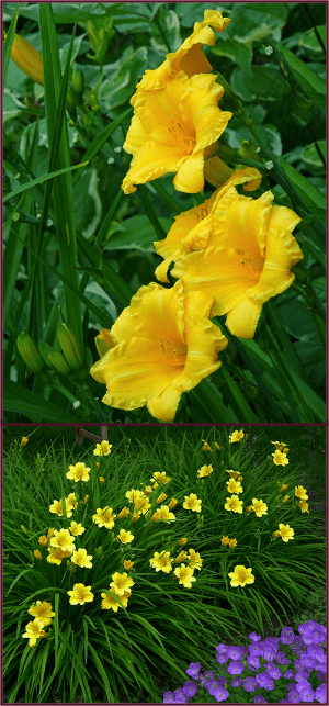
Photos: Sue Gaviller

Photos: Sue Gaviller

Ya gotta love Stella right? I know she’s a commoner and she gets around a little, but she’s bright and cheery and oh-so-reliable. Mine are simply spectacular right now – dozens of sunny gold 2½ inch blooms greet me each morning. Despite the huge number of blooms and the intensity of their color, she really doesn’t look garish – I suspect her equally dense, very dark green foliage, helps to mitigate her loud presentation.

Stella looks beautiful growing alongside other bright flowers like Rosa ‘Winnipeg Parks’ (itself a pick from last year) and Campanula carpatica, and looks especially lovely paired with variegated green/white foliage plants.

She just has so much going for her! A reblooming dwarf variety, drought resistant, disease resistant and cold hardy, Stella fits in just about anywhere. She’s happiest in a sunny border but can tolerate considerable amounts of shade. And her handsome arching foliage is rich, dark green and very dense, making her a valuable addition to the mixed border before and after blooming.

No wonder she’s been deemed the world’s most popular daylily!

July 21st 2013 – Heuchera ‘Pinot Gris’
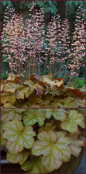
Photo: Sue Gaviller

Photos: Sue Gaviller

A warm summer evening calls for a glass of good wine on the patio – Saturday night was one such evening. I sipped my Poplar Grove Pinot Gris and closed my eyes, a well deserved rest after a hot afternoon working in the garden. When I opened my eyes the soft evening sun had illuminated the pale pink inflorescence of the Heuchera in one of my patio containers – fittingly a cultivar named ‘Pinot Gris’.

This beautiful H. villosa hybrid has been steadily earning its place on this page ever since the spring – after pulling out several of said cultivar from last year’s containers, I realized they’d actually survived the winter in each of the three containers I’d planted them in. Okay these are keepers I thought, and popped them back in the containers to be part of this year’s arrangements.

Sometime later in the season I witnessed this Heuchera cultivar stand up very well in one of our very nasty hailstorms.  And being native to the Southeastern United States, it’s also been right at home in the intermittent heat and humidity we’ve been experiencing this summer.

The beautiful foliage of Heuchera ‘Pinot Gris’, much like the wine after which it is named, varies from amber to copper to shades of light rose, and warm olive. The tiny peach-pink flowers are borne along many upright stems and contrast nicely with the large leaves. A truly stunning Heuchera cultivar – yup it’s a keeper.

July 28th 2013 – Hemerocallis ‘Starling’
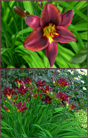
Photo: Sue Gaviller

Photos: Sue Gaviller

Yes that’s right – another daylily has made its way onto my plant picks page. No surprise really, considering these near-perfect perennials are stars of the midsummer border.

Hemerocallis ‘Starling’ is a fine example of a tetraploid daylily, meaning it has four complete sets of chromosomes compared to the normal two (diploid). Like all tetraploids, Starling demonstrates marked vegetative vigour – foliage, stems and flowers are stronger and sturdier than their diploid counterparts.

The colour of this cultivar is quite dramatic – dark, warm, chocolate-red petals and sepals with a darker eye-zone and golden-yellow throat. It’s one of the most reliable daylilies in my collection – even in those rare years when for reasons unknown, some daylilies don’t bloom, ‘darling Starling’ has never failed me. This year is no exception – it’s putting on an incredible show… and it will bloom for many weeks.

So if you happen upon this cultivar in your nursery travels, snap one up – they’re real beauties.

August 4th 2013 – Thymus citriodorus ‘Doone Valley’
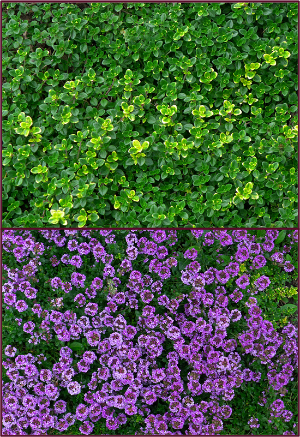
Photos: Sue Gaviller

Photos: Sue Gaviller

Many years ago my husband bought a pot of lemon thyme for his herb garden. When it started blooming I asked him if he’d mind if I moved it to my perennial garden – it was just so darn pretty. He was fine with this… until he wanted to harvest it – at which point I whined that he’d leave a big hole in its place. I promised to buy him another for his herb garden – which I did. The following year when it started blooming I asked if he’d mind if I “borrowed” this one too. He chuckled, knowing he wouldn’t get to harvest it either.

Doone Valley lemon thyme is no ordinary lemon thyme – it has the characteristic strong lemon scent and flavour but is far more ornamental than the species. Mat forming, green and gold variegated foliage spreads nicely but isn’t invasive. It blooms later than most ornamental thymes, gracing the garden with pretty mauve-pink hues from mid July to mid August. Winter hardy, and both drought and shade tolerant, it asks only for a little snow cover – since it’s mostly evergreen,  in drier winters it may suffer some winterkill (though it will regenerate from the roots).

Many years later I now have several large masses of this lovely groundcover – enough that we can actually harvest some for culinary purposes without leaving empty spaces in my perennial garden!

August 12th 2013 – Hosta ‘Guacamole’
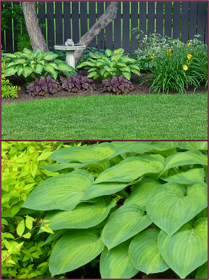
Photos: Sue Gaviller

Photos: Sue Gaviller

When I first started gardening, purchasing perennials meant buying small specimens – mostly in 4” pots. Over the years though, much larger specimens have become available – ornamental grasses, peonies and hostas for example, can now be purchased in 5 gallon pots.

There’s nothing more satisfying than planting that big beautiful Hosta in your garden and bang – instant appeal. Except the following season, those big beautiful hostas come up with a whimper instead of a bang – this is because the climate where they are grown is vastly different from the climate where they eventually find a home; our crazy Calgary climate.

Of course the plants do increase in size each year, but rarely do they have the robust leaf size they presented with at time of purchase. However Hosta ‘Guacamole’ has performed exceptionally well in all the designs I’ve used it in, coming back bigger and better every year, right from the get go. It is well named – indeed the colour of avocado flesh, edged in darker bluish-green. In a few short years it will reach 2 feet in height with a 3 foot spread and even in very moist soil, I’ve seen very little evidence of slug activity. Like all hostas, they are susceptible to damage from hail – situating them beneath a tree will ensure they don’t get too beat up during the several hailstorms we invariably get every summer.

Hosta ‘Guacamole’ – a stunning addition to your shade garden.

August 19th 2013 – Calamagrostis acutiflora ‘Avalanche’

Photo: Sue Gaviller

Photo: Sue Gaviller

Last year about this time I featured Calamagrostis acutiflora ‘Karl Foerster’ as a weekly plant pick. Equally impressive is the cultivar ‘Avalanche’. Though not quite as tall as Karl Foerster, the inflorescence is very robust, creating a solid-looking bushy column about four feet in height.

The foliage is variegated cream and green and the inflorescence is soft green with a hint of pink, turning to the characteristic straw gold as the season progresses.  Calamagrostis  acutiflora ‘Avalanche’ is happiest in full sun but will also tolerate some shade.

Avalanche reed grass is cold hardy, drought tolerant and a stately addition to any garden!

August 27th 2013 – Hydrangea arborescens  ‘Annabelle’
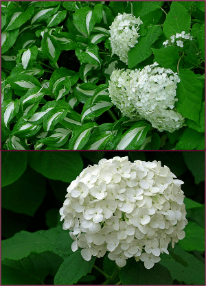
Photos: Sue Gaviller

Photos: Sue Gaviller

There was a time when I actually didn’t like these bright white beauties – I think I deemed them somewhat pedestrian. However, I’ve since changed my mind – late-blooming white flowers are decidedly refreshing in the late summer border. The huge, dazzling white flowerheads of Annabelle hydrangea, together with the large lush green leaves, invigorate a garden at this time of year – a time when our gardens are beginning to look a little tired.

Maturing to a height and spread of about a metre, this vigorous shrub looks exceptional when grouped, or on its own as a single specimen. And since they bloom on the current season’s wood, they are reliable bloomers.

Annabelle will perform well in a wide range of conditions but prefers morning sun and afternoon shade. Hardy to zone 3, she will brighten up even the weariest of gardens!

September 5th 2013 – Echinacea purpurea ‘Ruby Star’

Photo: Sue Gaviller

I am late posting this week’s plant pick – if you read my latest post you’ll know why.

Echinacea purpurea or Purple coneflower is a wildflower native to Eastern North America. The species grows quite well here, but many of its cultivars aren’t always stellar performers in our climate. There are of course a number of exceptions and Ruby Star is one of them. I have found her to be a consistently strong grower, beginning her bloom in late July and continuing well into the fall.

The blooms are darker than the species and a more intense fuchsia pink, with the characteristic mahogany coloured centre ‘cone’. Strong upright stems of the same dark red complete the picture. About 2 feet tall, she’ll love your sunny border and needs only whatever water falls in the form of rain. Even after 3 weeks with no appreciable rain, she still looks strong and healthy.

Indeed she is a ‘Star’ – why not let her brighten a spot on your garden.

September 10th 2013 – Heliopsis helianthoides
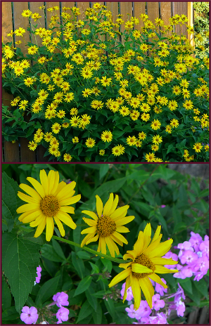
Photo: Sue Gaviller

Photo: Sue Gaviller

Some might think this an unremarkable plant, undeserving of a place on this page – after all it’s just an ordinary yellow daisy-like flower.  But every year, from late July, through the month of August and well into September, this hearty perennial makes its presence known in a very big way – with its brilliant gold flowers and its large stature.

Heliopsis helianthoides (false sunflower) provides a splash of intense colour when it is much-needed in the late summer border, and as it continues blooming, fits in well with the colour palette of warm fall hues.

So big and bright is this plant that you’ll want to limit yourself to only one or two of them – too many could appear garish.

Cold hardy and drought tolerant it requires very little attention save a little deadheading to prolong its bloom. It thrives in full sun but can also tolerate a little shade and will reach a robust size of four feet tall and at least as wide

Bring a little sunshine into your garden with Heliopsis helianthoides.

September 17th 2013 – Heuchera ‘Prince’

Photo: Sue Gaviller

Photo: Sue Gaviller

I used this Heuchera for the first time several years ago in a client’s containers – they’d started out as small plants in small pots but very quickly grew to dominate the arrangements.

Heuchera make fabulous container plants, providing big bold texture, but it can be expensive to buy them as specimens that are large enough to provide immediate visual punch. So instead of buying plants every year, I decided to try popping the various Heuchera cultivars in the ground at the end of the season to over-winter and use again the following year. While they all survived the winter quite nicely, they were still pretty small when it came time to plant the containers, and it took them too long to reach any appreciable size.  So I ended up having to purchase again anyway – except for the cultivar ‘Prince’ that is. Since many of the leaves had remained evergreen through the winter, they already had a head start, and true to their performance that first year, the plants doubled in size in their containers within a couple of weeks.

Heuchera ‘Prince’ has large shiny leaves that are richly coloured, emerging purple-red, darkening to purple-black, then fading to bronze-green as they mature. And the purple/pink undersides are intermittently visible due to the lovely ruffled edges, creating beautiful colour contrast and layers of textural interest.

This cultivar will grow to at least 18 inches wide, about 12 inches tall (foliage), and has the characteristic spikes of baby’s-breath-like flowers that aren’t particularly showy, but do provide nice contrast. While best foliage colour will be achieved in part to full sun, this plant is also shade tolerant – drought tolerant too, once established.

Heuchera ‘Prince’ – a real prince of a plant!

September 23, 2013 – Physocarpus opulifolius ‘Diabolo’

Photo: Sue Gaviller

Photos: Sue Gaviller

Last year I wrote about another ninebark – the cultivar ‘Summer Wine’.  The parentage of Summer Wine includes an older dark-leaved cultivar called ‘Diabolo’.

According to the OSU landscape plant database, Diabolo was a German introduction, discovered in 1968. It was found growing in a field of green-leaved ninebarks in the municipality of Ellerbek, and selected for its unusual dark red foliage. The patent name is ‘Monlo’ but the trademark name, currently owned by Monrovia Nursery, is ‘Diabolo’, from the Greek word diabollos and Latin diabolus, both meaning devil – so named because of the very dark colour of the leaves.

In my own design practice, this cultivar fell out of favour for a number of years – I found it to be untidy in its growth habit and prone to powdery mildew and aphid infestation. I have since discovered that this is only the case when it isn’t given enough sun. Diabolo requires full sun, and I mean full sun. Client’s whose yards afford them all-day-sun exposure, have big bushy disease-free specimens. Note too, that richer, more saturated colour is achieved in full sun.

Depending on a number of weather factors, Diabolo ninebark can be late to leaf out in the spring, but the payback is it’s also very late to lose leaves in the fall, contributing beautiful dark purple/red foliage colour well into November. As well it provides considerable textural value with its large trilobate leaves.

Physocarpus opulifolius ‘Diabolo’ will grow 2 to 3 metres tall and wide. In its first year it requires lots of water to get established but after that will be very drought tolerant. Feel free to prune this shrub quite hard in the spring resulting in a flush of fresh new growth.

Diabolo ninebark – a devilishly attractive shrub!

October 1st, 2013 – Symphoricarpos doorenbosii  ‘Amethyst’
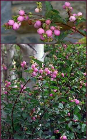
Photos: Sue Gaviller

Photos: Sue Gaviller

At this time of year, perennials and annuals are winding down their bloom display – soon the leaves will begin to parade their fiery fall colours. Many plants, particularly trees and shrubs, have already begun to present some late-season colour in their fruit – berries and hips, in red, burgundy, orange and dark purple. Rare it is though, to see ornamental fruit in shades of pink. However, Symphoricarpos doorenbosii  ‘Amethyst’, the purple coralberry, exhibits just that hue – and in abundance I might add.

This hardy shrub was originally developed for use in floral arrangements, requiring a plant that would produce large numbers of berries along each stem – you can be assured then, that Amethyst will provide a hearty display.

Fruiting occurs on new wood, so regular pruning to remove older wood will ensure peak production. Of course in our climate, there are years when ripening is slow, so some years will produce better crops than others.

During the growing season, this shrub will take a back seat to other showier plants, but its attractive arching branches and medium fine-textured foliage provide a nice backdrop. The flowers are small and inconspicuous, but are nonetheless quite pretty.

Purple coralberry matures to a height and spread of 1–1.5 metres, adapting to a wide range of soil and climate conditions, including dry shade and full sun. Plant in groups for best effect.

Amethyst – a bright jewel for the late summer and fall garden.

October 8th 2013 – Cornus alba ‘Aurea’ (Prairie Fire Golden Dogwood)
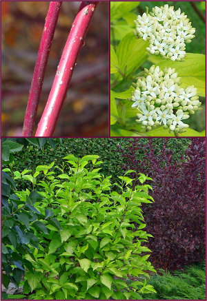
Cornus alba 'Aurea' 2 resample

Photos: Sue Gaviller

This is one of my all time favourite plants – in fact I’m not sure why I haven’t featured it on this page long before now. Perhaps I’m just so accustomed to its beauty and reliability that I take it for granted.

Cornus alba ‘Aurea’ is a big, bright, bushy dogwood with intense lime-green to gold leaves. It is fast-growing, reaching full size in two or three years, and adapts well to many climactic conditions; sun or shade, moist or dry. Like all dogwoods, it responds well to hard pruning, subsequently rewarding the gardener with a flush of fresh new growth.

At 5-6 feet in height and width this bright beauty can make quite a statement in the landscape, pairing well with wine-coloured shrubs like Summer Wine ninebark, or even the dark green foliage of common lilac. With blood-red bark for winter colour and pretty white spring flowers (which give way to pretty white berries in the fall), this is a true four-season shrub. Some years, if it doesn’t get too cold too early, the leaves will turn fiery red in late fall.

A fine finish to the gardening season, Prairie Fire Golden Dogwood is my final plant pick of the year.

And In the End

In retrospect, a few comments on this year’s picks:

Rhododendron ‘Mikkeli’ – lost a lot of leaves in August as it often does later in the season (three-year old leaves yellow and drop), but was markedly worse this year during August’s heat and diminished rainfall. I gave my clients’ larger specimens a good pruning so they’ll bush out next year.

Iris sibirica ‘Roanoke’s Choice’ – foliage got a little floppy after blooming in shadier sites but stayed strong and upright where it got more sun.

Rosa ‘Morden Sunrise’ – still blooming magnificently in a client’s yard until October. This particular yard is full sun and somewhat protected.

Heuchera ‘Pinot Gris’ and ‘Prince’ – leaves are still alive under the snow and so far have perked right up each time the snow melts and they get sun on their leaves. Pinot Gris bloomed right up until the first heavy snowfall when the weight of the snow snapped all the flower stems.

And a few updates from 2012 picks

Campanula portenschlagianaall 7 of mine survived the winter, but did best where they got some snow cover. Those in drier spots almost didn’t make it – same for those under very heavy snow cover.

Echinacea ‘Tangerine Dream’ – both fared well over the winter and bloomed nicely. Plants not huge but definitely bigger than last year.

Viburnum dentatum ‘J.N. Select’ – overwintered very nicely with no dieback whatsoever. One bloomed and both grew a little over the course of this year. Weren’t very happy during the dry heat of August so will move them to a slightly shadier, moister spot next year. Gorgeous fall colour this year.

Physocarpus opulifolius ‘Summer Wine’ – suffered significant winterkill this year due to last fall’s very early and very sudden temperature drop, but came back beautifully with very lush new growth.

Well folks there you have it, another gardening season come and gone. It was a good year, despite getting off to a rough start (late frost, hail, and devastating floods). Winter has come too early again, but we did have a lovely fall. Hope ya’ll are keeping warm.

Til next time,
Sue
 

© Sue Gaviller and Not Another Gardening Blog 2012. Unauthorized use and/or duplication of this material without express and written permission from this blog’s author and/or owner is strictly prohibited. Excerpts and links may be used, provided that full and clear credit is given to Sue Gaviller and Not Another Gardening Blog with appropriate and specific direction to the original content.

Messy Mingling or Outmoded Massing?

A day or two ago I was sitting at my desk mulling over which of several blog-posts-in-progress I would work on, when a colleague emailed me a link to the latest post on thinkinGardens. Happy for the distraction, I clicked on the link. If you’ve ever visited this website you know the articles are always thought-provoking and articulately presented – indeed the contributing writers are the intelligentsia of garden design.

This particular post was Part 1 of an arranged discourse, a debate if you will, between Thomas Rainer and Noel Kingsbury, discussing mass planting vs. intermingled planting and which represented the more sound ecology, thus the better design choice. I’d certainly been aware of an apparent paradigm shift – from Piet Oudolf’s compositions of huge single-species drifts, to the new intermingled compositions now being espoused by same designer – but I never really gave it much thought. While I know, as a designer, that it’s important to stay abreast of current trends, I’ve always been of the opinion that good horticulture and good design are timeless and don’t depend on adherence to design trends.

However, after reading Thomas Rainer’s opening argument (excerpted from a previous post he’d published in August), I decided I oughta take this matter more seriously. Judging by the ensuing comments, some of which were very long and impassioned, I figured this must be some really important stuff being discussed here – I’d better jump on one of these bandwagons lest I get left behind. Thing is, I’m not much of a wagon jumper. I’m more of a fence sitter. I know, I know, there’s some old adage that sitting on the fence means having one foot in Heaven and one in Hades – I believe what it really means though, is that I see both sides of the story. Initially I was going to leave a comment with my own thoughts on the matter, but the comment thread was already long and cumbersome. Besides, who am I to argue with, or agree with, or even comment on, the ideas put forward by these big garden thinkers. But comment I will….

Thomas presented a very balanced argument in his article, and I found myself nodding in agreement throughout the eloquently written piece. He suggested that both aesthetics – mass planting and intermingled planting – can have a place in good garden design, since both are seen in nature. And I agree – I think. I am fortunate to live only a few blocks from Nose Hill Park, a huge expanse of natural mixed-prairie grassland. I thought about the masses of native Rosa woodsii, Elaeagnus commutata and Symphoricarpos occidentalis growing in the ravines or along the slopes, and snorted at the thought that anything might intermingle within their dense colonies – a clear-cut case of nature’s mass planting. On another hillside nearby, numerous native grasses, as well as Campanula rotundifolia, Gallairdia aristia, Erigeron caespitosus, Linum lewisii and many other native species, comfortably intermingle. So I guess I must be in Thomas’s not-one-nor-the-other-but-both camp.

I called my sister, hoping she would have some photos to illustrate these points – though not a horticulturist by profession, she has a profound interest in native plants and certainly knows them better than I. We talked about nature’s areas of seeming monoculture and the more we talked the more evident it became that things are not necessarily as they appear – that the forest of evergreens we see along the drive into the mountains may appear to be a single type of tree, but in fact more likely consists of spruce, fir and hemlock. Or that colonizing shrubs like our numerous native rose species may obscure, but not necessarily exclude, smaller flora. Or that it’s possible for the aforementioned roses to coexist in an intermingling relationship with some other equally effective competitor, say Cornus sericea. I remembered a recent post about a cross-Canada road trip, in which I wrote: “I am fascinated by the changing ecosystems or ‘biomes’ as we move from west to east – from Grassland to Parkland to Boreal Forest … as gardeners, landscape designers and horticulturists, we can take many lessons from the natural rock formations and forestation that Mother Nature presents – the way she mass plants her trees and understory, the large areas of perceived monoculture masking the plant diversity that lies therein. Indeed this should be our template.” Hmmm.

Pat started going through her photos as we spoke – she’ll jump at any excuse to do so. A while later she sent a few to me in an email:

“Hi Sue”, she wrote. “Here is one example of both – in my mind. I don’t think Mother Nature likes to be pinned down….

“As the snow recedes high in the mountain meadows, one of the first flowers to appear, especially in avalanche tracts, is the yellow glacier lily – Erythronium grandiflorum. They are quite beautiful en masse and I think they are a great example of a mass planting. However if you look closely, you can see a few small white flowers in amongst them. They are the other herald of spring in the mountains (and most everywhere in Canada for that matter) – the ‘spring beauty’, in this case the Western Spring Beauty, Claytonia lanceolata. This small white flower also emerges as the snow melts and it too can be found en masse, but here is found ‘intermingling’ in a mass planting of glacier lilies – if one looks closely enough.”

Nicely put Sis – thanks.

Erythronium grandiflorum

Looking up the avalanche tract towards the mountain top, a mass of Erythronium grandiflorum in the forefront. Photo: Pat Gaviller

A closer view reveals bits of white amid the yellow. Photo: Pat GAviller

A closer view reveals bits of white amid the yellow. Photo: Pat Gaviller

Zoomed in further ones sees that Claytonia lanceolata grows amongst the Erythronium grandiflorum. Photo: Pat Gaviller

Zoomed in further ones sees that Claytonia lanceolata grows amongst the Erythronium grandiflorum. Photo: Pat Gaviller

evergreen mass

A quick glance might suggest this mass of evergreens is all one type of tree, but the greenery on the mountainside includes western red cedar, western white pine, lodgepole pine, western hemlock, interior Douglas fir, western larch & hybrid white spruce (Picea glauca x engelmannii).
Photo: Pat Gaviller

Alpine meadows are a classic example of plants intermingling in nature. Here one lone Anemone occidentalis blooms alongside Claytonia lanceolata and emerging Antennaria lanata foliage.Photo: Pat Gaviller

Alpine meadows are a classic example of plants intermingling in nature. Here a lone clump of Anemone occidentalis blooms alongside Claytonia lanceolata and emerging Antennaria lanata foliage.
Photo: Pat Gaviller

Today I returned to thinkinGardens to read Noel Kingsbury’s response. He too made some valid points, one of which was the very thing my sister and I had discussed relating to monoculture – that “often what appears to be monocultures are not”.

So does this mean then, that I’ve switched camps – that I’ve now bought into Mr. Kingsbury’s intermingling perspective? Maybe. Well, no not really. It’s true one would be hard pressed to find a true monoculture in nature. But mass planting doesn’t equal monoculture – there are mass plantings in nature, and intermingled plantings… and intermingled mass plantings, and massed intermingled plantings. How’s that for sitting on the fence? But there’s more.

Rainer also points out the potential for chaotic and badly executed compositions when using an intermingled approach, and both writers acknowledged the need for informed plant choices if this approach is to succeed. This is of course key – one must know and understand the growth and reproductive habits of any given plant, lest some garden residents crowd others, or shade them, or outcompete them in some way or another. Come to think of it there are plants that would absolutely not fit into an intermingled planting scheme – they would very quickly dominate the composition and begin to mass themselves regardless of the designer’s intent… and it would be completely unnatural to insist that they do otherwise. Noel speaks of “managing competition” and admits that it “requires plant knowledge and experience”. But why, if creating a natural ecosystem is the goal, would “managing competition” even need mention. The bottom line is, the old mass-planting design model and the new intermingling approach both require harnessing nature, which is fine, but obviously neither can claim to be a completely natural design strategy. Which is more natural?  Who knows?  And does it really matter?

So I guess I’m with Thomas here. This where I often stand on many issues – in the middle, on balanced ground. And to be fair, even Noel admitted there was a place for “moments of massing” within an intermingled design. Maybe the two are more in agreement than it first seemed.

I read through the comments made in response to both Rainer’s and Kingsbury’s articles and there were other interesting viewpoints as well, for example, and I’m paraphrasing:

  • garden design doesn’t need to perfectly imitate nature’s design.
  • it doesn’t matter if you mass or intermingle as long as native plants are used.
  • we are losing species at an alarming rate and garden design must be part of the solution to this.
  • what we do in our gardens isn’t going save the planet, the bigger picture is more important.

I agree, in part, with all of these positions – no, our garden designs don’t need to be completely “natural”, yes native plant material should comprise a portion of our garden compositions, yes species loss is a concern and should be taken into account when choosing plants, particularly to ensure that pollinators are encouraged, and no the fate of the planet isn’t going to be played out in the garden. Our responsibility as gardeners and garden designers is to create healthy, sustainable ecosystems that are functional and aesthetically pleasing (this is indubitably subjective).

For me, nothing has changed. I’ve always used a mixed approach, with much of the massing occurring as groundcover to create a sort of “negative space”, and the larger plants occupying the positive space – some intermingled, some massed. I’ve never used mass plantings to the extent Piet Oudolf did (though I have to admit I find the huge masses of colour and texture to be breathtaking), and I don’t intend to use exclusively intermingled plantings just because it’s the latest trend. I will continue to design the way I always have, deciding to plant what, where and how-many, based on the site, the plant and my client’s needs. To me this is good design.

Now go mingle or mass or whatever it is you do….

Til next time,
Sue

© Sue Gaviller and Not Another Gardening Blog 2012. Unauthorized use and/or duplication of this material without express and written permission from this blog’s author and/or owner is strictly prohibited. Excerpts and links may be used, provided that full and clear credit is given to Sue Gaviller and Not Another Gardening Blog with appropriate and specific direction to the original content.
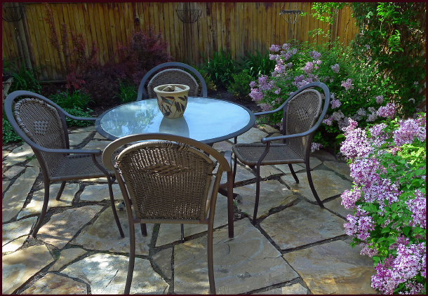
Fall Back

The words “fall back” can mean to recede, withdraw or retreat – like what happens to our gardens at this time of year. Fall back is also a catchy phrase we use to remind ourselves which way to adjust our clocks when moving from daylight time to standard time. Either way my friends, gardening season is over – the autumnal equinox officially ushered in fall on September 22nd, and in less than 2 weeks it will be time to turn our clocks back. For me, this turning of the clocks, more than any other temporal landmark, signals winter’s imminent approach; when we’ll trade our garden gloves for ski gloves, and hot toddies by the fire will replace chilled wine on the patio.

We could choose to lament the passing of another garden season, or we could celebrate what’s still beautiful in our gardens, while it’s there. If you find there’s little or no beauty left in your garden, you might want to consider adding some plant material specifically for fall colour – late or long blooming perennials, foliage that changes or intensifies its colour, plants with ornamental fruit and of course some evergreen material to set it all off.

Let’s take a walk along our city streets to see what autumn splendour we can find.

Trees

Photo: Sue Gaviller

Mountain ash turns intense shades of tawny red.
Photo: Sue Gaviller

Among the most dramatic fall colour displays is the mountain ash, with foliage hues of orange, red and mahogany, and bright red or orange berries.

The American mountain ash (Sorbus americana) and showy mountain ash (Sorbus decora) have big clusters of true red berries, which are very showy.

The European mountain ash (Sorbus aucuparia) has smaller berries that are more orange and is one of the last trees to turn colour in the fall.

Photo: Sue Gaviller

Sorbus americana beginning to change colour. Photo: Sue Gaviller

A make-shift swing hangs from the branches of colourful mountain ash. Photo: Sue Gaviller

A make-shift swing hangs from the branches of a colourful mountain ash. Photo: Sue Gaviller

Many species of Malus (apple, crabapple) also have excellent fall colour, for example;  the small weeping ‘Rosy Glo’ turns brilliant orange, and the stately ‘Pink Spires’ turns flaming red. Others display more golden tones which contrast beautifully with the red fruit.

Malus 'Rosy Glo'

Malus ‘Rosy Glo’. Photo: Sue Gaviller

Malus sp.

Malus sp. Photo: Sue Gaviller

Malus sp 2

Malus sp. Photo: Sue Gaviller

Betula (birch) too, present shades of gold, and Acer, the maple genus, includes some of the best fall colour specimens – unfortunately the gorgeous sugar maple, that king of autumn foliage, isn’t hardy here in the prairies. However, Acer ginnala (Amur maple) does well here and has fabulous fall colour. Its growth habit can be somewhat untidy when grown as a tree – it is therefore in my opinion, best grown as a large shrub.

Photo: Sue Gaviller

Acer ginnala. Photo: Sue Gaviller

Aesculus

Aesculus glabra – several young specimens in various stages of autumn colour change. Photo: Pat Gaviller

There are of course many other trees with colourful fall foliage: Aesculus glabra (Ohio Buckeye) produces stunning orange fall colour, as does Amelanchier grandiflora ‘Autumn Brilliance’ (Autumn Brilliance serviceberry).

Larix (larch) and Populus (aspen/poplar) turn golden-yellow, and the foliage of Crataegus  (hawthorn) changes to yellow, amber, orange or burgundy in the fall – the display is short-lived, but they also set pretty fruit.

The berries of Crataegus sp. are quite decorative. Photo: Sue Gaviller

The berries of Crataegus sp. are quite decorative. Photo: Sue Gaviller

Shrubs

There are countless shrubs that offer fine fall colour. Currently the most obvious is the ubiquitous Cotoneaster – I must admit I have a love-hate relationship with this shrub. What I don’t like is that I’ve inherited it – a hedge and 2 shrubs, positioned such that they require weekly pruning. Cotoneaster is prone to pests and disease (aphids, oyster shell scale, fire blight, twig blight), and the constant pruning makes it that much more susceptible. If mine had been situated differently, with more elbow room to reach their natural spread, I’d happily accept their presence in my yard. So why don’t I just remove them you ask? Well, the two shrubs are on city property and the hedge is a monster – I can’t even image the herculean effort required to remove it, or the impact it would have on the gardens. So I’m kinda stuck with all of them.

But I digress. Cotoneaster isn’t all bad – I love that it leafs out early in the spring, with dark green glossy leaves. I love that it attracts many species of birds, and I love the vibrant autumn foliage.

Brilliant hues of Cotoneaster lucidus foliage are a spectacular contrast to the silvery leaves of Elaeagnus angustifolia. Photo: Sue Gaviller

Brilliant hues of Cotoneaster lucidus foliage are a spectacular contrast to the silvery leaves of Elaeagnus angustifolia. Photo: Sue Gaviller

orange patio umbrella

Bright orange Cotoneaster foliage echoes the colour of the patio umbrella. Photo: Sue Gaviller

Viburnum trilobum berries

Viburnum trilobum. Photo: Sue Gaviller

Most species of Viburnum (nannyberry, highbush cranberry, arrowwood) also provide rich autumn colour (attractive fruit too), and the normally unassuming Euonymus alatus (burning bush) becomes show-stopping fuchsia-red in the fall. Many Cornus (dogwood) species turn various shades of red, contrasting nicely with the white berries and Spiraea (spirea) takes on fiery orange-red tones. There are even a couple of lilacs that display colourful fall foliage – Syringa patula ‘Miss Kim’ being the most notable.

Cornus sericea

Cornus sericea. Photo: Pat Gaviller

Cornus alba 'Aurea' fall foliage.

Cornus alba ‘Aurea’ fall foliage. Photo: Sue Gaviller

Spiraea japonica

Spiraea japonica ‘Macrophylla’ exhibits beautiful shades of orange, red and purple in its fall foliage.
Photo: Sue Gaviller

The orange-red autumn foliage of Spiraea japonica 'Gold Flame' is set off beautifully by the steely blue of the spruce. Photo: Sue Gaviller

The orange-red autumn foliage of Spiraea japonica ‘Gold Flame’ is set off beautifully by the steely blue of the spruce. Photo: Sue Gaviller

Some shrubs have no appreciable fall foliage colour to offer, instead providing a punch of colour with their fruit. Hippophae rhamnoides (Sea Buckthorn) has gorgeous orange fruit, Sambucus racemosa (red elder) produces beautiful red berries, Symphoricarpos doorenbosii  ‘Amethyst’ (coralberry) has pretty pink berries and many roses produce very showy hips.

Hippophae rhamnoides

Hippophae rhamnoides berries. Photo: Sue Gaviller

Sambucus racemosa berries.

Sambucus racemosa berries. Photo: Sue Gaviller

Rosa ‘Scabrosa’ produces huge cherry-red hips. Photo: Sue Gaviller

Rosa ‘Scabrosa’ produces huge cherry-red hips. Photo: Sue Gaviller

Perennials

Although herbaceous perennials by definition, die back at the end of the season, some have foliage that changes or intensifies its colour first. For example Paeonia (peony) foliage often takes on reddish tones, as does Bergenia (elephant ears), particularly the cultivar ‘Bressingham Ruby’. Arctostaphylos uva ursi (kinnickinnick), an evergreen groundcover, turns mahogany-coloured in the fall, and Ajuga reptans (bugleweed), which is semi-evergreen, intensifies its already dark hue, taking on a rich opalescence with fall’s cooler nights. Many Heuchera cultivars are also still colourful, again their foliage assuming darker, richer tones.

Peony fall foliage. Photo: Sue Gaviller

Peony fall foliage. Photo: Sue Gaviller

Heuchera 'Pinot Gris' foliage displays more prominent veining in the fall. Photo: Sue Gaviller

Heuchera ‘Pinot Gris’ still looking beautiful, its autumn foliage displaying very prominent veining. Photo: Sue Gaviller

There are even a few perennials still blooming – some are season-long bloomers; for example in my own garden, Geranium cinereum ‘Ballerina’ (Ballerina cranesbill) has a few stray blooms, as do Campanula portenschlagiana (Dalmatian bellflower) and Dianthus ‘Neon Star’ (Neon Star pinks), both profiled in a post from last year, Top Twenty of Twenty Twelve. There are also late bloomers that offer fall colour – Aster, Anemone hupehensis (Japanese anemone), Hylotelephium telephium (tall stonecrop) and Chrysanthemum (mums) to name a few. Even my Eutrochium purpureum (formerly Eupatorium purpureum and better known as Joe Pye Weed) still has a hint of colour.

Aster novae-angliae  ‘Alma Potschke'. Photo: Sue Gaviller

Aster novae-angliae ‘Alma Potschke’. Photo: Sue Gaviller

Aster novae-angliae  'Purple Dome'. Photo: Sue Gaviller

Aster novae-angliae ‘Purple Dome’. Photo: Sue Gaviller

Hylotelephium telephium  'Autumn Joy'. Photo: Sue Gaviller

Hylotelephium telephium ‘Autumn Joy’. Photo: Sue Gaviller

Ornamental grasses look stunning at this time of year – tall Calamagrostis cultivars (reed grass), with their straw-coloured inflorescence, nicely complement other autumn hues, and blue grasses like Helictotrichon sempervirens (blue oat grass) and Festuca glauca (blue fescue) offer cool contrast.

Calamagrostis 'Avalanche' beautifully complements Cotoneaster (left) and Viburnum trilobum 'Bailey Compact' (middle. Photo: Sue Gaviller

Calamagrostis ‘Avalanche’ beautifully complements Cotoneaster (left) and Viburnum trilobum ‘Bailey Compact’ (middle). Photo: Sue Gaviller

Blades of Panicum virgatum 'Shenandoah' grass turn bright red in autumn. Photo: Sue Gaviller

Blades of Panicum virgatum ‘Shenandoah’ turn rich red in autumn. Photo: Sue Gaviller

Autumn can be a beautiful time in the garden – for most plants it’s their last hurrah before winter sets in. Be sure to include some of these colourful fall plants in your garden composition – it will take the sting out of summer’s end.

Happy fall y’all,
Sue

© Sue Gaviller and Not Another Gardening Blog 2012. Unauthorized use and/or duplication of this material without express and written permission from this blog’s author and/or owner is strictly prohibited. Excerpts and links may be used, provided that full and clear credit is given to Sue Gaviller and Not Another Gardening Blog with appropriate and specific direction to the original content.