Where’s Your Sit Spot?

They say sitting is the new smoking – which is to say, too much sitting is really bad for your health. Indeed recent research suggests it contributes to any number of illnesses. I’m pretty sure I don’t have any of these, but I can still attest to the perils of sitting too long. During gardening season, the long hours I spend sitting at my computer are offset by as many hours spent on my feet (or my knees) – digging and planting, pruning, deadheading, weeding and mulching. During the off season however, in addition to my design work I often write and/or lecture, so the many hours spent sitting at my computer become many more hours, especially when I have several deadlines to meet at once. It is then that my body rebels. I get sore and stiff – not from lifting and bending, squatting and kneeling – but from sitting.

As I write this I am nursing a back injury so painful I can hardly move. Did I hurt myself skiing or snowshoeing you ask? No I did not. Did I slip on the ice while out for a brisk walk? No I did not. Did it happen while vacuuming or moving furniture? No it did not. It happened while leaning over to put coffee grinds in the compost. In fact I suspect the very reason it happened is because I haven’t been lifting and bending, and squatting and kneeling. I have been sitting.

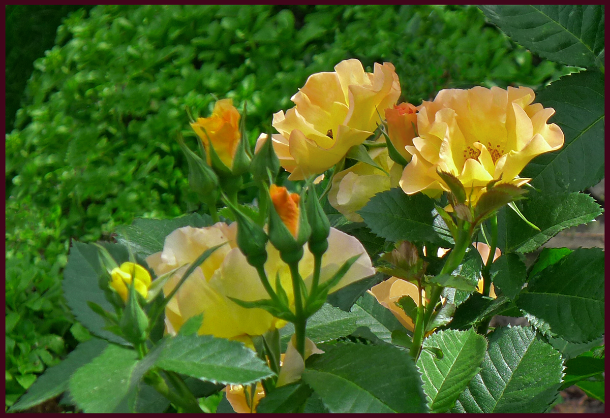
Ironic then, that the subject of this post is where, and on what, to sit in the garden! If you are reading this you are probably a gardener – during the growing season you do plenty of lifting and bending, squatting and kneeling. It’s okay to sit then – indeed you deserve to sit after long hours working in the hot sun.

So where’s the sweet spot for your sit spot? That depends on what you’ll be doing while you sit. Will you be eating dinner? Enjoying wine and canapés with a few friends? Or are you still working – sharpening your shears, mixing fertilizer or shelling peas? Or maybe you just want a place from which to admire your handiwork.

A few years ago I was conducting a pre-design interview with a new client. This fellow had been gardening for many years and wanted a couple of his own ideas incorporated into the design. I didn’t have a problem with this, but I did question one of his ideas. “I want to put a bench right there. Wouldn’t that look great?” he enthused, pointing to a spot a few meters away. “Hmmmm,” I answered noncommittally. All I could see was what he would be looking at from said bench – the large barren wall of his large home. I brought this to his attention. “I never thought of that,” he replied. We scrapped the bench idea and chose instead to put a small water feature in its place. Remember fellow gardeners, a sitting area isn’t just a pretty picture; it’s a destination – a place you want to go to and actually sit. So where it is situated is important; unless it’s only a place of work, it should offer a pleasing view. Even then, you might as well enjoy yourself while you shell the peas and shake the dirt off the potatoes.

Most important though, is functionality. To quote the late Steve Jobs, “It’s not just what it looks like….design is how it works.” In other words, wherever you’re going to situate that sit spot in your garden, and whatever it looks like, make sure it works for you. Some things to consider….

  • Is there a smelly compost or dog run nearby? If so, maybe don’t sit there.
  • Is there noise from a road or playground that would intrude on your quiet space?
  • If your sit spot is a work space, do you need a water faucet close by?
  • A dining area for enjoying full meals requires a site large enough for a patio table and chairs (trying to cut steak and eat corn-on-the-cob while sitting on an Adirondack chair isn’t very practical).
  • Do you want a place to have a siesta in the sun, or some shut-eye in the shade?
  • How much privacy will you want?
  • Think about the comfort of what you are sitting on – do you need cushions or some kind of back support?

Of course there are still aesthetic considerations. The style of your seating should fit with the design as a whole – both proportionately and thematically. Colours and materials should be chosen accordingly. And don’t feel you have to stop at one seating area – even smallish properties can often accommodate more than one sit spot. Perhaps an area to sit and dine, and another quiet spot to sit and read.

Need some inspiration? Have a look….

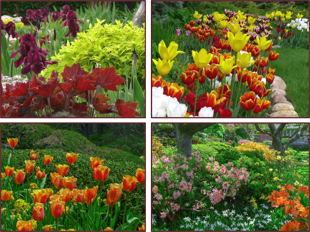
A weathered wooden patio set fits perfectly with the rough-hewn posts and beams of the pergola – and what a view! Kraze Legz Winery, Kaleden. Photo: Sue Gaviller

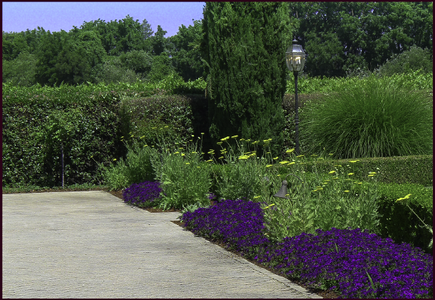
This client’s yard backs onto a natural area – the patio was thus situated to view both the garden and the aspen grove beyond the fence. Photo: Sue Gaviller

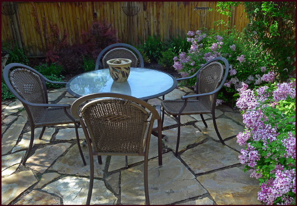
The warm brown colour of the furniture works well with the warm tan shades of the flagstone patio. Two dwarf reblooming Syringa ‘Sugar Plum Fairy’ flank the seating area providing heavenly aroma – twice a year! Photo Sue Gaviller

The shape and colour of this modern patio furniture is a good choice for the contemporary rectilinear design lines of the landscape. Photo: Pexels

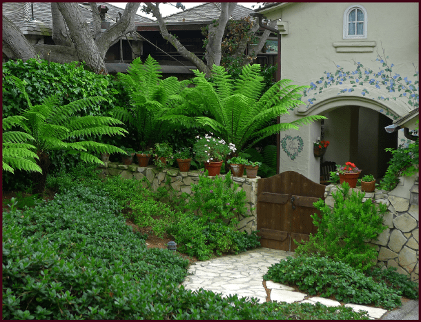
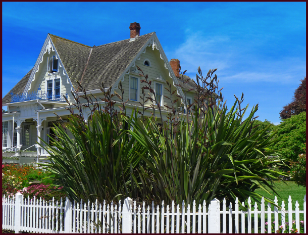
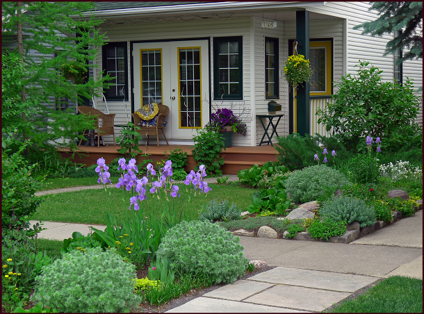
For small spaces, bistro sets are a good alternative to full size patio furniture; appropriate for meals (for 2 people) or for coffee and cookies. This homeowner has created privacy and an attractive view in a front yard setting by enclosing it with plantings. Photo: Sue Gaviller

When I designed this small seating area for a client, I didn’t know I’d end up sitting there frequently with her – sipping mojitos, Moscow mules, or our favourite; vodka tonics. It’s a cool, shady spot to relax on a hot summer day, with a spectacular view of the now-mature gardens. Photo: Sue Gaviller

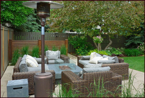
These clients wanted a large conversation set to entertain friends around a gas fire table – the space had to be designed to accommodate large chunky furniture while still allowing access to the hot tub (behind the screen). Photo: Sue Gaviller

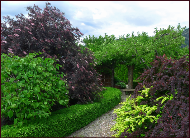
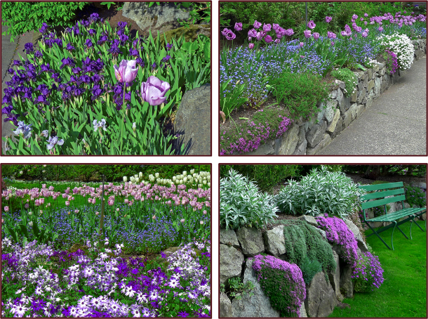
A bench under a vine-covered pergola offers respite from the hot California sun. Chateau St. Jean winery, Sonoma County. Photo: Sue Gaviller

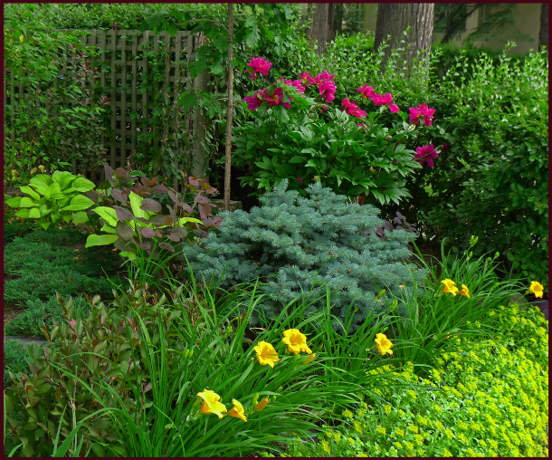
A cozy spot to sit, sheltered by 3 mature Cologreen junipers and surrounded by flowering shrubs and perennials. CNIB Gardens, Calgary. Photo: Sue Gaviller

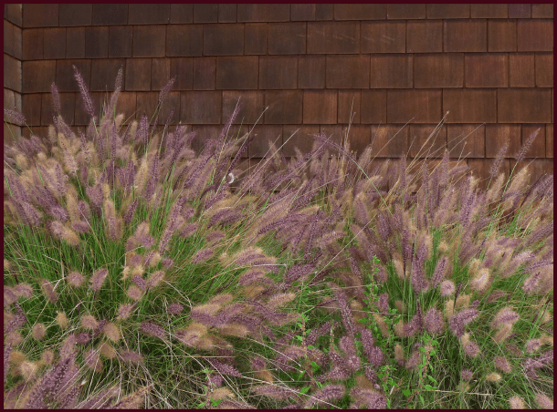
A faded wooden bench surrounded by ferns and fuchsias, fits the rustic exterior of the building.
Photo: Sue Gaviller

A bench outside the tasting room at La Frenz winery in Penticton is a feast for the eyes – a view of the pretty scented gardens up close and a view of the hills beyond. Photo: Sue Gaviller

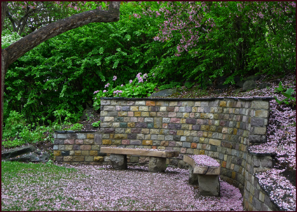
In the Shade of the Old Apple Tree – crabapple blossoms carpet the ground around two stone benches at Reader Rock Garden, Calgary. Photo: Sue Gaviller

A gravel pathway leads to a stone bench beneath a fruit tree. Bylands Nursery, West Kelowna.
Photo: Sue Gaviller

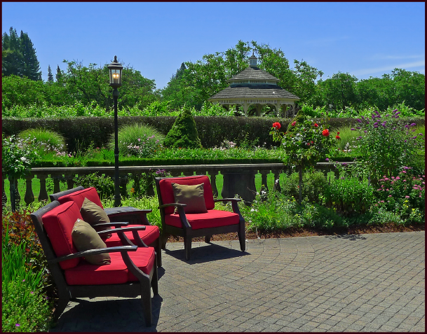
A sunny spot from which to view the beautiful gardens at Kendall Jackson winery. Photo: Sue Gaviller

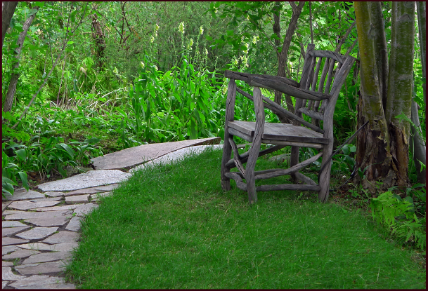
An old wooden chair, probably an original fixture, provides a moment of rest in the deep shade at Reader Rock Gardens, Calgary. Photo: Sue Gaviller

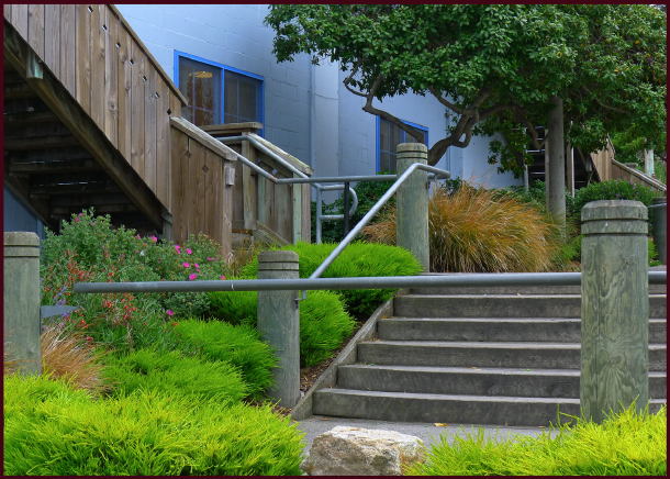
Covered verandas are a great place to sit and watch the world go by. This homeowner has beautified the sight-line with effective positioning of the gardens, including the use of the boulevard.
Photo: Sue Gaviller

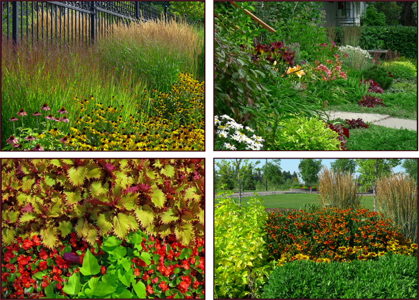
Keep in mind there are dimensional recommendations for specific spaces. For example, allow about 2½ linear feet per person for sitting space – this provides ample elbow room. Provide at least 3 feet of clearance around a patio table so guests can comfortably push their chairs out when dinner is over. Leave 1 – 1½ feet between chairs or couches and the coffee table. This makes for much easier navigation when you have a tray of drinks and appies – spilled drinks, bruised shins, or stubbed toes just ruin the party. And allow for a little room around the outside of a conversation set too – at least a foot, more if access around the furniture is needed.

Regardless of shape, 3 feet or more of clearance around the patio table means comfortable movement when sitting down to dinner, or getting up afterwards. Graphics: Sue Gaviller

Left: A large conversation set requires ample room to move in and around comfortably.
Right: A bistro set, though small, still needs enough room to be functional – 2½ feet for the table, 2½ feet for each chair space and at least a foot all the way around.
Graphics: Sue Gaviller

My sister’s dog Java, as a puppy, and still now as an old dog, thinks chairs are exclusively for his benefit. Of course he doesn’t care a whit about function or aesthetics. Photo: Cathy Gaviller

Well folks hope y’all enjoyed today’s post it is the first in more than a year, and what I hope is the first in a series on garden elements; fences and gates, pathways, and other elements that help to personalize our gardens.

Till then,
Sue


A Red by Any Other Name

“Hey Mom, what’s your favourite colour?”

I heard this question often when my boys were young. I could never give them a definitive answer though. “It depends,” I would say. “The colours I like for my garden aren’t necessarily the same colours I like to wear, or the colours I like to decorate the house with.” Was I a bad Mom, because I wouldn’t play the what’s-your-favourite game?

Over the years I’ve thought more about this – I suspect one day I’ll have grandchildren who will no doubt ask, “What’s your favourite colour Grandma?” – and I want to have an answer for them. So I decided to abide by the old adage, ‘when in doubt, make a list’. I took inventory of the colours in my garden, the colours in my closet, and the colours in the house. I compared the 3 lists and noted they had but one colour in common – rich dark burgundy, so named for the red wines of Burgundy (region of France). I guess this must be my favourite colour!

Now apparently, one’s favourite colour says something about one’s disposition; for example, people who like blue are reputed to be reliable, responsible, honest and loyal. Those who favour green are supposedly generous, good listeners, and possess good judgement. But I could find no descriptions of people whose favourite colour is burgundy.

If you’ve read my posts on colour theory you know that burgundy is actually a very dark red, and according to colour psychology, people who like red are passionate, strong-willed, extroverted and confident. They are also controlling, quick-tempered, easily bored and impulsive. Honey, does this sound like me? Well, maybe when I was younger.

But my favourite colour isn’t red; it’s burgundy – not ordinary red, but very dark red. Perhaps I’m everything a red personality is – but darker?  Yikes, how sinister! Upon further research I eventually found a number of references describing the ‘burgundy personality’. Burgundy is, apparently, a well-disciplined red. A mature, sophisticated red. Like red wine, I guess we get better with age….

Beautiful, bodacious burgundy - my favourite colour. Photos: Sue Gaviller

Beautiful, bodacious burgundy – my favourite colour. Photos: Sue Gaviller

Today is Valentine’s Day, an appropriate day to talk about red – and a fine time to savour a glass of Burgundy with someone you love. So in the spirit of Valentine’s Day and all things lovey-dovey, I leave you with this little piece of wisdom:

“Love does not consist in gazing at each other.....

“Love does not consist in gazing at each other…..

but in looking outward together in the same direction” ~ Antoine de Saint-Exupery ~

…but in looking outward together in the same direction” ~Antoine de Saint-Exupery

A really good smooch works too. Mourning Dove photos: Pat Gaviller

A really good smooch works too. Mourning Dove photos: Pat Gaviller

 
Happy Valentine’s Day,
Sue


Colouring Your Garden – Part 9: Colour Schemes

Over my last 8 posts I have looked at colour theory in considerable depth, focussing of course on its application in  garden design. One of the most powerful ways we can utilize this knowledge is by experimenting with colour schemes in our gardens.

Many gardeners balk at the idea of purposefully employing a garden colour scheme, assuming it’s just one more rule to follow, or at the very least, too restrictive.

Utilizing a colour scheme doesn’t have to be restrictive though, if we think rather in terms of a hue scheme. Looking to the Munsell Book of Colour, we find that for each hue, there are many permutations of value and saturation all arranged on an individual page. So if we want to work with a scheme which includes red, we have a whole hue page to choose from  just for red! The other hues in our scheme afford us the same broad selection of colours. A little less restrictive than you thought, right?

Colour Schemes

A colour scheme is a planned or logical combination of hues on a colour wheel. As we discussed in earlier posts, there is more than one colour wheel, but you’ll probably find the artist’s colour wheel to be the most user-friendly. You can then refer to Munsell hue pages (or reasonable facsimile) for guidance with the various colours that fall within that hue. I do sometimes utilize Munsell’s hue circle to work out colour schemes, but they aren’t always as straightforward. For ease of use then, I am mixing models here.

So how does one go about choosing a colour scheme for the garden? If your house or other backdrop is a particularly strong chromatic colour, then it’s most effective if you include that colour in your scheme. If on the other hand, your house is more neutral, then start with a colour you really like and build from there.

The colours used in this restaurant patio planting echo the muted red and yellow hues of the siding on the building. Photo: Sue Gaviller

Keep in mind that most plants – both in your garden and in the surrounding landscape – have green foliage, hence green will always be present. Since this hue is so much a part of the outside world, the eye tends to ignore it, and will instead focus on other colours. Green is therefore experienced mostly as a backdrop for your garden composition. But it can certainly be one of the hues in your colour scheme too.

You can vary the colour schemes from one part of the garden to another (particularly if you have a large canvas), and the scheme can also change or evolve as the season progresses. For example a garden that has a yellow-green and red-violet combination in the spring might add other colours later in the season, but those hues must always be part of the scheme.

Realistically speaking, some scenarios don’t lend themselves to formal colour schemes (if only for the reason that the proprietor of a well established garden may not want to part with anything – just to incorporate a colour scheme). One can still play with colour schemes though; containers are a great way to experiment without committing to a particular composition.

So let’s have a look at what we can construct using the artist’s colour wheel and some Munsell hue pages.

Monochromatic colour schemes use various values and degrees of saturation of a single hue. Working with a single hue creates naturally harmonious colour compositions.

Monochromatic colour scheme using the hue of red-violet (5RP). Photo and graphics: Sue Gaviller

Complementary colour schemes contain two hues that are opposite each other on the colour wheel.

This is a high contrast colour combo, which means it can be loud and demand attention. So you’ll want to tame it by including numerous value/saturation variations of the pure hues – and of course lots of green.

Complementary Colour Scheme: Red-violet (5RP) and yellow-green (5GY). Photos: Top left – Pat Gaviller. Bottom and right – Sue Gaviller

Analogous colour schemes use two or three hues that are next to each other on the colour wheel.

Although this is a low contrast combination, analogous hues still benefit from utilizing variations in saturation and value of the chosen hues, thus introducing more variety. Remember if you choose warm hues, there will need to be significant green (foliage) in your composition to provide the necessary cool/warm balance.

analagous-r-o-o-y-o-resize

Analogous Colour Scheme: red-orange (10R), orange (5YR) and yellow-orange (2.5Y). Photos and graphics: Sue Gaviller

Counterpoint schemes consist of a hue and one of the hues on either side of its complement.

This too is a dynamic colour combo, but somewhat less so than complementary compositions – many people prefer this colour duo as it generates less visual conflict. Again the use of variations in value and saturation of the two hues will create both unity and variety.

Photos: Sue Gaviller

Counterpoint Colour Scheme: red (5R) and yellow-green (5GY). Photos and graphics: Sue Gaviller

Split-complementary schemes are three-hue combos that use one hue and the two hues on either side of its complement.

The split-complementary colour combo has all the dynamism of complementary and counterpoint, with the balancing addition of two hues that are closer together. A garden may transition from the aforementioned counterpoint theme to split-complementary as the growing season progresses and more plants (thus more colours) take the stage.

Split Complementary colour scheme - yellow, blue-violet and red-violet. Photos: Top left: Cathy Gaviller. Right: Jane Reksten

Split Complementary colour scheme: yellow (5Y), blue-violet (7.5PB) and red-violet (5RP). Photos: Top left – Cathy Gaviller. Right – Jane Reksten. Graphics: Sue Gaviller

Analogous-complementary schemes use two adjacent hues and the complement of one of those hues.

Similar in effect to split-complementary, analogous-complementary schemes are especially soothing if the analogous constituents are cool hues.

Analogous-Complementary Colour Scheme: violet (5P), red-violet (5RP) and yellow-green (5YG). Photos: Sue Gaviller

Analogous-complementary Colour Scheme: violet (5P), red-violet (5RP) and yellow-green (5GY). Photos: Top left – Pat Gaviller. Bottom left/right – Sue Gaviller. Graphics: Sue Gaviller

Double-complementary schemes use two adjacent colors and the complements of both of those hues.

Graphics: Sue Gaviller

This four-hue scheme brings both drama (from opposites) and subtlety (from analogues) to a garden composition, and can be a natural seasonal transition from analogous-complementary as more plants come into bloom.

Double-complementary Colour Scheme: violet (5P), red-violet (5RP), yellow (5Y) and yellow-green (5GY). Photo and graphics: Sue Gaviller

Diads are colour schemes that consist of two hues located two spaces apart on the colour wheel.

Though this colour duo provides more contrast than an analogous scheme, it is still a low-contrast theme and less dramatic than higher contrast combinations. More contrast can be introduced if one of the hues is warm and one is cool, for example red and purple.

Diadic Colour Scheme: red (5R) and violet (5P). Photos: top – Pat Gaviller. Bottom – Sue Gaviller. Graphics: Sue Gaviller

Triads use three hues that are equally spaced around the colour wheel.

Triadic schemes offer interesting colour combinations and are inherently balanced because the hues are all equidistant from each other.

Triadic Colour Scheme: Violet-blue (7.5PB), orange-red (10R), and yellow-green (5GY). Photos: Sue Gaviller

Triadic Colour Scheme: blue-violet (7.5PB), orange-red (10R), and yellow-green (5GY). Photos and graphics: Sue Gaviller

Tetrads are colour schemes using four hues that are consistently spaced on the colour wheel.

  • Square tetrad – 4 hues touched by the four corners of a square placed in the centre of the colour wheel.
  • Rectangular tetrad – 4 hues touched by the four corners of a rectangle placed in the centre of the colour wheel

Four-hue schemes provide considerable colour choice thus can be quite vibrant, especially when hues are at full saturation. They can be toned down somewhat with the addition of less saturated versions of the pure hues.

Tetradic Colour Scheme: red-violet (5RP), orange (5R), yellow-green (5GY) and blue (5B). Photos and graphics: Sue Gaviller

You can see that with all the variations in value and saturation for each hue, many different but related colours are available to you – even when using only a couple of hues. Unfortunately, most of us don’t have access to the Munsell Book of Color, but there are numerous apps and online tools that will provide more than enough visual info for application in the garden.

I highly recommend the Virtual Munsell Color Wheel. It’s very easy to use – just bear in mind that it includes all the intermediate hues that lie between the basic hues (totaling 40 hues), which you may find overwhelming. The digital ‘hue pages’ aren’t identical to those in the Munsell Book of Colour either (copyright and such). You’ll also note that, compared to the traditional RYB colour wheel, Munsell’s blue (5B) appears more green and his purple-blue (5PB) more blue – this is because he divided the circular colour spectrum differently. I wouldn’t get too carried away with detail or accuracy though. Just choose your colour scheme using the artist’s colour wheel and find the hues that most closely approximate them on the Virtual Wheel.

Finding foliage or flowers in exactly the right colour may be next to impossible anyway. But don’t get discouraged. Remember green foliage abounds in the garden, and with all that ‘green between’, you’ll find that almost-the-right-colour will be close enough.

‘Til next time,
Sue


Colouring Your Garden, Part 7 – You Can’t Believe Everything You See

It’s the last week of March and it’s again been more than five months since I last posted to this blog. I just don’t know where the time goes. I’m as busy as I’ve ever been, and yet I feel like I’m accomplishing less. Perhaps it’s a function of age – everything seems to take longer the older I get. Or maybe it’s a function of the increasingly higher standards I set for myself. For example, last month I gave two  lectures to the current class of Master Gardener students. One of these was a full day design presentation – a talk I’d given (in some form or another) dozens of times and to a variety of audiences. It gets tweaked each time – compressed or expanded depending on the audience, but this time I ended up rebuilding the whole damn thing! Why? Well, as I reviewed my PowerPoint slides I found myself scoffing at everything; the photos looked unprofessional, the font was dated, the animation amateurish… and so a ‘tweak’ became a major reconstruction.

I was relatively happy with the finished product, but I don’t know if it was worth the several all-nighters I pulled to get it done (staying up all night was way easier, and waaaay more fun, in my twenties than in my fifties). And in the end, did I actually impart any more, or any better information to the students? Who knows? I do know though, that perfectionism isn’t always in one’s best interest. Because now I am sick. Not deathly ill, but miserable enough that I don’t feel like doing much of anything. So loyal readers, it seems my misfortune is your good fortune since the one thing I do feel up to, is writing. In fact it just might make me feel better.

If you remember my last post (it was so long ago, I barely remember) we examined the relationship between colour and various aspects of human perception – more specifically, how the former can impact the latter. Continuing with this exploration then, let’s look at some of the ways our visual perception can in turn affect and distort colour.

Understanding various visual mechanisms – ways our vision adapts and adjusts – is a key piece of the garden colour puzzle. For the most part, our eyes successfully adapt to ever-changing visual data, allowing us to maintain a stable and consistent interpretation of the world around us. We know that an object appearing smaller from across a room is the same size regardless of where we view it from, or that the darker colour created by a shadow doesn’t change the actual colour of an object. We know these things without even thinking about them – unless we are trying to draw or paint said objects. Sometimes though, this ‘constancy apparatus’ fails and our eyes make erroneous adjustments. Four such adjustments are commonly experienced; Simultaneous Contrast, Successive Contrast, Colour Assimilation and Colour Separation. Today we’ll look at the first two of these visual phenomena.

Simultaneous Contrast

Adjacent colours interact with one another other in a most curious way – actually changing the appearance of each other; an effect known as Simultaneous Contrast. Of course this phenomenon isn’t due to any magical properties the colours possess; rather the adjustments are taking place within our own visual system as it attempts to decipher and differentiate that which it sees by accentuating colour differences. All three colour attributes can be influenced by neighbouring colours, the effect being most noticeable when one colour is completely surrounded by another.

sc - colour wheel

Simultaneous Contrast of Hue. An identical magenta-coloured circle is placed all around the Artist’s Wheel illustrating how a hue can differ dramatically in appearance depending on the background hue. Graphics: Sue Gaviller

So what is actually happening here? Are our eyes just playing tricks on us? Well yes in fact they are. As I mentioned before, one of the ways our eyes recognize and discriminate between adjacent colours is by accentuating their differences, and in so doing, imbues each colour with traits of the other colour’s opposite. Yikes, that was a mouthful wasn’t it? Maybe I can better explain with some examples.

In the first example below, a magenta-coloured square is surrounded by a green square on the left and an orange square on the right – we can all agree it doesn’t look like the same magenta, right? (I assure you it is though). Our eyes acknowledge the green then ‘over-differentiate’ and induce green’s opposite hue, red, which then mixes with the magenta, making it appear warmer – hot pink even. The orange square on the other hand stimulates our eyes to add its opposite, blue, thus creating a cooler looking purple-pink. Another way to think of it is that colours will shift in hue, value and saturation away from those of the surrounding colour. Because the magenta square is smaller and completely enveloped in another colour it has little effect on those surrounding colours.

Graphics: Sue Gaviller

Simultaneous Contrast of Hue – note how the hue of the smaller square appears different depending on the background colour. Graphics: Sue Gaviller.

The next example shows Simultaneous Contrast as it relates to Value alone. On the left a medium gray square is enclosed on a background of darker charcoal gray, and on the right the same medium gray is surrounded by lighter gray. Again our vision discriminates between the darker gray and the medium gray by overstating the lightness of the medium gray (left). Likewise our eyes discriminate between the lighter gray and the medium gray by overstating the darkness of the medium gray (right).

Graphics: Sue Gaviller

Simultaneous Contrast of Value – a medium gray square looks markedly different surrounded by darker gray than by the lighter gray. Graphics: Sue Gaviller

In the third example the smaller square is a red of medium to low saturation, but its saturation seems to strengthen as its background colour weakens.

Graphics: Sue Gaviller

Simultaneous Contrast of Chroma/Saturation. All of the above squares are the same hue (5R or Red) but vary in saturation (colour content). The smaller square is weakly saturated but appears even less so in contrast to the fully saturated square on the left. However when contrasted with the almost-gray square on the right, it appears to have much richer colour content.  Graphics: Sue Gaviller

It is difficult to illustrate this effect with garden photographs – photos can deceive, particularly where colour is concerned. Perceived hue differences (or lack thereof) could thus be the fault of the photo and not a real representation of what is happening in the garden. And the degree to which Simultaneous Contrast is seen in the garden is less than one might think – there are many other factors at play, for example; weather changes, seasonal changes, daily sun movements, and even the amount of particulate matter in the air, can all affect lighting conditions, which in turn affect the colours we observe. Colour is reflected from other objects and surfaces too, thus altering hue perception, and the constant presence of unifying green can mitigate various colour illusions.

Nevertheless we do witness Simultaneous Contrast in our gardens and landscapes, though it is more subtle than squares of colour on a computer monitor. The effect, especially where hue is concerned, is most noticeable when two adjacent hues present as solid blocks of uninterrupted colour. Of course plants don’t always present this way since foliage, flower petals, stamens etc. are often different colours, which means colours will intermingle (this can produce yet another effect, one I will look at in my next post). Tertiary or intermediate colours (red-violet, blue-green, etc.) will be influenced to a greater degree by their surroundings than basic or primary hues because their make-up is more complex.

sc - liatris resize 3

Liatris spicata is a medium to high value red-violet – when contrasted with bright yellow Heliopsis helianthoides, it appears slightly blue-ish. However, next to Helictotrichon sempervirens, it looks somewhat pinker. Photos: Sue Gaviller

sc - hue juniper 3

Juniperus horizontalis ‘Blue Chip’ is a widely spreading evergreen groundcover – note how its blue-green hue shifts from slightly mauve-ish on the left to dull green on the right. Photo: Sue Gaviller

Photos: Sue Gaviller

Echinops ritro ‘Veitch’s Blue’ (left) looks a rich saturated purple-blue when paired with very desaturated Eryngium (right). Photos: Sue Gaviller

Photos: Sue Gaviller

The same Echinops would appear somewhat less saturated if situated beside the very rich-hued Gentian on the right Photos: Sue Gaviller

Simultaneous Contrast is the reason two complementary colours, when used together, create such a forceful pairing – they increase the intensity of each other. Think about it; each colour bestows upon the other, the traits of its own opposite – which is the other colour. A double dose of each!

sc - complementary colours 2 crop

This complementary pairing of red-violet Iris germanica against a backdrop of yellow-green Spiraea japonica ‘Goldmound’ creates an intense vignette. Photo: Sue Gaviller

Photo: Sue Gaviller

Red-orange and blue-green succulents bounce dazzling colour off each other because they are a complementary pairing. Photo: Sue Gaviller

Successive Contrast

Another visual effect related to Simultaneous Contrast is Successive Contrast – the best way to demonstrate this effect is to try the following: stare at the coloured circle below for 30 to 60 seconds, then immediately turn your gaze to a blank piece of white paper. What do you see? If you don’t see anything, try again. And if you have any serious eye condition or disease, you might want to avoid this exercise altogether.

green circle 2


When you look at the white paper after staring at the green circle,  you should see a circle of the same size in a light reddish pink colour – this is called an afterimage. Let’s try another one. Stare at the orange circle below for half-a-minute or so then look at the white piece of paper again.

orange circle


So what colour did y’all see this time? Light bluish right? We see this afterimage because the eye’s receptors for a particular color become desensitized to it, or more accurately, the receptors for the other colours become more sensitive – hence we see the perceptual complement of the colour we’ve just been staring at. The afterimage will dissipate shortly, its duration proportionate to the length of time you viewed the original colour and the intensity (saturation) of that colour.

Now try looking at each of the circles again, but this time when you avert your gaze, instead of focusing on the white paper, look towards a different coloured background. What do you notice? The colour of the afterimage should now blend with the new colour you are looking at. You can see where this might come into play in the garden – look at the following garden image for at least 30 seconds then at the white paper again. Do you experience the same effect?

Photo: Sue Gaviller

Photo: Sue Gaviller

How about this one?

Photo: Sue Gaviller

Photo: Sue Gaviller

The two previous images should produce afterimages the same size and shape as the photo images, in colours opposite to the predominant colour in the photos. Now see what happens when you look at one of them for a bit, then the other right after – how do they affect each other. What about the next image – how does staring at each of the previous two photos affect the way you see the colour of the Rudbeckia in the following photo?

Photo: Pat Gaviller

Photo: Pat Gaviller

The effect here will likely be muted – in fact you may have to do this exercise a few times before you recognize it. And because the effect is fleeting, its implications in the garden environs are limited. Large swaths of colour are more likely to produce afterimage effect because you will look at them for longer – all in all the experience of afterimages distorting the visual experience of successive plant colours, will at most be intermittent.

However, learning to recognize this phenomenon, as well as Simultaneous Contrast, affords the gardener one more advantage in working with colour in the garden. We’ll look at two more interesting colour effects in my next post.

Well whaddya know? I feel much better. Now if only pretty plants and pretty colours could heal our hurting world….

’Til next time,
Sue


Colouring Your Garden – Part 6; Putting Colour to Work

Greetings loyal readers. It seems I haven’t published a post in more than 5 months. I guess time flies when you’re having fun… or when you’re really busy. And a very busy summer it has been, both personally and professionally. Thanks to all who keep visiting here despite the lack of new content.

So to get back to where we were a loooong time ago, let’s continue with our study of colour in the garden. It’s time to take all that technical stuff about Hue, Value & Saturation and put it to work for you.

The interaction between colour and human perception is two-way – colour can influence perception, and perception can influence how we see colour. Today we’ll look at a couple of ways colour can affect perception and how this might be utilized in our gardens.

According to Encarta Dictionary, the psychological definition of perception is “any neurological process of acquiring and mentally interpreting information from the senses.” It is the interpreting of this information that makes colour a useful tool.

Temperature Perception

Looking out my window one morning last week, I saw blue-grey haze. Acrid smoke from distant forest fires filled the air, prompting air quality advisories and recommending folks stay inside. When I did venture outside briefly, I was surprised at how warm it was – the smoky, blue-grey light made it appear much cooler. Later that same day, as increasingly more smoke particles refracted what light could pierce the smoke, a reddish-orange light was cast over everything – I stepped outside again, this time anticipating oppressive heat, but it wasn’t as warm as I’d expected.

Both scenarios came about because my brain incorrectly interpreted the information my eyes had gathered – I expected coolness when the light wavelengths were in a cooler range, and warmth when longer wavelengths prevailed. Indeed we may actually feel cooler in the presence of cool colours, and warmer in the presence of warm colours. Those of you who live in colder climates have no doubt had the experience of looking out the window on a frigid winter day and feeling warmed to the core at the sight of a bright yellow sun.

This phenomenon can be exploited in the garden – perhaps you look out your window on a too-cool spring day and your whole being longs for the warmth of summer. Your eyes look toward your garden and espy drifts of orange tulips, yellow primrose and warm pink azalea – and you feel instantly warm. Or maybe you are sitting in your garden on a smoldering hot summer afternoon and note the swaths of soft mauve Russian sage, cool blue Delphinium and violet-blue globe thistle – how cool it feels.

warm spring colours

Warm hues make cool spring days feel balmy and bright.
Top
– Photos: Pat Gaviller. Bottom – Photos: Sue Gaviller

cool summer colours

Summertime blues provide cool respite from the heat. Photos: Sue Gaviller

On the other hand, maybe you like the coolness of spring and choose to accentuate this with the use of cool springtime hues – bright blue forget-me-nots, lilac-pink rock cress, mauve tulips and rich purple dwarf iris. And for those who like it hot, summer’s heat can be turned up a notch by using plants that bloom warm colours in midsummer – bright golden Rudbeckia, mahogany-red Helenium, warm pink Echinacea, and a sprinkling of hot lime-green foliage. Remember though, that abundant warm colours in the garden still require lots of green – enough to balance and counteract the bright reds, oranges and yellows.

cool spring colours 4 resize

Cool spring colours highlight cool spring weather. Photos: Sue Gaviller

warm summer colours -resize

The heat is on – warm colours sizzle in the summer heat. Photos: Sue Gaviller

Depth/Distance Perception

Visual design often involves a bit of trickery – ways of deceiving the eye to see something that isn’t altogether accurate. For example, in the urban setting many of us reside, yards are often small and disproportionately shaped. The designer’s challenge is to create a sense of spaciousness and pleasing proportion. Understanding the nuances of colour and using it effectively is one way we can achieve this.

If you recall from earlier posts in this series, warm colours appear closer than they really are, as do high value colours and those that are highly saturated. Likewise, cool colours, as well as those of low value and/or low saturation, appear further away. This optical illusion can be used to elongate a short flat space or shorten a long narrow space.

Since all three colour attributes come into play here, it isn’t always possible to predict how the eye will perceive a particular colour. For example, cool colours tend to recede and high value colours appear to advance – so a pastel mauve might do either depending on the colours that surround it. In the image below – one of many Joseph Alber’s paintings paying homage to ‘the square’ – the black central area at first appears to recede. The mauve area however, appears to alternately approach and retreat, thus bringing the black square forward then back.

For any given colour to provide the desired depth illusion, you must consider its context, i.e. its relationship to other nearby colours. A warm hue will appear closer to the viewer when contrasted with a cool hue of equal or lower value and saturation, but further away when contrasted with another warm hue of greater saturation and/or higher value. And although cool colours usually appear to recede, a cool colour that is high value will advance if contrasted with a low value colour of the same hue and equal or less saturation.

squares resize

The central hot pink square appears to advance toward us when set against the cooler, darker and less saturated purple square, whereas it recedes when contrasted with the warmer, lighter and more saturated orange. It also appears to be a different colour – a phenomenon I’ll discuss in my next post. Graphics: Sue Gaviller

Photo: Sue Gaviller

Lilium ‘Loretto’ and Berberis thunbergii both present very warm colouring. However, the lower value and weaker saturation of the barberry make it appear to recede, in contrast to the higher value and richer saturation of the lily, which appears to ‘pop right out’ at the camera. Photo: Sue Gaviller

Photo and graphics: Sue Gaviller

While cool colours often appear to recede from the observer, this cool mauve does the opposite when seen against a darker, less saturated version of the same hue. Note how the high-value, cool coloured tulips in the foreground jump out at us visually and the dark ones retreat further into the background. Photo and graphics: Sue Gaviller

So how do we use all of this to our benefit in the garden? If the colour of an object causes it to appear further away, placing this colour at the far end of a short flat space might serve to visually elongate the space – additionally, by contrasting this with the use of advancing colours on the side borders, the disproportionate width may appear compressed. Likewise, a long narrow space can be shortened and widened by placing advancing colours at the far end and receding colours on the lateral boundaries. The effect is subtle – colour is by no means the primary cue whereby we perceive depth – but when combined with other forms of ‘forced perspective’, a strong impression of distance or closeness can be implied.

In this well done rectilinear landscape, the designer has created a space that is longer in one direction than the other. Photo: Pat Gaviller

orange daylilies resize

A photoshopped version of the same photo – note the wall of warm, high value, fully saturated orange daylilies appears to advance, thus shortening the space. The junipers, now slightly darker, appear to recede thus widening the space somewhat. Photo: Pat Gaviller. Retouch: Sue Gaviller

long narrow yard reversed resize

Viewing the two images side by side, the effect is more obvious, albeit still subtle.

Do You See What I See?

The perception that some colours advance and others recede, isn’t an experience shared by everyone, particularly the warm vs. cool dichotomy – indeed there are those who don’t experience this phenomenon at all, as well as those who actually see the reverse of what most people see. It can also vary within the same individual, dependent on numerous factors; for example, the effect is much less apparent if the two contrasting colours (warm and cool) are viewed against a very light background. Age too, can dictate how colour affects our perception.

It’s all about the physics of vision. Yawn. Physics – I had the dullest, most boring, uninspiring, high school physics teacher ever. Last period of the day. Double yawn. But I digress. To put it in simplest terms, it has to do with light rays of differing wavelengths and where they refract and converge on our retinas.

Regardless, one thing is certain; colour – with its countless combinations of warm or cool, light or dark, and muted or vibrant – affects us all in subtle ways we aren’t even aware of. In my next post I’ll look at how our perception, in turn, affects the way we see colour.

’Til then,
Sue

Fifty Shades of Gray ~ Colouring Your Garden; Part 5

Ha! You thought this post was going be about the tawdry exploits of Anastasia Steele and Christian Grey didn’t you? Tsk, tsk, naughty gardeners. Sorry all you lusty ladies, but this post is literally about the (more than) fifty shades of gray… and brown.

Gray and brown; the dull drab colours of a lifeless winter landscape. Haven’t we seen enough of those – do we really need to discuss them on the pages of this usually-colourful blog? Well yes I’m afraid we do – for a number of reasons. While true achromatic grays are rarely seen, if at all, in plant life (more likely gray-green or blue-gray), we do see browns and beiges – in tree bark and branches, seed heads, dying foliage, ornamental grasses and sedges, and even a few flowers.

Garden Grays - aren't really gray; they are very desaturated blues and greens. Clockwise from top left: Elaeagnus angustifolia, Santolina chamaecyparissus, Salix salicola, Artemisia schmidtiana. Photos: Sue Gaviller

Garden Grays – aren’t really gray; they are very desaturated blues and greens. Clockwise from top left: Elaeagnus angustifolia, Santolina chamaecyparissus, Salix salicola, Artemisia schmidtiana. Photos: Sue Gaviller

Garden browns, clockwise from top left: brown container with Heuchera ‘Pinot Gris’ and Carex ‘Toffee Twist’, frosted leaf of Sorbus aucuparia, Phormium tenax ‘Atropurpureum’, Malus sp., Calamagrostis acutiflora ‘Karl Foerster’, Ulmus pumila buds. Photos: Sue Gaviller

Grays and browns comprise much of the background colour our gardens are seen against – soil, mulch, concrete, stone, wood etc. Our homes too, are backdrop to the garden and are often finished with siding, stucco or stone in some version of gray or brown. While it may seem outside the purview of a garden designer to comment on house colour, it’s actually an important consideration in the overall appeal of a garden. Case in point – our house was once painted white and contributed enormously to the midday washed-out appearance of my sun-drenched front garden. After painting the house a soft warm cafe-au-lait, the garden appears much richer, and colours hold up far better in full sun.

House colour is of course a very personal choice – my intent here is merely to arm you with a little understanding of browns, beiges and grays to help you make that choice. These colours are what paint companies and fashionistas call ‘neutral’. However, a true neutral is a colour that is entirely without hue – it is achromatic (i.e. white, gray or black). To avoid confusion then, I’ll avoid the use of the word altogether.

Many Shades of Gray

As we learned in my last post, colours that are completely desaturated – those at the centre of Munsell’s Color Space, have no hue content at all. These grays differ from each other only in value. However, many of the colours we call gray actually still contain trace amounts of hue. This is why it’s so difficult to match grays (white or black for that matter too) – if they have even a little hue and the parent hues are different, the eye will perceive this discrepancy.

Munsell's Grays: each of these colour chips if seen on it's own, would appear gray – seen together though it becomes obvious that they aren't true grays. In fact they represent the first step of saturation for 20 hues at 8 different values.

Munsell’s Grays: each of these colour chips if seen on its own, might appear gray – seen together though it becomes obvious that they aren’t true grays. In fact they represent the first step of saturation for 20 hues at 8 different values.

For example, the two grays below aren’t the same – they have the same value but each has enough hue that we can see they are different; different enough that if my husband wore pants in the warmer gray and a shirt in the cooler gray, I would gently advise, ‘Honey those don’t match.’

2 Grays

Both of these grays have a value of 5, but the cool gray on the left has its base in a violet hue whereas the warm gray on the right has a parent hue of orange.

If on the other hand the grays are of the same hue but different values, the eye will intuitively perceive the consistent underlying hue and experience a unified pairing – the difference will be noted but seen as effective contrast rather than awkward clash.

The above grays have the same parent hue – the medium-low value gray on the left and the medium-high on the right are united by this unchanging hue.

The above grays have the same parent hue – the medium-low value gray on the left and the medium-high on the right are united by this unchanging hue.

It’s clear then, that choosing paint colours to accompany that gray vinyl siding on your house, may not be as straightforward as dark gray and lighter gray. If you want contrasting grays, it’s better to maintain a consistent hue and introduce contrast by changing only the value or saturation – otherwise, because the gray has minimal hue content, the eye won’t see colour contrast so much as it will see colour conflict.

Left: Gray siding and gray painted stucco have the same hue hence present a cohesive combination. Right: Gray siding and stucco have different underlying hues thus appear less connected.

Left: Gray siding and gray painted stucco have the same hue hence present a cohesive combination.
Right: Gray siding and stucco have different underlying hues thus appear less connected.

Stone siding, because it has both warm and cool underlying hues, is more forgiving of its accompanying colours – while the warmer gray is still a better match, the cool gray does work.

Stone siding, because it has both warm and cool underlying hues, is more forgiving of its accompanying colours – while the warmer gray is still a better match, the cool gray does work.

This isn’t to say hue contrast shouldn’t be employed when choosing house colours; indeed it is a common design strategy, but it will be more effectively achieved by the addition of a stronger, somewhat more saturated colour – saturated enough that the eye can perceive it as purposeful contrast rather than ‘oops that’s the wrong colour’.

gray siding contrast 2 resample

The rusty-brown of cedar shakes and patio pavers, though not fully saturated, has sufficient colour content to provide effective contrast for the warm gray.

Keep in mind though, that the stronger the colour the more it will impact your choice of garden colour scheme. A weakly saturated beige or gray requires little consideration here, but a coppery brown, as pictured above, has enough hue content that it must be taken into account when deciding on colours for your garden.

The copper-brown shakes present enough colour saturation that the wrong plant choices could look awkward – good plant choices, like the shrubs on the right, pick up on both the stronger copper-brown and the grays. Photo: Sue Gaviller

Some may think me too conservative in my approach to exterior colour, but my comments on the subject are really only as it pertains to grays and browns (since that is the focus of this post). While we all have our own individual tastes, the more we explore and study colour, the better we are able to discern its subtleties and the nuances that contribute to a colour palette we’re happy with – or unhappy with.

Browns, Beiges, Tans and Taupes

Warm grays with a little more hue content, are browns and beiges, the parent hues being red, orange, yellow and sometimes green-yellow or red-violet. Despite their slightly increased saturation, it can still be difficult to discern an underlying hue – choosing the appropriate brown or beige can thus be a challenge. And because they have a bit more colour content, they are also affected more by light conditions. The first day after painting our house that attractive cafe-au-lait colour (the actual name I believe was Beige-Gray), I returned home just before dusk as the last rays of sun were dispersing. To my dismay, as I turned the corner and caught a glimpse of our newly painted house I saw pink – blech!

“OMG what have we done?” I thought, then resigned myself to the fact that I’d have to tell hubby to repaint (like that was going to happen). The next day however, it didn’t look so bad – in fact it was exactly how I’d envisioned it when we chose the colour. Relieved, I assumed the paint must’ve just needed to ‘cure’ before presenting its real colour. Of course I know now that the more likely explanation had to do with the colour of the ambient light – evening and early morning light is pink or reddish compared to other times of day when it may be more yellow, white or blue.

So how do we choose the right brown or beige? As with grays, maintaining a consistent hue is still the safest choice and therefore my best advice. Easier said than done; since the hues that underlie these colours may not be immediately discernible.

Let’s look at a few examples. Below are three different browns, each with a different parent hue – can you determine what the underlying hues are? Click on each one for the answer.


Small wonder that there are so many mismatched browns, beiges, tans and taupes – especially in older neighbourhoods where the original exterior colours have long since been covered by the respective paint choices of successive homeowners. A better understanding of why these mismatches occur will help you avoid making the same mistakes. The images below represent 2 different scenarios for house colours and materials. Which one do you think produces a more unified picture? Why?

brown house x 2

The answer is of course the colour combination on the right in which all colours have the same parent hue. In the image on the left the colours are based in several different hues which results in disunity.

All colours and materials are based in the same orange-yellow hue – Munsell’s 10YR.

And what about the garden – need we consider the undertones in the beige or brown colour of our home to make colour choices for the garden? As I mentioned previously, the stronger the colour of one’s house, the more it will factor into the garden colour scheme. However, with weakly saturated browns and beiges, you don’t really need to – they have such low hue content that you can get away with pretty much any colour scheme. But you certainly could – by bringing the same underlying hue from the house into the garden, a deep yet subtle sense of unity is achieved, though the untrained eye may not recognize it, only intuit it.

Since the underlying hue of the house colour(s) is a yellowish-orange, including this hue in the garden colour scheme provides subtle unity. Photo: Sue Gaviller

Paint companies don’t always make it easy for us find the right hue – while some organize their paint swatches into strips of 4 or 5 colours in the same hue family, others mix several similar hues within the same strip, leaving you guessing. And even those that use single hue strips, only a small sample of the possible colours within that hue are included. For these reasons I find the hue pages in the Munsell Book of Color to be a most helpful tool – but at $1000.00+ for the book, the cost is prohibitive for most.

Feeling a little frustrated now because ‘Hey how the heck am I supposed to figure all this out without those expensive Munsell colour charts at my disposal?’ Well here’s something for you:

Cool Tools (Yup there’s an App for that)

Since most of us don’t have 1000.00 dollars to spend on Munsell’s Book of Color, but we’d still like the benefit of comprehensive hue charts, check these out:

David Briggs’ Dimensions of Colour: Hue, Value and Chroma – scroll down to the third image, Figure 1.1.3. (wait a few seconds for it to load). Click on the thumbnail of any hue page and it will enlarge. All 40 Munsell hue pages are accessible for your viewing and reference.

Classical Lab has developed a Munsell App for iPad and iPhone called MunsellDG.  Note: the hue pages differ from the actual Munsell Book of Color due to copyright, but for the purposes of the average gardener or garden designer this is more than enough to help you determine ‘what hue is this?’, ‘what goes with this?’, etc. – and you can take it with you wherever you go.

Munsell Color Studies and Art – an interactive website with exercises to test and hone your colour skills.

Grays and browns may seem lifeless, especially when spring is so close and an explosion of colour is just around the corner, but understanding these understated colours and learning to see what lies beneath them is one more step towards ‘colouring your garden’ with confidence.

It takes practice to see colour in this new way – and I’m not done yet….

’Til next time,
Sue

Colouring Your Garden – Part 4; Saturated Solutions

A week or so ago, while out for a walk with my sister in her inner-city neighbourhood, I heard the familiar sound of Robin chirps. It took me a minute to realize that the sound was out of place on this mid-February afternoon. Indeed my sister doubted me initially, but then she heard it too. “Holy $#!+.” she said.  According to local bird experts a few robins do spend the winter here, but neither of us had ever seen one this early in the year.

Several blocks later I happened to look up and espied what appeared to be pussy willows. At first I thought it might be water droplets on the branches reflecting the late day sun – but then I reached up and felt the fat fuzzy protuberances. Yep, those are pussy willows. While there are many species of willow that produce the downy catkins, a few as early as February,  Salix discolor, the true North American pussy willow doesn’t usually bloom here until mid March – this was February 12th! I didn’t know whether to be elated or alarmed. Either spring is coming really early or the birds and the trees are in for a cold, snowy, nasty surprise in the weeks to come – despite a mild winter from a moderate El Nino effect, this is still zone 3 Calgary and the early bird rarely gets the worm. Only time will tell I guess, but my vote is for an early spring. In the meantime fellow gardeners, we have more to learn about colour.

Over the last few months I’ve been discussing colour theory as it relates to garden design. We’ve looked at two of the three attributes of colour (Hue and Value) and today we’ll examine the third; Saturation, or what Munsell called Chroma.

Saturation is the strength or concentration of a colour and is determined by how much of a particular hue is present in that colour. Think high school science for a moment and consider the amount of solute in a solution – in the scientific sense, saturation occurs when a liquid has reached its capacity to absorb a dissolved substance. Brine for example, is a solution of water and salt – if we start with pure water, then add salt until the water can’t absorb any more, we have a saturated solution. Similarly with colour, if we start with gray then add a particular hue until maximum hue content (i.e the pure hue) is reached, then we have full colour saturation.

High Saturation

A highly saturated colour reflects a great deal of light from one specific part of the spectrum, and very little light from anywhere else on the spectrum; for example, the pure hue of red reflects most light from the end of the visible spectrum where red is located, and yellow reflects most light from near the middle of the spectrum.

The pure hues (i.e. Munsell’s 10 basic hues around the outer edge of the Munsell Colour Space, or the 12 hues on the Artist’s Colour Wheel) are considered fully saturated. These are the vibrant colours some gardeners adore and others abhor; they are intense and flamboyant, and employed effectively are stunning additions to a garden composition. Used indiscriminately however, they’re sure to create garden chaos.

Photos and Graphics: Sue Gaviller

Full saturation. Photos and Graphics: Sue Gaviller

Saturated hues hold up well under full sun with very little colour washout, and like warm hues and high value colours, appear closer than they really are. They are thus highly conspicuous in the landscape, perfect for creating emphasis or accenting an area you want to draw attention to; an approach or a destination.

Photo: Sue Gaviller

Planting bright saturated colours in entryway container arrangements as this gardener has done, effectively draws the eye to the front entrance, creating a welcoming focal point. Photo: Sue Gaviller

Public gardens and parks often use abundant saturated colours in their annual display gardens – while this style of planting design isn’t one I’m likely to adopt, the plethora of intense colour certainly does what it’s intended to do; attract attention.

Photo: Sue Gaviller

Massed annuals in strong spicy hues draw the eye directly to the Tea House, advertising its presence and inviting visitors in. Note how the saturated reds and yellows hold their colour without fading in the bright sunlight. Photo: Sue Gaviller

Fullest saturation is experienced when hues are used individually rather than together – if two highly saturated colours are in close proximity to each other, the effect will be to decrease the intensity of both. This isn’t to say you should never use more than one saturated colour in a composition – you certainly can – but any given colour will be seen at its purist if there aren’t other equally intense, and therefore competing, colours close by (remember the design principle Unity by Dominance). The exception to this is complementary hues, which will both be intensified by their nearness to one another.

Photo: Pat Gaviller

Lime green Hosta, violet-red Paeonia, golden Hemerocallis and yellow Sedum all present very saturated colour – while it’s an attractive composition, the strong colours do compete somewhat meaning none of them can take centre stage. Photo: Pat Gaviller

Photo: Pat Gaviller

The same photo, now cropped to isolate the peony from the other intense colours, illustrates how a saturated colour on its own has stronger colour presentation than numerous competing colours together. Photo: Pat Gaviller

The eye perceives large areas of colour as more saturated than smaller areas; hence fine textured plants (small leaves and/or flowers) don’t appear as saturated as those with coarse texture (large leaves and/or flowers). This is particularly apparent when seen from a distance, so fullest possible saturation will only be experienced up close – distance tends to mute or desaturate colour. I learned this quite by accident in my own garden in my pre-designer years. I’d wanted a hefty shot of hot pink in a particular spot in the garden and chose Anthony Waterer spirea for its long-blooming bright fuchsia flowers. I thought I was happy with the choice, since it was just the right colour and bloomed continuously. However, I soon realized that unless I was right up at the edge of the garden, the fine-textured umbels of hot pink blooms looked dull an unimpressive, if seen at all. Needless to say I removed it – at some point I figured out that I needed a bigger, bolder flower to anchor the spot. I have since planted Purple Pavement rose, its large velvety, red-violet blooms showing strong colour even from far away.

Viewed from very close, coarse-textured Iris and fine-textured Salvia both present saturated Blue-Violet colouring. Photos: Sue Gaviller

Viewed from very close, coarse-textured Iris and fine-textured Salvia both present saturated Blue-Violet colouring. Photos: Sue Gaviller

Viewed from a few feet away, the big bold Iris blooms maintain almost full colour content and still appear richly-hued, whereas the finer-textured Salvia flowers appear somewhat desaturated. Photos: Sue Gaviller

Viewed from a few feet away, the big bold Iris blooms maintain almost-full colour content and still appear richly-hued, whereas the finer-textured Salvia flowers appear somewhat desaturated. Photos: Sue Gaviller

Low Saturation

Colours become less and less saturated the closer they are to the central neutral axis of Munsell’s Colour Space. The neutrals have no hue content whatsoever – they are the achromatic colours of white, black and numerous shades of gray in between. Colours that have some hue content but are relatively low in saturation, have a dull or muted appearance compared to their more highly saturated counterparts; hence they attract much less attention. We see this in some foliage, especially evergreen foliage, ornamental grasses, fading flowers and seed heads.

Low saturation plants 2

Low or weak saturation. Photos and graphics: Sue Gaviller

These muted colours are a nice foil or contrast to brighter flowers and foliage, affording the appearance of fuller saturation to neighbouring plants, even those that may be less than fully saturated.

Photo: Sue Gaviller

Spent flowers of purple smoke bush appear like billowy wisps of copper-rose smoke. The colour is actually a red of only medium saturation, but looks more intensely coloured next to the much less saturated inflorescence of the ornamental grasses. Photo: Sue Gaviller

Photo: Sue Gaviller

The muted blue-green of weeping blue cedar provides a soft backdrop allowing rich crimson barberry to really stand out. Photo: Sue Gaviller

Colours that have low or weak saturation appear to recede from the viewer thus seem farther away than they actually are. As mentioned earlier in this post, distance desaturates colour, as does bright sun and fine texture – any of these scenarios will lead to further desaturation of already dullish colours.

fescue sun

fescue shadeLeft: Fine-textured Festuca glauca (foreground) appears almost colourless under the glare of mid day sun. Right: the same blue fescue grasses, now in shade, display much higher colour content. Photos: Pat Gaviller

Unlike highly saturated colours, less saturated colours allow for the use of many hues within the same composition – without the garish results.

muted colours 4

Muted hues of red, orange, yellow, green, and red-violet are present in this composition but due to their low colour content, don’t overwhelm. Note that the one very saturated colour, the yellow-green cypress in the centre of the photo, is more prominent than any other colour. Photo: Sue Gaviller

 Saturation Contrast

Contrasting saturation levels of a single hue creates subtle unity as the eye recognizes the underlying hue and connects the elements.

Photo: Sue Gaviller

Terra cotta is a weakly saturated (and higher value) red-orange and provides elegant contrast to the highly saturated red-orange of the begonia. Photo: Sue Gaviller

You may recall from my last post that the pure hues don’t have equal native values – neither do they have equal hue content or saturation. The pure hue of Red for example has the highest degree of saturation, twice that of the lowest, which is Blue-Green. This means there are twice as many steps from neutral to pure red, than there are from neutral to pure Blue-Green.

An image from Munsell's Atlas of Color showing the scale of Chromas (Saturation) for Red and Blue-Green.

An image from Munsell’s Atlas of Color showing the scale of Chromas (Saturation) for Red and Blue-Green. Note that from the central neutral (gray) axis, there are 10 steps outward to fully saturated Red, and only 5 steps to fully saturated Blue-Green

When combining these colours, in order  to achieve a balanced composition, you’ll need at least twice as much Blue-Green as Red. Alternatively you could use a Red that is less saturated so it approximates the saturation of the Blue-Green.

Photo and graphics: Sue Gaviller

One way to balance Red and Blue-Green is to use a less saturated Red that is closer to the more weakly saturated Blue-Green. Photo and graphics: Sue Gaviller

Of course gardeners can’t be expected to know or remember the precise chroma or saturation of any given hue – but with a little colour knowledge we can be confident that if a colour seems very strong or intense, it probably is, and we can use it accordingly (i.e. sparingly). Likewise if a colour appears to be more subtle or muted, we can be pretty sure that it is less saturated and we can use a little more of it to balance out the more saturated colours.

Maintaining colour balance in the garden is another reason for using plenty of – you guessed it: green. And I don’t mean yellow-green, blue-green, gray-green or variegated green; I mean the basic hue of green – think lilac foliage or kinnickinnick, daylily, Russian cypress, peony or pine. These foliage greens have medium value and medium saturation – which means they can balance and bring together the stronger and weaker colours. Are you starting to get the picture now?

Foliage examples of basic green. Clockwise from top: common lilac, kinnickinnick, daylily, Russian cypress, Itoh peony and dwarf mugo pine. Photos: Sue Gaviller

The basic hue of green has medium value and medium saturation. Clockwise from top: common lilac, kinnickinnick, daylily, Russian cypress, Itoh peony and dwarf mugo pine. Photos: Sue Gaviller

During the long months of winter, weak desaturated colours abound (dead grass, naked bark, dull evergreen foliage, mud, gravel, etc.), especially evident in mild winters when there is no snow to brighten the landscape – we long for the full, rich colours of spring and summer. My friends I think it’s not far off – I’m anticipating a very early spring.

However, despite the robins and willows fuelling my hopes, a good friend and client has cautioned me, “Don’t you dare, dare to hope for such an early spring – February is WAYYYYY too early!” she jokingly admonished.

Hey girl, don’t rain on my parade.

’Til next time,
Sue

Colouring Your Garden – Part 3; Value Added

“Nowhere in nature can you find purer color than sunlight passing through the petal of a flower.”     ~ Larry K. Stephenson, Artist ~

Sunlit petals – the imagery evokes such warmth. Indeed there would be no flower petals without sunlight – plants require light to bloom, and light gives the flower (or any object) its colour.  In my last post I discussed the attribute of Hue which results from the particular wavelength of that light. In this post I’ll look at Value, which results from the amount of light reflected back from an object.

In simpler terms, Value is how light or dark a colour is. If you recall from Part 1 of this series, the value scale is located along the central vertical axis of the Munsell 3D Colour Space. Black is at the bottom of the scale and since it reflects no light, has a value of zero. White, located at the top of the value scale, has the highest value (10) because it reflects the most light – so the darker the colour, the lower the value. Here we start to see colour relationships within a single hue. For instance, maroon, red and pink are all the same hue but at different values, and mauve is the same hue as purple but at a higher value.

Photo: Sue Gaviller

Prunus cistena and Potentilla  ‘Pink Beauty’ displaying light, medium and dark values of the same hue. Photo: Sue Gaviller

Munsell value scale resample

An image from Munsell’s Colour Atlas depicting the basic hues at values from 2 through 8.

High Value Colours

Colours that have high value, pastels for example, are highly visible because they reflect so much light. Like warm hues, they appear to advance towards the observer, thus seem closer than they really are. For these reasons, plants with pastel colouring provide real ‘pop’ in the garden. And of course for these same reasons, overuse of light bright colours can fatigue the eye.

Graphics and photos: Sue Gaviller

High Value Colours. Graphics and photos: Sue Gaviller

High value colours are especially noticeable in shady locations, at twilight, or against a dark background. On the contrary, these colours get washed out in strong midday sun or near highly reflective surfaces such as concrete or light coloured stone.

Left: High value colours, like the pastel mauve of these Campanula, appear washed out under strong sun. Right: These same plants seem to glow in the fading light of dusk. Photos: Cathy Gaviller.

Left: High value colours, like the pastel mauve of Campanula, appear washed out under strong sun. Right: These same plants seem to glow in the fading light of dusk. Photos: Cathy Gaviller.

This washout effect can be minimized with the abundant use of dark green – its lower value helps to absorb reflected light. In fact pastel-coloured plants are at their best when seen against a backdrop of lush green foliage.

Photo: Sue Gaviller

Panicles of pastel mauve Syringa blossoms are a real standout against dark evergreen foliage.
Photo: Sue Gaviller

pastel rose - resample 2

Soft lemon-peach blooms of Rosa ‘Morden Sunrise’ are a striking contrast to the rich green surrounding foliage. Photo: Sue Gaviller

Photo: Pat Gaviller

Variegated foliage. Photo: Pat Gaviller

Plants that contain two colours of contrasting value, variegated green and white foliage for example, will appear pastel-coloured when seen from a distance – particularly if the variegations are small. This is called assimilation – the eye optically mixes the colours, averaging the high value of the white and the lower value of the green to make a lighter green. The smaller the variegation the more evident is this effect. In the photo on the right, assimilation is most apparent with the Lamiastrum in the centre – the variegation is barely evident and the leaves appear silvery pastel green. The Hosta in the foreground exhibits no assimilation at all and the Euonymus in the background, only slightly.

Low Value Colours

Low value colours reflect less light than their high value counterparts so are less visible in the landscape, especially in shade, at dusk, or against a dark background.

Low Value Colours. Photos and graphics: Sue Gaviller

Low Value Colours. Photos and graphics: Sue Gaviller

When viewed from a distance, dark-coloured garden elements lose their visual impact and recede into the background, an effect that is compounded by the optical illusion of appearing further away than they actually are. While low value foliage plants (especially dark green) make good garden backdrop, any dark feature you want to draw attention to is best situated close to the viewer, where the deep opulent colour can be appreciated.

barberry hedgebarberry hedge 2

Left: The low value red of this barberry hedge is rich and vibrant up close. Right: When viewed from further away the dark colour has a subtler effect, becoming part of the background. Photos: Sue Gaviller

Dark-coloured plants look exceptional against light-coloured stone, concrete, stucco, etc. and because they absorb light reflected from these surfaces, they also help to reduce glare and the washout effect of midday sun.

purple verbena resample

Low value colour from dark green hedging and dark purple Verbena, provides a good foil for the higher value of the tile-stone promenade. Photo: Sue Gaviller

Since dark colours make good background plantings, and because they don’t draw a lot of attention, they can be used  generously in the landscape. But don’t overdo it – too much low value without some medium and higher value to punctuate, will result in a garden composition that feels heavy and sombre.

Natural Value of Hues

Natural Value of Hues
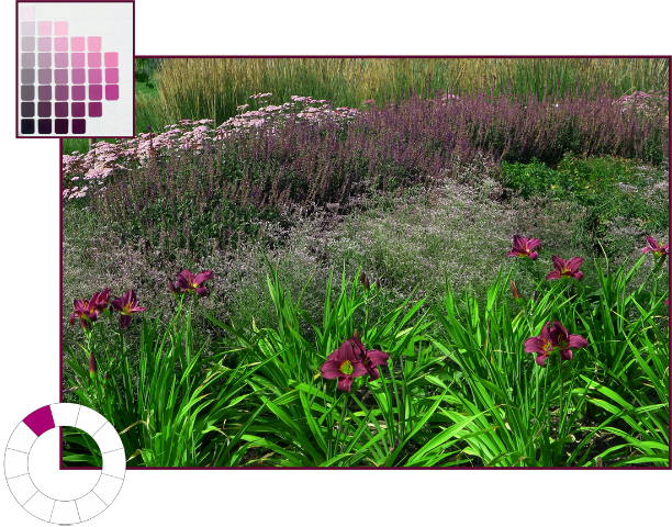
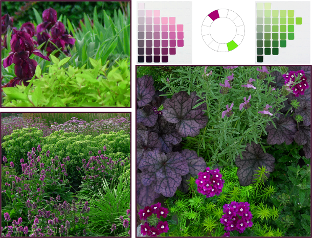
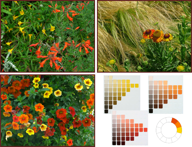
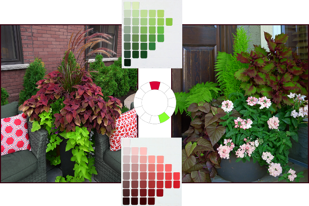
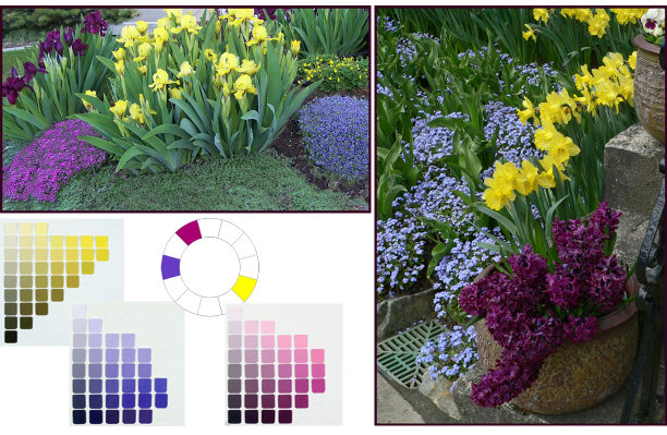
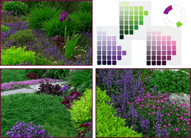
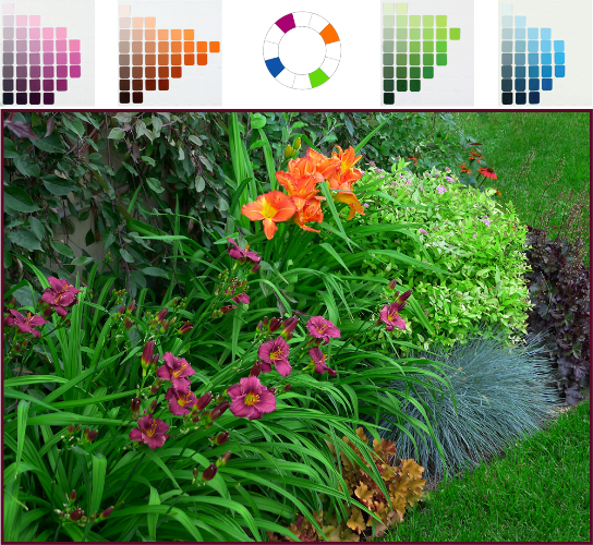
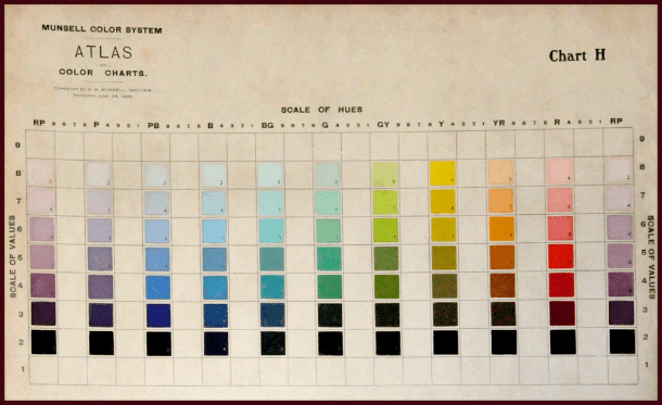
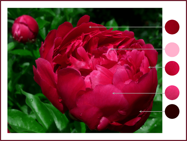
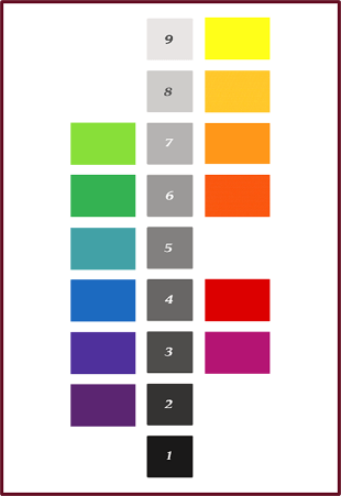
It’s important to note that the basic hues in their pure state don’t have equal values. If I were to pose the question, “Which of the spectral hues has the highest inherent or native value?” you wouldn’t have to think long before responding. You’d answer yellow right? It is obviously the lightest hue on the spectrum. Likewise you would probably intuit that the hue with the lowest natural value is violet or purple.

This ranking of hues by value is of particular significance as it relates to colour balance. For example, if you want to use the conventional opposites of violet and yellow you can’t use them in equal proportion – their disparate values will create too much visual tension.

I experienced this in my own garden years ago – in my infinite gardener’s wisdom I’d decided I wanted a colour scheme consisting of only purples/violets and yellows. And in my ultimate gardener’s naiveté, I planted an alternating border of pure yellow marigolds and dark purple Lobelia (yes, yes I can hear your snickers and snorts at the mention of such amateur plant choices). It didn’t take long for me to realize how very grating this composition was, although I didn’t know why – I would later learn it takes three or four units of low Value to balance one unit of high Value, and this 3 or 4 to 1 ratio should be applied to violet and yellow.

Photo: Pat Gaviller

Bright yellow Osteospermum and dark violet Petunia appear quite jarring when present in equal quantity. Photo: Pat Gaviller

Photo:

The same pairing, now seen in more balanced proportions with 3 or 4 parts low value to one part high value. Photo: Pat Gaviller

Another way to balance these two hues, and maybe a better way, would be to use darker yellow and lighter violet elements, which lessens the disparity between the two values. They can then be present in more or less equal proportions without the visual discomfort.

Photo: Sue Gaviller

Violet and yellow can be present in equal quantities by using a higher value violet, and lower value yellow, as in this container arrangement of mauve Petunia and dark golden Calendula at the Royal Botanical Gardens in Hamilton, Ont. Photo: Sue Gaviller

Contrasting Values

Value contrast in the garden results from both the strength & direction of sunlight, and from the pigments present in the plants. The sun shining on our gardens creates shadows and highlights that we take very much for granted – we don’t always notice the resultant areas of perceived lighter or darker colour. In fact it is this contrast of light and dark that defines an object in space and enables us to discriminate between like-coloured entities. It’s what allows us to see edges and depth, therefore texture. No one knows this better than the painter – he knows if he is painting a red flower that it involves many variations on red. He adds a little black here, some white there, or grey, thus bringing his 2D image alive. The photographer too, recognizes this – she adjusts her camera settings to compensate for natural lighting that may be less than ideal (well she knows she should, regardless of how finicky and annoying it is). In this way harsh contrast between light and dark can be minimized in her finished product.

Photo: Sue Gaviller

Paeonia ‘Unknown Soldier’ – note how many different values of the hue of red are seen in the shadows, midtones and highlights. Photo: Sue Gaviller

Using contrasting values of a single hue in a planting composition creates dramatic effect in the garden; indeed nature often does this within a single plant….

peach iris-resamplebicolour iris

Left: soft orange-peach standards and falls are set off by a darker orange beard. Photo: Sue Gaviller Right: velvety purple falls contrast nicely with softer mauve standards. Photo: Pat Gaviller. 

And the gardener does it within a planting scheme or vignette….

purple bicolor daylily and rose glow barberry 2

Value contrast within a planting composition – here I’ve paired cool-pink daylilies with dark plum-red barberry. Each plant contains value contrast as well – the daylily has a plum-red eyezone and the barberry has cool-pink variegations. Photo: Sue Gaviller

Photo: Cathy Gaviller

Dwarf Iris and creeping thyme – beautiful value contrast of red-purple hue. Photo: Cathy Gaviller

Lovely though these colour combos are, as with almost everything in the garden (and in life), too much of a good thing is… well, too much. Imagine how unpleasant it would be to look at a garden filled with high contrast plant combinations. While value contrast helps us discriminate between the various elements in a planting scheme, it doesn’t always have to be dramatic.

And don’t forget balance when contrasting values – use more low value than high value (remember that ratio of 3:1 or 4:1). And green; use lots of it (have I said that before?) low value green, as well as basic green, which has medium value and helps to balance the higher and lower values.

In the words of Spanish Poet and Playwright, Pedro Calderon de la Barca, Green is the prime color of the world, and that from which its loveliness arises.

On that note fellow gardeners, I will conclude today’s lesson – hope you’ve learned something of value.

’Til next time,
Sue

There and Back; a Hortigeek’s Tale, Part 3 ~ Going Coastal ~

Our time in wine country had been amazing – Len has professional associates in the area so we’d been treated very well. The coast was calling though, and for me this was the most anticipated part of our trip. Our next stop would be Monterey, which hubby had determined (mistakenly) we could reach via a single Interstate. Somewhere between Fremont and San Jose he asked his navigator (me) to check his directions (which he proactively wrote out every night before bed) to make sure the highway didn’t turn anywhere. Comparing his written directions to our TripTik, I realized something wasn’t right. I advised The Captain that according to our map, I-680 did not continue through to Monterey, that in fact it appeared to end abruptly just east of San Jose. It’s not so much that he didn’t believe me, as that he couldn’t disbelieve Mr. Google… until we found ourselves on the 101 heading towards San Francisco and there were no more signs for I-680. So we turned west somewhere, then eventually south until we ended up in Santa Cruz (which fortunately was less than an hour from Monterey and a very nice drive along the coastal highway). After this, it was I who consulted Google maps every night and wrote down directions for our next day’s destinations. I won’t say we didn’t get lost again after that, but at least I could read and understand my own directions. I suppose our continued use of such tools as maps must seem archaic, considering every cell phone now comes equipped with GPS.

When we arrived in Monterey and finally found our hotel (my husband did eventually break down and use his GPS), we checked in and asked the young ladies at front desk where we could find the best seafood. Our intention had been to have dinner in the famed Cannery Row district, but hotel staff asserted that the best seafood was to be had at fisherman’s wharf. The hotel was several blocks from the waterfront so we could walk along the beach to get to the wharf. It was windy and cool walking along the Monterey coast – a refreshing change from the hot still air of the valleys. I was fascinated with the unique coastal vegetation – rugged wind-sculpted Monterey cypress punctuated masses of succulent Delosperma carpeting the sandy hills beside the shore. Every so often I’d stop and turn to snap another shot.

Photo: Sue Gaviller

Photo: Sue Gaviller

Photo: Sue Gaviller

Photo: Sue Gaviller

I inhaled deeply the ocean’s salty aroma and revelled in the wind blowing through my hair. I heard the distant bark of sea lions which grew louder as we neared the wharf.

When we reached the dock it was too early for dinner so we wandered a bit. We found a little coffee shack and as usual, ordered a dark-roast – almost everywhere we visited we’d been unable to get a cup of dark-roast coffee. I started to think maybe it was a Canadian thing, this love of really rich dark brew, but here in Monterey we were finally able to sate our coffee cravings. Sipping the first dark brew I’d had since leaving Canada, we strolled around the wharf area and soaked up the coastal essence.

Beautiful Mexican sage bush (Salvia leucantha) in Monterey. Photo: Sue Gaviller

Beautiful Mexican sage bush (Salvia leucantha) at the Monterey wharf. Photo: Sue Gaviller

Photo: Sue Gaviller

Masses of Grasses: the reddish inflorescence of this dwarf fountain grass (Pennisetum alopecuroides) looks stunning against red-brown cedar shakes, Monterey Marina. Photo: Sue Gaviller

Echium - monterey

Purple spikes of Pride of Madeira (Echium candicans) are a common site in coastal gardens and landscapes. Photo: Sue Gaviller

We followed the sound of sea lions to their basking place on a raft beside the docks. I don’t know why I became so enamoured of these particular marine mammals – perhaps it was their goofy social antics, belying the incredible grace with which they swim and dive. Or the way they lay in the sun, their soft brown fur glistening, lifting their heads periodically to peer around before laying back down again, so seemingly content. They reminded me of our sweet brown dog Pepper, whom we’d lost only a couple of months before. It was mid January when we were given the news that she was terminally ill. My one wish had been that she’d have a chance to soak up the sun in her backyard, splayed out on her side the way she loved to do – just one more time. On a warm March day after weeks of vicious cold, she was able to do this – for maybe five minutes she lay there on a patch of dry grass, breathing softly, then got up and looked me straight in the eye as if trying to tell me something. I knew then that she was ready, indeed she wanted, to be set free to chase rabbits – in that big dog-park-in-the-sky. She’d lived a good life, a long life, and while I was at peace with the decision that had to be made, I knew I’d miss her terribly. And so it was that every time I saw or heard sea lions, I’d think of her and feel awash in warmth… and just a little melancholy.

Photo: Sue Gaviller

These furry brown sea mammals are sooo adorable are they not? Photo: Sue Gaviller

The wharf offered many choices for dining, each venue featuring plated displays of mouth-watering menu items and someone posted at the door beckoning passersby to come dine there. It was difficult to choose, so we chose the one with the first available window seat. Equally difficult was trying to decide what to select from the menu – in the end I opted for a ‘Captains Plate’ which had a bit of everything. And they boasted the best clam chowder in town so I had to try some of that too… yup I rolled outta there when we were finished. But a divine meal it was, eating succulent seafood and watching the sea lions settle on the rocks as the sun set.

While in Monterey we did visit Cannery Row (had another great cuppa dark java), as well as the artist’s community of Carmel about 20 miles south of Monterey. Both are tourist destinations, and since it was a weekend, they were very busy places. We agreed that we’d like to come back one day, when we had more time – and there were fewer people.

A contemporary planting, with a nautical flair in Cannery Row. Photo: Sue Gaviller

A contemporary planting – with a nautical flair. Cannery Row, Monterey. Photo: Sue Gaviller

Photo: Sue Gaviller

A Brewer’s Blackbird flits about a casual coastal planting. Photo: Sue Gaviller

In the artist's community of Carmel by the Sea, the artist's touch abounds, as in the pretty painted vine on the house above and the artful container arrangements below. Photos: Sue Gaviller

In Carmel, the artist’s touch abounds – note the pretty painted vine on the house (above) and the artful container arrangements (below). Photos: Sue Gaviller

container planting Carmelcontainer planting Carmel 2

When we left Monterey we drove south along the Big Sur coastline – a magnificent drive along winding, cliff-hugging roads with panoramic views of the ocean. The heights and the road’s proximity to the edge might have made me queasy had the vistas not been so awe-inspiring.

Photo: Sue Gaviller

Breathtaking views along the Big Sur coastline have earned this portion of route #1 the designation of National Scenic Byway and ‘All-American Road’. Photo: Sue Gaviller

We continued our drive along the beautiful coastal highway until we reached the town of Cambria where we turned inland towards Paso Robles – there were a couple of wineries in the area we wanted to visit, so we spent the night. We’d been on the road now for two weeks and I needed to wash some clothes – fortunately our hotel had laundry facilities. When I approached the front desk to get some coin for the washer and dryer, the clerk politely obliged. Well, more than politely – in his Southern-drawl he added, “Ma’am you smell real good. Like real expensive perfume.” The young fellow was probably just being friendly, but I found his candor a bit unnerving, especially since I wasn’t wearing any perfume.

It was pretty here, though hot and very dry – the effects of California’s drought were more obvious the further south we went. I was thankful we were back inland for only a day or two before we’d be heading back to the coast. San Francisco was our next destination.

I’d never been to San Francisco and I really didn’t think I was going to be all that thrilled with the sprawling metropolis. But I agreed to go for one night just so I could say I’d been to San Fran. Thanks to my directions we had no trouble finding our hotel, and to my delight, our room was on the 20th floor, providing a spectacular view of the city and a glimpse of the Golden Gate Bridge. I was beginning to like it here. It was mid afternoon so we had time to grab a Starbucks and take a leisurely stroll before heading to the wharf for dinner.

We made our way up the hills and down, marvelling at the distinctive design of the buildings. San Francisco’s architecture can only be described as… well, San Francisco. It is entirely unique. Of course there are many examples of contemporary design, but it is the peculiar mix of architectural styles in the older row homes that I found so intriguing.

san fran

Mosaic tile steps, terra-cotta containers and scrolled wrought iron create a distinct Spanish Mediterranean feel in the front entrance of this San Francisco home. Photo: Sue Gaviller

It is often referred to as Victorian, and there are certainly those elements – bay windows, steeply pitched roofs and highly decorative flourishes.

But there are also Spanish Mediterranean influences (mosaic tile, scrolled wrought iron, courtyard gardens) and some even exhibit a hint of New England Colonial – clapboard-like siding painted soft blue, ivory or beige, with white trim and paned windows.

Photo: Sue Gaviller

A pretty courtyard garden in San Francisco. Photo: Sue Gaviller

Photo: Sue Gaviller

Bright fuchsia Bougainvillea and white climbing rose frame an entryway; lavender, lily of the Nile and azaleas line the pathway. Photo: Sue Gaviller

We reached fishermen’s wharf about half an hour before our dinner reservation so we had time to do a little souvenir shopping. San Francisco’s wharf isn’t near as quaint as Monterey’s – it’s big and busy and… utterly enchanting. The sound of jazz floated through the air. I assumed it was music being piped from one of the many shops or restaurants, but I discovered later it was a lone busker – with a really big amp. And of course there was the now familiar sound of sea lions – here there were dozens of rafts for the cute critters to pile onto.


As expected, dinner was delectable, and the taxi-ride back to the hotel quite entertaining. The driver, a big fellow with a silky smooth voice, drove for a limo-tour company and did a fine job promoting San Francisco; not that it needed promoting – I was already smitten with The City by the Bay.

We spent the following morning in Golden Gate Park – the park has a world-renowned Japanese garden which I’d always wanted to see; another reason I’d agreed to visit San Francisco. After the difficulty I had photographing Portland’s Japanese gardens I hoped to have more success here. This garden was very different – brighter and more open than the dappled shade of Portland’s moist, almost-tropical garden. I mistakenly assumed this would make it easier to shoot. It didn’t. The hazy white sky created unpleasant glare and gave everything a yellowish tone. Of course if I was a real photographer I’d have known how to compensate for this. As I looked about the gardens I noted another significant difference – whereas Portland had more coarse textured plants like Hosta and abundant large-leaved rhododendrons to break up the finer texture of pines, ferns and grasses, much of the plant material here seemed finer textured. This resulted in a somewhat busy feel to plant compositions and also contributed to my photographic woes – the fine texture created so many areas of light and dark, hence the same difficulty with harsh contrast as the dappled shade of Portland. Sigh.

Still, it was beautiful and given the Japanese philosophy of celebrating ‘place’, it’s entirely valid that a Japanese garden in coastal California would differ from that of an Oregon rainforest. Regardless, it was well worth the visit.

Photo: S Gaviller

Iris ensata adds an elegant splash of colour to rich green vegetation at the Japanese Tea Garden in Golden Gate Park. Photo: Sue Gaviller

Photo: Sue Gaviller

Cloud pruning is the Japanese practice of trimming trees and shrubs into cloud-like forms. Known as ‘Niwaki’, which means ‘garden tree’, it is seen throughout the gardens. Photo: Sue Gaviller

Photo: Sue Gaviller

Stone lanterns are an integral part of the Japanese garden. Here a small lantern provides a solid foil for the many fine-textured elements. Photo: Sue Gaviller

fern grotto

Circle of Peace in the Fern Grotto, National Aids Memorial Grove, Golden Gate Park.
Photo: Sue Gaviller

We had both thoroughly enjoyed San Francisco and knew we’d visit again – for much longer next time. But now it was time to head to our next and final destination where we would spend our anniversary, and the last few days of our trip before embarking on the long journey home. Originally Len had suggested we stay in a big fancy resort hotel in Sonoma to celebrate our marriage milestone. However, I thought something quieter would be more relaxing and romantic. My research led me to a beautiful spa resort at Bodega Bay on the Sonoma coast – very elegant but not the least ostentatious.

We arrived mid afternoon and checked into our ocean view suite, complete with luxurious lounge furniture, a wood burning fireplace, a hot tub and a private patio. A bottle of chilled champagne awaited us – a gift from resort staff in honour of our special day. Pouring ourselves a glass of the cool effervescent nectar we relaxed on the patio and gazed out at the ocean. Tidal channels and saltwater marsh, creating a bird sanctuary, lay between us and the ocean. We could hear birdsong all day, frogs chirping all night… and sea lions barking all day and all night. Tastefully landscaped grounds, gorgeous pool, 4-star restaurant – truly this was a little piece of paradise. I didn’t think I’d ever want to leave.

Photo: Sue Gaviller

Native grasses and yellow lupins along the shoreline. Photo: Sue Gaviller

Not sure if this is the invasive artichoke thistle, but it was certainly photogenic against the misty marshlands at Bodega Bay. Photo: Sue Gaviller

Photo: Sue Gaviller

The softly draping form and muted colour of dwarf ornamental grasses contrasts beautifully with the rich colour and stiff upright texture of New Zealand flax. Photo: Sue Gaviller

Photo: Sue Gaviller

This lovely coastal landscape includes handsome New Zealand tea tree (Leptospermum scoparium), Mexican feather grass (Nassella tenuissima) and lavender cotton (Santolina chamaecyparissus). Photo: Sue Gaviller

Photo: Sue Gaviller

A bench in a cozy nook amid ferns and fuchsias. Photo: Sue Gaviller

Photo: Sue Gaviller

A fine pair; rich dark Aeonium and soft blue-green Echeveria. Note how the foliage rosettes echo the scalloped edge of the planter. Photo: Sue Gaviller

Photo: Sue Gaviller

A statue of Poseidon, Greek God of the Sea, watches over the pool area. Photo: Sue Gaviller

Yes indeed it was hard to leave – the Oceanside walks, strolls though the bird sanctuary, wonderful fresh food,  champagne by the fireplace, sea lions swimming and diving around the pier. But alas the time soon came for us to bid the coast goodbye. Our trip had come to an end – all that was left was the four-day drive back to Calgary, and this time we weren’t taking the scenic route.

Interestingly, the only negative experiences we had on the entire trip occurred on the drive home – a resort hotel in Reno with a casino that was so smoky we could smell it in our room. The room itself was posh on the surface, but somehow seemed really seedy – dozens of faux satin and velveteen pillows on the bed, and a black, not-terribly-clean hot tub at the foot of the bed. I wondered if the adage ‘what happens in Vegas stays in Vegas’ might apply to Reno as well.

While we were out for dinner that night we received a panicked text from one of our sons who’d been looking after our house while we were away. He’d been heading out the door to leave when he saw, at the foot of the steps, a big ol’ skunk. He wasn’t sure what to do. I knew what he was thinking – a number of years ago, his friend from across the road came home late one night, startled a skunk that was hiding in the shrubbery and got himself sprayed. I’d never really had any ‘up-close and personal’ dealings with the striped villains, though I’d smelled their stench periodically in the neighbourhood. And growing up on an acreage in Southern Ontario, the family dog would run afoul of one at least once every summer. Supposedly the only way to get rid of the smell was to bathe them in tomato juice, but I don’t honestly remember doing so with any of our dogs. I was pretty sure my twenty-something son wasn’t going to be too keen on a late night tomato juice dip – and there was no way of avoiding Pepé Le Pew in his current position. I texted him back, “Pour yourself a Scotch and sit down for a bit til he’s gone,” was the best I could come up with.

Then there was the horrible meal we had in Twin Falls the following night – the vegetables were literally rotten. And our last night on the road, in Great Falls – we got bumped from our hotel room (which we’d reserved weeks before) and dumped into what was likely the worst room in the hotel; way at the back with train tracks only a few feet from our window, and a really small bed. It made us all the more eager to get home.

Late afternoon the next day we arrived home. I was greeted with the colorful blooms of moss phlox, creeping thyme, dwarf iris… and lilacs. I hadn’t missed them after all! Walking up to the front door, suitcase in hand, I stopped and closed my eyes. For a moment, the breeze carried me back to the California coast I breathed deeply and my nostrils filled with Syringa‘s sweet perfume. I was home. Though I still felt the call of the road, it was time to dig in and get to work. This was my busy season and I knew I’d have to hit the ground running….

‘Til next time,
Sue

There and Back; a Hortigeek’s Tale, Part 2 ~ California Here we Come ~

We left Portland on Saturday of the Memorial Day weekend. Apparently traffic is bumper-to-bumper heading to the coast on holiday weekends, but since it was Saturday, our hope was that everyone would’ve arrived at their destinations already.  We decided to get an early start just to be safe. Indeed it was quieter on the freeways than any other time during our 5-day stay – if we’d known how much time we would spend in heavy traffic travelling to and from wine country, we’d have opted to stay in one of the smaller towns down the valley. I heard one of the locals comment that even visitors from LA, which is known for crazy car congestion, complain about traffic in and around Portland.

The drive to the coast took us through wine country again, then onto the Salmon River Highway which eventually joined up with the Oregon Coast highway just North of Lincoln City. We stopped in Lincoln City for a cuppa java – one of the finest we’d have on the entire trip; whether it was the coffee itself or the fact that we sipped while gazing out onto the Pacific Ocean I’m not sure. It had been years since I’d been to the ocean, and never the Oregon coast. I felt the familiar call of the water, as I always did since leaving my home on Georgian Bay as a young woman. Why I chose to move to an inland city (a semi arid one no less) I really don’t know, but I knew this trip would have me longing again for a life on the water.

The Coastal Highway was, as expected, very scenic – Oregon’s coast is varied in its topography, the highway traversing a shoreline of rugged rocky bluffs, massive sand-dunes that were oft right next to the highway, and dense forests of shore pine, rich with Rhododendron understory. I marveled at the range of conditions in which these Ericaceous shrubs thrived here – from the rich fertile soils of the Willamette valley to lean, sandy (and likely salty) coastal soils. I remembered something I’d read recently about successfully growing Rhododendrons in less-than-ideal soil conditions – amend the soil with pine needles. Noting the masses of healthy-looking native rhodies beneath the pines, I understood why. I noted too how Mother Nature, the ultimate designer, had perfectly paired the fine feathery texture of pine foliage with the coarse leathery Rhododendron foliage.

We pulled off the highway at a particularly gorgeous ocean look-out and I took a few shots of the breathtaking view. Then I heard it – a sound I’d miss more than any other sound the ocean offered – the barking of sea lions. Adjusting our vantage point we saw them, camped out on the rocks far below, basking in the sun. From where we were they looked rather like slugs. Turned out that just up the road were the Sea Lion Caves, a very busy Oregon Coast tourist attraction.

Heceta Head and Devil's Elbow Bay, Oregon Coast. Photo: Sue Gaviller

Heceta Head and Devil’s Elbow Bay, Oregon Coast. Photo: Sue Gaviller

Sunbathing sea lions. Photo: Sue Gaviller

Several hours later we crossed the border into California. Shortly thereafter the highway veered inland and before long we found ourselves among giant redwoods. I’d of course seen the behemoth redwoods before. I’d had the dizzying experience of looking up, looking waaaayy up, into the soft-needled crown of a single specimen or small stand, but never had I seen a whole forest. These horticultural giants were truly awe-inspiring. I wondered if maybe J.R.R. Tolkien was staring into an old-growth forest such as this when he created his beloved Treebeard and the other Ents.

Somewhere around Crescent City the highway met the shoreline again. We found a sandy cove where we dipped our feet, me for the first time, in California’s Pacific waters.

Photo: Sue Gaviller

I first set foot in California waters here on Wilson Creek Beach, Del Norte Coast Redwoods State Park. Photo: Sue Gaviller

We spent the night in pretty Eureka on the North coast. Looking out over Humboldt Bay we watched a big orange sun drop beneath the misty horizon. My husband ate fresh oysters from the bay and I partook of a fine California Riesling – this would be the first of many California sunsets we’d witness in the coming weeks.

Continuing South the next day on U.S. Highway 101, fittingly called the Redwood Highway through this part of the state, our destination for that day was Napa Valley. The fastest route would have been to follow 101 all the way down, but hubby wanted me to experience the Shoreline Highway as he had when a 20-something young man. So at Leggett, it’s Northern terminus, we turned off 101 and headed West on California State Route 1. Though it’s called the Shoreline Highway, it is well inland at this point and to the East of heavily treed mountainous terrain. To get to the coast one must first navigate this terrain…………

I took a deep breath. I knew I was in for a wild ride. At first it didn’t seem so bad, but very quickly the road heads into dark foreboding territory. We were climbing, climbing, following the winding, twisting road, narrow and full of snake-turns and switchbacks. Though we were always aware of the steep slope on one side or the other, periodic breaks in the trees allowed us to see how far up we were. And just when I’d think we were through it all and we’d start descending, we were climbing again. At times it was so dark, the tree canopy so dense, and the road so narrow that my husband commented, “I feel like we’re on some kind of hobbit trek.”

“Yeah, like through Mordor,” I muttered. If you aren’t familiar with Tolkein’s mythical realm of Middle Earth, then suffice it to say that Mordor is a very bad place. I don’t know how long we actually drove through this – it was only about 26 miles, but the going was slow and it seemed like hours. We finally emerged from Mordor about a half hour north of Fort Bragg, drove up around a bend and there stretched out before us, was the spectacular California coastline in all her windswept glory. Never had I felt so elated to see the endless expanse of water.

Photo: Sue Gaviller

Gorgeous view of California coastline just north of Westport-Union Landing State Beach.
Photo: Sue Gaviller

When we reached Mendocino, where we’d planned to stop for lunch, it was so full of tourists (yes we too fit that description) that we decided to wait. I needed to get out and stretch after the white knuckle drive I’d just endured, so we opted to have coffee and wander around the historic little town. I asked the young girl in the coffee shop where their washroom was – she informed me that due to the drought, all their wells were dry and the only available washroom was a public one down the street. I went in search of the facilities, passing numerous expensive shops and boutiques – in my ignorance I still thought of Mendocino as an old hippie town. There was a line-up for the ladies’ room – standing in line gave me the opportunity to take some photos of pretty gardens nearby. Vegetation here, both natural and garden, differed from that further up the coast.

Photo: Sue Gaviller

Mounds of pink and white rock rose dress up Mendocino’s wooden water tower. Photo: Sue Gaviller

Still waiting in line, I noticed a young man with long hair and a beard (which was as long as his hair), wearing cargo shorts, work boots and walking a beautiful bloodhound. “Must be a local,” I thought to myself, still showing my naivety (as if I had any idea what a local Mendocino-ite might look like). “Nice dog,” I remarked. He looked at me warily and muttered something – everywhere we’d been people were so open and friendly and this man’s guarded response was a marked contrast. “Is that a Bloodhound?” I persisted. At that the bearded fellow opened up completely, informing me that yes she was a bloodhound, that she was in heat, the second phase of her heat to be precise, and she was really………..well to put it a tad more delicately than he did, apparently her sex drive was extremely elevated. He was looking for another bloodhound to breed her with but the only one in the area belonged to the local police chief or sheriff or whatever and blah, blah, blah……..the guy was harmless but I was now a little uncomfortable with the conversation – fortunately by this time I’d progressed to the front of the line and could politely dismiss myself.

When I exited the washroom Mr. Mendocino was nowhere to be seen. I heard the sound of acoustic guitar and soft voices – a few yards away under a shady tree, a group of young people were playing guitar and singing old Neil Young tunes. I guess it was still a hippie town – young and old. I smiled, remembering my own youth and my first acoustic guitar, singing Mamas and Papas or Joni Mitchell tunes around a campfire – I was barely a teenager…………..and such a wannabe hippie.

I found my way back to the car where hubby was waiting, wondering if I’d got lost. We took a stroll, coffee in one hand, camera in the other, and explored scenic Mendocino before heading out on the road again. The gardens here were quite unique – picket fences, roses, heathers and other old-fashioned garden elements spoke to the vintage of the area, and spiky upright plants like Echium, Phormium and tall stiff grasses spoke to its coastal locale and lent structure to the softer elements.

Photo: Sue Gaviller

The juxtaposition of New Zealand flax (Phormium) with the white picket fence and heritage building makes quite a statement. Photo: Sue Gaviller

Photo: Sue Gaviller

Purple-blue spikes of Echium contrast nicely with the old-fashioned white roses in the foreground. Photo: Sue Gaviller

Photo: Sue Gaviller

Variegated New Zealand flax and tall ornamental grasses frame and anchor the mixed shrub/perennial border lining this pathway. Photo: Sue Gaviller

We continued our drive south on the #1 until it met up with #128 which would take us back inland, through more redwood forest on more winding roads – but nothing like Mordor. As we left the giant Sequoia forest behind, the landscape and vegetation changed quickly – we were entering wine country, more specifically the Anderson Valley Appellation (appellation is a fancy word for wine-growing region). We stopped for lunch in a little town called Boonville (yes that’s right; a little town out in the boonies called Boonville). It was hot here, like all wine growing regions, and like all small towns associated with wine growing regions, there were lots of great places to eat. We found a casual salad and sandwich place – I had one of the most flavourful salads I’d ever tasted; arugula, mango, grilled chicken breast, fresh cilantro…………mmmmm I can still taste it.

A couple of hours later we arrived in Napa Valley where we would stay and explore for the next 5 days. I won’t bore you with a play-by-play account of our stay in California wine country – I’ll just say it was fabulous; fine wine, great food, stunning scenery, beautiful gardens………………..

Chateau Ste. Jean, a Sonoma winery, boasts beautifully landscaped grounds - Mediterranean inspired in the Italian Renaissance style, with classical statuary, parterres and hedging, archways and rustic pergolas. Photo: Sue Gaviller

Chateau Ste. Jean, a Sonoma winery, boasts beautifully landscaped grounds – Mediterranean inspired in the Italian Renaissance style, with classical statuary, parterres and hedging, archways and rustic pergolas. Photo: Sue Gaviller

Photo: Sue Gaviller

Truchard vineyards are one of the oldest vineyards in the Carneros region of Napa and produce beautiful wines, my personal favourites being Chardonnay and Cabernet Reserve. After a lovely lunch in the gazebo with Tony and Anthony, we took a stroll through the vineyards. Photo: Sue Gaviller

Photo: Sue Gaviller

Modern, minimalistic promenade in downtown Napa. Photo: Sue Gaviller

Photo: Sue Gaviller

Simply planted , it is the shape, colour and placement of these terra-cotta pots that provides the appeal. Photo: Sue Gaviller

In Yountville, a gorgeous little town just North of Napa, beautiful gardens and landscapes abound - here lavender, roses and the ever-present columnar cypress adorn a restaurant parking lot. Photo: Sue Gaviller

In Yountville, a picturesque town just North of Napa, gorgeous gardens and landscapes abound – here lavender, roses and the ever-present columnar cypress adorn a restaurant parking lot.
Photo: Sue Gaviller

Poolside planting outside private residence at Trefethen Vineyards. Note how the form and dense texture of the columnar cypress nicely dominate the scene with the rounder forms playing a supporting role. Photo: Sue Gaviller

Photo: Sue Gaviller

Roses planted alongside a stone wall create real old world appeal in this roadside planting next to a vineyard in Napa. Photo: Sue Gaviller

Photo: Sue Gaviller

Rhythmic repetition of narrow upright cypress creates nice movement around this circular drive. Photo: Sue Gaviller

lambert bridge lavender 2

Layered planting – a swath of lavender repeats the horizontal line of the stone wall, which is again repeated in the barberry shrubs and the trees beyond. Lambert Bridge Winery. Photo: Sue Gaviller

Photo: Sue Gaviller

Kendall Jackson, another Sonoma winery, has lush gardens to wander through. Photo: Sue Gaviller

Photo: Sue Gaviller

A stunning ‘hedge’ of Cannas near Dry Creek. I guess they don’t get hail there. Photo: Sue Gaviller

After 5 days of hot weather, daily wine tasting and other overindulgences, I was ready to move on to the next leg of our journey – back to the coast. I was so looking forward to fresh seafood, the smell of saltwater and walks along the beach. Join me next time for more garden pics from the California coast.

Til then,
Sue