Ha! You thought this post was going be about the tawdry exploits of Anastasia Steele and Christian Grey didn’t you? Tsk, tsk, naughty gardeners. Sorry all you lusty ladies, but this post is literally about the (more than) fifty shades of gray… and brown.
Gray and brown; the dull drab colours of a lifeless winter landscape. Haven’t we seen enough of those – do we really need to discuss them on the pages of this usually-colourful blog? Well yes I’m afraid we do – for a number of reasons. While true achromatic grays are rarely seen, if at all, in plant life (more likely gray-green or blue-gray), we do see browns and beiges – in tree bark and branches, seed heads, dying foliage, ornamental grasses and sedges, and even a few flowers.

Garden Grays – aren’t really gray; they are very desaturated blues and greens. Clockwise from top left: Elaeagnus angustifolia, Santolina chamaecyparissus, Salix salicola, Artemisia schmidtiana. Photos: Sue Gaviller

Garden browns, clockwise from top left: brown container with Heuchera ‘Pinot Gris’ and Carex ‘Toffee Twist’, frosted leaf of Sorbus aucuparia, Phormium tenax ‘Atropurpureum’, Malus sp., Calamagrostis acutiflora ‘Karl Foerster’, Ulmus pumila buds. Photos: Sue Gaviller
Grays and browns comprise much of the background colour our gardens are seen against – soil, mulch, concrete, stone, wood etc. Our homes too, are backdrop to the garden and are often finished with siding, stucco or stone in some version of gray or brown. While it may seem outside the purview of a garden designer to comment on house colour, it’s actually an important consideration in the overall appeal of a garden. Case in point – our house was once painted white and contributed enormously to the midday washed-out appearance of my sun-drenched front garden. After painting the house a soft warm cafe-au-lait, the garden appears much richer, and colours hold up far better in full sun.
House colour is of course a very personal choice – my intent here is merely to arm you with a little understanding of browns, beiges and grays to help you make that choice. These colours are what paint companies and fashionistas call ‘neutral’. However, a true neutral is a colour that is entirely without hue – it is achromatic (i.e. white, gray or black). To avoid confusion then, I’ll avoid the use of the word altogether.
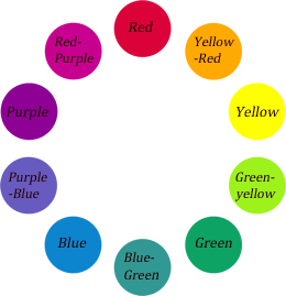
Many Shades of Gray
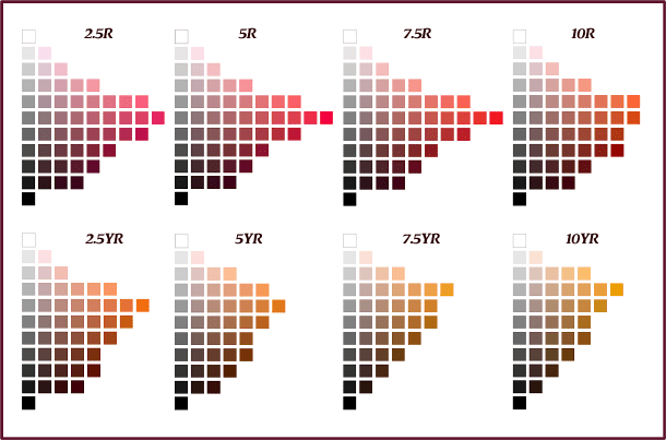
As we learned in my last post, colours that are completely desaturated – those at the centre of Munsell’s Color Space, have no hue content at all. These grays differ from each other only in value. However, many of the colours we call gray actually still contain trace amounts of hue. This is why it’s so difficult to match grays (white or black for that matter too) – if they have even a little hue and the parent hues are different, the eye will perceive this discrepancy.

Munsell’s Grays: each of these colour chips if seen on its own, might appear gray – seen together though it becomes obvious that they aren’t true grays. In fact they represent the first step of saturation for 20 hues at 8 different values.
For example, the two grays below aren’t the same – they have the same value but each has enough hue that we can see they are different; different enough that if my husband wore pants in the warmer gray and a shirt in the cooler gray, I would gently advise, ‘Honey those don’t match.’

Both of these grays have a value of 5, but the cool gray on the left has its base in a violet hue whereas the warm gray on the right has a parent hue of orange.
If on the other hand the grays are of the same hue but different values, the eye will intuitively perceive the consistent underlying hue and experience a unified pairing – the difference will be noted but seen as effective contrast rather than awkward clash.

The above grays have the same parent hue – the medium-low value gray on the left and the medium-high on the right are united by this unchanging hue.
It’s clear then, that choosing paint colours to accompany that gray vinyl siding on your house, may not be as straightforward as dark gray and lighter gray. If you want contrasting grays, it’s better to maintain a consistent hue and introduce contrast by changing only the value or saturation – otherwise, because the gray has minimal hue content, the eye won’t see colour contrast so much as it will see colour conflict.
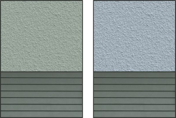
Left: Gray siding and gray painted stucco have the same hue hence present a cohesive combination.
Right: Gray siding and stucco have different underlying hues thus appear less connected.

Stone siding, because it has both warm and cool underlying hues, is more forgiving of its accompanying colours – while the warmer gray is still a better match, the cool gray does work.
This isn’t to say hue contrast shouldn’t be employed when choosing house colours; indeed it is a common design strategy, but it will be more effectively achieved by the addition of a stronger, somewhat more saturated colour – saturated enough that the eye can perceive it as purposeful contrast rather than ‘oops that’s the wrong colour’.

The rusty-brown of cedar shakes and patio pavers, though not fully saturated, has sufficient colour content to provide effective contrast for the warm gray.
Keep in mind though, that the stronger the colour the more it will impact your choice of garden colour scheme. A weakly saturated beige or gray requires little consideration here, but a coppery brown, as pictured above, has enough hue content that it must be taken into account when deciding on colours for your garden.

The copper-brown shakes present enough colour saturation that the wrong plant choices could look awkward – good plant choices, like the shrubs on the right, pick up on both the stronger copper-brown and the grays. Photo: Sue Gaviller
Some may think me too conservative in my approach to exterior colour, but my comments on the subject are really only as it pertains to grays and browns (since that is the focus of this post). While we all have our own individual tastes, the more we explore and study colour, the better we are able to discern its subtleties and the nuances that contribute to a colour palette we’re happy with – or unhappy with.
Browns, Beiges, Tans and Taupes
Warm grays with a little more hue content, are browns and beiges, the parent hues being red, orange, yellow and sometimes green-yellow or red-violet. Despite their slightly increased saturation, it can still be difficult to discern an underlying hue – choosing the appropriate brown or beige can thus be a challenge. And because they have a bit more colour content, they are also affected more by light conditions. The first day after painting our house that attractive cafe-au-lait colour (the actual name I believe was Beige-Gray), I returned home just before dusk as the last rays of sun were dispersing. To my dismay, as I turned the corner and caught a glimpse of our newly painted house I saw pink – blech!
“OMG what have we done?” I thought, then resigned myself to the fact that I’d have to tell hubby to repaint (like that was going to happen). The next day however, it didn’t look so bad – in fact it was exactly how I’d envisioned it when we chose the colour. Relieved, I assumed the paint must’ve just needed to ‘cure’ before presenting its real colour. Of course I know now that the more likely explanation had to do with the colour of the ambient light – evening and early morning light is pink or reddish compared to other times of day when it may be more yellow, white or blue.
So how do we choose the right brown or beige? As with grays, maintaining a consistent hue is still the safest choice and therefore my best advice. Easier said than done; since the hues that underlie these colours may not be immediately discernible.
Let’s look at a few examples. Below are three different browns, each with a different parent hue – can you determine what the underlying hues are? Click on each one for the answer.
![]()


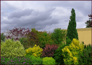
Small wonder that there are so many mismatched browns, beiges, tans and taupes – especially in older neighbourhoods where the original exterior colours have long since been covered by the respective paint choices of successive homeowners. A better understanding of why these mismatches occur will help you avoid making the same mistakes. The images below represent 2 different scenarios for house colours and materials. Which one do you think produces a more unified picture? Why?

![]()
The answer is of course the colour combination on the right in which all colours have the same parent hue. In the image on the left the colours are based in several different hues which results in disunity.
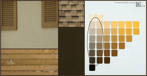
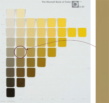
All colours and materials are based in the same orange-yellow hue – Munsell’s 10YR.
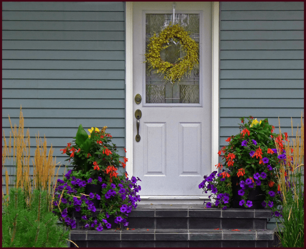
And what about the garden – need we consider the undertones in the beige or brown colour of our home to make colour choices for the garden? As I mentioned previously, the stronger the colour of one’s house, the more it will factor into the garden colour scheme. However, with weakly saturated browns and beiges, you don’t really need to – they have such low hue content that you can get away with pretty much any colour scheme. But you certainly could – by bringing the same underlying hue from the house into the garden, a deep yet subtle sense of unity is achieved, though the untrained eye may not recognize it, only intuit it.

Since the underlying hue of the house colour(s) is a yellowish-orange, including this hue in the garden colour scheme provides subtle unity. Photo: Sue Gaviller
Paint companies don’t always make it easy for us find the right hue – while some organize their paint swatches into strips of 4 or 5 colours in the same hue family, others mix several similar hues within the same strip, leaving you guessing. And even those that use single hue strips, only a small sample of the possible colours within that hue are included. For these reasons I find the hue pages in the Munsell Book of Color to be a most helpful tool – but at $1000.00+ for the book, the cost is prohibitive for most.
Feeling a little frustrated now because ‘Hey how the heck am I supposed to figure all this out without those expensive Munsell colour charts at my disposal?’ Well here’s something for you:
Cool Tools (Yup there’s an App for that)
Since most of us don’t have 1000.00 dollars to spend on Munsell’s Book of Color, but we’d still like the benefit of comprehensive hue charts, check these out:
David Briggs’ Dimensions of Colour: Hue, Value and Chroma – scroll down to the third image, Figure 1.1.3. (wait a few seconds for it to load). Click on the thumbnail of any hue page and it will enlarge. All 40 Munsell hue pages are accessible for your viewing and reference.
Classical Lab has developed a Munsell App for iPad and iPhone called MunsellDG. Note: the hue pages differ from the actual Munsell Book of Color due to copyright, but for the purposes of the average gardener or garden designer this is more than enough to help you determine ‘what hue is this?’, ‘what goes with this?’, etc. – and you can take it with you wherever you go.
Munsell Color Studies and Art – an interactive website with exercises to test and hone your colour skills.
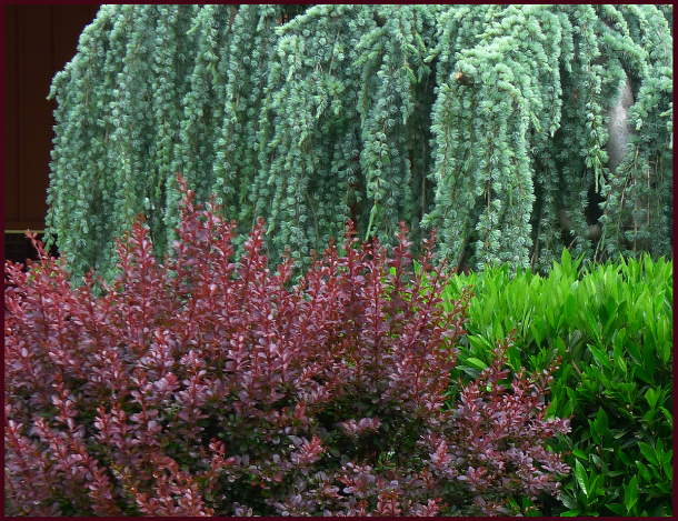
![]() Grays and browns may seem lifeless, especially when spring is so close and an explosion of colour is just around the corner, but understanding these understated colours and learning to see what lies beneath them is one more step towards ‘colouring your garden’ with confidence.
Grays and browns may seem lifeless, especially when spring is so close and an explosion of colour is just around the corner, but understanding these understated colours and learning to see what lies beneath them is one more step towards ‘colouring your garden’ with confidence.
It takes practice to see colour in this new way – and I’m not done yet….
’Til next time, Sue