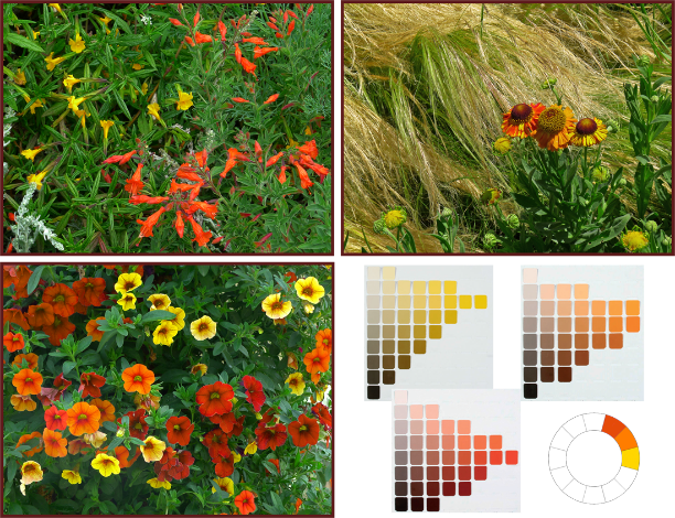
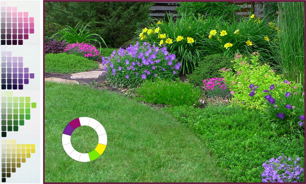
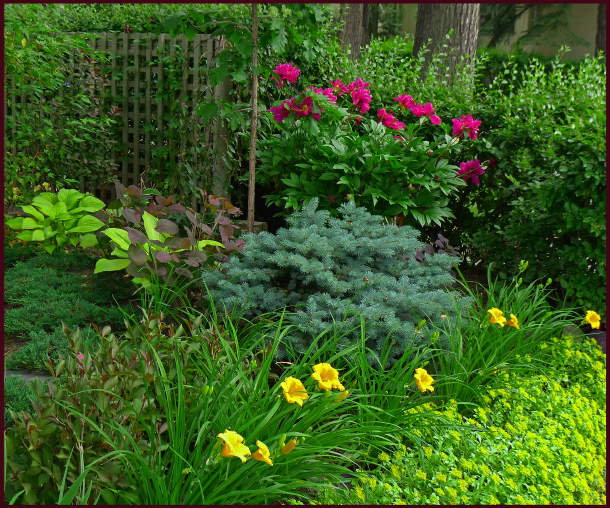
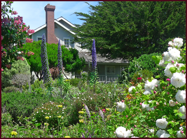
It snowed yesterday – the third snowfall of the season. It’s beginning to accumulate now since night-time temperatures are consistently falling below freezing, and my Rhododendron leaves have curled under which indicates the ground has frozen. So I think it’s safe to say no one in this neck of the woods will be doing anymore planting, transplanting or plant shopping this year. It’s time then, to put my Weekly Plant Pick page to bed for the winter. Not to worry though, I’ve put all 20 picks here in one post for your easy reference. And I’ve included a few notes at the end of the post regarding any noteworthy changes in performance over the course of the season.
For some of you, especially those who garden in more hospitable climate zones, these plant choices may seem a little ordinary, pedestrian even. But for those of us who garden north of the 5oth parallel, on windswept prairie or Chinook-challenged foothills, plants must be tough as well as beautiful. And for me, plants must be more than just showy bloomers – they must also be tidy growers with handsome foliage, and outstanding performers throughout the season. Only when these criteria are met does a plant have a chance of making it onto this annual list. So ladies and gentlemen, please put your hands together for…
Sue’s Top Twenty Plant Picks of 2013
Sunday May 26th – Berberis thunbergii ‘Rose Glow’

Photos: Top – Pat Gaviller. Bottom – Sue Gaviller
In the year 2002, the Japanese barberry returned from decades of banishment – new cultivars had been developed that were rust resistant, hence weren’t alternate hosts for the devastating Wheat Rust (a disease of cereal crops).
This was thrilling news to gardeners and landscapers, and of course we all bought any number of these new cultivars for our gardens and our client’s gardens. We soon discovered (though some of us are still in denial), that here on the prairies, many of these barberries have proven to be less-than-stellar performers – some years suffering significant winter dieback, and often appearing, well, kinda scraggly.
A few of them however, have shown themselves to be consistently hardy – robust even. One of these is the cultivar ‘Rose Glow’. Not only is it hardier than any other barberry I’ve grown (both in my own garden and clients’), it is quite stunning, with lovely arching branches and deep purple-red foliage. What is most unusual about it though is the colour of the new growth – mottled pink and white, giving it a truly rich textured appearance.
Rose Glow barberry will reach about 1 metre in height and almost as wide. While it is somewhat shade tolerant, the best colour is achieved in full sun.
So if you’ve all but given up on barberries, and haven’t yet tried this one, I highly recommend it – I don’t think you’ll be disappointed.

Sunday June 2nd – Clematis alpina ‘Constance’

Photo: Sue Gaviller
Like all Alpine clematis, the cultivar ‘Constance’ is an early-flowering vine that flowers on old wood. Belonging to Pruning Group “A”, which happily means little or no pruning, Clematis alpina need only be pruned to keep them within their allotted space, to remove deadwood, or to tidy them up. Other than that just let them do their thing.
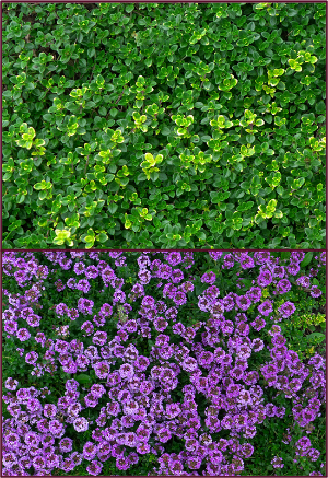
Constance is a particularly vigorous grower that can cover several large fence panels within a few short years. A beautiful soft magenta, the flowers are large, nodding and very plentiful. Alpine clematis are happy in lean soil, full sun or partial shade, and are quite drought tolerant.
With so little work required for such amazing results, one of these lovely vines should be in everyone’s yard!
Sunday June 9th – Syringa vulgaris ‘Sensation’

Photo: Sue Gaviller
Well what did you expect? Did you really think I could get through the month of June without choosing a lilac as a weekly plant pick? If you’ve been reading this blog for a while, you know how enamoured I am of sweet-scented Syringa – and the air is positively thick right now with the heady aroma of numerous species in this genus.
A very unique cultivar of S. vulgaris, ‘Sensation’ boasts the only bi-colour blossom – wine purple florets, edged in white. A tidy grower with minimal suckering, it’s also very fragrant, and the characteristic dark green, heart-shaped leaves provide excellent colour and textural contrast throughout the season.
Sensation lilac reaches an approximate height of 3 metres and a spread of about 2 metres. Like all lilacs it is cold hardy, drought tolerant and relatively disease free.
With so much going for it, why not try one? You know you wanna.
Monday June 17th – Picea abies ‘Nidiformis’

Photos: Sue Gaviller
Bird’s nest spruce is a dwarf cultivar of Norway spruce. Low growing with a flat top and slight depression in the centre, it somewhat resembles a bird’s nest (hence the name). Tiny needles emerge lime green, providing stunning contrast to the dark green older growth. New growth is very soft which creates a lovely drape to the young branches – they will stiffen as the season progresses.
Picea abies ‘Nidiformis’ is a good substitute for spreading junipers when space is tight as it is a slow grower – eventual size is variable and depends on which literature ones reads: anywhere from 2 to 6 feet in height, and 3 to 8 feet in width.
OSU website states: “1′ tall by 2′ wide at 10 years, and 2′ tall by 3′ wide at 20 years of age”. This is consistent with my own experience, for example; the specimens in the above photos are about a foot high and a little more than 2 feet wide – they were planted in a client’s yard about 7 years ago and would’ve already been a few years old in pot. The largest specimen I’ve seen here is about 3 feet tall, 5 feet wide and is many decades old.
Drought tolerant and cold hardy ( to zone 3), this beautiful dwarf conifer can also be used as a single specimen or feature – if you don’t mind waiting a few years for it to fulfil its role. It is well worth the wait!
Sunday June 23 – Rhododendron ‘Mikkeli’

Photos: Sue Gaviller
Growing rhododendrons in a semi-arid, zone 3 climate such as ours may seem counter-intuitive, but the beautiful St. Michael rhododendron has been growing in my garden, and those of several clients, for the better part of the last decade. Now for those of you who live in warmer, moister climes, you may not be aware of the ‘rhodo envy’ some Calgary gardeners feel – we really wish we could grow ‘em like you do, but alas no. So please don’t scoff at this week’s Plant Pick offering.
Rhododendron ‘Mikkeli’ is a large leaf or elepidote variety, belonging to the Marjatta Hybrid group – a very cold-hardy class of rhododendrons which are bred for Northern gardens. There are numerous cultivars in this group, but Mikkeli is the cultivar of choice for my local designs because it flowers very late.
This means the flower buds break dormancy later than most, hence are less prone to late frosts. Despite this of course, almost every spring the buds still get hit with late cold spells, so this is only the second or third year mine have actually flowered.
Why then you ask, has this shrub earned a place on this page? Well it’s not all about the flowers y’know. The big leathery leaves and exotic appearance provide considerable design value – rhodos are particularly appropriate for Asian inspired designs and woodland gardens. And when Rhododendron ‘Mikkeli’ does bloom, the flowers are indeed spectacular – bright pink buds open to soft pink flowers, eventually fading to white. Bushy when young, it can become a little leggy with age – periodic pruning is required to maintain attractive form.
So if you a have a somewhat moist, protected spot in morning sun or dappled shade, preferably with a little snow cover during the coldest winter months, why not satisfy that rhodo envy with Rhododendron ‘Mikkeli’.
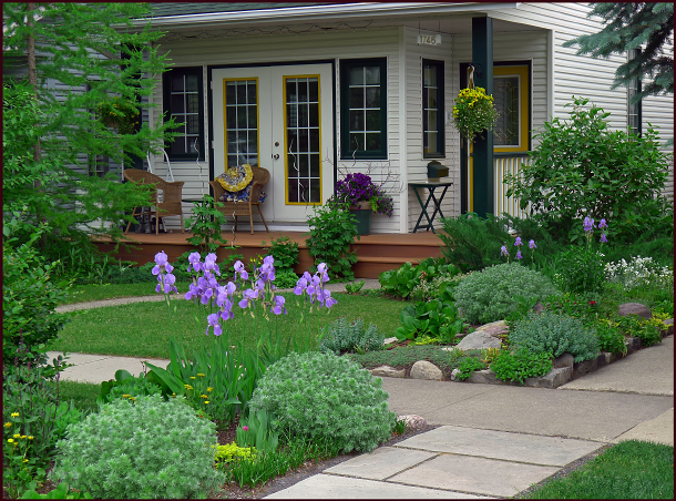
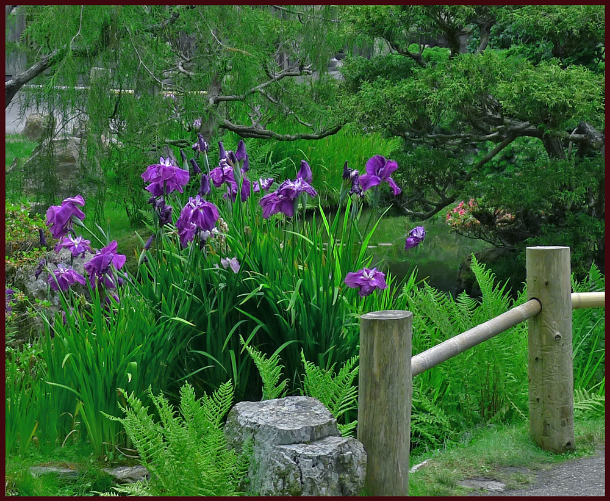
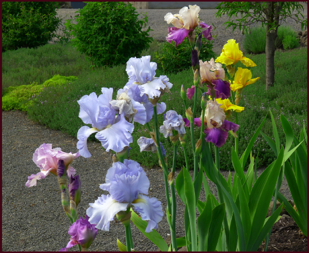
Sunday June 30 – Iris sibirica ‘Roanoke’s Choice’

Photo: Sue Gaviller
Siberian iris is a cold hardy, reliable perennial with fine grass-like foliage and an upright growth habit. Roanoke’s Choice is a spectacular cultivar with velvety, lilac mauve blossoms that are larger than typical Siberian iris. Tall and elegant, this cultivar is tolerant of both shade and full sun, but will be happiest in lots of morning sun, shaded from the hot late afternoon sun, and provided average moisture.
I used Iris sibirica ‘Roanoke’s Choice’ in a client’s Asian-inspired design a number of years ago, but until this year I had never managed to catch them blooming. Visiting this client last week, I was treated to these lovely Siberian irises in bloom, and what a treat it was. As I walked into her backyard, Roanoke’s Choice was the first thing I caught sight of and I have to say it took my breath away – its statuesque form, as well as the colour and texture of the blooms. Beautiful.
Siberian iris is a superb addition to the mixed perennial border, a woodland garden, or an Asian inspired design. It is lovely when massed, but can also make a stunning statement on its own, especially this particular cultivar – indeed if I had one Siberian Iris to choose from this would be the one. And that’s high praise coming from a picky designer.
July 7th 2013 – Rosa ‘Morden Sunrise’

Photos: Sue Gaviller
As a child growing up in Southern Ontario, I witnessed both my Mother and my Grandmother tend hybrid tea roses. I was never really a fan – they seemed to be all flower and no form. I have to admit though, the flowers were exquisite – I was especially fond of one known as the Peace Rose, a huge silky blossom that changed from soft yellow to pale peach, to ivory-white, and often displayed a combination of all three. And the scent was heavenly – like peaches and citrus.
So when I first laid eyes on the beautiful Rosa ‘Morden Sunrise’, my first thought was, “It reminds me a bit of the Peace Rose.” While Morden Sunrise of course isn’t a tea rose (they require some work to grow here), its soft colour blend of peachy pink and creamy yellow, and its fruity fragrance, always elicits a little nostalgia for me.
A bushy shrub rose, it has glossy dark green foliage which provides a stunning backdrop for the many delicate blossoms. And like all of the Parkland series of roses, Morden Sunrise is cold hardy, disease resistant and has a tidy compact form. So what’s not to like?
Peace be with you!
July 15th 2013 – Hemerocallis ‘Stella de Oro’
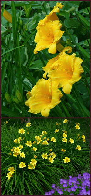
Photos: Sue Gaviller
Ya gotta love Stella right? I know she’s a commoner and she gets around a little, but she’s bright and cheery and oh-so-reliable. Mine are simply spectacular right now – dozens of sunny gold 2½ inch blooms greet me each morning. Despite the huge number of blooms and the intensity of their color, she really doesn’t look garish – I suspect her equally dense, very dark green foliage, helps to mitigate her loud presentation.
Stella looks beautiful growing alongside other bright flowers like Rosa ‘Winnipeg Parks’ (itself a pick from last year) and Campanula carpatica, and looks especially lovely paired with variegated green/white foliage plants.
She just has so much going for her! A reblooming dwarf variety, drought resistant, disease resistant and cold hardy, Stella fits in just about anywhere. She’s happiest in a sunny border but can tolerate considerable amounts of shade. And her handsome arching foliage is rich, dark green and very dense, making her a valuable addition to the mixed border before and after blooming.
No wonder she’s been deemed the world’s most popular daylily!
July 21st 2013 – Heuchera ‘Pinot Gris’
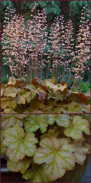
Photos: Sue Gaviller
A warm summer evening calls for a glass of good wine on the patio – Saturday night was one such evening. I sipped my Poplar Grove Pinot Gris and closed my eyes, a well deserved rest after a hot afternoon working in the garden. When I opened my eyes the soft evening sun had illuminated the pale pink inflorescence of the Heuchera in one of my patio containers – fittingly a cultivar named ‘Pinot Gris’.
This beautiful H. villosa hybrid has been steadily earning its place on this page ever since the spring – after pulling out several of said cultivar from last year’s containers, I realized they’d actually survived the winter in each of the three containers I’d planted them in. Okay these are keepers I thought, and popped them back in the containers to be part of this year’s arrangements.
Sometime later in the season I witnessed this Heuchera cultivar stand up very well in one of our very nasty hailstorms. And being native to the Southeastern United States, it’s also been right at home in the intermittent heat and humidity we’ve been experiencing this summer.
The beautiful foliage of Heuchera ‘Pinot Gris’, much like the wine after which it is named, varies from amber to copper to shades of light rose, and warm olive. The tiny peach-pink flowers are borne along many upright stems and contrast nicely with the large leaves. A truly stunning Heuchera cultivar – yup it’s a keeper.
July 28th 2013 – Hemerocallis ‘Starling’
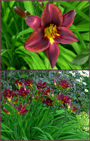
Photos: Sue Gaviller
Yes that’s right – another daylily has made its way onto my plant picks page. No surprise really, considering these near-perfect perennials are stars of the midsummer border.
Hemerocallis ‘Starling’ is a fine example of a tetraploid daylily, meaning it has four complete sets of chromosomes compared to the normal two (diploid). Like all tetraploids, Starling demonstrates marked vegetative vigour – foliage, stems and flowers are stronger and sturdier than their diploid counterparts.
The colour of this cultivar is quite dramatic – dark, warm, chocolate-red petals and sepals with a darker eye-zone and golden-yellow throat. It’s one of the most reliable daylilies in my collection – even in those rare years when for reasons unknown, some daylilies don’t bloom, ‘darling Starling’ has never failed me. This year is no exception – it’s putting on an incredible show… and it will bloom for many weeks.
So if you happen upon this cultivar in your nursery travels, snap one up – they’re real beauties.
August 4th 2013 – Thymus citriodorus ‘Doone Valley’
Photos: Sue Gaviller
Many years ago my husband bought a pot of lemon thyme for his herb garden. When it started blooming I asked him if he’d mind if I moved it to my perennial garden – it was just so darn pretty. He was fine with this… until he wanted to harvest it – at which point I whined that he’d leave a big hole in its place. I promised to buy him another for his herb garden – which I did. The following year when it started blooming I asked if he’d mind if I “borrowed” this one too. He chuckled, knowing he wouldn’t get to harvest it either.
Doone Valley lemon thyme is no ordinary lemon thyme – it has the characteristic strong lemon scent and flavour but is far more ornamental than the species. Mat forming, green and gold variegated foliage spreads nicely but isn’t invasive. It blooms later than most ornamental thymes, gracing the garden with pretty mauve-pink hues from mid July to mid August. Winter hardy, and both drought and shade tolerant, it asks only for a little snow cover – since it’s mostly evergreen, in drier winters it may suffer some winterkill (though it will regenerate from the roots).
Many years later I now have several large masses of this lovely groundcover – enough that we can actually harvest some for culinary purposes without leaving empty spaces in my perennial garden!
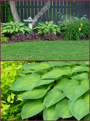
August 12th 2013 – Hosta ‘Guacamole’
Photos: Sue Gaviller
When I first started gardening, purchasing perennials meant buying small specimens – mostly in 4” pots. Over the years though, much larger specimens have become available – ornamental grasses, peonies and hostas for example, can now be purchased in 5 gallon pots.
There’s nothing more satisfying than planting that big beautiful Hosta in your garden and bang – instant appeal. Except the following season, those big beautiful hostas come up with a whimper instead of a bang – this is because the climate where they are grown is vastly different from the climate where they eventually find a home; our crazy Calgary climate.
Of course the plants do increase in size each year, but rarely do they have the robust leaf size they presented with at time of purchase. However Hosta ‘Guacamole’ has performed exceptionally well in all the designs I’ve used it in, coming back bigger and better every year, right from the get go. It is well named – indeed the colour of avocado flesh, edged in darker bluish-green. In a few short years it will reach 2 feet in height with a 3 foot spread and even in very moist soil, I’ve seen very little evidence of slug activity. Like all hostas, they are susceptible to damage from hail – situating them beneath a tree will ensure they don’t get too beat up during the several hailstorms we invariably get every summer.
Hosta ‘Guacamole’ – a stunning addition to your shade garden.
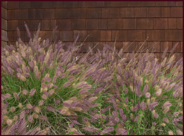
August 19th 2013 – Calamagrostis acutiflora ‘Avalanche’

Photo: Sue Gaviller
Last year about this time I featured Calamagrostis acutiflora ‘Karl Foerster’ as a weekly plant pick. Equally impressive is the cultivar ‘Avalanche’. Though not quite as tall as Karl Foerster, the inflorescence is very robust, creating a solid-looking bushy column about four feet in height.
The foliage is variegated cream and green and the inflorescence is soft green with a hint of pink, turning to the characteristic straw gold as the season progresses. Calamagrostis acutiflora ‘Avalanche’ is happiest in full sun but will also tolerate some shade.
Avalanche reed grass is cold hardy, drought tolerant and a stately addition to any garden!
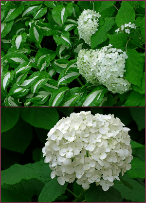
August 27th 2013 – Hydrangea arborescens ‘Annabelle’
Photos: Sue Gaviller
There was a time when I actually didn’t like these bright white beauties – I think I deemed them somewhat pedestrian. However, I’ve since changed my mind – late-blooming white flowers are decidedly refreshing in the late summer border. The huge, dazzling white flowerheads of Annabelle hydrangea, together with the large lush green leaves, invigorate a garden at this time of year – a time when our gardens are beginning to look a little tired.
Maturing to a height and spread of about a metre, this vigorous shrub looks exceptional when grouped, or on its own as a single specimen. And since they bloom on the current season’s wood, they are reliable bloomers.
Annabelle will perform well in a wide range of conditions but prefers morning sun and afternoon shade. Hardy to zone 3, she will brighten up even the weariest of gardens!
September 5th 2013 – Echinacea purpurea ‘Ruby Star’

Photo: Sue Gaviller
I am late posting this week’s plant pick – if you read my latest post you’ll know why.
Echinacea purpurea or Purple coneflower is a wildflower native to Eastern North America. The species grows quite well here, but many of its cultivars aren’t always stellar performers in our climate. There are of course a number of exceptions and Ruby Star is one of them. I have found her to be a consistently strong grower, beginning her bloom in late July and continuing well into the fall.
The blooms are darker than the species and a more intense fuchsia pink, with the characteristic mahogany coloured centre ‘cone’. Strong upright stems of the same dark red complete the picture. About 2 feet tall, she’ll love your sunny border and needs only whatever water falls in the form of rain. Even after 3 weeks with no appreciable rain, she still looks strong and healthy.
Indeed she is a ‘Star’ – why not let her brighten a spot on your garden.
September 10th 2013 – Heliopsis helianthoides
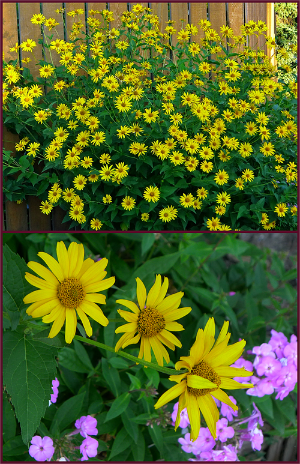
Photo: Sue Gaviller
Some might think this an unremarkable plant, undeserving of a place on this page – after all it’s just an ordinary yellow daisy-like flower. But every year, from late July, through the month of August and well into September, this hearty perennial makes its presence known in a very big way – with its brilliant gold flowers and its large stature.
Heliopsis helianthoides (false sunflower) provides a splash of intense colour when it is much-needed in the late summer border, and as it continues blooming, fits in well with the colour palette of warm fall hues.
So big and bright is this plant that you’ll want to limit yourself to only one or two of them – too many could appear garish.
Cold hardy and drought tolerant it requires very little attention save a little deadheading to prolong its bloom. It thrives in full sun but can also tolerate a little shade and will reach a robust size of four feet tall and at least as wide
Bring a little sunshine into your garden with Heliopsis helianthoides.
September 17th 2013 – Heuchera ‘Prince’

Photo: Sue Gaviller
I used this Heuchera for the first time several years ago in a client’s containers – they’d started out as small plants in small pots but very quickly grew to dominate the arrangements.
Heuchera make fabulous container plants, providing big bold texture, but it can be expensive to buy them as specimens that are large enough to provide immediate visual punch. So instead of buying plants every year, I decided to try popping the various Heuchera cultivars in the ground at the end of the season to over-winter and use again the following year. While they all survived the winter quite nicely, they were still pretty small when it came time to plant the containers, and it took them too long to reach any appreciable size. So I ended up having to purchase again anyway – except for the cultivar ‘Prince’ that is. Since many of the leaves had remained evergreen through the winter, they already had a head start, and true to their performance that first year, the plants doubled in size in their containers within a couple of weeks.
Heuchera ‘Prince’ has large shiny leaves that are richly coloured, emerging purple-red, darkening to purple-black, then fading to bronze-green as they mature. And the purple/pink undersides are intermittently visible due to the lovely ruffled edges, creating beautiful colour contrast and layers of textural interest.
This cultivar will grow to at least 18 inches wide, about 12 inches tall (foliage), and has the characteristic spikes of baby’s-breath-like flowers that aren’t particularly showy, but do provide nice contrast. While best foliage colour will be achieved in part to full sun, this plant is also shade tolerant – drought tolerant too, once established.
Heuchera ‘Prince’ – a real prince of a plant!
September 23, 2013 – Physocarpus opulifolius ‘Diabolo’

Photos: Sue Gaviller
Last year I wrote about another ninebark – the cultivar ‘Summer Wine’. The parentage of Summer Wine includes an older dark-leaved cultivar called ‘Diabolo’.
According to the OSU landscape plant database, Diabolo was a German introduction, discovered in 1968. It was found growing in a field of green-leaved ninebarks in the municipality of Ellerbek, and selected for its unusual dark red foliage. The patent name is ‘Monlo’ but the trademark name, currently owned by Monrovia Nursery, is ‘Diabolo’, from the Greek word diabollos and Latin diabolus, both meaning devil – so named because of the very dark colour of the leaves.
In my own design practice, this cultivar fell out of favour for a number of years – I found it to be untidy in its growth habit and prone to powdery mildew and aphid infestation. I have since discovered that this is only the case when it isn’t given enough sun. Diabolo requires full sun, and I mean full sun. Client’s whose yards afford them all-day-sun exposure, have big bushy disease-free specimens. Note too, that richer, more saturated colour is achieved in full sun.
Depending on a number of weather factors, Diabolo ninebark can be late to leaf out in the spring, but the payback is it’s also very late to lose leaves in the fall, contributing beautiful dark purple/red foliage colour well into November. As well it provides considerable textural value with its large trilobate leaves.
Physocarpus opulifolius ‘Diabolo’ will grow 2 to 3 metres tall and wide. In its first year it requires lots of water to get established but after that will be very drought tolerant. Feel free to prune this shrub quite hard in the spring resulting in a flush of fresh new growth.
Diabolo ninebark – a devilishly attractive shrub!
October 1st, 2013 – Symphoricarpos doorenbosii ‘Amethyst’
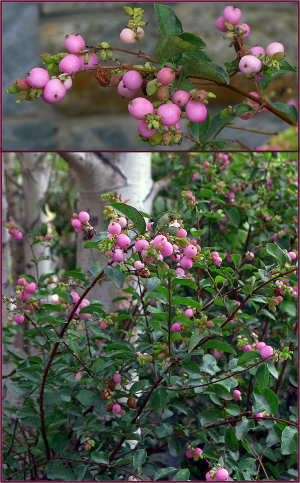
Photos: Sue Gaviller
At this time of year, perennials and annuals are winding down their bloom display – soon the leaves will begin to parade their fiery fall colours. Many plants, particularly trees and shrubs, have already begun to present some late-season colour in their fruit – berries and hips, in red, burgundy, orange and dark purple. Rare it is though, to see ornamental fruit in shades of pink. However, Symphoricarpos doorenbosii ‘Amethyst’, the purple coralberry, exhibits just that hue – and in abundance I might add.
This hardy shrub was originally developed for use in floral arrangements, requiring a plant that would produce large numbers of berries along each stem – you can be assured then, that Amethyst will provide a hearty display.
Fruiting occurs on new wood, so regular pruning to remove older wood will ensure peak production. Of course in our climate, there are years when ripening is slow, so some years will produce better crops than others.
During the growing season, this shrub will take a back seat to other showier plants, but its attractive arching branches and medium fine-textured foliage provide a nice backdrop. The flowers are small and inconspicuous, but are nonetheless quite pretty.
Purple coralberry matures to a height and spread of 1–1.5 metres, adapting to a wide range of soil and climate conditions, including dry shade and full sun. Plant in groups for best effect.
Amethyst – a bright jewel for the late summer and fall garden.
October 8th 2013 – Cornus alba ‘Aurea’ (Prairie Fire Golden Dogwood)
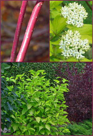
Photos: Sue Gaviller
This is one of my all time favourite plants – in fact I’m not sure why I haven’t featured it on this page long before now. Perhaps I’m just so accustomed to its beauty and reliability that I take it for granted.
Cornus alba ‘Aurea’ is a big, bright, bushy dogwood with intense lime-green to gold leaves. It is fast-growing, reaching full size in two or three years, and adapts well to many climactic conditions; sun or shade, moist or dry. Like all dogwoods, it responds well to hard pruning, subsequently rewarding the gardener with a flush of fresh new growth.
At 5-6 feet in height and width this bright beauty can make quite a statement in the landscape, pairing well with wine-coloured shrubs like Summer Wine ninebark, or even the dark green foliage of common lilac. With blood-red bark for winter colour and pretty white spring flowers (which give way to pretty white berries in the fall), this is a true four-season shrub. Some years, if it doesn’t get too cold too early, the leaves will turn fiery red in late fall.
A fine finish to the gardening season, Prairie Fire Golden Dogwood is my final plant pick of the year.
And In the End
In retrospect, a few comments on this year’s picks:
Rhododendron ‘Mikkeli’ – lost a lot of leaves in August as it often does later in the season (three-year old leaves yellow and drop), but was markedly worse this year during August’s heat and diminished rainfall. I gave my clients’ larger specimens a good pruning so they’ll bush out next year.
Iris sibirica ‘Roanoke’s Choice’ – foliage got a little floppy after blooming in shadier sites but stayed strong and upright where it got more sun.
Rosa ‘Morden Sunrise’ – still blooming magnificently in a client’s yard until October. This particular yard is full sun and somewhat protected.
Heuchera ‘Pinot Gris’ and ‘Prince’ – leaves are still alive under the snow and so far have perked right up each time the snow melts and they get sun on their leaves. Pinot Gris bloomed right up until the first heavy snowfall when the weight of the snow snapped all the flower stems.
And a few updates from 2012 picks…
Campanula portenschlagiana – all 7 of mine survived the winter, but did best where they got some snow cover. Those in drier spots almost didn’t make it – same for those under very heavy snow cover.
Echinacea ‘Tangerine Dream’ – both fared well over the winter and bloomed nicely. Plants not huge but definitely bigger than last year.
Viburnum dentatum ‘J.N. Select’ – overwintered very nicely with no dieback whatsoever. One bloomed and both grew a little over the course of this year. Weren’t very happy during the dry heat of August so will move them to a slightly shadier, moister spot next year. Gorgeous fall colour this year.
Physocarpus opulifolius ‘Summer Wine’ – suffered significant winterkill this year due to last fall’s very early and very sudden temperature drop, but came back beautifully with very lush new growth.

Well folks there you have it, another gardening season come and gone. It was a good year, despite getting off to a rough start (late frost, hail, and devastating floods). Winter has come too early again, but we did have a lovely fall. Hope ya’ll are keeping warm.

Til next time,
Sue

© Sue Gaviller and Not Another Gardening Blog 2012. Unauthorized use and/or duplication of this material without express and written permission from this blog’s author and/or owner is strictly prohibited. Excerpts and links may be used, provided that full and clear credit is given to Sue Gaviller and Not Another Gardening Blog with appropriate and specific direction to the original content.