Principled Gardening – The Final Chapter: Proportion

Today is the last Monday of the month, the last day of the year, and the last installment in our Principled Gardener series – we have one last design principle to look at and that is Proportion.

Proportion is related to Scale – in fact the terms are often used interchangeably, but I consider them to be different enough to present separately. You may recall from Part 7 of this series that Scale refers to the size of landscape elements in relation to their existing surroundings, i.e adjacent buildings, neighbouring buildings/trees etc. Proportion on the other hand, is the size of landscape elements in relation to each other and to the design as a whole. It can also refer to the ratio of one dimension to another, such as width to length.

So how do we know if the various elements and dimensions in our design are proportionate to one another? To some degree this must be intuited, but there are a few guidelines that may be helpful.

For relatively simple designs, the rule of thirds, or an adaptation thereof, can be used. As it pertains to landscape design, this means elements or dimensions that relate to each other in a 1:3 or 2:3 ratio.

This is most effective when applied to linear dimensions. For example, in my own front yard the linear distance from the street to the house is roughly divided into thirds, one-third being garden space and two-thirds lawn space. (Please ignore the goofy little strips of lawn at the bottom on both sides – bad design.)

PROPORTION - front yard

If however, we look at the horizontal dimension of this same yard, the rule of thirds isn’t adhered to. The existing walkway is too far to the right, and more significantly, the overall or cumulative width of the side beds is only 14 feet – less than the 20 feet needed to satisfy the rule of thirds.

PROPORTION - front yard 2

Both beds would have to be wider to make up one-third of the total horizontal space, but the current position of the walkway and the two Cotoneaster shrubs preclude this option.

While these horizontal proportions may be less than optimal, the overall proportions are still quite favourable – at least on paper. However, because the yard slopes somewhat, the garden area in front of the house appears much shallower from the street. This makes the lawn look disproportionately large in both directions – a real source of frustration for me. It could of course be remedied, but not using the present design lines. I get tired just thinking about the work required to execute effective change, not to mention the expense. You can see why good design requires some forethought, preferably expressed first on paper. I suspect if I’d known what I was doing decades ago when I began this whole thing, I would have designed something very different. Sigh.

For now I’ll just have to resort to that hypocritical mantra of many a parent, teacher or boss: ‘Do as I say, not as I do’.

But enough about me.  Let’s look at a simple design that puts the rule of thirds to work. The example below illustrates a symmetrical design using the rule of thirds to achieve good proportion. You can see that all of the rectangular spaces relate to one another in a 1:3 or 2:3 ratio – the lawn area is 2/3 the width of the property, the dining area is 2/3 the width of the lawn and the seating area is 2/3 the width of the dining area.

Rule of ThirdsIn addition each rectangle is in itself proportioned such that the shorter dimension is two-thirds the length of the longer one. The result is a design with very pleasing proportions.

PROPORTION - plant material

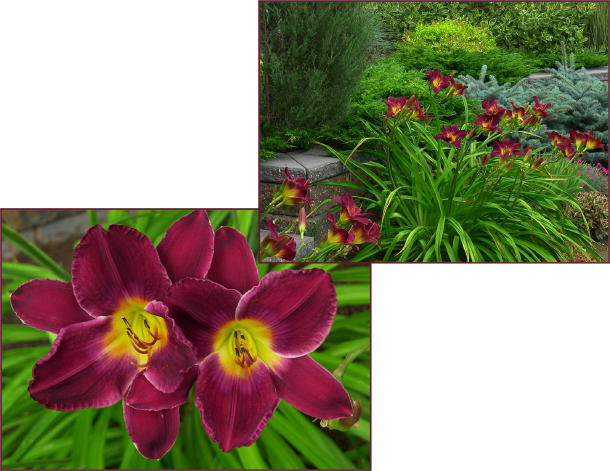
The rule of thirds can also be applied to plant selection, albeit loosely as plants don’t reach an exact height, but rather a range – keeping this range in mind can help you achieve well proportioned planting arrangements.

In the photo on the right, two Syringa sp. together with Picea pungens, illustrate one such plant grouping.

Containers too can be arranged this way – many ‘nesting pots’ are trios that bear a 1/3, 2/3 relationship to each other. Planting them in a similar or identical manner is very effective.

These 3 containers on my client's front deck display good proportion based roughly on the rule of thirds. Photo: Pat Gaviller

These 3 containers on my client’s front deck display good proportion based roughly on the rule of thirds. Photo: Pat Gaviller

The rule of thirds is not always easily or realistically applicable – existing hardscapes, the shape of adjacent buildings, positioning of property lines, or even the design itself, can make this tool ineffectual. Many of the elements we add to our gardens – be they plants, focal points or furniture – don’t really lend themselves to the use of this ratio either. This is when we just have to rely on our intuition and common sense.

Consider a tiny bird bath or piece of statuary – it might appear lost in an expanse of trees and large shrubs, but be right at home amongst smaller perennials. Likewise, that gargantuan classical fountain may look ridiculous adorning a small urban patio, but fit perfectly into a more grandiose courtyard or terrace, as illustrated in the photos below.

Court of the Lions, Alhambra, Granada, Andalusia

Court of the Lions, Alhambra, Granada, Andalusia. Photo Credit: Wikipedia

Gardens at the Livadiya Palace, Crimea, Ukraine.

Gardens at the Livadiya Palace, Crimea, Ukraine. Photo Credit: Andrew Butko, Wikipedia

Another way we can ensure good proportion in our landscapes is with the use of a grid. To do this, draw a series of vertical and horizontal lines on some trace paper and place over a plan view of your property. It’s most effective if you can make the size of the grid square relate to the house in some way, but be careful not to make the square too small or the whole purpose will be defeated. In the example below, I’ve chosen a grid square that is the same size as the house indentation in the right corner.

GRID

The grid lines are then used as an outline for the design.

PROPORTION - RECTILINEAR

Your choice of design concept isn’t limited to straight lines as the grid is just a template – arcs could be inserted into some of the corners to create an Arc & Tangent design. Each arc would necessarily segment or bisect a grid square.

PROPORTION - ARC & TANGENT

For circular or curvilinear designs a grid can still be used, but because there are no straight lines it must be more loosely interpreted. Ideally the outermost point of an arc or circle should extend to a grid line – since this isn’t always possible using up a half grid square is acceptable.

GRID - circular

Regardless of the concept, the spatial relationship that now exists between all design elements, is one of good proportion.

GRID - RECTILINEAR Colour

GRID - CIRCULAR Colour

So ladies and gentlemen, there you have it – design principles in a nutshell. It’s been a long process – thanks for your patient reading.

Happy New Year to Y’all
Sue
 
 
© Sue Gaviller and Not Another Gardening Blog 2012. Unauthorized use and/or duplication of this material without express and written permission from this blog’s author and/or owner is strictly prohibited. Excerpts and links may be used, provided that full and clear credit is given to Sue Gaviller and Not Another Gardening Blog with appropriate and specific direction to the original content.

A Nice Pair

………Of plants that is.  (Well what did you think I meant?)

Now that winter is here to stay,  I thought I’d take this opportunity to profile some ‘pretty plant pairs’ that caught my eye this year, and why it is they look so great together. I actually started writing this post months ago. Each plant pair I profiled had a clever name and was followed with the subheading ‘Why This Works’. However after visiting a favourite blog, Christina Salwitz’s personalgardencoach.com, I discovered that I’d been beaten to the post (no pun intended). Christina has just co-authored a beautiful book on plant combinations and shared a couple of sample pages in her Aug. 1st blog post. Like me, she’s given her combos clever names, like ‘Strawberries and Chocolate’, and after each one has a subtitle ‘Why This Works’.

Wow – really? Yes really. I guess great minds think alike.

Anyway my first thought was to abandon the idea altogether, but I decided to go ahead and just rework my format. Besides they’re really very different approaches – Christina’s is a fabulous ‘how-to’ book on creating artful foliage combinations. Mine is a more casual read, a haphazard ‘see how pretty these look together’ approach. I’ll still tell you why they work though – sans the subtitle. And I’m keeping my cutesy names……….

Courtin’ Couples

Stella and Karl

When combining plants, it’s important to consider contrast and/or repetition of colour, form and texture. Hemerocallis ‘Stella d’Oro’ and Calamagrostis acutiflora ‘Karl Foerster’ make a subtle but effective combo, for a couple of reasons  –  Stella’s strappy  foliage is a broader version of Karl’s grassy foliage and the same dark green, so provides repetition.

Hemerocallis 'Stella d'Oro' and Calamagrostis acutiflora ‘Karl Foerster’

Hemerocallis ‘Stella d’Oro’ and Calamagrostis acutiflora ‘Karl Foerster’. Photo: Pat Gaviller

As well, in early summer when the grass sends up its vertical inflorescence, the soft arching form of the daylilies contrasts beautifully with the upright form of the grasses. As the grass turns to gold in late summer, it will echo the colour of Stella’s blooms. The two look striking together as a linear planting along the fence and will become more so as they both mature.

Stella and………….another Karl?

Hemerocallis 'Stella d'Oro' and Campanula carpatica v. turbinata ‘Karl Foerster’

Hemerocallis ‘Stella d’Oro’ and Campanula carpatica v. turbinata ‘Karl Foerster’. Photo: Pat Gaviller

That’s right Stella is cheating on Karl – with another of the same name. Here she’s seen with Campanula carpatica var. turbinata ‘Karl Foerster’, bred by famed Swedish hybridizer Karl Foerster, who of course also bred the aforementioned grassy Karl.

This Campanula cultivar is used extensively in Europe, but can be difficult to obtain here – I special ordered mine years ago. No matter, C. carpatica ‘Deep Blue Clips’ will do quite nicely.

The key to this combo is the colour contrast, as well the contrasting forms – the fountain shape of Hemerocallis arches nicely over the rounded mound of Campanula. Nice pair eh?

Stella and Ruby

Tsk, tsk – Stella you do get around don’t you! This time she’s with Berberis thunbergii ‘Ruby Carousel’ – a stunning combination. Stella’s bright gold blooms contrast beautifully with the barberry’s dark wine-coloured foliage as well as the texture, and her arching form repeats the form of Ruby’s horizontal arching branches.

Hemerocallis ‘Stella d'Oro' and Berberis thunbergii ‘Ruby Carousel’

Hemerocallis ‘Stella d’Oro’ and Berberis thunbergii ‘Ruby Carousel’. Photo: Pat Gaviller

Okay enough of Stella’s tawdry affairs – let’s move on to something more appetizing.

Picture1

Palatable Pairs

Guacamole and Plum Pudding

Hosta 'Guacamole' and Heuchera 'Plum Pudding'

Hosta ‘Guacamole’ and Heuchera ‘Plum Pudding’.
Photo: Sue Gaviller

Guacamole & Plum Pudding? Blech! That sounds decidedly unpalatable – sure looks pretty though doesn’t it?  The contrast in hue is lovely, and since Hosta ‘Guacamole’ and Heuchera ‘Plum Pudding’ are both foliage perennials, this colour combo is offered on the menu all season long.

Though both are very coarse-textured (large leaves), there’s still textural contrast because the Hosta leaves are so much larger, and their leaf shape differs significantly.

Picture1

Peaches and Salmon

Heuchera ‘Georgia Peach’ and Begonia ‘Nonstop Salmon’

Heuchera ‘Georgia Peach’ and Begonia ‘Nonstop Salmon’.
Photo: Sue Gaviller

C’mon now, peaches and salmon? That sounds awful too. However it looks quite delicious – the muted coral-rose leaves of Heuchera ‘Georgia Peach’ are a lovely foil for the bright coral-red blooms of Begonia ‘Nonstop Salmon’.

The contrast of slightly fuzzy Heuchera foliage with the waxy surface of Begonia leaves, also contributes to the success of this container combo.

As well, the lobed foliage of both nicely echo each other.

Picture1

Peaches and Cream

Now that sounds yummy – like summer brunch on the patio.

These two foliage plants display understated colour contrast because they are both muted hues.  Variegated foliage like that of Cornus alba ‘Cream Cracker’ always makes an eye-catching backdrop for warm colours like this Heuchera ‘Georgia Peach’.

Heuchera ‘Georgia Peach’ and Cornus alba ‘Cream Cracker

Heuchera ‘Georgia Peach’ and Cornus alba ‘Cream Cracker. Photo: Sue Gaviller

While one might think that the two-toned colouring of each would make for a ‘too busy’ picture, it really doesn’t. The veining of the Heuchera leaves presents quite differently from the dogwood variegation so they don’t compete visually with one another. In fact they make a truly scrumptious pair.

Picture1

Berries and Cream

Sorbus decora berries and Cornus alba 'Cream Cracker'

Sorbus decora berries and Cornus alba ‘Cream Cracker’.
Photo: Sue Gaviller

Mmmm, this too sounds tasty. The berries from a client’s Sorbus decora were so plentiful that they hung down into the Cornus alba ‘Cream Cracker’ below. As I said of the previous pair, variegated foliage is an excellent foil for warm colours. Here the effect is even more stunning because the berries are also very bright against the more muted tones of the dogwood foliage.

The Cornus leaf petioles are the same plum-red as that of both the Sorbus leaf petioles and the peduncle/pedicels of the berries, hence providing subtle repetition.

As well, the peachy pink colour of the changing leaves is a lovely contrast to the berries – tasty indeed!

Picture1

Opposites Attract

Red-violet and Yellow-green

Red-violet and Yellow-green, as seen in this pairing of Paeonia ‘Morning Lilac’ and Spiraea bumalda ‘Goldmound’, are opposite each other on the colour wheel. Using these complementary colours together makes a dramatic, eye-catching combination – generous amounts of basic green foliage should therefore be included to soften the high contrast.

Paeonia ‘Morning Lilac’ and Spiraea bumalda 'Goldmound'

Paeonia ‘Morning Lilac’ and Spiraea bumalda ‘Goldmound’. Photo: Sue Gaviller

Blue and Orange

Hemerocallis fulva (tawny daylily) and blue Delphinium

Hemerocallis fulva (tawny daylily) and blue Delphinium.
Photos: Sue Gaviller

Another complementary pairing, Hemerocallis fulva (tawny daylily) and two different shades of blue Delphinium team up to create a really outstanding combo.

In addition to the beautifully contrasting colours, the fountain-like form of Hemerocallis contrasts nicely with the very upright growth habit of Delphinium.

Picture1

Seasonal Fare

When choosing plant material, don’t forget to consider those many barren winter months. This twosome – Picea pungens var. glauca (Colorado blue spruce) and Prunus mackii (Amur cherry) – provides striking colour contrast throughout the off-season when little colour is present in our gardens and landscapes. The colour combo is effective because the blue-green of the spruce needles and the red-orange of the cherry bark are opposites, or complements.

Picea pungens var. glauca and Prunus mackii.

Picea pungens var. glauca and Prunus mackii. Photo: Sue Gaviller

Light and Dark

Just as opposite colours create high contrast, so does the combination of light and dark. This dark wine-coloured Hemerocallis ‘Purple d’Oro’ is gorgeous next to bright white Leucanthemum superbum. The sunny yellow daisy centres pick up on the lemon yellow throat of the daylily offering some nice repetition too.

Leucanthemum  superbum and Hemerocallis ‘Purple d'Oro'

Leucanthemum superbum and Hemerocallis ‘Purple d’Oro’. Photo: Sue Gaviller

Sun and Stars

Heliopsis helianthoides and Liatris spicata.

Heliopsis helianthoides and Liatris spicata. Photo: See Gaviller

False sunflower (Heliopsis helianthoides) and blazing star (Liatris spicata) make a dazzling duo.

Their successful partnership is due in part to the colour contrast, but also because of their textural differences – feathery spikes of mauve stars pair beautifully with the bright rays of sunny gold.

A casual pairing with real visual punch.

Picture1

Take a Walk on the Wild Side

A Woodland Pair

Actaea rubra and Matteuccia struthiopteris

Actaea rubra and Matteuccia struthiopteris. Photo: Sue Gaviller

Using native plants in our garden compositions can create a setting that looks very natural, as if Mother Nature herself planned it.

In this woodland pairing, the rich red berries and dark green toothed foliage of Actaea rubra (red baneberry) look striking with the light green, lacy fronds of Matteuccia  struthiopteris (ostrich fern).

(Please note that all parts of Actaea are poisonous, especially the berries, hence the common name ‘baneberry’.)

Picture1

Mother Knows Best

Sometimes Mother Nature does indeed put things together in the most charming way, as with this delightful duet – Aquilegia canadensis and Cypripedium parviflorum var. pubescens. Each of these wildflowers offers unique form that complements the other, and the very visible yellow stamens of the columbine nicely repeat the colour of the lady’s slipper. Couldn’t have done better myself!

Cypripedium parviflorum var. pubescens and Aquilegia canadensis

Cypripedium parviflorum var. pubescens and Aquilegia canadensis. Photo: Pat Gaviller

Threesome Anyone?

When I first espied this colourful combo from a block or so away, I noticed only the purple Salvia nemerosa ‘May Night’ and the bright yellow-green Lysimachia nummularia ‘Aurea’ but as I approached, camera in hand, I realized that a pink peony had flopped down to join them. I wanted to push it out of the way but then decided I quite liked this little trio – the plump pink peony was a pretty addition to the spiky sage and creeping groundcover, and actually softened the intense colour contrast between the two.

Salvia nemerosa ‘May Night’, Lysimachia nummularia ‘Aurea’ and Paeonia sp.

Salvia nemerosa ‘May Night’, Lysimachia nummularia ‘Aurea’ and Paeonia sp. Photo: Sue Gaviller

Whenever I go clothes shopping, before I buy that must-have new sweater, I ask myself “what have I got to wear this with?” Remember this the next time you’re out plant shopping – before you buy that must-have new shrub or perennial, ask yourself “what have I got to pair this with?”

And be sure to check out Christina’s book.

Stay warm,
Sue
Picture1
© Sue Gaviller and Not Another Gardening Blog 2012. Unauthorized use and/or duplication of this material without express and written permission from this blog’s author and/or owner is strictly prohibited. Excerpts and links may be used, provided that full and clear credit is given to Sue Gaviller and Not Another Gardening Blog with appropriate and specific direction to the original content.

The Principled Gardener Part 7 – Scale

Part Seven? I’m beginning to feel like I’m writing the script for a “Rocky” movie. Anyway, we’re nearing the end of our months-long discussion on Landscape Design Principles – are ya bored yet?  Well hang in there, there’s only two more to go. Today we look at Scale.

The principle of Scale refers to the size of landscape elements in relation to their surroundings. There are two factors to consider – one is the size of your house, and the other is the size of objects in the larger landscape (existing trees in the community, size of your neighbour’s house etc.).

In the examples to the left, the top image illustrates a house that is visually overwhelmed by the landscaping – the shrubs next to the house are as tall, or taller than the house, with some even obscuring windows. And the shade trees are huge in relation to the house – this scale is too large. The middle example is the exact opposite. The trees and shrubs look like toys in comparison to the house – the scale of this landscape is too small. The bottom example is what we’re after. The landscape elements are well suited to the size of the house, hence this represents appropriate scale.

So what makes for proper scale? Well for one, the shrubs right up against the house shouldn’t be much more than about ¾ the height of the house (walls) and the trees that are out a bit further, not more than about twice the height of the house. It just looks “right”.

But what if you live in an older neighbourhood, like mine, where the houses are small, the lots are huge and so are the existing trees in the community? In this case, the large shade trees may indeed be in scale with the neighbourhood, but any plantings against the house will still need to be in scale with the house, like in the example below right. Note the larger shrubs bridging the scale between the smaller plants and the big trees.

I spend a lot of time exploring various communities while walking our dog, and what I see is yard after yard where scale is consistently ignored, even in the simplest landscapes – either the house is dwarfed by the landscape or the landscape is dwarfed by the house.

I think what happens is one of two things. Many newer communities boast large homes, but at the expense of usable outdoor space – the house takes up most of the lot, leaving very little room for landscaping. Homeowners then opt for groupings of smallish shrubs that take up less space, without considering their size relative to the house.

A large house on a small lot creates a design challenge in terms of good scale. Here, the small plantings in front of this house appear overpowered because they are too small for the house.

The use of a few tall narrow trees can be helpful here – they relate well to the height of the house without taking up too much breadth. With just the addition of a columnar tree or two, a whole composition can be brought into scale.

The two columnar trees flanking the house provide necessary scale to this landscape, relating the large stature of the house to that of the smaller plantings.

The same house, now with mature boulevard trees, illustrates proper scale in the context of the larger landscape, i.e. a neighbourhood.

The other thing that happens is illustrated on the left. In the top example, the diorama represents an older home with plantings typical of the time it was built – Cotoneaster hedge, Potentilla, and little Johnny’s ‘Arbour Day’ tree, a Colorado spruce (Picea pungens). Not particularly inspired I realize, but at least it’s in scale with the house.  Fast forward a few decades and the scenario depicted in the bottom photo has likely ensued. Little Johnny is forty years old now and so is this landscape. I guess nobody took into account way back when, that living things don’t remain static. They grow … and grow and grow. So what was once in scale is no longer.

Gardeners, let’s remember to consider future size – the mature size of the plants we choose – and locate them accordingly.  Let’s not plant Colorado spruce or the even larger white spruce (Picea glauca), in our small urban yards. They are for acreages and parks, and maybe very large residential yards, but too big for any other urban application.

There are smaller evergreens much better suited to our gardens, for example Picea pungens ‘Bakeri’ (Baker’s blue spruce) or Pinus uncinata (mountain pine).

In my own neighbourhood I see tall cedars (likely cv. ‘Brandon’) – planted decades ago to frame the entrance of tiny bungalows – that now tower above them. In fairness to whomever planted them, I suspect the literature at the time may have advised that these Thuja species would top out at about 15 feet. Yeah right – gotta laugh when I hear people exclaim ‘cedars don’t do well in Calgary’.

I find this latter scenario (small house, big lot) to be more of a challenge than the reverse –precisely because there is often existing mature plant material that’s way too big, and homeowners are reluctant to part with it.  I don’t blame them. I have a huge Colorado blue spruce right in the middle of my back yard. Though we have a relatively large property, this mammoth evergreen has been difficult to design around. Every winter my husband and I contemplate removing it and every summer we remember why we, as of yet, haven’t done so – it provides much-needed shade from the late-day prairie sun. If you live on the prairies you’ll no doubt be aware, that our late-day sun can be hotter and more intense than our mid-day sun. So unless we decide to invest in central air conditioning, Mr. Spruce gets to stay.

The right side of this landscape is nicely in scale with the house. On the left side, a very large blue spruce precludes the possibility of correct scale for that area. It’s a lovely tree – healthy and very blue, so I understood why the clients wanted to keep it, but it typifies the design challenges of a mature neighbourhood. Photo: Sue Gaviller

If you’re planning a new landscape, or renovating your old landscape, remember to think about Scale. Then think like Goldilocks – you don’t want too big. Or too small. You want juuust right.

Til next time,
Sue
 
© Sue Gaviller and Not Another Gardening Blog 2012. Unauthorized use and/or duplication of this material without express and written permission from this blog’s author and/or owner is strictly prohibited. Excerpts and links may be used, provided that full and clear credit is given to Sue Gaviller and Not Another Gardening Blog with appropriate and specific direction to the original content.

Georgia’s World

“When you take a flower in your hand and really look at it, it’s your world for the moment. I want to give that world to someone else.” ~ Georgia O’Keeffe ~

When Georgia O’Keeffe painted the stunning floral portraits for which she was famous, she did so with the intent of expressing what she felt when looking at a flower, portraying it as she experienced it – layered, luxuriant, larger-than-life. She assigned as much significance to the details as to the whole, often painting less than the whole flower and using the outer edges merely to frame its inner beauty.

I’m a huge fan of Georgia O’Keeffe’s work – for so many reasons. The designer in me is completely enamoured by her attention to detail, creating texture so rich one can almost feel it. The gardener in me………well what gardener doesn’t love to look at big beautiful flower pictures?  And as a horticulturist, I find her sensuous presentation of every ruffle and ridge, petal, sepal and stamen, to be a breathtaking study in flower anatomy. If one looks at these paintings from this botanical vantage point, a whole new appreciation of both painter and subject ensues.

The Birds and the Bees

I think to truly appreciate a flower one must first understand its role. A flower exists, not for the purpose of our enjoyment (much as we gardeners would like to think), but rather for the purpose of reproduction. Their brightly coloured parts aren’t intended to garner the oohs and aahs of our neighbours and friends, but to attract pollinators, like birds, bees and butterflies.

“Let me tell you ‘bout the birds and the bees
  and the flowers and the trees
  and the moon up above
  and the thing called love”.

We all know those infamous Herb Newman lyrics, and what often follows is………the Talk. You know the talk of which I speak – the one your parents or grandparents, or teachers, had with you just as you were approaching puberty. Well here it is again – sort of.

Prepare yourself – I have graphic images.

Cross section of a ‘perfect’ flower, meaning it has both stamens (male) and carpels (female). Not all flowers are perfect – some plants have separate male and female flowers. In some cases, the entire plant is either male or female – these plants are referred to as dioecious.

So it goes something like this: A bee or other pollinator enters the interior of a flower in search of nectar and pollen. In the process of collecting pollen it inadvertently brushes against the stigma, thereby depositing the pollen which contains the sperm. A pollen tube then forms, growing down the style and transporting the sperm to the ovary where the ovules reside. The male sperm joins with the female ovule and voila, fertilization! Fruit and/or seeds then develop from the fertilized egg and these are dispersed by wind, rain, birds, etc., eventually settling into the soil where the seeds germinate. Plant grows, plant produces flowers, bees pollinate………..yadda yadda yadda. Did ya get all that?

Pretty in Pink – this pink hollyhock presents her best ‘come hither’ look, hoping to entice pollinators. The brighter pink veins add to her allure and serve to guide visitors in. Work it girl! Photo: Cathy Gaviller

Of course the bees have no idea that they’re participating in the plant’s sex life – they’re just there for the pollen. But they are vital to this courtship dance. In fact flowers get all dressed up in their most colourful outfits and put on their finest perfume to impress these pollinators – or any pollinator for that matter. Oh those fickle flowers.

Ah yes – success. Now that is one amorous bee! Photo: Cathy Gaviller

Come A Little Bit Closer Now

If we zoom in a little closer to have a really good look at the inner workings of these remarkable reproductive machines, you’ll see that the very heart of a flower is indeed a thing of beauty and something to be celebrated – sketched, painted or photographed. This was Georgia’s gift to the world – she made us really look at a flower.

A close-up of Hemerocallis ‘Strutter’s Ball’ reveals velvety ridges, sumptuous ruffles, delicate veins and arching stamens – worthy of Georgia’s paintbrush don’t you think? Photo: Sue Gaviller

Plants like the above-pictured daylily have large showy flowers which easily attract pollinators. Other plants, lilacs for example, have many tiny florets each with reproductive capacity. These florets are clustered together to form a large inflorescence which not only increases the chances of being noticed by passing pollinators, but vastly increases the opportunities for pollination. Most of us never really notice these tiny floral entities that make up the larger racemes, umbels and panicles, but they are miniature marvels that merit a closer look.

Syringa vulgaris ‘Katherine Havemeyer’ – each tiny floret is picture-perfect in itself. Photo: Sue Gaviller

Inner Space

Zooming in even more we can get a detailed view of the various reproductive parts of a flower. The male parts are the anthers and filaments, collectively called the stamen. Anthers are the pollen producing organs and are often quite pronounced, hence they are usually quite recognizable.

The female parts – stigma, style and ovary, together make up the carpel. Often there are multiple carpels, which are jointly referred to as the pistil. If there is only one carpel, then the terms carpel and pistil can be applied interchangeably. Carpels come in all shapes and sizes. Some have a long tube-shaped style and a bulbous stigma. Others have a bulb-shaped style and fleshy stigma. Sometimes the style appears almost non-existent and the stigma is all that’s visible. While the shape is widely variable, the carpel can usually be recognized by the surface texture of the stigma, which will appear sticky, oily or waxy – this ensures adherence of pollen grains.

Hemerocallis ‘Little Grapette’ – note the pollen-laden anthers, long tubular style and the tiny stigma. Photo: Sue Gaviller

The bulbous stigma of Lilium longiflorum is quite large compared to that of the Hemerocallis in the previous image, but both stigma have the characteristic spongy, waxy surface for trapping pollen. Photo: Pat Gaviller

Lilium columbianum has very pronounced carpel and stamens. Here the pollen on the anthers has all but disappeared but grains of it heavily coat the sticky stigma surface. Photo: Pat Gaviller

Paoenia ‘Morning Lilac’ – a ring of bright yellow anthers atop pink filaments surrounds a group of carpels with pale greenish styles. The furled flaps of paler pink fleshy tissue are the stigma. Photo: Pat Gaviller

Paeonia ‘Tom Eckhart’ has a centre full of butter yellow staminodes – flattened sterile stamens that are the result of extensive hybridization Photo: Sue Gaviller

Rosa nutkana – pale yellow stamens surround a group of pale greenish carpels, of which only the stigma is visible. Photo: Pat Gaviller

Iris ‘Raspberry Blush’ – note the voluptuous centre pieces, called style arms, each of which arches over a male stamen. Photo: Sue Gaviller

Outer Space

The outermost layer of a flower is the calyx, which is made up of all the sepals. Just inside the calyx  is the corolla which consists of all the petals.  Ah yes, the petals – this is why we grow plants that flower right? Generally speaking the petals are the largest, showiest part of the flower (there are exceptions though). Biologically speaking they serve the purpose of surrounding and protecting the flower’s reproductive parts, as well as attracting pollinators with their colourful presentation.

The sepals on the other hand, are usually nondescript, green leaf-like units that surround and enclose the flower in the bud stage, as well as support the petals once they emerge. However, there are a number of plants that have very showy sepals, almost as showy as the petals – Lilium, Hemerocallis, Iris and Narcissus to name a few.

The petals of Rosa ‘Winnipeg Parks’ are bright and very flashy, whereas the pale gray-green sepals have very little ornamental value. Photo: Sue Gaviller

Daylily sepals, like this Hemerocallis ‘Chicago Antique Tapestry’, are the same colour and texture as the petals, albeit a little smaller. Photo: Sue Gaviller

The sepals of plants in the Iris genus are the downward-curving parts, called ‘falls’, and are every bit as beautiful as the upright petals or ‘standards’. Photo: Sue Gaviller

Some Irises have fuzzy caterpillar-like tufts along the midline of the sepals – these are known as ‘beards’. The Iris beard may serve to collect and protect pollen (note its proximity to the stigmatic lip directly above the beard) or it may simply provide a place for pollinators to alight and grasp onto. Photo: Pat Gaviller

Narcissus sp. has 3 petals, 3 almost identical sepals and an additional trumpet-shaped structure known as the corona. Photo: Pat Gaviller

This Bud’s for You

A flower begins as a bud – an unremarkable green protuberance that bears no resemblance to the flower it will eventually become.

Like all of the intersectional hybrids, Paeonia ‘Morning Lilac’ has unique pointy buds. Photo: Sue Gaviller

I find flower buds to be as rewarding as the blooms, more so maybe. A bud is the promise of a flower and we experience it with all the anticipation of a bride-to-be. I doubt if I’m the only gardener who has spent countless hours peering into the depth of daylily foliage, gently separating the grassy blades looking for emerging bloomscapes. Or palpating Iris fans, feeling for the swellings of blooms-to-be. Or closely examining lilac buds to determine which will be leaves and which will be gorgeous fragrant blossoms.

I count the buds to see how many blooms I’ll be blessed with this year. I observe them daily, gauging their progress, watching them swell and elongate, slowly taking on a hint of colour. I daresay by the time my flowering plants actually bloom, I’ve spent so much time anticipating it that the experience is almost anticlimactic. Almost.

Left: Hemerocallis ‘Mary Reed’ – flower bud almost ready to open.
Right – Hemerocallis ‘Starling’ has luscious plump flower buds, as do most tetraploid daylilies.
Photos: Sue Gaviller

Today is Georgia O’Keeffe’s 125th birthday and it is in her honour I write this post.

I invite you to see every flower through new eyes and with deeper appreciation. Take a step into Georgia’s world.

Yours,
Sue
 
© Sue Gaviller and Not Another Gardening Blog 2012. Unauthorized use and/or duplication of this material without express and written permission from this blog’s author and/or owner is strictly prohibited. Excerpts and links may be used, provided that full and clear credit is given to Sue Gaviller and Not Another Gardening Blog with appropriate and specific direction to the original content.

Movin’ On – The Principled Gardener Part 6

A week or so ago, before our balmy fall weather morphed into an early blast of winter, I took a drive through a couple of our city’s more ‘distinguished’ neighbourhoods looking for photo-ops. As I scanned the tastefully landscaped homes, which were all the more attractive with the accompanying hues of autumn, I found myself stopping and starting, braking and rubbernecking to get a better look. Yes I was that nuisance driver you wanted to bellow at: “Get moving lady!”  “Move over lady!”  “Move lady!”

Move!

My car may not have been moving but my eye certainly was – well designed landscapes invite that. In fact Movement is one of the Design Principles and just happens to be the subject of this post (shameless segue I know). The definition is of course self-explanatory: Movement refers to what keeps the eye in motion throughout a landscape. Of course this visual movement will occur with or without our intervention, but design choices can definitely affect how our eye will move through a garden.

One of the ways we can generate movement is with rhythmic repetition. You’ll recall that I discussed repetition several months ago in reference to Unity. However, repetition as it relates to Movement refers to a design element that is repeated at regular intervals or in an obvious pattern. It can be a single element recurring regularly or a more complex pattern of alternating elements.

Rhythmic repetition of grafted Syringa meyeri standards reinforce movement along this uniquely curving fence. Photo: Sue Gaviller

Rhythmic repetition of grafted Syringa meyeri standards reinforce movement along this uniquely curving fence. Photo: Sue Gaviller

Picea pungens ‘Glauca Globosa’ & dwarf Pinus mugo alternate in front of the fence, and Populus tremula ‘Erecta’ & upright Picea pungens (unknown cv.) alternate behind the fence, creating effective rhythmic movement. The fence too has rhythm, due to the repeating brick pillars. Photo: Sue Gaviller

Repeating clumps of Calamagrostis acutiflora 'Karl Foerster' direct and reinforce movement in two directions. Photo: Sue Gaviller

Repeating clumps of Calamagrostis acutiflora ‘Karl Foerster’ direct and reinforce movement in two directions. Photo: Sue Gaviller

Straight lines = fast movement. Note how the eye shoots right back to the end of this path – likely the desired effect, i.e. the eye goes directly to the focal point at path’s end. Photo: Marny Estep

We can also affect movement with the design lines we choose. Straight lines, since they’re very direct, generate very fast, forceful movement. Angled lines, though still quite dynamic, are a little slower because they’re less direct – they move across our field of vision at the same time they’re moving with it. Curving lines create the slowest movement. Perhaps this gentle movement explains why curves are favoured by gardeners – a reprieve from our fast paced lives? Remember though that curves need to be big and bold if they’re to have this calming effect – too many small curves just feels busy.

The large curve of lawn space and the alternating blue and green junipers, create good flow and movement in this autumn landscape. Photo: Sue Gaviller

Movement can be affected by plant form as well. Rounded or mounding forms encourage movement – the eye just glides over them and moves on. Upright forms on the other hand, arrest the flow of movement – they literally interrupt our line of vision. For this reason they are useful in a long straight planting – the upright form acts as a visual stop to prevent the eye from reading the entire length at once. However, for this same reason, upright forms (especially very narrow ones) should be used sparingly or a ‘stop and start’ kind of movement results (a bit like my abovementioned driving).

The rhythmic repetition of clipped Buxus shrubs, in addition to their rounded form, creates nice movement along this walkway at Butchart Gardens, Victoria. Photo: Jane Reksten.

The large rounded forms of pruned Cotoneaster lucidus lead the eye to the upright pyramidal Picea pungens which abruptly halts visual movement. Photo: Pat Gaviller

So there you have it fellow gardeners – we’ve waded through yet another Design Principle. Moving on then….

 
Drive safe,
Sue
 
© Sue Gaviller and Not Another Gardening Blog 2012. Unauthorized use and/or duplication of this material without express and written permission from this blog’s author and/or owner is strictly prohibited. Excerpts and links may be used, provided that full and clear credit is given to Sue Gaviller and Not Another Gardening Blog with appropriate and specific direction to the original content.

Barking up the Wrong Tree

They say dog is man’s best friend – well how about dogwood is gardener’s best friend? I don’t mean the graceful dogwood trees, Cornus kousa or Cornus florida  – I wish I could say I was referring to them, but sadly no, we can’t grow these lovely trees in our zone 3, chinook-challenged climate. We can however, grow some splendid cultivars of our native Cornus sericea (red osier dogwood), and the closely related Cornus alba (Tatarian dogwood). I recall a recent quip from an out-of-province industry professional in reference to these…….he snorted, “That’s a dogwood? Where I come from dogwoods are trees.” Yeah, yeah, I know – we’re horticulturally deprived here. But no need to feel sorry for ourselves – the dogwood shrubs I speak of, though not as ornamental in flower, have special characteristics that set them apart from their arboreal counterparts. Not only are they extremely hardy in our fierce climate, they have a beauty all their own and offer it up year round.

Let’s take a walk through the seasons and see what these dogwoods have to offer

Winter Bark

Both species have colourful bark which is very showy in winter. C. sericea has dark red bark, C. alba has brighter red bark, and each have numerous cultivars presenting additional bark colours of green, yellow, coral and purple-black.  Indeed it is this trait that makes dogwood so desirable in Northern climes – our winters are long and it provides a bright spot in a dreary landscape. The branches are often used in seasonal container arrangements as well, since they hold their colour well when cut.

Cornus sericea (red osier dogwood) lines the banks of the Bow River, its massive root system preventing erosion, and its colourful stems brightening the winter landscape. Photo: Pat Gaviller

The pliable branches are also useful for various crafts – basketweaving for example. Dream catchers too, were traditionally made of red osier dogwood, which some considered to be sacred.

Colourful bark makes dogwood branches useful in other landscape applications – the detail in the viewing window on the left is made from dogwood which I harvested from one of my very mature Cornus sericea ‘Flavirimea’. I then had my friend and colleague, Greg Booth of Sawback Developments, fashion this Japanese-style gate for a client. Photos: Sue Gaviller

Since it is the younger branches that are the most colourful, keeping old branches pruned out will ensure good bark colour. Very old, untidy specimens can be ‘rejuvenated’ by pruning them to the ground. Your efforts will be rewarded with lush new growth the following year.

Spring Flowers and Summer Berries

All of the C. Sericea and C. Alba cultivars have delicate white flowers in spring. Some years they flower abundantly, other years more sporadically, and while the blooms can’t compete visually with those of Malus or Syringa, they are nonetheless suitably pretty. In late summer these pretty white flowers become pretty white berries, which are especially attractive against the changing foliage colour.

Dogwood berries provide food for many species of birds – too numerous to list here. Suffice it to say that if you want to attract birds to your yard, include a native dogwood or two in your plan.

Dogwood flowers, though not particularly showy, still have ornamental value in the landscape. Left: Cornus sericea. Photo: Pat Gaviller. Right: Cornus alba ‘Aurea’. Photo credit: Wikipedia

Cornus sericea: small white flower clusters become cream-coloured berries – stunning against the red fall foliage. Photos: Pat Gaviller

Foliage Colour All Season Long

Cornus sericea and Cornus alba contribute both texture and colour to the garden. Texturally they are medium-coarse – these coarser textures are desirable for providing moments of emphasis and contrast in the landscape. As for colour, there is increasing variety in available foliage colours – bright gold, bronze-green, variegated green and gold, variegated green and white, and of course basic green. With all these colours to choose from, the lowly dogwood shrub can make a real splash in your garden.

Cornus alba ‘Aurea’ has intense bright golden foliage – a real standout. Here it contrasts beautifully with the dark green of Syringa vulgaris and the rich wine-coloured Physocarpus opulifolius ‘Summer Wine’. With colour like this who needs flowers? Photo: Sue Gaviller

Cornus alba ‘Strawberry Daiquiri’ (left) has very white leaf margins and strawberry coloured bark, while Cornus alba ‘Cream Cracker’ has butter cream variegation and dark purple-red bark. Such yummy names aren’t they? Photos: Sue Gaviller

Cornus sericea ‘Silver & Gold’ has green and cream variegated leaves and bright yellow bark – an attractive addition to the landscape any time of year. Photo: Sue Gaviller

Dogwoods also have brilliant fall foliage colour – the red-barked cultivars turn varying shades of red, the yellow-barked cultivars turn golden and the variegated cultivars turn shades of peach, pink or orange.  These Cornus shrub species really do have something to offer in all four seasons – few plants have such versatility.

The bright red fall foliage of this small compact dogwood (which I suspect is Cornus sericea ‘Farrow’) looks stunning against the backdrop of a richly stained fence and the limestone boulder in the foreground. Photo: Sue Gaviller

Cornus alba ‘Cream Cracker’ in late summer, just beginning to show its fall colours. Photo: Sue Gaviller

Size Matters

C. sericea and C. alba species are quite large – 2 to 3 meters height and spread. This is great if you have lots of room, but if not, there are many cultivars bred specifically for the smaller yard. Cornus sericea ‘Farrow’ (Arctic Fire dogwood) is a compact bushy cultivar with lush green leaves and intense red stems, reaching about 1 meter tall and wide. Cornus sericea ‘Kelseyi’ is a cute little dwarf variety growing only about ½ metre. For variegated cultivars, the very pretty Cornus alba ‘Cream Cracker’ is a great choice for small yards with a height and spread of about 1 metre.

This client’s Northwest Calgary yard was one of the first designs in which I used Cornus alba ‘Cream Cracker’. I’ve been very happy with its performance – very little winterkill, bushy compact growth habit and beautiful warm variegated foliage has made it a great choice. Photo: Pat Gaviller

Dogwoods aren’t  picky about where you put them – I have 12 or 13 of them in my yard, numerous cultivars of both species, placed in every conceivable growing condition – shade, semi-shade, full sun, moist, dry, sheltered, exposed and several combinations thereof. I can’t say any particular specimen is doing markedly better than others – the one in full sun with supplemental water from the downspout has perhaps grown the fastest, but on the whole they’re all pretty happy.

So you see there’s a dogwood for everyone, for every site, and for every season. Indeed they are a gardener’s best friend.

Thank y’all for reading,
Sue
 
© Sue Gaviller and Not Another Gardening Blog 2012. Unauthorized use and/or duplication of this material without express and written permission from this blog’s author and/or owner is strictly prohibited. Excerpts and links may be used, provided that full and clear credit is given to Sue Gaviller and Not Another Gardening Blog with appropriate and specific direction to the original content.

A Question of Balance – The Principled Gardener Part 5

Life’s all about balance right? Well not all, but balance is vital to a happy healthy life – a balanced diet, work/life balance, even our ‘play time’ needs a balance of restful leisure vs. active recreation. My husband has been reminding me of this frequently of late: ‘Sue, you need more balance in your life – it’s not healthy to spend so many hours in front of your computer.’ Unfortunately, much of my work – designing, writing, preparing presentations, requires that I do just that. It seems the creative process may be good for the brain but not so good for the body. Hubby is right of course. I am however, better at bringing balance to a landscape composition than to my own life, so for now let’s deal with that.

Balance refers to a state of equilibrium – real or perceived.  Traditionally we think of balance in the landscape as being either symmetrical or asymmetrical, symmetry being elements arranged identically around a central axis, and asymmetry, when elements appear equally weighted but aren’t identically arranged.

Left: Symmetrya columnar tree and bird bath create a central axis with identical plantings on either side.
Right: Asymmetry – the mass of the larger shrub on the right is roughly equal to that of the 3 smaller shrubs on the left.

Though symmetry most often has a formal application, it has other uses that aren’t necessarily formal. For example, a long narrow space can benefit from the use of symmetry – the eye will always stop and rest at the centre point, often stopping there first before scanning the composition in either direction. This prevents viewing it in one uninterrupted scan. Symmetry is also appropriate for certain theme gardens, for example Colonial style gardens or Italian Renaissance style gardens.

Formal symmetrical design.

Symmetry is useful in a long straight planting, preventing the eye from reading the entire length in a single scan. Photo: Sue Gaviller

The Italian Renaissance garden at Hatley Park in Victoria B.C. is appropriately symmetrical. Photo: Jane Reksten

Asymmetry on the other hand, is more common than symmetry and is generally considered to be more informal in presentation. Ensuring proper balance in an asymmetrical design means planning your garden spaces in such a way that you can in fact create balanced plantings. If you’ve designed your yard with all or most of the planting space on one side of the yard and nothing but lawn on the other, then you simply won’t be able to bring balance to your landscape composition.

Asymmetrical landscape design

An asymmetrical design sometimes contains moments of symmetry – symmetry can be useful  in a corner planting to ‘anchor’ the corner, used around a focal point to help “stage” it, or at the deepest part of a curve.

Left: unbalanced asymmetrical design. Right: Balanced asymmetrical design – note the symmetry in the top right corner, anchoring it.

A brief moment of symmetry supports the dominant status of the bird bath. Photo: Sue Gaviller

Balance can be thought of in terms of more than just symmetry and asymmetry. There must also be balance of colour, weight and line. Okay what does that even mean? Well let’s look at colour – light colours draw the eye more than dark colours so to balance these, more of the darker colours need to be present. However, dark colours also appear more ‘weighty’ so their overuse can cause your garden to feel heavy. Colours of medium darkness then, should predominate – colours like green. Yup jus’ plain ol’ green. I’ve said it before and I’ll say it again – green should be the principal colour in your garden.  Bright colours too will draw the eye, so for the purpose of balance, muted colours need to outweigh vivid hues.

If we look at the concept of line, a vertical line (like that presented by an upright tree or tall grass), offers more visual punch than a horizontal line (such as that created by a mass of groundcover or low growing shrubs). Hence upright forms should be used as accents with lower forms predominating.

Balanced asymmetry - note the use of symmetry at the centre of this otherwise asymmetrical design. As well, the balance of colour, weight and line, creates a varied but balanced sight-line. Photo: Sue Gaviller

Balanced asymmetry – note the use of symmetry at the centre of this otherwise asymmetrical design. As well, the balance of colour, weight and line, creates a varied but balanced sight-line. Photo: Sue Gaviller

Ah yes, balance! Vital to both good health and good design – guess I better go find me some.

Yours in Good Health,
Sue
 
© Sue Gaviller and Not Another Gardening Blog 2012. Unauthorized use and/or duplication of this material without express and written permission from this blog’s author and/or owner is strictly prohibited. Excerpts and links may be used, provided that full and clear credit is given to Sue Gaviller and Not Another Gardening Blog with appropriate and specific direction to the original content.

Holy H. Batman!

That’s ‘H’ for Heuchera – you know that indispensable foliage plant that comes in every colour of the rainbow?

I believe a garden plant should carry its weight throughout the season, from early spring through late fall – in other words they must be more than just a pretty face, I mean flower.  Plants with attractive foliage are the key here and Heuchera rules this realm – what other plant has leaves that can bring the same intensity of colour as flowers, and in a huge range of hues?

So let’s take a closer look at this genus of fabulous foliage perennials.

Foliage Favourites

There are more than 50 species in this genus, all or most of which are North American natives, and a few of which figure prominently in Heuchera breeding programs: H. americana, H. villosa, H. micrantha, H. sanguinea, H. cylindrica, and H. pubescens.  Each of these species brings unique characteristics to the table. Hence, countless crosses and back crosses have resulted in enormous variety in terms of leaf colour (pink, purple, plum, peach, lime, orange), leaf size (some are huge) and leaf shape (scalloped, pointy, curled, ruffled). I’m not even going to try to walk you through all of this – the folks at Terra Nova Nurseries, responsible for much of the current hybridizing craze, can show you so much better than I. Do check out their website. Be prepared though: if you garden in Calgary, you may experience a little ‘inner whine’ when you view some of the stunning images of their beautiful plants – we can’t grow’em like that here………sigh.

Charles Oliver of The Primrose Path and France’s Thierry Delabroye have also made significant contributions to the vast selection of new Heuchera cultivars.

The frenzied hybridizing that has produced hundreds of new cultivars since 1990, began with the discovery of Heuchera ‘Palace Purple’ – originally determined to be a variant of H. micrantha, but later argued to be of H. villosa stock. It was awarded the Perennial Plant Association’s Plant of the Year in 1991 – since then of course, far superior dark-leaved cultivars have been developed, as well as many other unimaginable colours.

Heuchera ‘Palace Purple’. Photo: Marny Estep

Dark and rich foliage colours. Clockwise from top left: Heuchera ‘Berry Smoothie’ (late summer colour), Heuchera ‘Frosted Violet’, Heuchera ‘Plum Royale’, Heuchera ‘Bressingham Bronze’ and Heuchera ‘Prince’. Photos: Sue Gaviller

Warm and Bright foliage colours. Clockwise from top left: Heuchera ‘Pinot Gris’, Heuchera ‘Mahogany’, Heuchera ‘Berry Smoothie’ (early summer colour), Heuchera ‘Tiramisu’ and Heuchera ‘Georgia Peach’. Photos: Sue Gaviller

Flowers Too

Heuchera ‘Bressingham Hybrid’. Photo: Sue Gaviller

Flower characteristics have also been the focus of various breeding programs – in fact well before Heuchera was deemed a desirable foliage perennial, Alan Bloom of Blooms of Bressingham had been working to improve the original coral bells, with their racemes of tiny, coral-coloured bells (Heuchera sanguinea). He began selecting for larger, brighter coloured florets. ‘Bressingham Hybrid’ was one of his early successes followed by numerous others –  ‘Red Spangles’, ‘Rosemary Bloom’ and ‘Bridget Bloom’ to name a few.

Some Like it Hot

In the early years, Heuchera was marketed as a shade perennial – indeed many nurseries still display it in their Shade Perennials section. However, many cultivars actually present better colour in half, if not full sun.

How much sun or shade a particular cultivar can tolerate is partly determined by geography – our prairie summers are generally hot and fairly dry, but not nearly as hot and dry as Las Vegas. So a Heuchera planted in full sun in Calgary may do just fine, but could fry in the hot sun of the Mojave Desert.

In addition, the particular species of Heuchera will determine its heat and sun tolerance, as well as its cold hardiness. Species that are native to subtropical regions will be more tolerant of high heat and humidity, even thriving in such conditions. Heuchera villosa, a native of the subtropical southeastern United States, is one such species. Heuchera americana on the other hand, is native to more northern climes hence prefers cooler drier conditions.

Some Have it All

It used to be that you could purchase Heuchera with colourful foliage and nondescript flowers, or you could buy Heuchera with brightly coloured flowers and pretty, but nondescript, foliage. However, with complex hybridizing using numerous parent species, it’s now possible to have both – showy foliage and showy flowers. Terra Nova’s City Series boasts some great examples of this.  And of course the hybrids will retain the climactic preferences of their parentage, so if there is villosa, americana and pubescens species in their make-up, they will be drought tolerant, heat & humidity tolerant and cold hardy. Indeed some really do have it all!

Left: Heuchera ‘Havana’ from Terra Nova’s City Series has bright lime green foliage and large, plentiful, bright coral-pink florets. Photo: Sue Gaviller
Right: Heuchera ‘Cherries Jubilee’, also from Terra Nova Nurseries, has dark burgundy foliage and bright coral-red flowers. Photo: Pat Gaviller

…….And Then Some

Heuchera is parent to one of the few instances of intergeneric hybridization in horticulture – it has been crossed with Tiarella to produce the lovely Heucherella.  Because Tiarella is a true shade plant, adding this to the mix means better colour retention in shady locations. Case in point : Heucherella ‘Berry Fizz’, a relatively new introduction which I used in some shade containers for a client – the pink-splashed purple leaves maintained good colour saturation all season.

Heucherella ‘Berry Fizz’ with Heuchera ‘Havana’ make a lovely container arrangement in this client’s shady front entryway. Photos: Sue Gaviller

Design Value

The upshot of all this is that the hardy Heuchera has (or should) become an indispensible addition to gardens around the globe, and for good reason. If we look at it in light of our recent discussions on Unity, we see that this perennial, because of its colourful foliage, can provide colour repetition all season long, not just when in bloom. Even if we’re using one of the early hybrids grown just for its flowers, these Heuchera can still provide an extended period of colour repetition because they’re very long blooming – cultivars chosen for flowers alone are most effective when massed so the impact is more significant.

This mass of Heuchera flowers makes a lovely early summer statement. Photo: Pat Gaviller

As well, the decidedly coarse texture of this genus is useful for creating moments of emphasis or dominance – keep in mind though, that because the overall plant size isn’t very large, dominance is better achieved using a small group rather than a single specimen. The landscape-size selections, like Terra Nova’s Marmalade Series are the only cultivars large enough to be dominant on their own. Utilizing Heuchera in containers is another way they can contribute to dominance in the landscape, i.e. a focal point. Bear in mind too, especially with the brightly hued foliage selections, that you don’t want to go overboard with this perennial – too much bright colour or coarse texture can create competition for dominance which results in visual tension.

Heuchera can bring real pizzaz to container plantings – just imagine any one of these beautiful arrangements as a stunning focal point in your garden. Photos courtesy of Terra Nova Nurseries.

Well, what else can I say – what else is there to say? This fabulous foliage perennial speaks for itself – why not let a Heuchera talk to you?

Til next time,
Sue
 
© Sue Gaviller and Not Another Gardening Blog 2012. Unauthorized use and/or duplication of this material without express and written permission from this blog’s author and/or owner is strictly prohibited. Excerpts and links may be used, provided that full and clear credit is given to Sue Gaviller and Not Another Gardening Blog with appropriate and specific direction to the original content.

The Principled Gardener Part 4 – Unity by Interconnection

Over the last several months I’ve been discussing the Design Principle of Unity and how it can be incorporated into our landscapes and gardens. We’ve looked at Unity by Repetition, Unity by Dominance and Unity of Three. Today I wrap up this discussion with a look at one last way we can create unity in our gardens, with the use of Interconnection.

Interconnection refers to the practice of connecting or physically joining all landscape elements and spaces. Now you’d think that since the definition of Unity is oneness, that the idea of interconnection or joining would be a no-brainer, but I have trouble convincing gardeners of this one. It’s certainly harder to achieve if the basic layout of your landscape is already in place, especially the hardscapes (patios, walkways, etc.), but if you have the opportunity to physically connect all your landscape spaces, the result is very pleasing. So what do I mean by this? Let’s look at the example below. In the image on the left, a number of different landscape features – a deck with a hot-tub, patio with a fire-pit, and kidney-shaped island beds – are all floating disconnected in a sea of lawn. This composition lacks interconnection. The image on the right includes the same landscape features but the spaces are now all linked together, hence this landscape has been unified through interconnection.

Left: landscape lacks unity. Right: landscape is unified through interconnection. Note how the lawn in the composition on the left, is ‘negative’ space, i.e. the space between the landscape elements. In the image on the right, the lawn has become a landscape element and the planting space is now the negative space.

What this means fellow gardeners, is – brace yourselves – no island beds. I suspect therein lies the gardener’s grievance with interconnection – we do love our island beds don’t we? But think about it, the word ‘island’ by definition means disconnected. Just to be clear though, this rule doesn’t apply to acreages where very large island plantings are often employed as spatial definers – perhaps to separate the landscaped area around the house, from the ‘back forty’.  In this case the plantings are large enough that the eye doesn’t experience them as islands, so unity isn’t compromised. Neither would it apply to botanical gardens, or show gardens – again the plantings are too large to be seen as island beds, and are planned in such a way as to facilitate foot traffic for maximum viewing potential.

Interconnection can also be utilized to unify an individual planting space – disparate groupings of trees, shrubs and perennials can be underplanted with a single type of groundcover or other low growing plant. This connecting plant material brings the dissimilar groups into relationship with each other, therefore unifying the whole planting composition.

A mass of Arctostaphylos uva-ursi (kinnickinnick) covers this entire bed thereby connecting the plant material and creating unity. Photo: Pat Gaviller

The idea of Interconnection is really underscored for me when I look at the evolution of my own garden. When we purchased our house almost 25 years ago, the only growing things in the front yard were two Cotoneaster shrubs, which the previous owner had tried in vain to kill, and a green ash tree, all of which were on city property. The only garden beds were small strips of soil against the foundation:

front yard 1

Over the next few years, I built upon these beds, first expanding the beds adjacent to the house and carving out a kidney-shaped bed around the ash tree:

front yard 2

A year or so later I decided to make the bed in front of the house a little curvier and I added a couple more island beds:

front yard 3

I kept adding and expanding until eventually it looked something like this:

front yard 4

I was never really happy with the design as a whole, even though each individual bed was nicely planted. When I’d stand back and try to take the whole thing in, what I saw was a bunch of scattered puzzle pieces – a disjointed picture, as if the puzzle was yet to be assembled. It wasn’t until I became a student of design that I discovered what the problem was; none of the beds were linked or touching, hence no interconnection = disunity. A number of years ago I decided to correct this and proceeded to join all of the beds.

front yard interconnected

It’s an improvement to be sure, but there are still flaws – a couple of acute angles which as you know is a design no-no. As well, due to the positioning of the sidewalk, the two sides are still unbalanced – but that’s a whole other story. In fact it’s a whole other design principle, that being the Principle of Balance which we’ll look at next month. Stay tuned.

Til next time,
Sue
 
© Sue Gaviller and Not Another Gardening Blog 2012. Unauthorized use and/or duplication of this material without express and written permission from this blog’s author and/or owner is strictly prohibited. Excerpts and links may be used, provided that full and clear credit is given to Sue Gaviller and Not Another Gardening Blog with appropriate and specific direction to the original content.
 

A Midsummer’s Daydream

If you could dream up the perfect perennial what would be on your wish list?

How about big beautiful blooms? Check.

Long blooming? Check.

Enormous selection of bloom colours, bloom-times, sizes etc.? Yes indeed.

Easy care? Definitely.

Tidy growth habit? For sure.

Handsome foliage? Yes please!

Anything else? Let’s see……..how about sweet but subtle fragrance? Yes definitely!

If only we could conjure up such a plant…..but alas it’s only a dream. Well maybe not; that dream plant sounds decidedly like Hemerocallis, the daylily – in fact this perennial has oft been called the ‘perfect perennial’. Hard to believe then, that there are those who claim not to like daylilies, scornfully referring to them as ‘ditch lilies’. Ouch, what a derisive term for such a beautiful, useful, reliable perennial!  As a designer, in a difficult climate, I can’t imagine the midsummer border without them. Some are even fragrant.  And they have few enemies, except for maybe hail but don’t get me started on that (I have yet to fully assess the damage from Sunday night’s storm). Granted, the daylily dissenters are likely referring to the tawny daylily, Hemerocallis fulva, that ubiquitous orange thing found in many a tired garden – but even it has its place.

Daylilies Reader Rock Garden resize

Hemerocallis fulva – that old garden variety daylily – can make a stunning statement when used effectively. Left: tawny daylilies line the sidewalk leading to Reader Rock Garden. Photo: Pat Gaviller. Right: beautifully paired with blue Delphinium. Photo: Sue Gaviller

This summer has been exceptional for Hemerocallis, at least in my own garden, which is home to numerous spectacular cultivars – every single plant is loaded with blooms.  But let’s revisit our wish list and see whether this ‘perfect perennial’ meets all of our expectations.

Big Beautiful Blooms

Generally speaking, daylilies are a large-flowered perennial – even the smaller cultivars have relatively big blooms compared to other perennials. Because the blooms are large, and profuse, the colour impact is significant, especially the brighter-hued selections. So don’t go wild with too many different colours blooming at once.

Strutter's Ball Daylily 2 resize

Hemerocallis ‘Strutter’s Ball’ is a big beefy daylily and can hold its own even when surrounded by mostly woody plant material. The velvety magenta flowers are huge and very showy.
Photos: Sue Gaviller

Hemerocallis ‘Purple Bicolour’ – a rather simplistic name for a stunningly unique cultivar. The soft rose-pink petals and sepals, and the wine-purple eye zone, merit a more exciting moniker. How about ‘Wine and Roses’ – a much more fitting name don’t you think? Photos: Sue Gaviller

Long Blooming

While each individual flower opens for only a day, there are so many buds on each branched scape that a single plant can bloom for weeks. And since there are early, mid-season, and late bloomers, daylily season is pretty much all summer long. As well, there are an increasing number of reblooming varieties that can rebloom several times throughout the summer.

‘Stella d’Oro’ was the first ever reblooming daylily cultivar. Her reliable bloom habit and dwarf form have made her a favourite of both gardeners and landscape professionals. Photo: Pat Gaviller.

Another reblooming cultivar, ‘Little Grapette’ is a dwarf selection. Though the blooms are smaller, they are profuse and richly coloured, so provide significant colour impact. Photo: Sue Gaviller

Enormous selection

Daylilies were once dismissed as pedestrian plants unsuitable for the sophisticated garden, but early in the last century they made a come-back with the introduction of new colours. This daylily renaissance marked the beginning of a new era in Hemerocallis hybridization, with cultivars now numbering in the tens of thousands – over 60,000 registered cultivars now exist! Breeding programs have produced a mind-boggling variety of colours – reds, oranges, yellows, golds, pinks, peaches, dark wines and purple-reds, near-whites and bicolours. Some have ruffled edges, some are fragrant, some dwarf and some huge. Early bloomers, mid-season bloomers, late bloomers and rebloomers……well you get the picture.

Much of the breeding has concentrated on producing new tetraploids – this refers to the number of chromosomes; 44 for a tetraploid, 33 for a triploid and 22 for a diploid. Those extra chromosomes result in stouter scapes and sturdier petals and sepals – thick and almost rubbery compared to the papery thin petals and sepals of non-tetraploids.

Chicago Antique Tapestry resize

Hemerocallis ‘Chicago Antique Tapestry’ – a rare find, this tetraploid is a really classy cultivar. Huge, ruffled and mildly fragrant blooms – a real stunner. Photo: Sue Gaviller

Another tetraploid, Hemerocallis ‘Starling’ is a regal addition to the midsummer border, pairing well with the above mentioned ‘Chicago Antique Tapestry’. Photo: Sue Gaviller

Hemerocallis ‘Kitten’s Paw’ is bright peachy pink – a lovely tetraploid with characteristic sturdy scapes and firm petals. Photo: Cathy Gaviller

Ruffled, spicy orange Hemerocallis ‘Hot Embers’ – another stand-out tetraploid. Photo: Pat Gaviller

Easy Care

Daylilies aren’t fussy plants – they’ll be happy just about any place you put them. From zone 1 to zone 11, in sun or light shade, moist or dry, clay or sand, they will perform. They are sufficiently drought tolerant to be a staple in our semi-arid climate, but they will appreciate a little extra water when in heavy bloom.  Deadheading every day will keep the plants looking fresh – luckily this is an easy task as the spent blooms snap off easily. I can deadhead all of my 20+ plants in a matter of minutes. Hemerocallis is for the most part pest and disease free and requires dividing only occasionally. I’d call that pretty easy care.

Tidy Growth Habit

I’ve never owned a daylily that required staking or tying of any kind. Even the very tall cultivars like ‘Tetrina’s Daughter’ or ‘Autumn Minaret’ stand up nicely on stiff stems, despite being bloom laden.

Handsome Foliage

Hemerocallis has wide strap-shaped leaves that arch gracefully, so the plant has design value even when not in bloom. They are ideal for underplanting trees or focal points, edging around planting beds, massing, and filling in difficult areas.

Grassy daylily foliage makes a nice underplanting, lending visual support to the bird bath. Photo: Sue Gaviller

A swath of dwarf reblooming Hemerocallis ‘Stella d’Oro’ is an effective way to plant a difficult space like this long narrow bed. When not blooming the arching daylily foliage still provides a simple elegant line. Photo: Pat Gaviller.

Sweet Subtle Fragrance

Many daylilies have a very pretty scent – some more so than others. It’s not overpowering, but if you’re standing or sitting nearby you’ll get a light bouquet on the nose.

Hemerocallis ‘Mary Reed’ is a dwarf cultivar with pretty mauve-pink blooms and a delicate scent. Photo: Sue Gaviller

Hemerocallis ‘Ivory Edges’ is by far the most fragrant daylily in my garden – strikingly beautiful as well. Photo: Sue Gaviller

When I awoke yesterday morning I peeked out the window to survey the devastation wrought by the previous night’s hail storm. Miraculously, what first caught my eye was cheerful daylily blooms – they seemed to be wishing me a beautiful day. How apt, since the word Hemerocallis comes from the Greek words hemera, meaning ‘day’ and kalos, meaning ‘beautiful’. May your day be beautiful – Hemerocallis!

Thanks for visiting – y’all come back now.
Sue
 
© Sue Gaviller and Not Another Gardening Blog 2012. Unauthorized use and/or duplication of this material without express and written permission from this blog’s author and/or owner is strictly prohibited. Excerpts and links may be used, provided that full and clear credit is given to Sue Gaviller and Not Another Gardening Blog with appropriate and specific direction to the original content.