Say it Again Sue

Happy New Year fellow gardeners! It’s a week or two into 2014 and I’d like to bid a fond farewell to 2013. Let me rephrase that. I’m so glad to see the arse-end of the year 2013!

It wasn’t my finest year.

Like many of you, I made some New Year’s Resolutions. Most are pretty straightforward; return to healthier eating, lose some weight, get more exercise, spend less time in front of my computer screen, blah, blah, blah. Challenging as it may be to abide by such resolutions, if I can commit to them for even a few weeks, perhaps these lifestyle changes will become re-established in my daily repertoire of healthy behaviours – they say it takes only 21 days to form a habit.

However, not all of my avowed changes are quite so straightforward; be more organized, procrastinate less; qualities that just aren’t part of my make-up – supposedly one can learn though. I’ve also decided that from now on I will try to think before speaking. Yikes! How does one possibly remember to catch oneself each time the mouth opens to speak; to always first consider: is what I’m about to say necessary, or useful? Will I come on too strong, or too loud, is this a “think” or a “say”, will I be oversharing or heaven forbid, repeating myself?

I was advised once, by a well-meaning person of course, that I have an annoying habit of repeating myself. Not entirely untrue I guess. In my defense though, experience has taught me that some people need to hear things several times before they get it. And as a design instructor and lecturer I also know that some things merit repeating – whether within the same address or at a later date as a review. It’s what good teachers do. For example, since this blog’s inception I have thrown oodles of design advice at you – do you remember all of it? Not likely. Do you remember exactly where to find whatever information you might want to revisit? Probably not. Repeating myself would be helpful here no? Perhaps a review to help you navigate both the design process and this site – all my design advice in a tidy little bundle with links to the applicable posts where you’ll find the information you seek.

You’re welcome! It’s what good teachers do.

Design Process and Principles – A Review

The Process

The first thing I want to reiterate, and this can’t be overstated, is that design is primarily about organizing and arranging space, not plants. The same way a house must first be properly designed and built before it can be furnished, so the outline of a garden or landscape must first be planned before plants are considered. The functionality of any given space should be the designer’s chief concern, followed by its form – hence the designer’s mantra “form follows function”. The design process then, looks like this (click on the red text to go to corresponding post):

Phase 1 – FUNCTIONAL DRAWINGS: one must first determine what one want or needs; for example, garden beds, a deck or patio, walkway, lawn, fireplace etc., and then decide where each will be situated. Various possible locations for each element can be explored before deciding on the best placement for your particular needs.

Phase 2 – CONCEPT DRAWINGS: once you know what you want and where you want it, you can give form to your garden beds, patio, walkway and other garden elements. Remember your design concept can consist of:

As you play with various design lines, there are some Key Things to Remember:

  • Maintain Continuity
  • Avoid acute angles
  • Use design lines to guide planting

Phase 3 – Planting Plan: when your landscape or garden outline has been conceptualized, plants can then be considered. However, before one can effectively arrange plant material, some governing principles must first be understood – we’ll return to the Planting Plan later.

The Guiding Principles

Although designing a garden or landscape requires both creativity and knowledge, anybody can learn how to improve their own gardens with the help of a few guidelines or Design Principles. These principles, as applied to landscape design are:

  1. UNITY – a sense of oneness and harmony in the garden, achieved through:
    • Repetition – repeating elements throughout a composition.
    • Dominance – one element or group of elements is given emphasis
    • Unity of Three – arranging elements in groups of three (or odd numbers)
    • Interconnection – physically connecting all landscape spaces
  2. BALANCE – perceived equilibrium in a garden or landscape composition. Balance can be Symmetrical or Asymmetrical.
  3. MOVEMENT – visual motion throughout a composition
  4. SCALE – size of landscape elements in relation to their surroundings
  5. PROPORTION – size of landscape elements in relation to each other

The Planting Plan Revisited

With a rudimentary understanding of design principles you’ll now be in a better position to choose and arrange plant material, but there are still procedural steps to follow:

  1. FUNCTION – determine if there are functional roles like shade or privacy that you need plants to play.
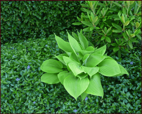
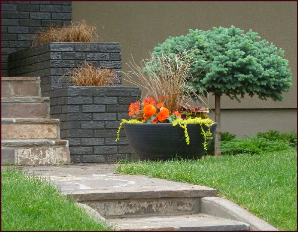
  2. AESTHETICS – plants provide visual appeal from their physical traits:
  • Colour
    • Gardeners looove colour don’t we? I have touched only lightly on the effective use of colour in the garden. Colour theory is a big topic and I’m still trying to decide how I want to approach it – how much information will be enough, without being too much (see I’m already adhering to one of my resolutions; I’m thinking before speaking, er writing).

Well my friends that wraps up my review – a little New Year’s gift for you. Keep this post handy for future reference – design advice is just a click away.

You’re welcome! It’s what good teachers do.

Yours,
Sue

Principled Gardening – The Final Chapter: Proportion

Today is the last Monday of the month, the last day of the year, and the last installment in our Principled Gardener series – we have one last design principle to look at and that is Proportion.

Proportion is related to Scale – in fact the terms are often used interchangeably, but I consider them to be different enough to present separately. You may recall from Part 7 of this series that Scale refers to the size of landscape elements in relation to their existing surroundings, i.e adjacent buildings, neighbouring buildings/trees etc. Proportion on the other hand, is the size of landscape elements in relation to each other and to the design as a whole. It can also refer to the ratio of one dimension to another, such as width to length.

So how do we know if the various elements and dimensions in our design are proportionate to one another? To some degree this must be intuited, but there are a few guidelines that may be helpful.

For relatively simple designs, the rule of thirds, or an adaptation thereof, can be used. As it pertains to landscape design, this means elements or dimensions that relate to each other in a 1:3 or 2:3 ratio.

This is most effective when applied to linear dimensions. For example, in my own front yard the linear distance from the street to the house is roughly divided into thirds, one-third being garden space and two-thirds lawn space. (Please ignore the goofy little strips of lawn at the bottom on both sides – bad design.)

PROPORTION - front yard

If however, we look at the horizontal dimension of this same yard, the rule of thirds isn’t adhered to. The existing walkway is too far to the right, and more significantly, the overall or cumulative width of the side beds is only 14 feet – less than the 20 feet needed to satisfy the rule of thirds.

PROPORTION - front yard 2

Both beds would have to be wider to make up one-third of the total horizontal space, but the current position of the walkway and the two Cotoneaster shrubs preclude this option.

While these horizontal proportions may be less than optimal, the overall proportions are still quite favourable – at least on paper. However, because the yard slopes somewhat, the garden area in front of the house appears much shallower from the street. This makes the lawn look disproportionately large in both directions – a real source of frustration for me. It could of course be remedied, but not using the present design lines. I get tired just thinking about the work required to execute effective change, not to mention the expense. You can see why good design requires some forethought, preferably expressed first on paper. I suspect if I’d known what I was doing decades ago when I began this whole thing, I would have designed something very different. Sigh.

For now I’ll just have to resort to that hypocritical mantra of many a parent, teacher or boss: ‘Do as I say, not as I do’.

But enough about me.  Let’s look at a simple design that puts the rule of thirds to work. The example below illustrates a symmetrical design using the rule of thirds to achieve good proportion. You can see that all of the rectangular spaces relate to one another in a 1:3 or 2:3 ratio – the lawn area is 2/3 the width of the property, the dining area is 2/3 the width of the lawn and the seating area is 2/3 the width of the dining area.

Rule of ThirdsIn addition each rectangle is in itself proportioned such that the shorter dimension is two-thirds the length of the longer one. The result is a design with very pleasing proportions.

PROPORTION - plant material

The rule of thirds can also be applied to plant selection, albeit loosely as plants don’t reach an exact height, but rather a range – keeping this range in mind can help you achieve well proportioned planting arrangements.

In the photo on the right, two Syringa sp. together with Picea pungens, illustrate one such plant grouping.

Containers too can be arranged this way – many ‘nesting pots’ are trios that bear a 1/3, 2/3 relationship to each other. Planting them in a similar or identical manner is very effective.

These 3 containers on my client's front deck display good proportion based roughly on the rule of thirds. Photo: Pat Gaviller

These 3 containers on my client’s front deck display good proportion based roughly on the rule of thirds. Photo: Pat Gaviller

The rule of thirds is not always easily or realistically applicable – existing hardscapes, the shape of adjacent buildings, positioning of property lines, or even the design itself, can make this tool ineffectual. Many of the elements we add to our gardens – be they plants, focal points or furniture – don’t really lend themselves to the use of this ratio either. This is when we just have to rely on our intuition and common sense.

Consider a tiny bird bath or piece of statuary – it might appear lost in an expanse of trees and large shrubs, but be right at home amongst smaller perennials. Likewise, that gargantuan classical fountain may look ridiculous adorning a small urban patio, but fit perfectly into a more grandiose courtyard or terrace, as illustrated in the photos below.

Court of the Lions, Alhambra, Granada, Andalusia

Court of the Lions, Alhambra, Granada, Andalusia. Photo Credit: Wikipedia

Gardens at the Livadiya Palace, Crimea, Ukraine.

Gardens at the Livadiya Palace, Crimea, Ukraine. Photo Credit: Andrew Butko, Wikipedia

Another way we can ensure good proportion in our landscapes is with the use of a grid. To do this, draw a series of vertical and horizontal lines on some trace paper and place over a plan view of your property. It’s most effective if you can make the size of the grid square relate to the house in some way, but be careful not to make the square too small or the whole purpose will be defeated. In the example below, I’ve chosen a grid square that is the same size as the house indentation in the right corner.

GRID

The grid lines are then used as an outline for the design.

PROPORTION - RECTILINEAR

Your choice of design concept isn’t limited to straight lines as the grid is just a template – arcs could be inserted into some of the corners to create an Arc & Tangent design. Each arc would necessarily segment or bisect a grid square.

PROPORTION - ARC & TANGENT

For circular or curvilinear designs a grid can still be used, but because there are no straight lines it must be more loosely interpreted. Ideally the outermost point of an arc or circle should extend to a grid line – since this isn’t always possible using up a half grid square is acceptable.

GRID - circular

Regardless of the concept, the spatial relationship that now exists between all design elements, is one of good proportion.

GRID - RECTILINEAR Colour

GRID - CIRCULAR Colour

So ladies and gentlemen, there you have it – design principles in a nutshell. It’s been a long process – thanks for your patient reading.

Happy New Year to Y’all
Sue
 
 
© Sue Gaviller and Not Another Gardening Blog 2012. Unauthorized use and/or duplication of this material without express and written permission from this blog’s author and/or owner is strictly prohibited. Excerpts and links may be used, provided that full and clear credit is given to Sue Gaviller and Not Another Gardening Blog with appropriate and specific direction to the original content.

The Principled Gardener Part 7 – Scale

Part Seven? I’m beginning to feel like I’m writing the script for a “Rocky” movie. Anyway, we’re nearing the end of our months-long discussion on Landscape Design Principles – are ya bored yet?  Well hang in there, there’s only two more to go. Today we look at Scale.

The principle of Scale refers to the size of landscape elements in relation to their surroundings. There are two factors to consider – one is the size of your house, and the other is the size of objects in the larger landscape (existing trees in the community, size of your neighbour’s house etc.).

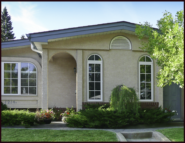
In the examples to the left, the top image illustrates a house that is visually overwhelmed by the landscaping – the shrubs next to the house are as tall, or taller than the house, with some even obscuring windows. And the shade trees are huge in relation to the house – this scale is too large. The middle example is the exact opposite. The trees and shrubs look like toys in comparison to the house – the scale of this landscape is too small. The bottom example is what we’re after. The landscape elements are well suited to the size of the house, hence this represents appropriate scale.

So what makes for proper scale? Well for one, the shrubs right up against the house shouldn’t be much more than about ¾ the height of the house (walls) and the trees that are out a bit further, not more than about twice the height of the house. It just looks “right”.

But what if you live in an older neighbourhood, like mine, where the houses are small, the lots are huge and so are the existing trees in the community? In this case, the large shade trees may indeed be in scale with the neighbourhood, but any plantings against the house will still need to be in scale with the house, like in the example below right. Note the larger shrubs bridging the scale between the smaller plants and the big trees.

I spend a lot of time exploring various communities while walking our dog, and what I see is yard after yard where scale is consistently ignored, even in the simplest landscapes – either the house is dwarfed by the landscape or the landscape is dwarfed by the house.

I think what happens is one of two things. Many newer communities boast large homes, but at the expense of usable outdoor space – the house takes up most of the lot, leaving very little room for landscaping. Homeowners then opt for groupings of smallish shrubs that take up less space, without considering their size relative to the house.

A large house on a small lot creates a design challenge in terms of good scale. Here, the small plantings in front of this house appear overpowered because they are too small for the house.

The use of a few tall narrow trees can be helpful here – they relate well to the height of the house without taking up too much breadth. With just the addition of a columnar tree or two, a whole composition can be brought into scale.

The two columnar trees flanking the house provide necessary scale to this landscape, relating the large stature of the house to that of the smaller plantings.

The same house, now with mature boulevard trees, illustrates proper scale in the context of the larger landscape, i.e. a neighbourhood.

The other thing that happens is illustrated on the left. In the top example, the diorama represents an older home with plantings typical of the time it was built – Cotoneaster hedge, Potentilla, and little Johnny’s ‘Arbour Day’ tree, a Colorado spruce (Picea pungens). Not particularly inspired I realize, but at least it’s in scale with the house.  Fast forward a few decades and the scenario depicted in the bottom photo has likely ensued. Little Johnny is forty years old now and so is this landscape. I guess nobody took into account way back when, that living things don’t remain static. They grow … and grow and grow. So what was once in scale is no longer.

Gardeners, let’s remember to consider future size – the mature size of the plants we choose – and locate them accordingly.  Let’s not plant Colorado spruce or the even larger white spruce (Picea glauca), in our small urban yards. They are for acreages and parks, and maybe very large residential yards, but too big for any other urban application.

There are smaller evergreens much better suited to our gardens, for example Picea pungens ‘Bakeri’ (Baker’s blue spruce) or Pinus uncinata (mountain pine).

In my own neighbourhood I see tall cedars (likely cv. ‘Brandon’) – planted decades ago to frame the entrance of tiny bungalows – that now tower above them. In fairness to whomever planted them, I suspect the literature at the time may have advised that these Thuja species would top out at about 15 feet. Yeah right – gotta laugh when I hear people exclaim ‘cedars don’t do well in Calgary’.

I find this latter scenario (small house, big lot) to be more of a challenge than the reverse –precisely because there is often existing mature plant material that’s way too big, and homeowners are reluctant to part with it.  I don’t blame them. I have a huge Colorado blue spruce right in the middle of my back yard. Though we have a relatively large property, this mammoth evergreen has been difficult to design around. Every winter my husband and I contemplate removing it and every summer we remember why we, as of yet, haven’t done so – it provides much-needed shade from the late-day prairie sun. If you live on the prairies you’ll no doubt be aware, that our late-day sun can be hotter and more intense than our mid-day sun. So unless we decide to invest in central air conditioning, Mr. Spruce gets to stay.

The right side of this landscape is nicely in scale with the house. On the left side, a very large blue spruce precludes the possibility of correct scale for that area. It’s a lovely tree – healthy and very blue, so I understood why the clients wanted to keep it, but it typifies the design challenges of a mature neighbourhood. Photo: Sue Gaviller

If you’re planning a new landscape, or renovating your old landscape, remember to think about Scale. Then think like Goldilocks – you don’t want too big. Or too small. You want juuust right.

Til next time,
Sue
 
© Sue Gaviller and Not Another Gardening Blog 2012. Unauthorized use and/or duplication of this material without express and written permission from this blog’s author and/or owner is strictly prohibited. Excerpts and links may be used, provided that full and clear credit is given to Sue Gaviller and Not Another Gardening Blog with appropriate and specific direction to the original content.

Movin’ On – The Principled Gardener Part 6

A week or so ago, before our balmy fall weather morphed into an early blast of winter, I took a drive through a couple of our city’s more ‘distinguished’ neighbourhoods looking for photo-ops. As I scanned the tastefully landscaped homes, which were all the more attractive with the accompanying hues of autumn, I found myself stopping and starting, braking and rubbernecking to get a better look. Yes I was that nuisance driver you wanted to bellow at: “Get moving lady!”  “Move over lady!”  “Move lady!”

Move!

My car may not have been moving but my eye certainly was – well designed landscapes invite that. In fact Movement is one of the Design Principles and just happens to be the subject of this post (shameless segue I know). The definition is of course self-explanatory: Movement refers to what keeps the eye in motion throughout a landscape. Of course this visual movement will occur with or without our intervention, but design choices can definitely affect how our eye will move through a garden.

One of the ways we can generate movement is with rhythmic repetition. You’ll recall that I discussed repetition several months ago in reference to Unity. However, repetition as it relates to Movement refers to a design element that is repeated at regular intervals or in an obvious pattern. It can be a single element recurring regularly or a more complex pattern of alternating elements.

Rhythmic repetition of grafted Syringa meyeri standards reinforce movement along this uniquely curving fence. Photo: Sue Gaviller

Rhythmic repetition of grafted Syringa meyeri standards reinforce movement along this uniquely curving fence. Photo: Sue Gaviller

Picea pungens ‘Glauca Globosa’ & dwarf Pinus mugo alternate in front of the fence, and Populus tremula ‘Erecta’ & upright Picea pungens (unknown cv.) alternate behind the fence, creating effective rhythmic movement. The fence too has rhythm, due to the repeating brick pillars. Photo: Sue Gaviller

Repeating clumps of Calamagrostis acutiflora 'Karl Foerster' direct and reinforce movement in two directions. Photo: Sue Gaviller

Repeating clumps of Calamagrostis acutiflora ‘Karl Foerster’ direct and reinforce movement in two directions. Photo: Sue Gaviller

Straight lines = fast movement. Note how the eye shoots right back to the end of this path – likely the desired effect, i.e. the eye goes directly to the focal point at path’s end. Photo: Marny Estep

We can also affect movement with the design lines we choose. Straight lines, since they’re very direct, generate very fast, forceful movement. Angled lines, though still quite dynamic, are a little slower because they’re less direct – they move across our field of vision at the same time they’re moving with it. Curving lines create the slowest movement. Perhaps this gentle movement explains why curves are favoured by gardeners – a reprieve from our fast paced lives? Remember though that curves need to be big and bold if they’re to have this calming effect – too many small curves just feels busy.

The large curve of lawn space and the alternating blue and green junipers, create good flow and movement in this autumn landscape. Photo: Sue Gaviller

Movement can be affected by plant form as well. Rounded or mounding forms encourage movement – the eye just glides over them and moves on. Upright forms on the other hand, arrest the flow of movement – they literally interrupt our line of vision. For this reason they are useful in a long straight planting – the upright form acts as a visual stop to prevent the eye from reading the entire length at once. However, for this same reason, upright forms (especially very narrow ones) should be used sparingly or a ‘stop and start’ kind of movement results (a bit like my abovementioned driving).

The rhythmic repetition of clipped Buxus shrubs, in addition to their rounded form, creates nice movement along this walkway at Butchart Gardens, Victoria. Photo: Jane Reksten.

The large rounded forms of pruned Cotoneaster lucidus lead the eye to the upright pyramidal Picea pungens which abruptly halts visual movement. Photo: Pat Gaviller

So there you have it fellow gardeners – we’ve waded through yet another Design Principle. Moving on then….

 
Drive safe,
Sue
 
© Sue Gaviller and Not Another Gardening Blog 2012. Unauthorized use and/or duplication of this material without express and written permission from this blog’s author and/or owner is strictly prohibited. Excerpts and links may be used, provided that full and clear credit is given to Sue Gaviller and Not Another Gardening Blog with appropriate and specific direction to the original content.

A Question of Balance – The Principled Gardener Part 5

Life’s all about balance right? Well not all, but balance is vital to a happy healthy life – a balanced diet, work/life balance, even our ‘play time’ needs a balance of restful leisure vs. active recreation. My husband has been reminding me of this frequently of late: ‘Sue, you need more balance in your life – it’s not healthy to spend so many hours in front of your computer.’ Unfortunately, much of my work – designing, writing, preparing presentations, requires that I do just that. It seems the creative process may be good for the brain but not so good for the body. Hubby is right of course. I am however, better at bringing balance to a landscape composition than to my own life, so for now let’s deal with that.

Balance refers to a state of equilibrium – real or perceived.  Traditionally we think of balance in the landscape as being either symmetrical or asymmetrical, symmetry being elements arranged identically around a central axis, and asymmetry, when elements appear equally weighted but aren’t identically arranged.

Left: Symmetrya columnar tree and bird bath create a central axis with identical plantings on either side.
Right: Asymmetry – the mass of the larger shrub on the right is roughly equal to that of the 3 smaller shrubs on the left.

Though symmetry most often has a formal application, it has other uses that aren’t necessarily formal. For example, a long narrow space can benefit from the use of symmetry – the eye will always stop and rest at the centre point, often stopping there first before scanning the composition in either direction. This prevents viewing it in one uninterrupted scan. Symmetry is also appropriate for certain theme gardens, for example Colonial style gardens or Italian Renaissance style gardens.

Formal symmetrical design.

Symmetry is useful in a long straight planting, preventing the eye from reading the entire length in a single scan. Photo: Sue Gaviller

The Italian Renaissance garden at Hatley Park in Victoria B.C. is appropriately symmetrical. Photo: Jane Reksten

Asymmetry on the other hand, is more common than symmetry and is generally considered to be more informal in presentation. Ensuring proper balance in an asymmetrical design means planning your garden spaces in such a way that you can in fact create balanced plantings. If you’ve designed your yard with all or most of the planting space on one side of the yard and nothing but lawn on the other, then you simply won’t be able to bring balance to your landscape composition.

Asymmetrical landscape design

An asymmetrical design sometimes contains moments of symmetry – symmetry can be useful  in a corner planting to ‘anchor’ the corner, used around a focal point to help “stage” it, or at the deepest part of a curve.

Left: unbalanced asymmetrical design. Right: Balanced asymmetrical design – note the symmetry in the top right corner, anchoring it.

A brief moment of symmetry supports the dominant status of the bird bath. Photo: Sue Gaviller

Balance can be thought of in terms of more than just symmetry and asymmetry. There must also be balance of colour, weight and line. Okay what does that even mean? Well let’s look at colour – light colours draw the eye more than dark colours so to balance these, more of the darker colours need to be present. However, dark colours also appear more ‘weighty’ so their overuse can cause your garden to feel heavy. Colours of medium darkness then, should predominate – colours like green. Yup jus’ plain ol’ green. I’ve said it before and I’ll say it again – green should be the principal colour in your garden.  Bright colours too will draw the eye, so for the purpose of balance, muted colours need to outweigh vivid hues.

If we look at the concept of line, a vertical line (like that presented by an upright tree or tall grass), offers more visual punch than a horizontal line (such as that created by a mass of groundcover or low growing shrubs). Hence upright forms should be used as accents with lower forms predominating.

Balanced asymmetry - note the use of symmetry at the centre of this otherwise asymmetrical design. As well, the balance of colour, weight and line, creates a varied but balanced sight-line. Photo: Sue Gaviller

Balanced asymmetry – note the use of symmetry at the centre of this otherwise asymmetrical design. As well, the balance of colour, weight and line, creates a varied but balanced sight-line. Photo: Sue Gaviller

Ah yes, balance! Vital to both good health and good design – guess I better go find me some.

Yours in Good Health,
Sue
 
© Sue Gaviller and Not Another Gardening Blog 2012. Unauthorized use and/or duplication of this material without express and written permission from this blog’s author and/or owner is strictly prohibited. Excerpts and links may be used, provided that full and clear credit is given to Sue Gaviller and Not Another Gardening Blog with appropriate and specific direction to the original content.

The Principled Gardener Part 4 – Unity by Interconnection

Over the last several months I’ve been discussing the Design Principle of Unity and how it can be incorporated into our landscapes and gardens. We’ve looked at Unity by Repetition, Unity by Dominance and Unity of Three. Today I wrap up this discussion with a look at one last way we can create unity in our gardens, with the use of Interconnection.

Interconnection refers to the practice of connecting or physically joining all landscape elements and spaces. Now you’d think that since the definition of Unity is oneness, that the idea of interconnection or joining would be a no-brainer, but I have trouble convincing gardeners of this one. It’s certainly harder to achieve if the basic layout of your landscape is already in place, especially the hardscapes (patios, walkways, etc.), but if you have the opportunity to physically connect all your landscape spaces, the result is very pleasing. So what do I mean by this? Let’s look at the example below. In the image on the left, a number of different landscape features – a deck with a hot-tub, patio with a fire-pit, and kidney-shaped island beds – are all floating disconnected in a sea of lawn. This composition lacks interconnection. The image on the right includes the same landscape features but the spaces are now all linked together, hence this landscape has been unified through interconnection.

Left: landscape lacks unity. Right: landscape is unified through interconnection. Note how the lawn in the composition on the left, is ‘negative’ space, i.e. the space between the landscape elements. In the image on the right, the lawn has become a landscape element and the planting space is now the negative space.

What this means fellow gardeners, is – brace yourselves – no island beds. I suspect therein lies the gardener’s grievance with interconnection – we do love our island beds don’t we? But think about it, the word ‘island’ by definition means disconnected. Just to be clear though, this rule doesn’t apply to acreages where very large island plantings are often employed as spatial definers – perhaps to separate the landscaped area around the house, from the ‘back forty’.  In this case the plantings are large enough that the eye doesn’t experience them as islands, so unity isn’t compromised. Neither would it apply to botanical gardens, or show gardens – again the plantings are too large to be seen as island beds, and are planned in such a way as to facilitate foot traffic for maximum viewing potential.

Interconnection can also be utilized to unify an individual planting space – disparate groupings of trees, shrubs and perennials can be underplanted with a single type of groundcover or other low growing plant. This connecting plant material brings the dissimilar groups into relationship with each other, therefore unifying the whole planting composition.

A mass of Arctostaphylos uva-ursi (kinnickinnick) covers this entire bed thereby connecting the plant material and creating unity. Photo: Pat Gaviller

The idea of Interconnection is really underscored for me when I look at the evolution of my own garden. When we purchased our house almost 25 years ago, the only growing things in the front yard were two Cotoneaster shrubs, which the previous owner had tried in vain to kill, and a green ash tree, all of which were on city property. The only garden beds were small strips of soil against the foundation:

front yard 1

Over the next few years, I built upon these beds, first expanding the beds adjacent to the house and carving out a kidney-shaped bed around the ash tree:

front yard 2

A year or so later I decided to make the bed in front of the house a little curvier and I added a couple more island beds:

front yard 3

I kept adding and expanding until eventually it looked something like this:

front yard 4

I was never really happy with the design as a whole, even though each individual bed was nicely planted. When I’d stand back and try to take the whole thing in, what I saw was a bunch of scattered puzzle pieces – a disjointed picture, as if the puzzle was yet to be assembled. It wasn’t until I became a student of design that I discovered what the problem was; none of the beds were linked or touching, hence no interconnection = disunity. A number of years ago I decided to correct this and proceeded to join all of the beds.

front yard interconnected

It’s an improvement to be sure, but there are still flaws – a couple of acute angles which as you know is a design no-no. As well, due to the positioning of the sidewalk, the two sides are still unbalanced – but that’s a whole other story. In fact it’s a whole other design principle, that being the Principle of Balance which we’ll look at next month. Stay tuned.

Til next time,
Sue
 
© Sue Gaviller and Not Another Gardening Blog 2012. Unauthorized use and/or duplication of this material without express and written permission from this blog’s author and/or owner is strictly prohibited. Excerpts and links may be used, provided that full and clear credit is given to Sue Gaviller and Not Another Gardening Blog with appropriate and specific direction to the original content.
 

The Principled Gardener Part 3 – Unity of Three

We all know three’s a crowd right? Right, but in design-speak that’s not a bad thing – in fact it’s a very good thing. Massing or grouping plants in threes or other odd numbers is good design – there’s something very pleasing about this configuration because it creates unity.

How so you ask?

Well first let’s look at what happens when we use even numbers – the eye wants to divide these in half…because it can. This visual division disrupts unity. If, on the other hand, we group elements in odd numbers the eye can’t divide this group and unity is therefore maintained.

Three Hemerocallis  ‘Stella D’oro’ and a bird bath make a lovely vignette. Photo: Sue Gaviller

Five Hosta sp. nestled amongst ferns and daylilies in this woodland garden. Photo: Sue Gaviller

Generally speaking odd numbers are preferable, but with larger groups (8 or more) this ceases to be important – the eye will automatically view these as a unified mass. So if you live on an acreage and have a shelterbelt consisting of 100 spruces, I’m not going to insist that you should have 99.

With larger plant groupings odd numbers are no longer required – the eye sees this grouping of Hemerocallis sp. as a unified mass, as it does the Heuchera sp. behind. Photo: Sue Gaviller

Don’t get carried away with threesomes though – if all your plant groups are trios, the composition will lack visual credibility and look somewhat contrived. Instead, use some groups of three, some fives or sevens and some singles.

Two Physocarpus opulifolius ‘Summer Wine’ flank Syringa reticulata, creating a symmetrical backdrop. Photo: Sue Gaviller

So is there ever an occasion when even numbers are appropriate? Yes – as with all the design principles, it’s acceptable to periodically ignore a particular guideline, providing you know why. In other words it must be done with purpose. For example, if you want to ‘stage’ a feature tree, it could be flanked on either side by two smaller shrubs to create a moment of symmetry – this will draw attention to the more dominant feature.

Another example would be when plantings are used to reinforce a design line – in this case it doesn’t matter if even or odd numbers are used since the resulting visual movement trumps any tendency of the eye to break groups in two.

This planting plan contains several even-numbered plant groupings – in this scenario unity isn’t compromised because the plantings follow the design lines, hence the eye follows the same lines resulting in good flow.

Sometimes a group of three consists of three similar but not identical features, for example a grouping of boulders or containers.

This trio of containers, though not all the same size or shape, still provide unity of three because they’re all black ceramic and planted in a similar fashion. I chose the colour scheme based on the coral-coloured stucco and the black trim on my client’s house. This too provides unity – by repetition.  Photo: Pat Gaviller

Yes indeed three’s a crowd – ‘oddly’ satisfying isn’t it?

Yours,
Sue
 
© Sue Gaviller and Not Another Gardening Blog 2012. Unauthorized use and/or duplication of this material without express and written permission from this blog’s author and/or owner is strictly prohibited. Excerpts and links may be used, provided that full and clear credit is given to Sue Gaviller and Not Another Gardening Blog with appropriate and specific direction to the original content.
 

The Principled Gardener Part 2 – Unity by Dominance

Well here we are the last Monday of the month and time for your monthly measure of design doctrine. Last month, in Part 1 of this series, I discussed Unity in the garden and how it can be achieved using repetition. Continuing our discussion on Unity then, let’s look at the use of Dominance. By this I don’t mean standing over your plants, whip in hand, ordering them to behave themselves – nope, in fact a plant may get to do the dominating. Dominance occurs when one element or group of elements stands out or is more prominent than others.  The dominant feature may be a plant, a design line or space, or a non-living element. It can be dominant by way of its size, its shape, its colour, its texture or because it is a Focal Point (a Focal Point refers to a non-living element such as a bird bath or fountain.)

Dominance in the landscape can result from larger size, coarser texture, stronger form, stronger colour or the existence of a focal point.

Dominance in the landscape can result from larger size, coarser texture, stronger form, stronger colour or the existence of a focal point.

The arching purple branches of Berberis thunbergii ‘Rose Glow’ stand out against the softer greens of surrounding foliage. Photo: Pat Gaviller

A good design concept will have a hierarchy of spatial sizes with one dominant space. Here the lawn area in the centre is dominant as it is the largest design space.

A good design concept will have a hierarchy of spatial sizes with one dominant space. Here the lawn area in the centre is dominant as it is the largest design space.

The circular lawn area is the dominant space here because it contains the only arc in an otherwise angular concept.

The circular lawn area is the dominant space here because it contains the only arc in an otherwise angular concept.

The symmetrical planting (Hosta ‘Guacamole’ and Heuchera ‘Plum Pudding’) around this bird-bath enhances its role as focal point. Photo: Sue Gaviller

A garden devoid of any moments of emphasis can be visually unrestful as the eye tends to just wander. A dominant feature however will draw the eye and steady it, allowing it to rest. This is another concept that gardeners often intuit early on, but lose sight of later – myself included. When I purchased my first bird-bath and placed it in the garden, I indeed noted a more cohesive, restful composition – so I bought another. Then I found a beautiful earthenware bowl, filled it with water and nestled it amongst some groundcover in my shade garden. My husband asked me “What is it with you and round things filled with water?” Good question. The truth is I’d given in to the gardener’s favourite mantra “more is better” and rendered ineffective the dominance I’d unknowingly applied with the initial bird-bath. A single strong feature demands attention. Too many strong features compete for attention.  This too can create unrest in the garden as the eye bounces around between competing elements.

Unfortunately there’s no dominance metre to tell us when enough is enough. Just keep in mind that the stronger the colour and/or the form, the more dominant it will be, hence the fewer of these elements your garden can support.  For example, weeping standards such as Young’s weeping birch or Walker’s weeping Caragana, have very strong architectural form thus should always be used as single specimens, whereas vertical accents like columnar aspens or tall reed grasses, though still fairly dominant, can be repeated a couple of times or used in small groups. Warm vibrant colours like bright yellow or lime green will really draw the eye so should be used with some restraint whereas cooler, less intense colours can be used more generously.

The key is to use elements within your garden composition that are dominant for different reasons – maybe one has brilliant colour, another is a small group of very coarse textured plants and another has unique form. Or maybe there are several that are dominant because of their unique form but they are very different forms. While each one will draw the eye, they tend to lead the eye from one to another rather than rival each other. As well, a single dominant feature will often stand out for several reasons, for example it may be larger and more colourful and have unique form, making it particularly dominant. And you can help your focal point or feature tree take centre stage by surrounding it with more subdued elements.

Good placement of dominant features is also important. Anywhere the eye is naturally drawn, like the deepest part of a curve or through a visual opening, is an obvious spot to situate a strong feature. The space where design lines form a visual frame is another good location, as is an area you want to draw attention to – your front door for example. Remember too, that some of these elements – focal points or feature trees and shrubs – will have a presence in the winter as well, so make sure they are visually supported by other woody plant material. For more ideas on Focal Points and dominant plant forms as they are experienced in the winter months, check out a couple of my earlier posts: Focal Points in the Garden and Form Colour and Texture in the Winter Garden.

Malus ‘Rosyglo’, with its elegant form, takes centre stage in the foreground while Syringa prestoniae dominates the background. Note the placement of the two features – Malus is framed by the curving design line and Syringa is situated at the deepest part of the curve. Both are well staged by subdued plantings of Juniperus sabina cultivars. The junipers will serve as visual props for these features in the winter. Photo: Sue Gaviller

Hosta 'Sum and Substance' stands out because of its very coarse texture (large leaves) and its bright lime green colour. Photo: Sue Gaviller

Hosta ‘Sum and Substance’ stands out because of its very coarse texture (large leaves) and its bright lime green colour. Photo: Sue Gaviller

While too many dominant elements in close proximity is bad design, there are scenarios where several strong features can be present together in a co-dominant relationship – for instance a vase shape tree with a bird bath in front of it. One may be slightly more dominant than the other but the effect is that they appear as a single focal vignette, not two competing entities.

A container filled with brightly coloured annuals is quite dominant on its own, as is the top graft Picea pungens 'Glauca Globosa', however because they are so different, their proximity to each other is mutually supportive rather than conflicting. Photo: Sue Gaviller

A container filled with brightly coloured annuals is quite dominant on its own, as is the top graft Picea pungens ‘Glauca Globosa’, however because they are so different, their proximity to each other is mutually supportive rather than conflicting. Photo: Sue Gaviller

The dominant feature brings unity to the garden by subduing all other elements in its presence, hence unifying them in their shared secondary status.

A dominant feature like this gazing ball focal point, can pull together an otherwise nondescript scene, thus creating unity and harmony in the garden. Photo: Sue Gaviller

So go out and buy yourself a graceful weeping standard like Malus ‘Royal Beauty’ – but just one. Indulge yourself with that beautiful bird bath – but just one. You’ll see how creating areas of emphasis can bring about peace and harmony in your garden.

Yours,
Sue
© Sue Gaviller and Not Another Gardening Blog 2012. Unauthorized use and/or duplication of this material without express and written permission from this blog’s author and/or owner is strictly prohibited. Excerpts and links may be used, provided that full and clear credit is given to Sue Gaviller and Not Another Gardening Blog with appropriate and specific direction to the original content.

The Principled Gardener

No, I don’t mean the gardener who has principles (though I’m sure you do); I’m referring to the gardener who uses principles – design principles that is. Last month (Good Lines Mean Good Designs Part 1 and Part 2) I discussed the first two stages of the design process – functional drawings and concept drawings. The final stage is a Planting Plan, but before we can complete this design process, a look at the principles that guide it is in order.

So what are design principles anyways?

Design principles are guidelines that help create pleasing relationships between the various elements of a composition. If you’ve ever picked up a garden design magazine or attended a garden design lecture, you will no doubt have been introduced to the concepts – they may not always be presented in exactly the same framework or use exactly the same terminology, but the constructs are nevertheless the same. I like to think of Design Principles not so much as rules that must be followed, but rather as a way of understanding how the human eye perceives its surroundings and using that to its best advantage.

Gardeners don’t always recognize when they’ve utilized a design principle. Though it may happen by accident, a well designed garden will most certainly have some or all of these principles incorporated in it. It would be so much easier though, if we knew what they were and how to use them, instead of the trial and error approach that most of us employ.

So let’s get started. As I mentioned, Design principles can be organized or categorized in numerous ways, but for the sake of simplicity I’m going to call these principles Unity, Balance, Movement, Scale and Proportion.

UNITY

According to the Canadian Oxford Dictionary, Unity is defined as:  Oneness, being one, interconnection of parts, coherence of parts. So how do we bring that ‘oneness’, that ‘coherence of parts’ into our gardens? There are several ways we can achieve this – repetition, dominance, unity of three and interconnection. Unity then, is an umbrella principle for all of these concepts. Today I look at Repetition.

UNITY by REPETITION

Repetition refers to the repeated use of the same or similar elements throughout a composition.

Plant Material

One of the easiest things to repeat in your landscape is plant material – gardeners often do this unknowingly in their early gardening years, and then abandon it. For many of us our first gardening ventures are somewhat tentative and often constrained by budget limitations. We gladly accept our next door neighbour’s offer of perennials that she’s dividing or discarding. We take a few clumps of each, and spread them around the garden; hence many plants are repeated several times. As we get more adventuresome, we want to try all manner of new things and before we know it we’ve arrived at the ‘one of this and one of that’ scenario, which is anything but coherent.  It’s an expensive mistake and wasteful at that – in order to repeat you now have to reduce. Restraint people, restraint – you don’t need one of every plant in order to attain beauty and diversity in your garden. So, the next time you have some perennials that need dividing, don’t discard the extras, or give them away –  repeat them!

Photo: Sue Gaviller

Numerous plants, including creeping thyme, Goldmound spirea, blue oat grass and bugleweed, are repeated throughout my front garden beds. Photo: Sue Gaviller

Photo: Marg Gaviller

Hosta and red Astilbe are the recurring plant theme in this mature garden.
Photo: Marg Gaviller

Building Material

The repeated element can also be a building or hardscape material, for example; brick, wood or stone. Repeating this in the landscape allows house and landscape to appear as one entity. Conversely, using a material in the landscape that doesn’t also occur on the house, can result in a visual disconnect between house and landscape.

Incorporating a building material from the house, into the surrounding landscape, unites house and landscape. Photo: Sue Gaviller

Incorporating a building material from the house, into the surrounding landscape, unites house and landscape. Photo: Sue Gaviller

Stone pillars echo the stone facing on the house. Photo: Sue Gaviller

Architectural Features

You can also repeat an architectural line or feature. For example, the shape of an arched window could be repeated in the shape of a garden bed or in the arching branches of a weeping tree. A unique detail on the house could be the inspiration for a fence or arbour design.

repetition - line

The arches on the house are repeated in the arching form of this Caragana arborescens ‘Walker’s Weeping’. Photo: Sue Gaviller

The diamond shape detail on the windows was the inspiration for the fence I designed for a client’s home. The fence is being installed as I write this, hence the computer generated image.

Colour

A colour can be repeated as well – bringing a colour from the house into the landscape or using a recurring colour within a garden composition, can unify your whole outdoor space. A purposeful colour scheme will allow you to do this with some real finesse (more on colour schemes in another post). Keep in mind that choosing a plant for its flower colour will provide colour repetition, but only when it’s in bloom – to achieve this throughout the season, choose plants with colourful foliage too.

The colour of the front door is seen again in the Chrysanthemums. Black is also repeated, as is the architectural detail of the columns, which is repeated in the planter pedestal. Photo: Pat Gaviller

Repeating a colour within a planting composition is very unifying – here the dark wine colour of emerging Acer palmatum leaves picks up on the same hue in the tulips.
Photo: Jane Reksten

By repeating elements that are the same, or have similar characteristics, the eye posits each recurrence into visual memory and ties them all together in one coherent theme – voila Unity!

Yours,
Sue

© Sue Gaviller and Not Another Gardening Blog 2012.

Unauthorized use and/or duplication of this material without express and written permission from this blog’s author and/or owner is strictly prohibited. Excerpts and links may be used, provided that full and clear credit is given to Sue Gaviller and Not Another Gardening Blog with appropriate and specific direction to the original content.