Over the last year or so I’ve talked much about form, texture and colour, both as they relate to individual plants, and in the garden as a whole – indeed these traits are the means by which plants relate visually to each other. When I wrapped up my 6-part series on Plant Form, I promised future detailed coverage on texture and colour in the garden. Today then I’ll begin the discussion on texture.
Where plant form gives a garden its structure, I believe it is plant texture that gives a garden its sensuality. Even the descriptors we use – words like velvety, satiny, ruffled, rough, fuzzy, lacy, delicate, succulent, leathery, strappy – denote a certain sensuality.
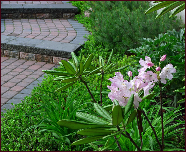
Foliage exhibits many different textures, creating a rich layered tableau in this client’s front yard garden. Photo: Sue Gaviller
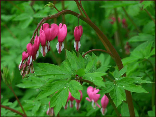
Lacy leaves and delicate, satiny flowers give the common bleeding heart very alluring texture. Photo: Sue Gaviller

Velvety and ruffled, it is the texture as much as the colour of Hemerocallis ‘Strutter’s Ball’ that afford it its luxurious appearance. Photo: Sue Gaviller
So what exactly is plant texture? The word texture comes from the Latin word texere which means “to weave”. If we look at gardening as the weaving of a giant tapestry, we begin to understand why texture is such an important consideration in garden design – it makes a significant contribution to the overall picture. As a designer I use the word texture in referring to a) the size, shape and arrangement of a plant’s component parts, i.e. fine texture vs. coarse texture or b) the visual and tactile characteristics of a plant surface, i.e. rough vs. smooth.
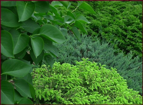
Coarse-textured Syringa vulgaris foliage (left) has a smooth leathery surface, fine-textured Picea abies ‘Nidiformis’ (bottom) has nubby-looking new growth, and Juniperus horizontalis ‘Blue Chip’ (middle) and Juniperus Sabina ‘Calgary Carpet’ (top) are both fine-textured and feathery. Photo: Sue Gaviller
Fine Texture

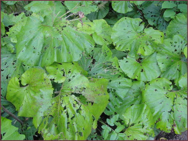
This casual composition would appear quite messy if it weren’t for the very large leaves of Rogersia.
Photo: Marny Estep
Plants with smaller individual parts (small or very narrow leaves) that are spaced closely together, are considered fine textured. These plants are important for building volume in the garden as well as setting the stage for coarse textured plants.
While fine texture should predominate in a composition, periodic interruptions with coarser texture are needed or the garden can appear busy – untidy even. I experienced this many years ago when I drove up to our house one summer afternoon and noted that a large area of the garden looked decidedly unkempt.
Approaching the offending composition, I tried to determine why it looked so messy – nothing was in need of deadheading, nothing was flopping over and it wasn’t particularly crowded. So I did what all gardeners do – took out some stuff, added some stuff, added some more stuff, yadda, yadda, yadda, more trial and error planting decisions, none of which solved the problem… until I planted some Heuchera. Its big bold leaves seemed to be just what was needed, and while I likely intuited that it was the textural contrast of large leaves with the airier texture of yarrow, spirea and juniper, I certainly couldn’t have articulated that “too much fine texture with no coarse texture to punctuate” was the problem. In fact it really wasn’t until I began to study design that I figured it out – one of those light-bulb moments while listening to my design instructor discuss texture.
It’s important to note that small leaves or flowers which are very tightly packed result in visual weightiness. For example spruce needles, though fine and narrow, are very closely spaced and very rigid, hence the plant appears heavy. Cedar and juniper are also fine-textured, but the foliage is much more open thus appears airy and weightless. Making this distinction will help you effectively balance and contrast lightness and weight when choosing and placing fine textured plants in your garden.
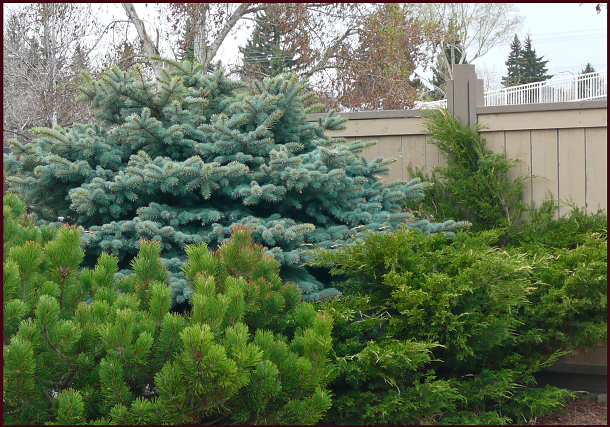
While all evergreens exhibit fine texture, very tightly spaced, rigid needles like those of Pinus mugo (bottom) and Picea pungens ‘Globosa’ (top) result in a weightier presentation than the lighter feathery foliage of Juniperus chinensis ‘Mint Julep’ (right). Photo: Sue Gaviller
Coarse Texture
Plants with large individual parts spaced further apart are coarse textured. They have a dramatic, almost tropical appearance which draws the eye and gives it a place to rest – this grounds and unifies a composition. Coarse texture is dominant to fine texture and should therefore be used more sparingly – too much of it creates competition for dominance, which in turn can cause visual unrest.

Large lush leaves of Hosta ‘Zounds’ unify and ground a tangle of kinnickinnick and daylily foliage. The understated toad sculpture plays a supporting role. Photo: Sue Gaviller
Unfortunately, many plants with very large leaves are susceptible to damage from hail, wind and frequently, slugs. It is therefore important to situate them appropriately – protected by a fence, tree or building and in conditions that are moist enough for the plant to thrive but not so wet that slugs also thrive.
Large leaves, lovely as they are, can be reduced to tatters from hailstorms and slugs.
Photo: Diana Lane

Rhododendron seems coarse in relation to the tiny red leaves of Berberis thunbergii ‘Cherry Bomb‘, but much finer relative to the much larger leaves of the Hosta.
Photo: Pat Gaviller
Texture is of course relative; for example, rhododendron foliage may appear coarse next to periwinkle or kinnickinnick, but seem much less so beside Hosta. The key here is contrast – if every plant has leaves and/or flowers of similar size, monotony will result. Instead, a variety of textures; fine, medium, coarse and in-between, will ensure an exciting, balanced composition – the coarser the texture, the less you use.

The flowers and foliage of Gypsophila repens ‘Rosea’ are very fine textured, whereas Iris leaves and blooms exhibit much coarser texture – the resulting textural contrast paints a lovely picture. Photo: Cathy Gaviller
Keep in mind too that foliage consisting of more than one colour – variegated, veined, mottled etc., will appear finer textured. This is especially evident if the variegations are small and closely spaced, and less so if larger blocks of colour make up the variegations, for example a green Hosta with white or cream margins.

The large leaves of Heucherella ‘Berry Fizz’(left), Tiarella ‘Crow Feather’ (right) and Aegopodium podagraria (bottom) appear more finely textured than they actually are, due to their bicolour pattern. Photos: Sue Gaviller

Lamiastrum galeobdolon ‘Herman’s Pride’ and Hosta sp – note how the very busy variegation affects the perceived texture of the finer textured plant, but the big blocky variegations of the larger hosta leaves only slightly affect its coarseness. Photo: Pat Gaviller
Now go outside and take a look at your garden composition – is there something you don’t like about it? Instead of just throwing more plant material at it this season, examine it from the perspective of contrasting and balancing fine texture, coarse texture and in-between texture – maybe you just need to rethink it.
Join me for more sensuous plant talk in my next post as I take a look at surface texture.
Til Then, SueRelated articles
- The Bold and the Blissful (fine-foliage.com)
- Garden Designer’s Roundtable: Ideas for Adding Texture to Your Landscape ( Personal Garden Coach)
- Garden Designers Roundtable: Texture in the Landscape – A Musical Analogy (Grounded Design)
© Sue Gaviller and Not Another Gardening Blog 2012.
Unauthorized use and/or duplication of this material without express and written permission from this blog’s author and/or owner is strictly prohibited. Excerpts and links may be used, provided that full and clear credit is given to Sue Gaviller and Not Another Gardening Blog with appropriate and specific direction to the original content.
