The difference between a well textured garden and one that is not, is much like the difference I see when I view my garden with my glasses on… and with them off.
Contrary to my optometrist’s recommendation, I don’t usually wear glasses during my day-to-day activities – except for television viewing and driving. So it is that every time I climb aboard my little red wagon (station wagon that is), the first thing I do is don my specs, and immediately I notice my garden leap out at me.
When I observe my garden without my glasses, I see colour, I see form, I even see contrasting fine and coarse textures – but there is very little depth or detail. However, when bespectacled, I see the finer details; layers of shadow and light, rough texture, smooth texture, shiny surfaces, matte surfaces, ruffles and ridges, creases and edges – a well textured garden. A sensuous garden even.
To achieve this end one must learn to see and appreciate the assorted textural treats that each plant brings to the garden party. As we view the various parts of a plant (leaves, flowers, bark etc.), we subconsciously imagine how they might be experienced by our other senses; how they might feel to the touch – soft, smooth, buttery, waxy, fuzzy; how they might smell, or even taste, and in so doing our visual experience is enhanced.
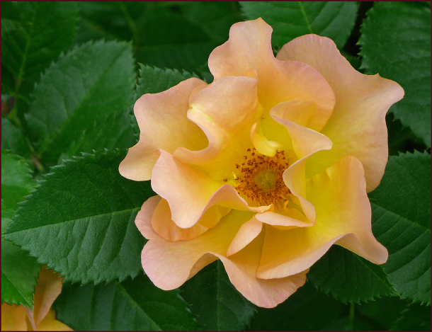
Rosa ‘Morden Sunrise’. Petals of finest silk against leaves of rich embossed leather – oh so touchable.
Photo: Sue Gaviller
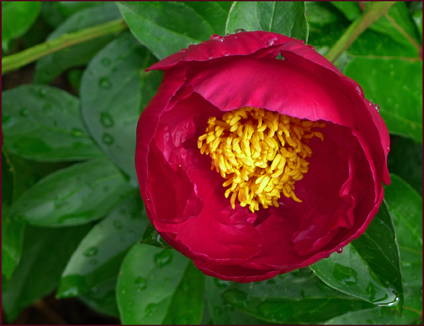
Glossy dark green foliage sets the stage for this single red peony – petals like layers of mouth-watering buttercream icing and stamens of mac n’ cheese look good enough to eat. Photo: Sue Gaviller
All plants, and all of their constituent parts, have texture – some of course more interesting than others. For many plants it is the foliage that has the most notable texture, others it is their bark, or their seedheads, their flowers, or even specific parts of their flowers that provide the textural appeal.
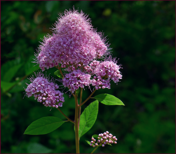
The inflorescence of Spiraea douglasii appears fuzzy, but closer inspection reveals that it is many tiny protruding stamens creating the fuzzy-looking texture. Photo: Pat Gaviller
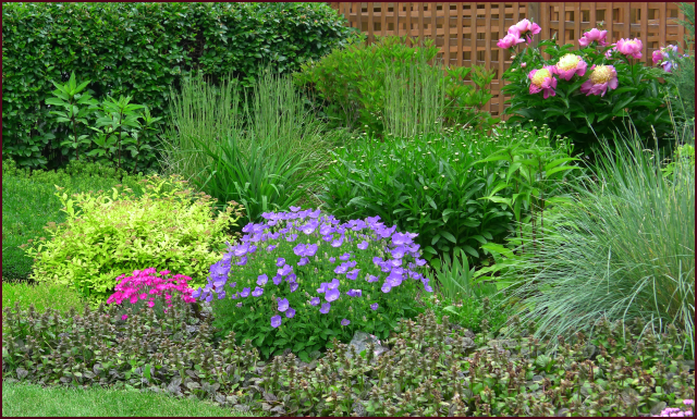
Plant textures play off each other and their surroundings, offering layers of subtle beauty and visual depth.

The richly textured bark of this stunning multistem paper birch contrasts and compliments the surrounding textures – the brick chimney, the siding on the house, and the underplanting of yellow daylilies.
Photo: Sue Gaviller
In my last post I discussed the importance of using fine texture to build volume, and coarse texture for contrast and emphasis. In this post I’ll look more closely at the visual and tactile characteristics of plant surfaces.
Rough or Smooth?
Plant surfaces can be either rough or smooth. In attempting to provide basic definitions for rough texture and smooth texture, I’ve found myself stalled – every time I start to formulate a definition I realize it isn’t as simple as the designer-speak I spout off to my students in design class. The simple definition for rough plant texture is anything with an irregular surface – this means the presence of fine hairs, scales, thorns, lumps or any other protuberance. Smooth texture is of course just the opposite – a regular surface with no protrusions.
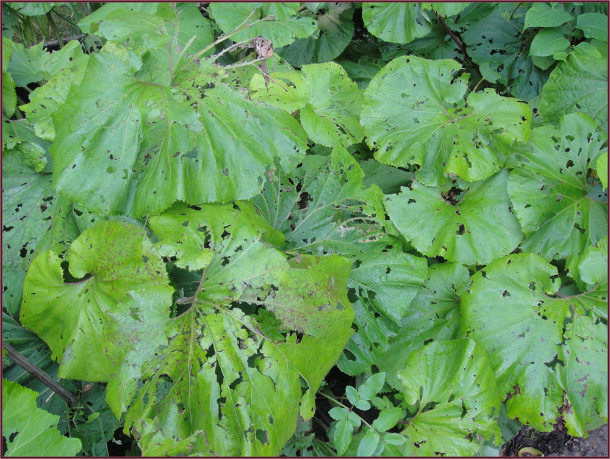
However let’s look at a Hosta leaf – a classic example of smooth texture. But many Hosta leaves have very conspicuous veining, producing a somewhat puckered appearance. The leaf surface is still considered smooth – there are no actual protuberances, but perceptually the surface could be described as irregular.

Huge conspicuously veined Hosta leaves have a puckered appearance. Photo: Pat Gaviller
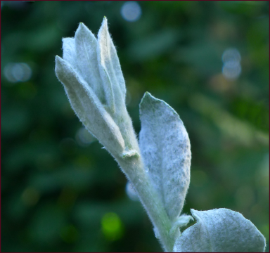
Soft furry Salix salicola. Photo: Sue Gaviller
The foliage of the polar bear willow (Salix salicola) on the other hand, is covered with many tiny hairs, resulting in a uniformly fuzzy surface – indeed it begs to be caressed.
Some would argue that the words “rough texture” couldn’t possibly describe these leaves that look and feel so soft and downy.
![]()
So you see my conundrum here?
Well it doesn’t really matter. The important thing is that you recognize the basic textural differences between rough and smooth, and understand how the eye experiences them – light is refracted and reflected, or in laymen’s terms, bent and bounced off, surfaces that are irregular, differently than smooth surfaces. This creates changes in perceived colour as well as subtle areas of light and dark.
Shiny vs. Matte
Smooth texture is further categorized as either shiny or matte. Shiny surfaces reflect light, thus attract more attention – just ask a child. Conversely, matte surfaces absorb light and tend to blend more into their background.
Bergenia cordifolia, with its coarse texture and glossy leaf surface, makes a great feature plant. Photo: Pat Gaviller
We can keep this in mind when fashioning areas of emphasis or dominance in a garden composition; for example, foliage features – while coarse texture will be the initial determinant of a plant’s dominance, a plant with leaves that are both large and shiny will be a real standout.

Rough vs. Smooth – Left: Elaeagnus angustifolia – deep vertical fissures in the bark create unique striated texture. Right: Prunus mackii – the bark surface is shiny and the leaf surface is matte . Photos: Pat Gaviller
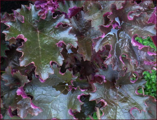
Bear in mind that too many plants with shiny leaf surfaces, can be both distracting and disunifying – particularly if the leaves are large. In my last post I mentioned that planting Heuchera in my garden had provided some visual relief from the excess of fine texture. What I didn’t mention was that after deciding the big glossy Heuchera leaves were indeed a welcome addition, I made the typical “the-only-thing-better-than-a-good-thing-is-more-of-a-good-thing” mistake, and added a whole bunch more plants with big shiny leaves – eventually creating a bed that consisted almost entirely of coarse, shiny texture. During the course of my design study, as I began to understand the role of texture in my own garden, I surmised that “too much coarse texture” had now supplanted the “too much fine texture” scenario, but it was a while later before I figured out that all those shiny surfaces had amplified the problem.
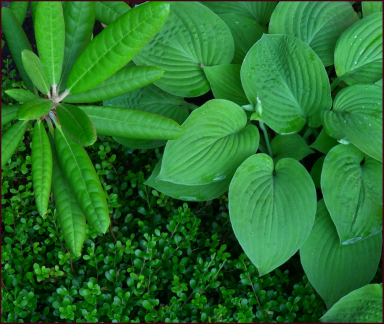
Hosta, Rhododendron and Arctostaphylos – note the contrasting surface textures. Photo: Sue Gaviller
As always, contrast and balance are key – be sure to include plants with smooth matte surfaces, some shiny surfaces, fuzzy, wrinkled, spiny, furrowed……..
Mother Nature often brings her own contrasting textures to the party in a single plant; for example, foliage may have a glossy surface, and flowers have a lustreless surface, sometimes with a bit of nap, like velvet or nubuck.
The glossy pinnate leaves of Rosa ‘Purple Pavement’ contrast beautifully with the softly sueded surface of the blooms. Photo: Sue Gaviller

A study in textural contrast: Prickly Pear Cactus has dangerously spiny foliage, but delicate papery blooms. Photo: Pat Gaviller
On the Edge
Variations in surface edges also impact textural appearance – smooth surfaces with edges that are ruffled, serrated, fringed etc. will seem more irregular, and finer textured as well. Keep this in mind when using plants that exhibit these characteristics.
The large leaves of Heuchera ‘Prince’ are smooth with an intense sheen, but the ruffled edges cause the surface to appear more irregular. Photo: Sue Gaviller
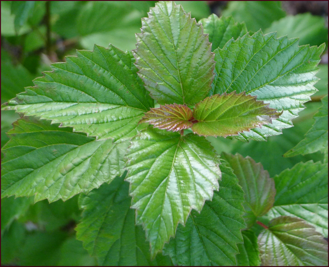
The jagged leaf edges of Viburnum dentatum perceptually alter their surface texture.
Photo: Sue Gaviller
As Time Goes By
Plant texture changes as a plant goes through its seasonal cycles and its life cycle – new growth may be smooth and shiny and older growth, duller or rougher. The formation of deadheads, seedheads or berries adds a new textural dimension as the season progresses. Leaving these to develop may be desirable for visual effect, but depending on the plant, sometimes removal is better. And of course when woody plants enter winter dormancy, most will lose their leaves, exposing their textural bones.

Elaeagnus angustifolia presents many unique textures – stems, petioles and pedicels appear silver and fuzzy, bark on young branches is shiny mahogany brown and mature bark on the trunk is rough and fissured, as seen in the photo earlier in this post. Edible berries form in late summer. Photo: Sue Gaviller.
Much of this bed is edged with Ajuga reptans ‘Catlin’s Giant’, a lovely creeping groundcover with large, glossy, wine-coloured leaves and pretty blue flowers. Here the faded flowers obscure the beautiful foliage – I’ll need to deadhead so the leaf texture can be enjoyed. Photo: Sue Gaviller
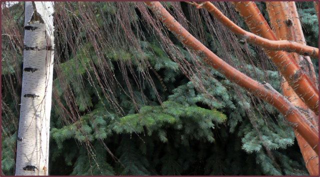
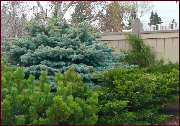
Bark and branches provide textural interest during long winter months. From left: Betula pendula, Picea pungens var. glauca and Prunus mackii. Photo: Sue Gaviller
Texture in the garden has so much more impact than we realize – as I examine my own garden I recognize there are still areas that could benefit from some ‘texturizing’. As I wrap up this post I recognize there is still more I could add, like why have certain plants evolved with particular texture – Mother Nature has her reasons you know. But alas that will have to be the subject of another post.
So when you shop for new plant material, or play with what you already have, take note of what each has brought to the party before adjusting or expanding the menu.
Bon Appétit, SueRelated articles
- Weaving Your Garden – the Importance of Plant Texture (notanothergardeningblog.com)
© Sue Gaviller and Not Another Gardening Blog 2012.
Unauthorized use and/or duplication of this material without express and written permission from this blog’s author and/or owner is strictly prohibited. Excerpts and links may be used, provided that full and clear credit is given to Sue Gaviller and Not Another Gardening Blog with appropriate and specific direction to the original content.