The Principled Gardener Part 3 – Unity of Three

We all know three’s a crowd right? Right, but in design-speak that’s not a bad thing – in fact it’s a very good thing. Massing or grouping plants in threes or other odd numbers is good design – there’s something very pleasing about this configuration because it creates unity.

How so you ask?

Well first let’s look at what happens when we use even numbers – the eye wants to divide these in half…because it can. This visual division disrupts unity. If, on the other hand, we group elements in odd numbers the eye can’t divide this group and unity is therefore maintained.

Three Hemerocallis  ‘Stella D’oro’ and a bird bath make a lovely vignette. Photo: Sue Gaviller

Five Hosta sp. nestled amongst ferns and daylilies in this woodland garden. Photo: Sue Gaviller

Generally speaking odd numbers are preferable, but with larger groups (8 or more) this ceases to be important – the eye will automatically view these as a unified mass. So if you live on an acreage and have a shelterbelt consisting of 100 spruces, I’m not going to insist that you should have 99.

With larger plant groupings odd numbers are no longer required – the eye sees this grouping of Hemerocallis sp. as a unified mass, as it does the Heuchera sp. behind. Photo: Sue Gaviller

Don’t get carried away with threesomes though – if all your plant groups are trios, the composition will lack visual credibility and look somewhat contrived. Instead, use some groups of three, some fives or sevens and some singles.

Two Physocarpus opulifolius ‘Summer Wine’ flank Syringa reticulata, creating a symmetrical backdrop. Photo: Sue Gaviller

So is there ever an occasion when even numbers are appropriate? Yes – as with all the design principles, it’s acceptable to periodically ignore a particular guideline, providing you know why. In other words it must be done with purpose. For example, if you want to ‘stage’ a feature tree, it could be flanked on either side by two smaller shrubs to create a moment of symmetry – this will draw attention to the more dominant feature.

Another example would be when plantings are used to reinforce a design line – in this case it doesn’t matter if even or odd numbers are used since the resulting visual movement trumps any tendency of the eye to break groups in two.

This planting plan contains several even-numbered plant groupings – in this scenario unity isn’t compromised because the plantings follow the design lines, hence the eye follows the same lines resulting in good flow.

Sometimes a group of three consists of three similar but not identical features, for example a grouping of boulders or containers.

This trio of containers, though not all the same size or shape, still provide unity of three because they’re all black ceramic and planted in a similar fashion. I chose the colour scheme based on the coral-coloured stucco and the black trim on my client’s house. This too provides unity – by repetition.  Photo: Pat Gaviller

Yes indeed three’s a crowd – ‘oddly’ satisfying isn’t it?

Yours,
Sue
 
© Sue Gaviller and Not Another Gardening Blog 2012. Unauthorized use and/or duplication of this material without express and written permission from this blog’s author and/or owner is strictly prohibited. Excerpts and links may be used, provided that full and clear credit is given to Sue Gaviller and Not Another Gardening Blog with appropriate and specific direction to the original content.
 

The Principled Gardener Part 2 – Unity by Dominance

Well here we are the last Monday of the month and time for your monthly measure of design doctrine. Last month, in Part 1 of this series, I discussed Unity in the garden and how it can be achieved using repetition. Continuing our discussion on Unity then, let’s look at the use of Dominance. By this I don’t mean standing over your plants, whip in hand, ordering them to behave themselves – nope, in fact a plant may get to do the dominating. Dominance occurs when one element or group of elements stands out or is more prominent than others.  The dominant feature may be a plant, a design line or space, or a non-living element. It can be dominant by way of its size, its shape, its colour, its texture or because it is a Focal Point (a Focal Point refers to a non-living element such as a bird bath or fountain.)

Dominance in the landscape can result from larger size, coarser texture, stronger form, stronger colour or the existence of a focal point.

Dominance in the landscape can result from larger size, coarser texture, stronger form, stronger colour or the existence of a focal point.

The arching purple branches of Berberis thunbergii ‘Rose Glow’ stand out against the softer greens of surrounding foliage. Photo: Pat Gaviller

A good design concept will have a hierarchy of spatial sizes with one dominant space. Here the lawn area in the centre is dominant as it is the largest design space.

A good design concept will have a hierarchy of spatial sizes with one dominant space. Here the lawn area in the centre is dominant as it is the largest design space.

The circular lawn area is the dominant space here because it contains the only arc in an otherwise angular concept.

The circular lawn area is the dominant space here because it contains the only arc in an otherwise angular concept.

The symmetrical planting (Hosta ‘Guacamole’ and Heuchera ‘Plum Pudding’) around this bird-bath enhances its role as focal point. Photo: Sue Gaviller

A garden devoid of any moments of emphasis can be visually unrestful as the eye tends to just wander. A dominant feature however will draw the eye and steady it, allowing it to rest. This is another concept that gardeners often intuit early on, but lose sight of later – myself included. When I purchased my first bird-bath and placed it in the garden, I indeed noted a more cohesive, restful composition – so I bought another. Then I found a beautiful earthenware bowl, filled it with water and nestled it amongst some groundcover in my shade garden. My husband asked me “What is it with you and round things filled with water?” Good question. The truth is I’d given in to the gardener’s favourite mantra “more is better” and rendered ineffective the dominance I’d unknowingly applied with the initial bird-bath. A single strong feature demands attention. Too many strong features compete for attention.  This too can create unrest in the garden as the eye bounces around between competing elements.

Unfortunately there’s no dominance metre to tell us when enough is enough. Just keep in mind that the stronger the colour and/or the form, the more dominant it will be, hence the fewer of these elements your garden can support.  For example, weeping standards such as Young’s weeping birch or Walker’s weeping Caragana, have very strong architectural form thus should always be used as single specimens, whereas vertical accents like columnar aspens or tall reed grasses, though still fairly dominant, can be repeated a couple of times or used in small groups. Warm vibrant colours like bright yellow or lime green will really draw the eye so should be used with some restraint whereas cooler, less intense colours can be used more generously.

The key is to use elements within your garden composition that are dominant for different reasons – maybe one has brilliant colour, another is a small group of very coarse textured plants and another has unique form. Or maybe there are several that are dominant because of their unique form but they are very different forms. While each one will draw the eye, they tend to lead the eye from one to another rather than rival each other. As well, a single dominant feature will often stand out for several reasons, for example it may be larger and more colourful and have unique form, making it particularly dominant. And you can help your focal point or feature tree take centre stage by surrounding it with more subdued elements.

Good placement of dominant features is also important. Anywhere the eye is naturally drawn, like the deepest part of a curve or through a visual opening, is an obvious spot to situate a strong feature. The space where design lines form a visual frame is another good location, as is an area you want to draw attention to – your front door for example. Remember too, that some of these elements – focal points or feature trees and shrubs – will have a presence in the winter as well, so make sure they are visually supported by other woody plant material. For more ideas on Focal Points and dominant plant forms as they are experienced in the winter months, check out a couple of my earlier posts: Focal Points in the Garden and Form Colour and Texture in the Winter Garden.

Malus ‘Rosyglo’, with its elegant form, takes centre stage in the foreground while Syringa prestoniae dominates the background. Note the placement of the two features – Malus is framed by the curving design line and Syringa is situated at the deepest part of the curve. Both are well staged by subdued plantings of Juniperus sabina cultivars. The junipers will serve as visual props for these features in the winter. Photo: Sue Gaviller

Hosta 'Sum and Substance' stands out because of its very coarse texture (large leaves) and its bright lime green colour. Photo: Sue Gaviller

Hosta ‘Sum and Substance’ stands out because of its very coarse texture (large leaves) and its bright lime green colour. Photo: Sue Gaviller

While too many dominant elements in close proximity is bad design, there are scenarios where several strong features can be present together in a co-dominant relationship – for instance a vase shape tree with a bird bath in front of it. One may be slightly more dominant than the other but the effect is that they appear as a single focal vignette, not two competing entities.

A container filled with brightly coloured annuals is quite dominant on its own, as is the top graft Picea pungens 'Glauca Globosa', however because they are so different, their proximity to each other is mutually supportive rather than conflicting. Photo: Sue Gaviller

A container filled with brightly coloured annuals is quite dominant on its own, as is the top graft Picea pungens ‘Glauca Globosa’, however because they are so different, their proximity to each other is mutually supportive rather than conflicting. Photo: Sue Gaviller

The dominant feature brings unity to the garden by subduing all other elements in its presence, hence unifying them in their shared secondary status.

A dominant feature like this gazing ball focal point, can pull together an otherwise nondescript scene, thus creating unity and harmony in the garden. Photo: Sue Gaviller

So go out and buy yourself a graceful weeping standard like Malus ‘Royal Beauty’ – but just one. Indulge yourself with that beautiful bird bath – but just one. You’ll see how creating areas of emphasis can bring about peace and harmony in your garden.

Yours,
Sue
© Sue Gaviller and Not Another Gardening Blog 2012. Unauthorized use and/or duplication of this material without express and written permission from this blog’s author and/or owner is strictly prohibited. Excerpts and links may be used, provided that full and clear credit is given to Sue Gaviller and Not Another Gardening Blog with appropriate and specific direction to the original content.

The Principled Gardener

No, I don’t mean the gardener who has principles (though I’m sure you do); I’m referring to the gardener who uses principles – design principles that is. Last month (Good Lines Mean Good Designs Part 1 and Part 2) I discussed the first two stages of the design process – functional drawings and concept drawings. The final stage is a Planting Plan, but before we can complete this design process, a look at the principles that guide it is in order.

So what are design principles anyways?

Design principles are guidelines that help create pleasing relationships between the various elements of a composition. If you’ve ever picked up a garden design magazine or attended a garden design lecture, you will no doubt have been introduced to the concepts – they may not always be presented in exactly the same framework or use exactly the same terminology, but the constructs are nevertheless the same. I like to think of Design Principles not so much as rules that must be followed, but rather as a way of understanding how the human eye perceives its surroundings and using that to its best advantage.

Gardeners don’t always recognize when they’ve utilized a design principle. Though it may happen by accident, a well designed garden will most certainly have some or all of these principles incorporated in it. It would be so much easier though, if we knew what they were and how to use them, instead of the trial and error approach that most of us employ.

So let’s get started. As I mentioned, Design principles can be organized or categorized in numerous ways, but for the sake of simplicity I’m going to call these principles Unity, Balance, Movement, Scale and Proportion.

UNITY

According to the Canadian Oxford Dictionary, Unity is defined as:  Oneness, being one, interconnection of parts, coherence of parts. So how do we bring that ‘oneness’, that ‘coherence of parts’ into our gardens? There are several ways we can achieve this – repetition, dominance, unity of three and interconnection. Unity then, is an umbrella principle for all of these concepts. Today I look at Repetition.

UNITY by REPETITION

Repetition refers to the repeated use of the same or similar elements throughout a composition.

Plant Material

One of the easiest things to repeat in your landscape is plant material – gardeners often do this unknowingly in their early gardening years, and then abandon it. For many of us our first gardening ventures are somewhat tentative and often constrained by budget limitations. We gladly accept our next door neighbour’s offer of perennials that she’s dividing or discarding. We take a few clumps of each, and spread them around the garden; hence many plants are repeated several times. As we get more adventuresome, we want to try all manner of new things and before we know it we’ve arrived at the ‘one of this and one of that’ scenario, which is anything but coherent.  It’s an expensive mistake and wasteful at that – in order to repeat you now have to reduce. Restraint people, restraint – you don’t need one of every plant in order to attain beauty and diversity in your garden. So, the next time you have some perennials that need dividing, don’t discard the extras, or give them away –  repeat them!

Photo: Sue Gaviller

Numerous plants, including creeping thyme, Goldmound spirea, blue oat grass and bugleweed, are repeated throughout my front garden beds. Photo: Sue Gaviller

Photo: Marg Gaviller

Hosta and red Astilbe are the recurring plant theme in this mature garden.
Photo: Marg Gaviller

Building Material

The repeated element can also be a building or hardscape material, for example; brick, wood or stone. Repeating this in the landscape allows house and landscape to appear as one entity. Conversely, using a material in the landscape that doesn’t also occur on the house, can result in a visual disconnect between house and landscape.

Incorporating a building material from the house, into the surrounding landscape, unites house and landscape. Photo: Sue Gaviller

Incorporating a building material from the house, into the surrounding landscape, unites house and landscape. Photo: Sue Gaviller

Stone pillars echo the stone facing on the house. Photo: Sue Gaviller

Architectural Features

You can also repeat an architectural line or feature. For example, the shape of an arched window could be repeated in the shape of a garden bed or in the arching branches of a weeping tree. A unique detail on the house could be the inspiration for a fence or arbour design.

repetition - line

The arches on the house are repeated in the arching form of this Caragana arborescens ‘Walker’s Weeping’. Photo: Sue Gaviller

The diamond shape detail on the windows was the inspiration for the fence I designed for a client’s home. The fence is being installed as I write this, hence the computer generated image.

Colour

A colour can be repeated as well – bringing a colour from the house into the landscape or using a recurring colour within a garden composition, can unify your whole outdoor space. A purposeful colour scheme will allow you to do this with some real finesse (more on colour schemes in another post). Keep in mind that choosing a plant for its flower colour will provide colour repetition, but only when it’s in bloom – to achieve this throughout the season, choose plants with colourful foliage too.

The colour of the front door is seen again in the Chrysanthemums. Black is also repeated, as is the architectural detail of the columns, which is repeated in the planter pedestal. Photo: Pat Gaviller

Repeating a colour within a planting composition is very unifying – here the dark wine colour of emerging Acer palmatum leaves picks up on the same hue in the tulips.
Photo: Jane Reksten

By repeating elements that are the same, or have similar characteristics, the eye posits each recurrence into visual memory and ties them all together in one coherent theme – voila Unity!

Yours,
Sue

© Sue Gaviller and Not Another Gardening Blog 2012.

Unauthorized use and/or duplication of this material without express and written permission from this blog’s author and/or owner is strictly prohibited. Excerpts and links may be used, provided that full and clear credit is given to Sue Gaviller and Not Another Gardening Blog with appropriate and specific direction to the original content.

CURVES WONDERFUL CURVES: Good Lines Mean Good Designs – Part 2

At the end of March, I published a post on some of the early, though somewhat obscure, Harbingers of Spring – for me these offer hope after a long cold winter (my tolerance for winter must be decreasing as I get older, because this winter was neither long nor particularly cold).

The glimmer of colour I noticed radiating from tree branches last month is now a full-on flush of green as plumped-up buds become tiny unfurling leaves, especially after this week’s rain. The waiting game it seems is over. Hooray, gardening season is upon us! Perennials and annuals have been arriving at local greenhouses for a few weeks, trees and shrubs are here now too. Rakes, shovels, gloves and overalls are coming out of storage – it’s time to start ‘digging in the dirt’. Okay hold on there gardeners, slow down – remember you need to get those garden design lines right first. Guess I better finish Part 2 of GOOD LINES MEAN GOOD DESIGNS before your attention turns to the array of bright shiny things at your neighbourhood nursery.

Alrighty then … last post we looked at Landscape Design Concepts that contain straight lines – from that discussion you might conclude that a rectilinear design theme is my preferred concept form. Not so – in fact my back yard is curvilinear and my front yard, arc and tangent.  So you see I do like curves, but if I’d presented curving themes first, would you have read further?

CURVILINEAR FORM

Curves are the design line most favoured by gardeners, often to the exclusion of other design themes. Admittedly, there is something very captivating about voluptuous curves – the problem is curvilinear designs are the hardest to execute skillfully. The curves required to make this design theme work, are sweeping arcs as opposed to wiggly lines.

The curvilinear design theme is a design formed from continuous flowing lines using the circumferences of adjacent circles and/or ellipses. The fewer circles used and the more of each circle you can utilize, the more effective this theme will be.

Weak vs. Strong design lines. The top image illustrates weak design lines formed from many circles, utilizing a small portion of each circle. The bottom example illustrates strong design lines formed from fewer circles utilizing a greater portion of each circle.

Unfortunately the tendency is to use too many smaller arcs. As I’ve mentioned before, gardeners tend to subscribe to the adage that more is better – they equate simple with boring and mistakenly assume that adding a few more bows and bends will up the wow factor. It doesn’t. Instead it creates an awkward kind of visual movement as the eye wanders along a vague path.

The extra curves (top left) unnecessarily complicate this design line. The simplified curve shown in the second image (bottom right) would create a more effective curvilinear design.

Not all sites or space allotments are ideal for a curvilinear design theme. It’s really best suited for a site that is relatively large – large enough to accommodate some big bold arcs. Sometimes though, there may be a reasonable amount of space, but only in one direction, say a site that is either narrow and deep, or wide and shallow.  In this case, the solution might be to choose a different concept form altogether, or you may just have to be a little creative in your understanding of the curvilinear theme.

Side yards are typically long and narrow – gardeners often opt for a weak serpentine line like the one on the left, assuming there isn’t room for larger arcs. Instead, one could reinterpret the curvilinear theme to include a straight line, resulting in a bolder design line.

A back yard with very little depth can still be designed in a curvilinear fashion, but not with the use of weak wavy lines(left). Including one or two straight lines can allow for the use of longer deeper arcs even when space is tight(right).

But what if you have no appreciable distance in either direction – does this mean you are limited to straight lines?  Not necessarily. While a very small urban yard doesn’t lend itself to a curvilinear design theme, there are still ways you can incorporate curves into your garden beds. The Arc and Tangent Form I discussed in my last post can work nicely in a small yard, or you could try a circular design form, which is made up of circles and portions of circles. There are several circular design themes, but the simplest of them is overlapping circles.

CIRCULAR FORM – OVERLAPPING CIRCLES

An overlapping circular design is formed entirely from the arcs of overlapping circles. The key to making this design theme work is to use a variety of sizes, with one dominant circle. The circles should overlap enough that they can intersect at 90 degrees or more, thus avoiding acute angles.

An Overlapping Circular design theme can work equally well on a small site or a large site, because the circles can be moved in any direction. Note that on the larger property space is taken up, not by increasing the number of circles, but rather the size of the circles. This ensures that they will be in scale with the site.

A lovely example of an overlapping circle design. Photo Credit: Merton Designs, Dublin


MAKING YOUR DESIGN LINES WORK

Regardless of whether you choose a curving or straight line design there a few things to keep in mind.

  • Maintain continuity – stick with one design theme, as mixing themes will result in disunity.  This doesn’t mean that you can’t include an arc or a circle in an angular design, but the dominant theme must still be angular. It’s also acceptable to use one form in the front yard and a different one in the back, assuming that they are visually separated hence wouldn’t be experienced together.

This angular design contains a single arc for the purpose of creating emphasis.

  • Avoid acute angles – when design lines meet at less than 90 degrees, acute angles are formed. These are best avoided if at all possible. Aesthetically, these sharp angles appear awkward – in fact as a design instructor, they are first thing my eye goes to when critiquing student’s work. Functionally, there are several reasons to avoid them – in concrete, the use of acute angles creates weak areas prone to cracking. In beds and borders it creates tiny unusable spaces, too small for plants to grow in, and in lawns creates tight spots that are difficult to mow.
The use of acute angles in garden design is not recommended, for both functional and aesthetic reasons.

The use of acute angles in garden design is not recommended, for both functional and aesthetic reasons.

  • Use design lines to guide planting – the outline of your garden beds can influence ‘where you plant what’. For example, the space that is created when a design line arcs or juts out, is a great place for a feature plant or Focal Point. As well, you can accentuate your design lines by planting a single type of plant along the entire length of that line. Or you can alternate two or three different plants in a rhythmic pattern along the line, which will also serve to emphasize it.
The generous curves in this simple curvilinear design are accentuated by the alternating blue and green Junipers. The Malus 'Rosyglo' in the foreground is nicely 'framed' by the arching design line around it. Photo: Sue Gaviller

The generous curves in this simple curvilinear design are accentuated by the alternating blue and green Junipers. The Malus ‘Rosyglo’ in the foreground is nicely ‘framed’ by the arching design line around it. Photo: Sue Gaviller

Okay gardeners, I’m finished talking about arcs & angles, form & function and other designerspeak. Now you can go plant shopping – if you’re like me you’ll be the proverbial ‘kid in a candy store’. They say you should never go grocery shopping when you’re hungry….

Happy Gardening (at last),
Sue

© Sue Gaviller and Not Another Gardening Blog 2012.

Unauthorized use and/or duplication of this material without express and written permission from this blog’s author and/or owner is strictly prohibited. Excerpts and links may be used, provided that full and clear credit is given to Sue Gaviller and Not Another Gardening Blog with appropriate and specific direction to the original content.

GOOD LINES MEAN GOOD DESIGNS

Now that spring is here we can … well we can wait. The ground is almost fully thawed (I know this because my Rhodos tell me so) but it’s still too early to start digging in the soil – to do so could harm its delicate structure.

So what then is a restless gardener to do? Some will busy themselves with tasks from spring ‘to do lists’ posted by local gardening sites/blogs. Others pore over mail order catalogues and websites looking for inspiration. And we all try to visualize the dozens of new plants we’ll surely add to our gardens this year – as if the addition of new plant material will magically solve any dissatisfaction we had with last year’s garden. Sometimes it does, but more often not – good designs don’t begin there.

Functional Drawings

Most gardeners fail to understand that good design isn’t about manipulating plants, it’s about manipulating space. And good use of space begins with … the ‘f-word’. That’s right – function.  As gardeners, we often arrive at function last – perhaps if we’d considered it first we’d be much happier with our gardens. So we need to ask ourselves, “What is it we want to achieve here?” How do we want to utilize our outdoor space? For example, do we want a place to sit and relax? If so, do we want sun or shade?  And since the sunny and shady spots in our yards will be determined by the direction of the sun at any given time of day, what time of day are we most likely to be sitting outside? Do we need some lawn for children to play on, a place for Fido to call his own, a dining space, an entertainment space, a space to grow vegetables, a utility space etc.?

It can be helpful to map this out on paper – in fact a ‘functional drawing’ is the first step in the design process. It’s the ‘where everything goes’ phase and the site’s individual attributes will often determine where a particular functional space will be best located. For instance, a vegetable garden needs a considerable amount of sun, and young children will need a shadier spot. A dining space we’ll probably want conveniently close to the house and out of the wind, and the garbage, compost, workspace etc. we may want further away and out of sight. And be sure to allow enough room for a given space to fulfill its intended function – without creating areas that will be awkward to maintain or difficult to access. For example, a patio should be large enough that chairs can be pushed out from the table after a meal, a front walkway wide enough for 2 people to walk on, and a mixed shrub bed large enough to accommodate average-size shrubs (with a mature spread of 4-6 feet).

Let’s look at a real life example – I’ve adapted this from a recent client scenario. These clients wanted to redo their front yard, specifically the entrance – new walkway, sitting area, new garden beds. A functional diagram therefore, might look something like this:

The site itself often determines where a particular landscape element is most appropriately situated. In this example, the house, the garage and the existing wall create a semi-enclosed space perfectly suited to a sitting area.

The site itself often determines where a particular landscape element is most appropriately situated. In this example, the house, the garage and the existing wall create a semi-enclosed space perfectly suited to a sitting area.

Note that each space is still formless and depicted only by a simple oval shape, a bubble if you will. Indeed a functional drawing is often referred to as a ‘bubble diagram’.

Concept Drawings

Once you have sketched your map of functional spaces you can begin to give each space form in a Concept Drawing. A concept drawing outlines the shape of patios, walkways, garden beds etc.. This is where the real creativity in garden design begins, and yet gardeners are often stumped at this point – where do we begin? Gardeners limit themselves unnecessarily by ruling out all but curving design lines – curves are indeed a sensuous type of line, but they aren’t the only design line to choose from. In fact curvilinear designs aren’t always the best choice and more often than not, they are executed poorly.

Let’s look again at the real life example – since the space articulated by the house, garage and wall is rectangular, the best place to start is with a design concept that includes some straight lines. Those who lack design training might advise you that straight lines aren’t good garden lines, claiming that ‘there are no straight lines in nature’, but just take a look at a blade of grass, a leaf vein, rock face, tree branch, a pine or spruce needle, a thorn, etc. –  of course they may not be truly straight, but  perceptually they are straight and quite likely as straight or straighter than any line we might carve out in our gardens. Okay point made.

There are a number of design themes that include straight lines, but the 3 basic ones are Rectilinear, Angular/Diagonal and Arc & Tangent. Using the abovementioned Functional Diagram, I presented three possible options to my clients.

A Rectilinear design theme consists of shapes and lines that establish 90 degree relationships to each other and to the house or adjacent building. Here these lines are used to create a quadripartite courtyard design.

An Angular design theme consists of lines drawn at 45 or 60 degrees to the house, but 90 degrees or more to each other. To avoid the use of acute angles (less than 90 degrees), some lines will necessarily be perpendicular to the house.

The Arc & Tangent design theme is made up of arcs (¼ circle, ½ circle and/or ¾ circle) and straight lines that are tangent to those arcs.

The clients liked all three but were leaning towards the rectilinear design. However, they preferred the arc and tangent shape of the bed adjacent to the house – was it possible, they asked, to incorporate an arc into this bed and still choose the rectilinear design? The answer is of course yes – since an Arc & Tangent design is basically a Rectilinear design with arcs inserted into some of the corners, adding one or two arcs to this design still maintained a unified theme. So the resultant Concept looked something like this:

The Rectilinear theme and the Arc & Tangent theme relate well to each other so the client could, in this case, have the best of both. An additional rectangular bed was added to incorporate the existing gas lamp into the design.

Let’s look at the above three design themes in a little more detail.

RECTILINEAR FORM

Rectilinear form has received a bad rap – perhaps because its straight lines are associated with the straight narrow strips of soil against the house or fence that our mothers or grandmothers called their gardens. In reality this design form is made up of adjacent and/or overlapping squares and rectangles, which create much more interesting design lines.

The original owner of this house was an architect and had designed it in a ‘Frank Lloyd Wright-esque’ manner – my client wanted a design that would work with the style of the house, hence the rectilinear form. These photos were taken when this landscape was quite new – it has filled out considerably since then. Photos: Sue Gaviller

I drive by this landscape regularly and I’m always impressed with how great it looks, regardless of the season. This is partly owing to the strong design lines – the rectilinear design theme reflects the contemporary lines of the house. Photo: Sue Gaviller

The above two examples are small-scale urban applications of this design form, but it can be equally as applicable on a larger scale with a more ‘rural’ feel – check out this link for some lovely examples.

ANGULAR/DIAGONAL FORM

This design theme has a strong angular component, although all lines don’t need to be angled – sometimes a single purposeful angled line can achieve that angular component quite nicely. Ideally a diagonal design is just a rectilinear design, but rotated 45 or 60 degrees. There are a number of scenarios this form works well for, e.g. a property that is disproportionately longer than it is wide.  The long straight property lines draw our eye directly to the back of the property, but when angled design lines are used, the angled bearing encourages the eye to move along a less direct path, detracting from the site’s long narrow configuration. Another example where a diagonal or angular theme would be appropriate is a site with an angled property line.

A long narrow yard can feel a bit like a bowling alley – making use of an angular or diagonal concept can diminish this effect by drawing the eye away from the back of the yard.

The North property line angles at approximately 30/60 degrees to the house so an angular design theme using that same angle worked very well here.

For a couple of good photographic examples of angular designs, click here and here.

ARC AND TANGENT FORM

This design theme is made up of arcs and straight lines – an arc and tangent concept can be thought of as a rectilinear theme with arcs inserted into some of the corners. The arcs can be ¼ circles, ½ circles or ¾ circles and should be large enough that it actually looks like lines and arcs and not just right angles with slightly bevelled corners.

The easiest way to arrive at an arc & tangent concept is to begin with a rectilinear theme and insert arcs into some of the corners.

I find that photographing this design form is tricky because of the role perspective plays – the straight lines don’t always look truly tangent to the arcs. Below are a couple of photos from several years ago.

The Arc & Tangent design theme lends itself nicely to the architectural lines of the house. The landscape has matured some since this photo was taken. Photo: Sue Gaviller

A simple Arc and Tangent form effectively outlines this mixed shrub and perennial border. Photo: Sue Gaviller

So there you have it – a case for straight lines in the garden. Next post I’ll cover a couple of the curving design themes. In the meantime, try playing with new lines for your garden – on paper of course. And don’t be afraid to think outside the box – or maybe I should say ‘inside the box’.

Til then,
Sue

© Sue Gaviller and Not Another Gardening Blog 2012.

Unauthorized use and/or duplication of this material without express and written permission from this blog’s author and/or owner is strictly prohibited. Excerpts and links may be used, provided that full and clear credit is given to Sue Gaviller and Not Another Gardening Blog with appropriate and specific direction to the original content.

Form, Colour and Texture in the Winter Garden

I had hoped to follow up with this second post on “Winter in the Garden” before now, but photo shoots take time, especially for a beginner photographer like me. However, this is Calgary and winter will be sure to hang around for a bit longer, so the topic is still timely.

In my last post I discussed Focal Points and their value in the winter garden. You’ll recall from that discussion, that a focal point refers to a ‘hard’ or non-living feature that draws the eye. We can also employ ‘soft’ or living elements in the garden to create winter interest – plant material that contributes form, colour and texture.

Form

Plants with strong architectural form offer a unique kind of winter interest – naked of foliage from fall through spring, their distinctive silhouette draws the eye in much the same way as a focal point, hence many of the same guidelines would apply: don’t overuse, make sure they are planted perfectly upright (they will sometimes lean over time so need to be straightened periodically) and stage them for maximum visual impact.

So what constitutes ‘strong architectural form’? There are a number of plant shapes that fit the bill.  I find that ‘weeping standards’ are among the most dominant of plant forms – small weeping ‘trees’ which are developed by grafting a pendulous or prostrate form onto a standard, e.g. Malus ‘Rosy Glo’, Betula pendula ‘Youngii’. These little beauties bring real elegance to a composition. Not surprising then that gardeners often make the erroneous assumption that because one looks awesome, two will look even better. More is better? This may be a great philosophy – when it comes to lobster, or cheesecake, but not here. I made this mistake in my own front yard a few years ago. On one side of the yard a Royal Beauty weeping crab took centre stage and I wanted something interesting to balance it on the other side. Off I went to the nearest greenhouse to look for the perfect garden addition. A beautiful Young’s weeping birch caught my eye. Oh yes, I thought, that will be perfect for that spot. I should really know better – in fact even as I stood in line I was having an internal dialogue: “Sue, you already have a weeping standard in the front yard – another one would be overkill”… “But, but it’s such a perfect specimen and the bark will look lovely against the cedar fence in the winter”. Well, the gardener won out over the designer – I bought it and had it planted within an hour. I guess it looked okay, but it didn’t take my breath away. The real effect was that each of the two similarly strong features diminished the impact of the other, even though they were 40 feet apart.

As I scrutinized this over the next few weeks, I eventually decided that it wasn’t ideal but it would have to do … for awhile anyway. It has of course, now been replaced – like I said I should know better. Weeping standards are definitely best used as single specimens. But enough about my garden challenges.

This attractive little Caragana arborescens ‘Walker’s Weeping’ has been nicely staged by underplanting with a Juniperus sabina cultivar and framing with 2 Juniperus scopulorum specimens – likely Wichita Blue. Photo: Sue Gaviller

Additional plant forms that are distinctive and provide winter appeal would be:

  • other top grafted standards, e.g. top-graft Syringa meyeri
  • columnar trees, e.g. Populus tremula ‘Erecta’
  • vase shape trees e.g. Caragana arborescens ‘Sutherland’, Malus ‘Pink Spires’
  • tall upright grasses e.g. Calmagrostis acutiflora ‘Karl Foerster’ or ‘Avalanche’
  • evergreen topiary e.g. Juniperus chinensis ‘Mint Julep’(pom-pom)

These can be used as single specimens, and with the exception of certain topiary forms (e.g. pom-poms), they can also be grouped, used to frame entrances/views or planted sequentially to direct visual movement and reinforce design lines. And while more than one can be used in a composition, they too if overused, will create visual unrest.

This ‘pom-pom’ topiary pine is appropriately used as a single specimen. Here, it needs very little staging as the detail on the house is an effective backdrop. The upright blue juniper supports visually too, although appears to have once been a topiary specimen itself – it would be best if allowed to revert to natural form so as not to compete with the pine. Photo: Pat Gaviller

This grouping of spire-like Populus tremula ‘Erecta’ creates a stately feel in an otherwise informal landscape. Photo: Sue Gaviller

The upright form of these Calamagrostis acutiflora ‘Avalanche’, effectively directs visual movement along the pathway in one of my client’s front yards. Photo: Sue Gaviller

Top-grafted standards like this Syringa meyeri, provide strong form while allowing a view beneath it to what lies beyond.

You can get away with using numerous strong forms if they aren’t all the same shape. For example when I removed the Young’s weeping birch, I replaced it with a Pink Spires Crabapple – a lovely vase shape tree. In front of this I placed a bird bath – these two together created a co-dominant ‘focal vignette’, completely different in appearance from the weeping crab. Hence the effect is that they support rather than compete with each other.

For the average gardener it can be hard to predict how certain plant forms will work together – just keep in mind that the more striking or unusual its form, the more likely it is that it will need to stand alone.

I will be discussing plant form in more detail in a later post, but in the meantime the best advice I can give you is to practice some restraint. (Really? Is that even possible for a gardener?)

Colour

There is of course a limited palette available to us at this time of year – let’s see, gray, brown, grayish brown, brownish gray, sometimes white, some green, a bit of blue. Anything else? Well yes actually – take a look:

Many trees have colourful bark, in varying hues of green, yellow, orange, red and purple. These colours may be less saturated than the colours of summer, but because they are exhibited by an entire tree or shrub, the effect can be quite dramatic. Photos: Sue Gaviller

The beautiful bronze bark of this Prunus mackii picks up the warm hues of the wood and stone on the house. These same colours are seen again in the boulder in the foreground. Photo: Pat Gaviller

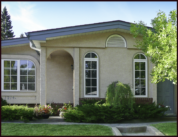
This landscape was also featured in my last post. I’ve included another photo, (minus the lopsided light fixture), because it’s an excellent example of how colourful a winterscape can be. Photo: Sue Gaviller

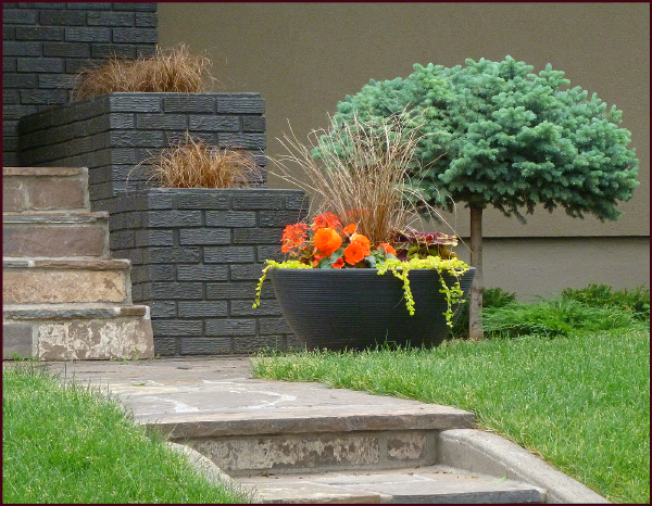
Berries too can provide winter appeal. The visual impact will be determined by the amount of fruit and it’s size – this may vary from year to year. As well, berries with little water content, like the above examples, will retain colour better through the winter than juicier fruits.

The abundance of Hippophae rhamnoides berries caught my eye when driving by this landscape – a good illustration of the use of form, colour and texture to provide winter interest. Photo: Sue Gaviller

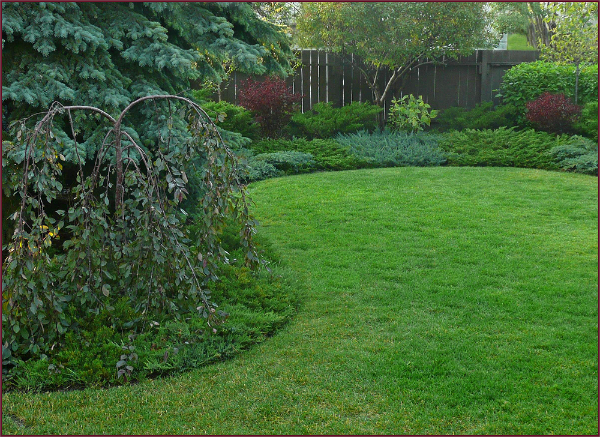
While all conifers provide winter interest, it is the rich green of several Pinus mugo that enlivens this scene. Imagine how drab it would appear without them. Photo: Pat Gaviller

Evergreen Colour

I aim for at least 1/3 of the plant material in a composition to be evergreen – and I mean evergreen, not everblue. Not that I don’t love blue spruces and blue junipers – I do, and they should be used, but not to the exclusion of green. Blue-grey foliage has less pigment than green foliage, hence can contribute to the washed-out look of a winter landscape, especially in the absence of snow. If you’ve ever been to one of my Colour Theory lectures, you know my thoughts on green – it’s the most important colour in your landscape, the colour which allows other colours to have significance.

Green is the colour of life (plant life that is). It can tame the most unruly of hues, add visual depth and infuse richness into your landscape year round. So for every blue conifer you use, plant a few green ones. You’ll see how much more alive your garden will look in the dead of winter.

Texture

Textural contrast is another important consideration when planning your garden. Texture can be fine or coarse – during the growing season, fine texture generally refers to small leaves or flowers that are grouped closely together, and coarse texture would be large leaves or flowers spaced further apart. During the winter months though, we need to look at texture differently. Since most herbaceous perennials have little or no presence in the winter, and most deciduous trees and shrubs lose their foliage entirely, then it is the texture of their bark and branches we see. Spiraea and Potentilla, for example are fine textured – their branches are small, twiggy and tightly spaced. Syringa and Fraxinus (especially males) have much coarser texture – their branches are beefier, and more widely spaced. At any time of year too much tiny, tightly packed foliage, flowers or branches will end up looking busy, so punctuating with some coarse texture will create both emphasis and contrast.

Texture can also refer to the surface of something – is it rough or smooth, shiny or matte. In the winter this will refer mostly to the bark of trees and shrubs.

Compare the very different texture of the above three trees – the oddly flaking bark of Pinus sylvestris (left), the twisted striated bark of Crataegus mordenensis ‘Toba’(centre), and the shiny peeling bark of Prunus mackii (right). Photos: Sue Gaviller

Evergreen Texture

All evergreen foliage is considered fine textured – narrow needles spaced closely, and yet they appear texturally quite different. Some appear weightier than others – they may be denser or the needles longer, or stiffer. Use of contrast in this regard will produce superior results to utilizing a single type of evergreen. Yet another example of me not practicing what I preach – I have too many junipers in my backyard, with few other evergreen foliage types (that and my Rosy Glo has developed quite a lean).

These conifers are all fine textured, but they differ in perceived weight. The lacy foliage of Juniperus chinensis ‘Mint Julep’ (right), appears lighter and airier than the stiff needled Pinus mugo (left) and Picea pungens ‘Globosa’ (middle). Photo: Sue Gaviller

The beauty of winter is that it offers us a glimpse of colour and texture combinations that would be obscured in other seasons by branches clothed in foliage. Photo: Sue Gaviller

I invite you to open your eyes to the beauty that is winter – at least for a few more weeks.

Spring is coming.

Til then,
Sue

© Sue Gaviller and Not Another Gardening Blog 2012.

Unauthorized use and/or duplication of this material without express and written permission from this blog’s author and/or owner is strictly prohibited. Excerpts and links may be used, provided that full and clear credit is given to Sue Gaviller and Not Another Gardening Blog with appropriate and specific direction to the original content.

ANOTHER GARDENING BLOG … seriously?

Yes indeed – another gardening blog. Bear with me though, as I present a designer’s perspective of what is for some, a minor hobby, and for others an obsession so grand they forget to eat, bathe or feed their children: The Garden.

My intention had been to start blogging on Jan 1st – New Year, new endeavour. But honestly, I just couldn’t get excited about garden writing when the darkest days of winter were still upon us, regardless of the above average temperatures we’d been experiencing. Then when winter truly hit and we plunged into the deep freeze, so did any ambition to write about all things spring and summer.

Temperatures have since moderated – in fact the days are again unseasonably warm and the promise of spring is actually believable. There are still weeks of winter ahead of us though – Balzac Billy saw his shadow. Sooo… what better to write about than the garden in winter!

Many gardeners don’t see winter as a “gardening season” and I guess, considering nothing is growing at this time of year, we don’t really garden. But that doesn’t mean we can’t, or shouldn’t, design our gardens with winter in mind. In fact as a designer, when I‘m choosing plant material for a landscape plan, I always start with winter appeal – evergreen plant material, trees /shrubs with colourful bark or berries, plants with strong form or interesting texture. All these things allow us to extend the beauty of our garden-scapes beyond the growing season to fill much of the rest of the year.

These first blog posts then will address how we might plan our gardens for winter interest.

Focal Points in the Winter Garden

A Focal Point refers to an element in the garden that is constant, unchanging. This means it is a “hard” feature, i.e. non-living. A non-living element doesn’t grow, or change colour, or lose its leaves. It simply remains the same – drawing the eye and giving it a place to rest, throughout the seasons. Never is the importance of focal points more evident though, than during the dreary winter months when there is often little else to capture our attention. A well placed bird bath or piece of sculpture in the dead of winter can be as lovely as any summer garden scene, albeit more subtle. The presence of a focal point reminds us that the garden is still here, still beautiful in its simplified form.

But just plopping the aforementioned feature anywhere in the yard will not necessarily create the postcard winterscape we’re after – a focal point is most effective when properly staged. Too often I see a unique garden element with no visual support – stuck out in the middle of the lawn or a part of the garden that is completely barren from fall through spring. Of course everything is picture pretty when covered in snow, but in the austerity of a snowless landscape (as is often the case in Calgary), more artful planning is required. Plant material that maintains a presence throughout the year will provide an effective prop for your garden ornament. This means using woody plant material (trees and shrubs), ideally some of it evergreen, in the vicinity of or surrounding your focal point.

I drove by this garden recently while taking an alternate route home - this charming lady presents an elegant focal point and would be equally lovely even in the absence of snow. Photo: Sue Gaviller

I drove by this garden recently while taking an alternate route home – this charming lady presents an elegant focal point and would be equally lovely even in the absence of snow. Photo: Sue Gaviller

A single boulder, ideally with a unique shape and textural interest, can serve as a focal point. Photo: Pat Gaviller

A single boulder, ideally with a unique shape and textural interest, can serve as a focal point.
Photo: Pat Gaviller

Containers are a valuable addition to the winter landscape - the container itself serves as the focal point and also allows for the use of seasonal arrangements, as this homeowner has created. In this example the rocks play a supporting role rather than focal. Photo: Sue Gaviller

Containers are a valuable addition to the winter landscape – the container itself serves as the focal point and also allows for the use of seasonal arrangements, as this homeowner has created. In this example the rocks play a supporting role rather than focal. Photo: Sue Gaviller

This wintry scene as viewed from my back window illustrates how a focal point can be so well merged with its setting that it appears to have ‘grown there all by itself’. Photo: Sue Gaviller

This wintry scene as viewed from my back window illustrates how a focal point can be so well merged with its setting that it appears to have ‘grown there all by itself’. Photo: Sue Gaviller

Another photo taken by my sister on one of our walks - not sure if the colour of the gazing ball was purposefully chosen to echo the golden inflorescence of the reed grasses in the background, but the result is quite effective. Photo: Pat Gaviller

Another photo taken by my sister on one of our walks – not sure if the colour of the gazing ball was
purposefully chosen to echo the golden inflorescence of the reed grasses in the background, but the result is quite effective. Photo: Pat Gaviller

A focal point, in any season, can pull together an otherwise nondescript scene. This gazing ball is surrounded by woody and evergreen plant material surround, so will have the same effect in winter as well. Photo: Sue Gaviller

A focal point, in any season, can pull together an otherwise nondescript scene. This gazing ball is surrounded by woody and evergreen plant material, so will have the same effect in winter as during the growing season. Photo: Sue Gaviller

Bear in mind that your focal point needs to be level. If your bird bath is leaning, get out your level and straighten it, otherwise it just looks sloppy.

And don’t be tempted to overuse focal points – this is probably the most common mistake gardeners make with garden decor. Too many of these in close proximity will create competition for the viewer’s attention, hence visual unrest. So how many is too many? Unfortunately there is no formula for this – it depends on the particular focal point, the overall landscape design and the size of the area.  Generally speaking though, for an average size front yard, one bold focal point can deliver sufficient visual punch – there will be other “soft” (i.e. living) features drawing the eye as well. I’ll discuss these in my next post.

Consider too that there are superfluous elements in the garden that may inadvertently serve as focal points, e.g. a couple of my personal pet peeves – bright blue security system signs and outdoor lighting fixtures.  I don’t mean elegant post lamps or subtly placed spot lights – rather I’m referring to the cheesy sets of lights gardeners poke haphazardly into the ground, forgetting that the purpose of garden lighting is to draw attention to the lovely light that is cast, not the fixture that is casting the light. But more on garden lighting another time. As for security system signs, I appreciate that they serve an important purpose and hence need to be visible, but to me they are beyond visible, they are visually distracting– just keep this in mind when placing them.

I often pass by this well done landscape on my neighbourhood walks – though it’s especially attractive at this time of year, I doubt the homeowners intended for the light fixtures to be the focal point in this composition, especially since one is noticeably lopsided. Photo: Sue Gaviller

I often pass by this well done landscape on my neighbourhood walks – though it’s especially attractive at this time of year, I doubt the homeowners intended for the light fixtures to be the focal point in this composition, especially since one is noticeably lopsided. Photo: Sue Gaviller

Well, so ends my inaugural blog post. I realized when writing this that I ought to practice what I preach – the bird bath in my front yard could use some evergreen plantings around it. That will be my first purchase come spring. Ah yes, spring – so close … yet so far.

Till next time,
Sue

© Sue Gaviller and Not Another Gardening Blog 2012.

Unauthorized use and/or duplication of this material without express and written permission from this blog’s author and/or owner is strictly prohibited. Excerpts and links may be used, provided that full and clear credit is given to Sue Gaviller and Not Another Gardening Blog with appropriate and specific direction to the original content.